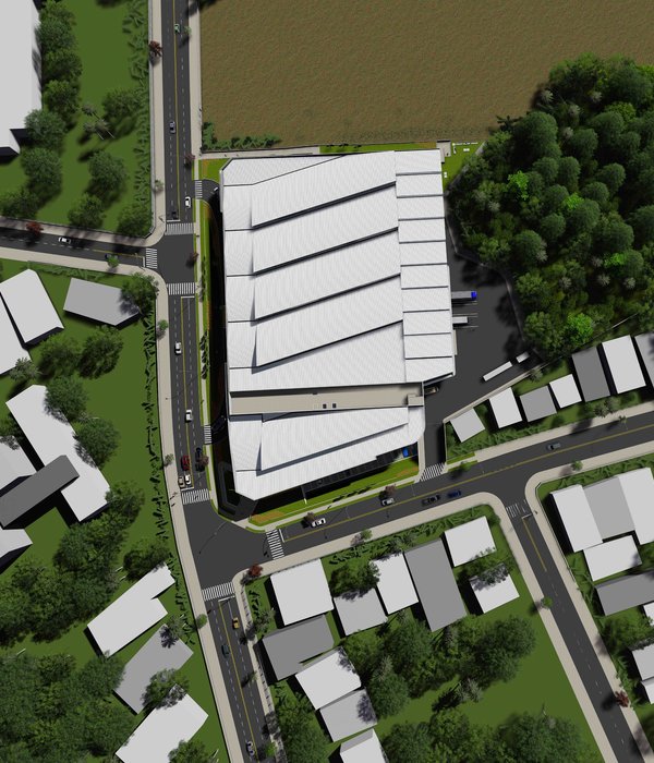
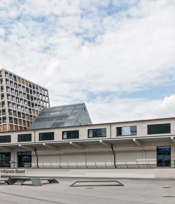
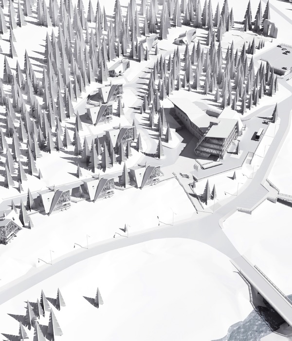
A small park is laid out eastward along the street and the setback frontage of the neighboring residential buildings. A dilapidated row of houses to the west prevents it from being extended westward. The new office building cannot resolve that urban dilemma, but it can keep the situation open for a future solution. While the ground floor is positioned to align with the residential buildings to maintain the longer-term urban development objective as a viable option, the three upper floors project above the plaza in front, making full use of the maximum allowable volume. As a result, the Sparkasse building has a spacious forecourt that is open to the public. The lobby is oriented towards this 'plaza', from which the building is entered centrally, giving direct access to the events room and the staff café.
At the center of the ground floor is a hall, above which is an outdoor atrium. The ring-shaped floor plan reduces the number of vertical circulation areas required and allows the floors to be flexibly divided into different functional units. The 4.05-meter grid of light-colored bricks and rectangular windows echoes the scale and rhythm of the surrounding residential buildings.
The floor plan offers maximum adaptability thanks to its structured configuration. The use of prestressed concrete slabs made it possible to largely dispense with load-bearing internal columns and walls. Bracing and seismic stability are provided by the two core zones, which contain the vertical circulation and utility risers as well as all the ancillary rooms that require plumbing connections. On the upper floors, the office blocks can be occupied by different tenants if desired, creating up to eight separately functioning units.
Light grey wool felt curtains can be used as needed to divide the open-plan space. Cellular rooms at the ends of the building bundle function to provide spaces for both meetings and concentrated work.
The interior palette of materials is limited to exposed concrete ceilings, oak built-in furniture and wall paneling, white modular partitions, and green carpeting. Only a few versatile pieces of furniture, predominantly in white, were selected, along with a few specific textile 'splashes' of color. They embody the idea of providing a modular system of interior elements that can be easily adapted to changing work situations and company structures.
Thanks to its spatial adaptability, the office building can be used for a long time to come, even if the composition and needs of its users change. The compact structure has a favorable surface-to-volume ratio, which helps to reduce heat losses. The internal courtyard and large expanses of glass ensure that the office areas receive optimum natural light and also allow cross-ventilation through the windows.
Durable and easily repairable materials were used – such as clinker brick, timber-aluminum windows, exposed concrete, oak surfaces, and exposed mastic asphalt screed. Many elements were not glued but screwed or hung without the use of harmful substances.
The cooling and base-load heating of the building is provided by the concrete core temperature control in the concrete slabs, which exploits the inertia of the building mass. Additional short-term heating requirements are met by the ventilation system, which is kept to a strict minimum using low-velocity air diffusers at the windows and central exhaust air intakes at the two cores. The building is connected to the municipal district heating network. The entire roof area is used for photovoltaic power generation, with surpluses expected.
{{item.text_origin}}

