Mid 2017 Schipper Bosch Development commissioned Space Encounters for the design of a new office building above the former Prodent warehouse in De Nieuwe Stad (The New City) in Amersfoort. The new building is located on the south side of the central space which has been designed by ZUS [Zones Urbaines Sensibles, Rotterdam] as a forest, square and charging station for electric vehicles. Typologically a new public space. This renewal in form and use is characteristic of De Nieuwe Stad. With respect for the past, the future is being built in an innovative, sustainable and dauntless manner.
The new office space concerns two floors added to the existing building. The existing warehouse below is a relatively anonymous building. Characteristic is the concrete cassette facade showing the rhythm of the construction. The building used to serve as a storage shed for a toothpaste factory. Currently, it houses the online supermarket Picnic and the pop venue FLUOR.
Because the new building is constructed separately over the existing hall, the clearest and most conceptual choice is made. The ambition to create a flexible, non-conventional office layout also results in innovative choices in the field of construction methodology. The Platform was built over the hall by means of seven steel trusses. These frames each span thirty-four meters and stand heart to heart more than fourteen meters apart. Constructively it is as much like a bridge than a building. A typological crossover.
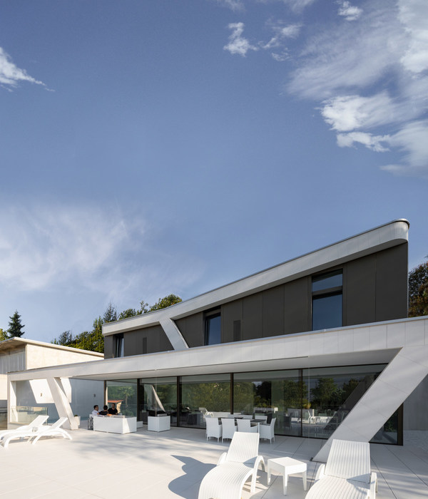
Quality and interconnection are core values for the developments in De Nieuwe Stad and thus also for The Platform. The way in which the old shed and the new building just don’t touch each other and are nevertheless interconnected shows itself cause the columns of the new building to follow the rhythm of the old building. On the square side, The Platform protrudes three meters from the shed. On the ground floor, this creates a covered entrance area with space for bicycle parking places. On the first floor, this three-meter zone results in a generous balcony. It is the entrance balcony for the offices and an outside workplace with a view of the forest in front of the building. This space is connected to the square with a three-meter wide concrete staircase. The stairs invite. The balcony has a pink strip steel balustrade. The grand industrial gesture of the building becomes friendly and soft here.
The office connects with the square through the balcony and the stairs. Inside and outside. The size of the balcony can be felt again on the ends. Closing the depth of the balcony here on the second floor creates an imaginary vertical line that continues into the old building. It goes without saying that The Platform is over the former warehouse. Old and new have been integrated, by continuing the architectural characteristics of the existing into the new building. The connection between old and new is also reflected in the finish, on the outside of the Het Platform. The white glazed ceramic tiles are traditionally used in industrial interiors because of the resilience. By placing them on the facade, the enormous scale of the building becomes tactile and connects with the history of the place. At the same time, it is a reference to the superstructures of Superstudio. The avant-garde architects collective that was the perfect example of counterculture in the service of freedom.
The interior is completely in the service of the building. The same no-nonsense service. Functional necessities have been clustered to keep the size of the large office floors tangible. The boring collection is used to make room. Color clusters with pieces of furniture on which consultation or relaxation can take place fill the space in a natural and fresh way.
The building connects the past, the present and the future. In form, in materiality, in meaning, in use, in energy. The trees on the square give the building context, both on the ground and in the sky. This quality is continued in the patio that fits in with the scale of the building. The green of the trees, the yellow crosses on the square, the red frames in the shed, the pink fencing and the blue sky. The white tiling works like a canvas that connects everything.
{{item.text_origin}}

