Sergey Makhno Architecs • We art the world!
ACADEMY DTEK
Published by Archiscene • Archello• Архидом• ID.interior design
Build regardless: Innovation Academy DTEK in 6 months
What: The implementation of the interior design for a business platform that specializes in corporate education
| Where: Kyiv, UNIT.City |How: 6 months from an idea to the first student |The main idea: space that fills with energy |Area: 3 234 sq. m.
BIO • CLIENT • TEAM • WHAT WE NEEDED TO DO • WHAT WE REALLY DID • VIDEO TOUR • DETAILS • F*CK-UPS
CLIENTDTEK is a Ukrainian energy company, the largest private investor in the energy sector of the country. In 2018 the investments were at the amount of 20 billion UAH. The company employs 70 thousand employees. One of the main directions is the Academy DTEK business platform, which specializes in corporate education and training of state sector employees. For the second direction, it received the "gold" of Global CCU Award 2019 in Brazil.
TEAMArchitects: Sergey Makhno, Artem Meshchankin, Alexander Makhno, Oleksandr Kovpak, Ihor Tykhyi, Oleksandr Doykov,Maryna Hrechko, Olha Sobchyshyna, Serhii Filonchuk, Kostiantyn Svetlykh, Viktor Zakharchenko, Polina Volkova
Usually, we work in teams of 2-3 specialists: an architect or interior designer plus design engineer. But due to the strict deadline, we had to call for heavyweights. Together we defined the stylistic direction, we argued, discussed the options, lingered around when others have already left. And together we were glad when the ideas were a success. Sometimes it took several hours from the moment of the first visualization to submitting drawings directly to the construction.
WHAT WE NEEDED TO DO
KAN development company was responsible for constructing a new building in Ukrainian Silicon Valley UNIT.City for Academy DTEK. When in the summer of 2018 Sergey Makhno Architects team met the representatives of the Academy DTEK, only four floors out of six were ready. Sergey, with all his optimism and vigor, stated a sentence: "Year and no less." To which the customers said: "We have the opening in 6 months. Six months and no day more."
The client is accustomed to global decisions, and we are accustomed to challenges. The design project had to be echoed with the values of the company, to be ecological and durable as more than 200 000 students visit the Academy throughout the year. Audiences must be mobile and adapt to various tasks and the number of listeners. So the space doesn’t annoy you, and the process of education is a pure thrill.
And, let us remind you, it’s just 6 months we had.
WHAT WE REALLY DID
We immodestly believe that nature is our main co-author, and it is the most talented architect ever. The interior design was planned as its continuation as if the interior was created by nature but with the access to the latest energy-efficient technologies.
We sincerely believe that the energy of space is one of the most powerful ones. If the interior meets the set goals, if it is integral — it literally "recharges".
RECEPTION
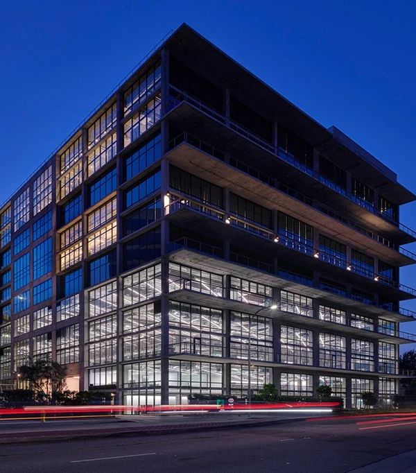
We slide by the glass facade of the building, which blushes in the sunny weather — the windows are covered with a red membrane. The stuffy construction heat is all around — UNIT.City continues to grow in leaps and bounds.
The roundabout door seems to dispel a heavy water mass and now we’re in the life-giving underwater kingdom. Large-scale tile on the floor is a step by a water glider. Yes, you can walk on water — everything you can imagine is real. Hall of the academy exalts a human, its character, and will.
The interior is quite rich: the vertical gardens compete in the majesty with wooden panels on the walls, the led-tape hurries across the mirrored ceiling, the lighting sculpture tries to break through to the 2nd floor, while the ceramic canoes — the author’s tile from Sergey Makhno Architects — set sail to the reception desk. But with that, the design remains imperceptible, it does not distract attention — because the main thing here is a human.
SCHEME OF RECEPTION
LIBRARY
Behind the wall of the reception desk, there is a coworking library. Huge ears of authors Elephants armchairs by Sergey Makhno Architects carefully protect personal space but do not cut you off from the outside world. The windows to the ceiling and glass lamps by Expolight. Here, the light runs wild. Metal waves of the wall and smooth pebbles on the coast.
SCHEME OF LIBRARY
CAFETERIA #1
Also on the first floor, there is a cafe with access to the terrace. There’s a zen garden under the ceiling — among the blossom of flowers, ceramic Crust lamps by Sergey Makhno sprinkle the warmth all around the space. When having a cup of coffee, you have a chance to meditate and cleanse the consciousness for future affairs, thoughts, and knowledge.
SCHEME OF CAFETERIA #1
Metal and wood that unite
We go to the second floor by strict stairs, sewn in metal and wood — the unifying elements of the entire space. The sheets of stainless steel are 0,8 mm thick — they are about the flexibility that makes the modern world a little less tough.
GENERAL SCHEME OF THE 2NDFLOOR
Academy DTEK is the first project in Ukraine that has integrated complex management and automation of the space using Crestron technology. The solution was implemented by the Ukrainian company D8. At the output, we have a single intelligent system that allows you to manage the spaces both locally and through the Internet.
EXCELLENCE | CLASS ROOM1
And again, a wave of freshness — the blue, gold sands and dozens of suns.
We go to the first audience of Excellence (the names reflect the values of the company).
Suspended brass ceilings aim at the goal, and columns are a symbol of experience.
Peaceful dark gray and always young black.
The audience next door — Openness — is the openness to changes.
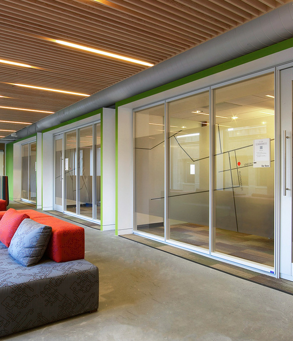
On a sunny day, a translucent airy room is flooded with the red light.
Down the hall, there’s a mobile audience Unity. Thanks to the noise-isolation curtains, the room can be divided into two smaller ones or can be combined into one large one. Due to the Crestron automation, the mode is selected by touch and the control system understands which source for the presentation it is connected to, and where the event is held. The furniture choice is also very simple. With the Stalcon mobile constructions, you can change the seating zones in 5 minutes.
On the wall — the author’s tile Tetrapod, the owner of Red Dot Award-2017. The design was inspired by few-ton concrete structures that protect the shores from the destructive waves. One Tetrapod had the courage to stand out and now everyone is trying to touch it, we even had to cover it with a protective layer.
The largest audience — Big Idea — for big things. Mobile internal walls can change the space beyond recognition. The right zoning is an important success factor for effective learning.
CAFETERIA #2
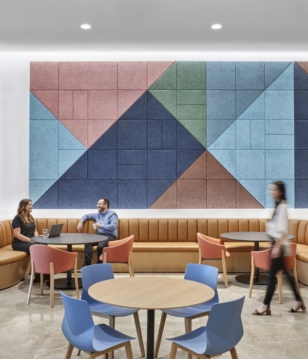
There’s one more coffee-point and the blue, the blue. By the way, the furniture and the floor are also delicious. They are covered with a modern eco-friendly material the Forb company boldly declares to be as safe as something edible and tasty.
PROFESSIONALISM — CLASS ROOM5
To manage the "sun", at least artificial is also possible. You set the desired level of lighting and leave the rest to the automated control system: it will open/ close the curtains, increase/ decrease the illumination, and focus on the important.
RESPONSIBILITY — CLASS ROOM6
Here, the main difficulty and challenge is the freedom of complex design solutions in favor of space where you feel yourself the very change that the world needs now.
EXAMINATIONROOM
Examination rooms are designed according to all the European requirements. You won’t cheat, no. And this, in the first place, teaches to respect yourself.
YELLOW HALL
The colors are natural, but not blurred. The range is saturated — from orange and blue to salad green.For the eye to not get bored, and the space to be a forever unexplored land.
BLUE HALL
ORANGE HALL
A good interior is primarily about functionality and comfort. Here is the maximum of light, freedom of movements and solutions.
A good interior is for geometry and ergonomics you do not think about. When you are at the academy, you are strolling through the pages of the book. Where each chapter has its own main character, but in the final act they all meet for the sake of a common cause.
A good interior gives you the energy of development.
VIDEO TOUR
Directed by Maryna Grechko.
DETAILS
We create our products in Ukraine. The award-winning tile, lighting, dishes, furniture, and carpets — every item is another story we are telling the world.
For students and teachers to concentrate on the learning process for 100% and not to be distracted by the problem of equipment, each audience has a direct connection with the support service. All you have to do is press the desired button on the touch panel that will instantly connect you with a technical service which will diagnose and resolve the problem remotely. Also, the system will digitize all the information presented at the interactive whiteboard and save it in a relevant format.
Energy saving is also taken care of. There are motion sensors to save electricity in transit zones, while unused audiences can be taken off into economical mode. And in the cinema, — the team’s long-standing dream — the sound system is just the same as at the Cannes Film Festival.
The Elephantsis a series of armchairs, sofas, and chairs with large ears that help to maintain own “comfort zone”.
THE ELEPHANTS, MODEL 1
Large “ears” perfectly evoke a sense of comfort — even when you are working in a crowded office.
Due to the materials and curved angles, they have a domestic calm feel.
TETRAPOD, TILE
One of the most non-standard and original solutions of wall tiles by Sergey Makhno Architects` own production that won "The Best Of The Best" of Red Dot Design Award 2017. We got inspiration from the practical tetrapods under bridges and piers, which are washed with water and do not allow the earth to collapse. This tile won’t save from the flood, but definitely make the space unique.
Designer lamps by Sergey Makhno are the light that comes from under the ground and sprinkles the warmth all beneath the ceilings. Made in limited quantities, from one person to another, at our own ceramic manufacture. Loved by the thousands of fans at the studio debut at the world’s largest design exhibition — iSaloni — in April 2019.
FLAPJACK, TILE
No, it’s not dragon eggs. This is our Flapjack tile, another owner of Red Dot Design Award-2017. It does not fly and does not breathe a flame, but it can fascinate your eyes. Favorite selfie-place of all the visitors.
F*CK-UPSCar enthusiasts have a phrase: “It is stuck in the first gear”. In the process, we had a few chances to be there too. At such a pace, many processes that under normal conditions are consistent, are performed in parallel. One day, almost 956 different specialists worked at the project simultaneously — from the architects to the cleaning service. Still meter by meter, we turned capricious iron-concrete structures into the space, that not only has its own specific energy but also is ready to share it. But not without the f*ck-ups.
F*ck up #1:Three times the tile was redone. The technology required a week to mount this volume. The terms required 2 days. The result was three times and 2 days each.
F*ck up #2: The plants have been changed 5 times. They were brought to the facility when the climate system was not working yet and the temperature was about 12 degrees when it should have been 16-18. On the first day, 70% of the vertical landscaping was lost.
F*ck up #3: A day before the opening, designer lamps were damaged. Ceramics does not really like the haste.
Photos by Andrey Avdeenko
Text by Tetiana Vakula, Alina Kulyk
Layout design byIhor Havrylenko, Nikita Uvarov
THANKS FOR WATCHINGfacebook | instagram | website | shop
作者:Makhno Studio
语言:英语
{{item.text_origin}}

