The present west district of Taichung is a popular residential and artistic hub of the city. Formerly known as the MAAG compound, it was one of the earliest communities established for the US army. The spatial scale and street grid still remain the same today. As the land value of this area soars, high-rise developments start to thrive nearby. These clusters of two-story duplexes are the only area where the streetscape was preserved for the past 40 years.
Isagi restaurant sits in one of the townhouse duplexes at the street corner. Previously used as an artist’s studio, the existing building was painted in pale yellow and light green, spreading throughout the exterior walls and internal spaces. As this new restaurant becomes one of the occupiers in the life cycle of this building, we wish to bear this thought in our design, by not completely erasing the traces it has accumulated over time, and to avoid presenting the restaurant space in an entirely new language. Furthermore, we endeavor to seek a harmonious conversation between the new and the obsolete. We believe this aligns with the owner’s pursuit of creating an innovative and wholesome Japanese catering experience by serving dishes of the chef's choice.
In terms of the floor plan layout, the service space of the restaurant is concealed at the back and runs at the same location vertically upstairs. It maximizes the view towards the garden at the dining area. The original toilet and stairs were demolished. The reconfiguration of the new linear stairs divides the space more efficiently and enables the space to be fully utilized. The four new load-bearing walls on the ground floor not only partition the kitchen, the front serving, and prep area, the private dining rooms, and at the same time serve as the structural reinforcement for the existing house.
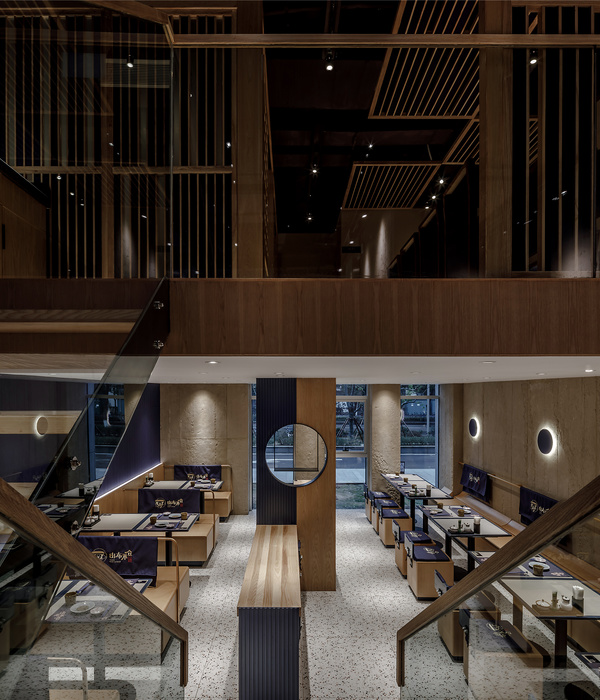
On the upper floor, the large north-facing private dining room can be separated into two small private dining rooms depending on the occasion. When opened, the door panels are stored in the spare space above the stairs, which also display the alteration of internal situations and external expressions of the private dining rooms. The dining space facing the west end is configured to accommodate mostly three to four guests, with the rear row seats embedded in slightly elevated wooden boxes. The boxed sets are almost like a gazebo encouraging the guests to look out to the garden.
Lightly attached to the structure, the new window frames of this renovated building are deliberately offset from the external walls. The sharp-edged metallic finish aesthetically contrasts with the rawness of the exposed concrete walls. Numerous traces of the past engraved by different occupancies are curated, in order to maintain a balance between preserving the historical texture and the new space. Layered industrial-grade plywood sheets were used in a certain portion of the ceilings. Mediating a cascading relationship between the original structure and the new space, that deductively induces new perspectives between the present and past. Part of the garden fences doubles as retaining walls and elevates the ground level, on these planter beds bushes of camellia flourish. It filters out the noise of passing traffic and reinforces the tranquil dining experience.
How does a space preserve its memory and exhibit history? Let the light interpret the traces of the time, and let the growth of plants and the changes of the seasons nourish the texture of the space. Let us enjoy the taste and beauty of the food at the walnut dining table and immerse ourselves in the scent of Taiwan Cypress.
▼项目更多图片
{{item.text_origin}}

