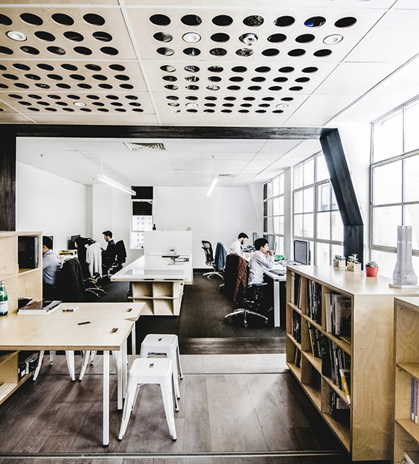
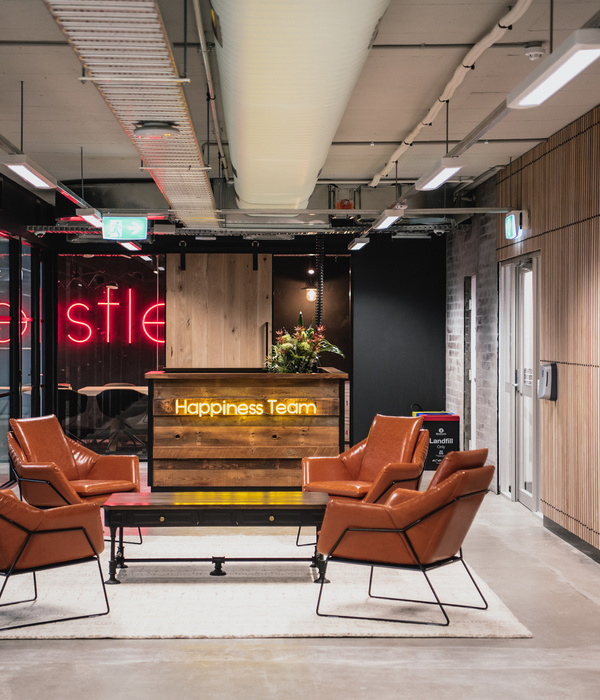
Soler Orozco Arquitectos worked around a complicated layout to complete a sleek and sophisticated design for the Origins IT offices in Mexico City, Mexico.
The initial challenge for this project was the open-plan, triangular layout of the building’s entire floor, with a service nucleus and vertical circulations in the center.
Our client—Origis IT, an information technology and cybersecurity company—required an integrated design that also differentiated the firm’s two areas of operations. We found a solution by subdividing the business activities.
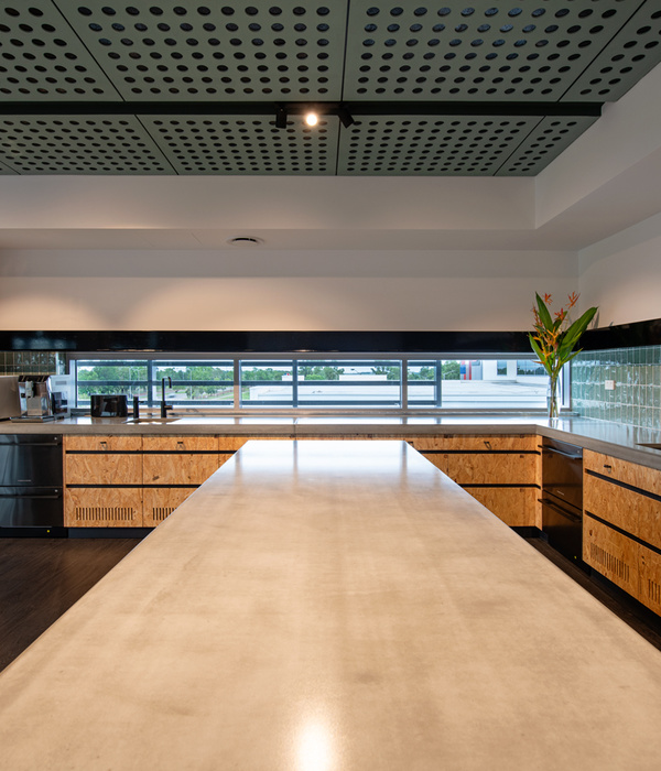
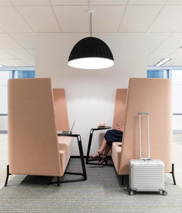
We placed the company’s main offices in the southern part of the building, at the base of the triangular, 450-square-meter floor plan. The program is arranged around a central, communal space, with informal meeting rooms, tables for impromptu gatherings, as well as a series of private meeting rooms and individual telephone booths. The rows of desks are clustered in two sections toward the eastern and southern façades. This part also has the main meeting room, the directors’ private suites, a sealed-off space for working on top-secret projects, a cafeteria and communal dining room.
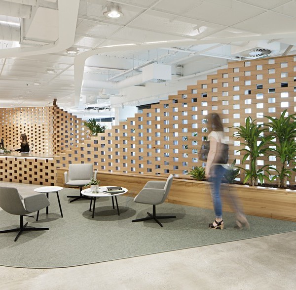
A flexible working area called Origis Spaces occupies the triangle’s apex, a 300-square-meter area to the north; this branch of the company focuses on business incubation. Connecting to a formal reception area is a small meeting room with a luminescent ceiling, where curved and transparent glass walls dominate the open space, surrounded by co-working type communal spaces and services. Flexible offices along the main façade are divisible into different-sized areas depending on the number of members in each small firm. Another notable feature is the open cafeteria with a long bar that encourages free and spontaneous gatherings. The point of the triangle is the brainstorming room with furniture that can be reconfigured into different heights and layouts in order to alter the communication dynamics in creative meetings.
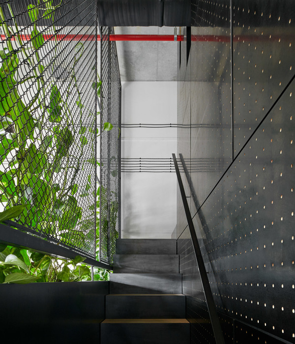
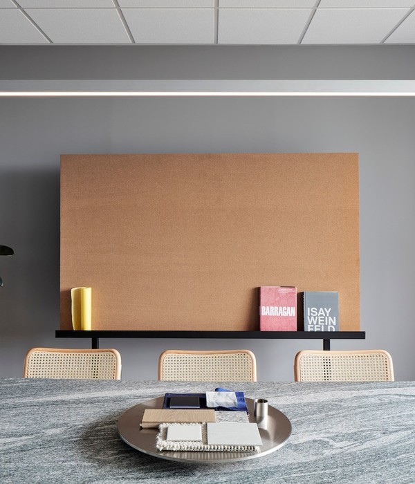
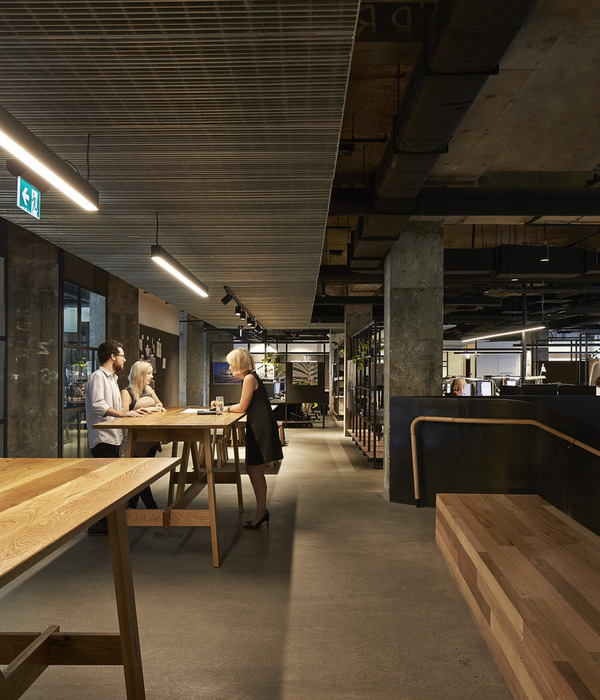
Although built over different periods, both areas share the same conceptual principles. We imagined clean spaces with sharp chromatic and light contrasts. White, gray, black, and orange with gloss and matte, polished and soft finishes provide the materials’ base colors to create a clean, contemporary look.
Beside the façades, the closed and private spaces are mainly white with transparent glass partitions and doors, bringing light from the outer façade into the central spaces.
Design: Soler Orozco Arquitectos
Design Team: Alan Orozco, Juan Soler, Fernando Orozco, Carlos Vera, Fernanda Leon
Photography: Zaickz Studio
10 Images | expand for additional detail
{{item.text_origin}}

