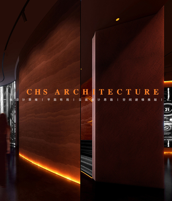
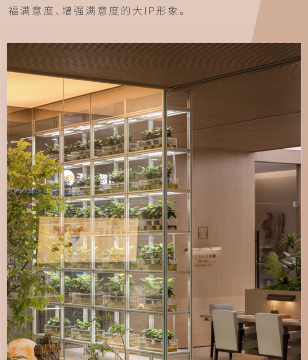
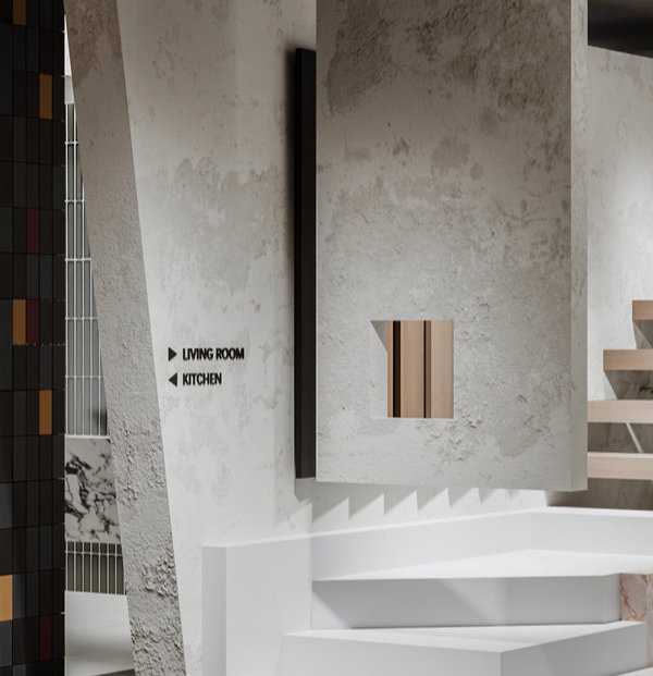
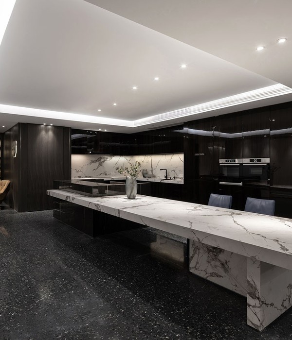
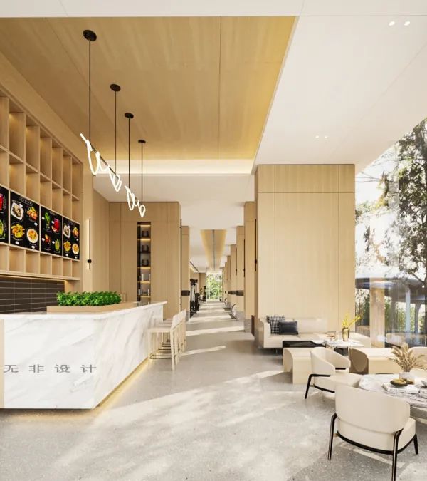
- 项目名称:周笙笙全案设计 | 400㎡长沙约克VRF暖通展厅
- 项目地址:湖南-长沙
- 建筑面积:400
- 设计风格:极简风格
点击上方“
周笙笙全案设计工作室
”可以
订阅哦!
▲[ 平面方案 ]
plan
我们平面方案大致感觉是由几个大大小小的矩形组成的,
空间之间相对独立,但又互相有联系。
Our flat plan roughly feels like it is composed of several large and small rectangles, with relatively independent but interconnected spaces.
▲[ 楼梯+端景 ]
Staircase+End View
利用岩石、涂料和灯光营造出高山流水的感觉,
打造出禅意简单的景观空间
。
Using rocks, paint, and lighting to create a sense of high mountains and flowing water, creating a simple Zen inspired landscape space.
▲[ 前台 ]
reception
顶面我们采用星空顶。在这繁华的城市里,星星的火光已被高楼的耸立和通亮的灯光埋没了,但我们依然遥望着那神秘的星空、向往着那最亮的明星。
We use the starry sky as the top surface. In this bustling city, the flame of the stars has been buried by the towering buildings and bright lights, but we still look at the mysterious starry sky and yearn for the brightest star.
▲[ 儿童区 ]
Children's area
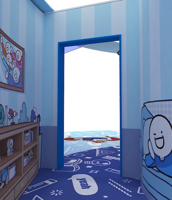
儿童区域摆放一些积木,可以提供给小孩玩耍。墙面的圆形设计是这个小空间的点睛之笔,在外观造型上别具一格,也是舒适惬意的休憩空间。
Place some building blocks in the children's area for children to play with. The circular design of the wall is the finishing touch of this small space, with a unique appearance and a comfortable and comfortable resting space.
▲[ 沙龙区 ]
Salon District
外观上像盒子一样,但我们两面采用折叠门,使这个空间既可以是一个封闭空间,也可以是一个开放空间。另一面采用大面积的玻璃,让客户在这个空间里也能了解到产品。
It looks like a box in appearance, but we use folding doors on both sides, so this space can be either a closed space or an open space. On the other side, a large area of glass is used, allowing customers to also learn about the product in this space.
▲[ 展示区 ]
Exhibition area
通过模拟家庭使用场景,为观者带来空间深度体验。连接人、家庭、空气、美好生活,使人与空间产生共鸣。
By simulating home usage scenarios, it provides viewers with a deep spatial experience. Connecting people, families, air, and a better life, resonating with space.
Meeting activity area
以客户的体验感为核心,让空间不再局限与购物和展示,在多元社交的场域中触动观者真实的情绪,轻松自在,舒适顺心。
Taking the customer's experience as the core, the space is no longer limited to shopping and display, touching the true emotions of the audience in a diverse social field, relaxed and comfortable.
▲[门头展示 ]
Door display
门头设计既要体现设计的美感,又要体现店铺的文化。以顾客的方便性作为出发点去做设计,无论是店面内外装修风格的统一性,还是色彩搭配的协调性都应具有自身的一些特色,给消费者以深刻的感受和记
忆。
The door design should not only reflect the beauty of the design, but also reflect the culture of the store. Taking customer convenience as the starting point for design, whether it is the unity of the interior and exterior decoration style of the store or the coordination of color matching, it should have its own characteristics, giving consumers a profound feeling and memory.
项目地址:湖南-长沙
建筑面积:400
设计风格:极简风格
硬装设计
:
周笙笙全案设计工作室
软装设计
:
周笙笙全案设计工作室
主要材料:
玻璃、涂料、线性灯、
微水泥瓷砖、星空顶、不锈钢
等
THANKS
公司地址:湖南长沙宜家汇聚之光1817-1818
手机 /tel:15388051772
周笙笙全案设计 | 南玻集团玻璃展厅-穿越光影的旅程
周笙笙全案设计 | BOX-东芝中央空调展厅
周笙笙全案设计 | 150m² 黑暗武士风-松下+多伦斯暖通展厅
{{item.text_origin}}

