- 项目名称:如咖啡
- 设计方:彼山设计
- 公司网站:http:,,buildever.com
- 联系邮箱:sh@buildever.com
- 主创及设计团队:吴冠中,徐霆威,王晨歌,王萍,李扬杰,吴凌燕,张艺涵
- 项目地址:上海市长宁区镇宁路465弄181号安垦AIR3号楼5B
- 建筑面积:85㎡
- 摄影版权:刘松恺
- 客户:如家集团
- 品牌:鼎城建筑陶瓷
- 材料:多孔砖,红砖,亚克力,木板
作为首旅如家如咖啡品牌第一家门店,如何经营一个清晰而独特的品牌形象成为本案的一个重要议题。作为一个具有品牌自觉的咖啡店,我们需要采取一种清晰而强烈的空间策略来统一功能与审美,以实现对“家”的回归。
As the first Ru Coffee store of the BTG Homeinns, to manage a clear and unique brand image has become an important issue in this project. As a coffee shop with brand awareness, we need to adopt a clear and strong spatial strategy to unify function and aesthetics in order to return the ideal of ‘home’.
▼沿街立面 main facade ©刘松恺 Songkai Liu
一方面,原有空间将多种需求群混合在同一大空间内相互干扰,而“家”则更多是不同房间各司其职;另一方面,作为一个公共空间的咖啡店,需要承载公众人群的社交属性,也是城市活动发生器的导流装置。对此,设计采取的方式是置入一间“房中房”,使各个区域的私密度和归置感得到保障,同时房内外可流动贯通。
The original space mixes multiple groups into a large space and interferes with each other, while “home” is more likely with different rooms performing their duties and connecting each other at the same time. Meanwhile, as a coffee shop, it needs to carry the social attributes for the public, and it is also a diversion device for urban activity generators. In this regard, the design method adopted is to place a ‘HOME IN HOUSE’, which not only guarantees the privacy and sense of placement in many areas, but also allows flow through the inside and outside of the room.
▼改造后外观 exterior view after renovation ©刘松恺 Songkai Liu
▼店铺入口 the entrance ©刘松恺 Songkai Liu
人们从室外下沉庭院步入咖啡馆内,首先看到吧台和一个咖啡豆展示区。室内以唯一的核心元素——红砖——作为表达方式,通过砌面样式的差异勾画出空间韵律,并将人流导向不同房间。
▼轴测图 axonometric ©彼山设计
People walk into the cafe from the sunken courtyard, then see the bar and a coffee bean display area. The interior uses the only main element-red bricks-as a means of expression, and outlines the rhythm of the space through the differences in wall cladding styles, and directs the flow of people to different areas.
▼门厅 lobby ©刘松恺 Songkai Liu
▼砖的盒子 brick box ©刘松恺 Songkai Liu
▼红砖坐席 brick seat ©刘松恺 Songkai Liu
▼视线穿过墙上门洞 view through the interior doors ©刘松恺 Songkai Liu
▼房中房内部空间 space inside HOME IN HOUSE ©刘松恺 Songkai Liu
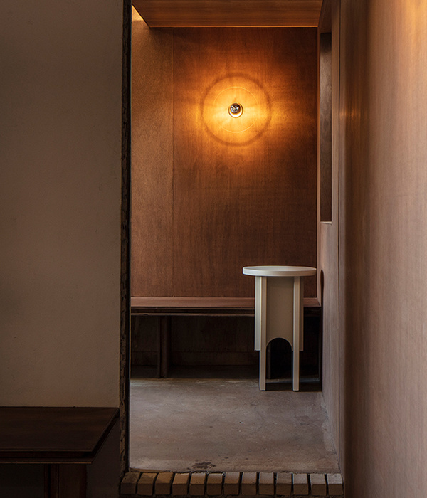
墙面上的门窗洞口自由流动于”房中房”展开面所构成的二维空间,以实现墙内墙外的动态渗透与沟通。尽端房外的通高墙面为一面靛蓝色展示柜,形成房内外强烈的冷暖对比。
Several holes on the wall flow into the two-dimensional space formed by the expanded surface of the ‘HOME IN HOUSE’, realizing the dynamic penetration and communication of adjacent spaces. The high wall outside the room shows an indigo blue display cabinet, which forms a strong contrast between warm and cold of inside and outside.
▼墙内墙外的动态渗透与沟通 the dynamic penetration and communication of adjacent spaces ©刘松恺 Songkai Liu
▼内外双层座位区 seating areas inside and outside the wall ©刘松恺 Songkai Liu
▼房内外强烈的冷暖对比 a strong contrast between warm and cold of inside and outside ©刘松恺 Songkai Liu
▼房外的展示架 cafe library outside the home ©刘松恺 Songkai Liu
最内部的空间是一间可兼做咖啡厅和会议室的独立房间,同样延续温馨的场景氛围,尽头通向旅馆内部。
The innermost space is a room that can be used as both coffee and meeting room, which also continues the cozy atmosphere of the scene, leading to the Home Inn at the end.
▼会议室 the meeting room ©刘松恺 Songkai Liu
▼从矩形窗洞看向外部 view through the window on the wall ©刘松恺 Songkai Liu
▼砌块墙体 the brick wall ©刘松恺 Songkai Liu
▼平面图 plan ©彼山设计
▼外立面图 elevation ©彼山设计
▼剖面图 section ©彼山设计
{{item.text_origin}}

