伊丽莎白码头彩色小灯塔 | 灵活设计应对极端环境
位于维多利亚码头的冰淇淋贩卖亭是已有的EQ家族的一部分,如同一块发光的宝石,尽管占地面积很小,但存在感很强。建筑不仅白天夜晚外观不同,还会以灵活的方式回应不同的天气,持续为人们带来惊喜和快乐。
The Elizabeth Quay gelato kiosk sits as part of the existing EQ family, a glowing gem; small in footprint and large in presence. A day/night transformation combined with the flexibility to respond to changing weather patterns ensures continual surprise and delight.
▼项目外观,external view of the project
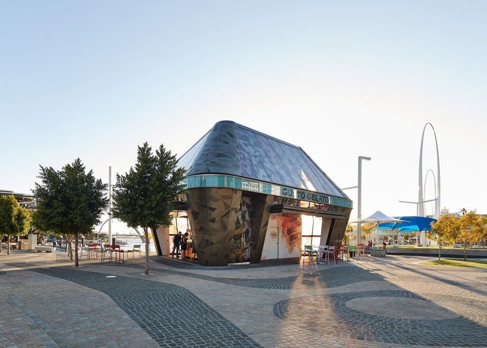
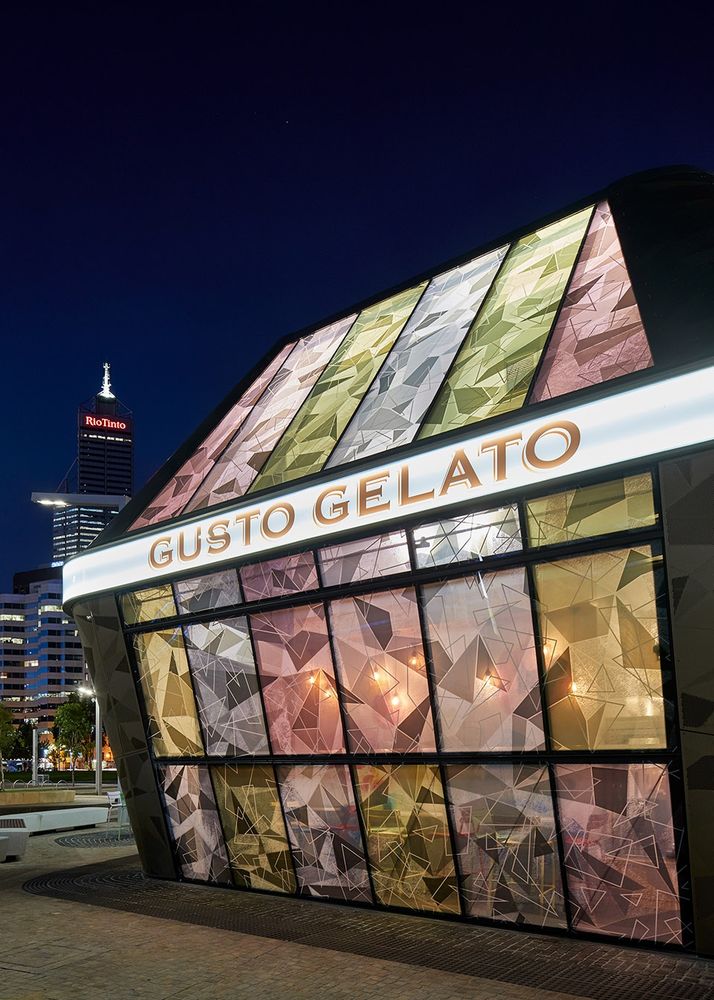
建筑立面如同变色龙一般,白天反射外界环境,夜晚则散发出光芒,如同一座充满色彩与喜悦的小小灯塔。
Reflective during the day and colour emitting at night, this chameleon-like existence reflects the surrounding context during the day and becomes a small beacon of colour and joy at night.
夜晚的建筑如同一座小灯塔,building in the night like a small beacon
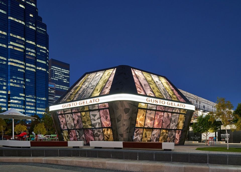
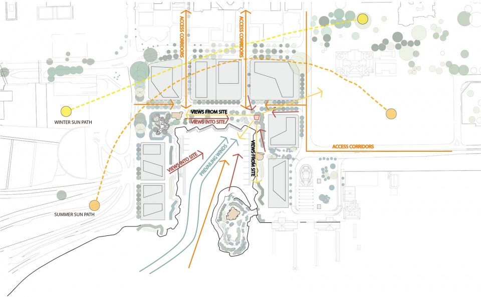
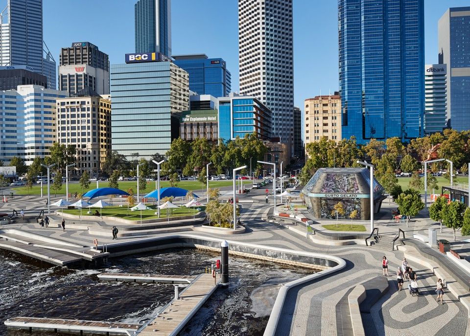
这座小巧的亭子漂浮在Ashton Raggat MacDougall伊丽莎白码头的“水波纹路”上,成为了EQ主题的一部分,在码头东北角迎接城市来客。它体现了码头作为通往珀斯市的登陆点的传统角色,并使之与珍贵而独特的西澳大利亚物件产生对话。
Our little object floats on the Ashton Raggat MacDougall Elizabeth Quay ‘ripple-wave pattern’ forming part of a unified EQ theme welcoming the city in the EQ north east corner. It acknowledges the role of EQ as a traditional (40,000 year) landing and entry point in to the city of Perth and expands the conversation to include precious and unique West Australian objects.
▼环境分析,environment analysis
设计以西澳大利亚的独特宝石和意大利冰淇淋为灵感,开发了一套配色以在产品和消费者之间形成共感,仿佛在冰淇淋中吃冰淇淋。
Inspired by the unique gems of Western Australia and the Gelato Ice-cream, colours were developed to create a synergy of product and purchaser. One eats and inhabits what one is eating simultaneously.
形状与配色草图,sketch of the form and color palette

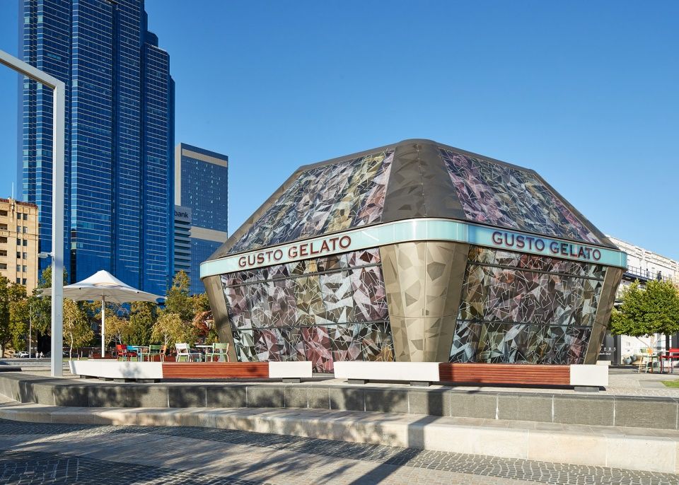
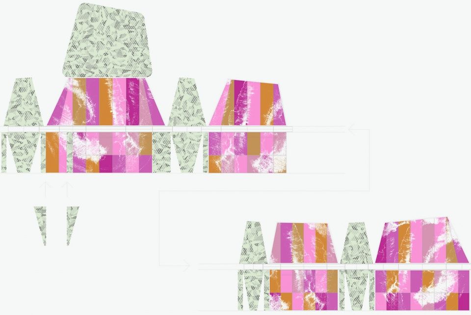
设计师故意将图案打碎并与木纹重叠,对应了码头的涟漪。通过与颜色、图案、木纹和肌理的融合,玻璃呈现出了不同厚度与深度,如同一块经过粗糙打磨的钻石,给人以流动的外观体验。艺术家Panela Gaunt与iph建筑事务所在概念的发展上紧密合作,将艺术完全植入到了建筑之中。颜色、肌理和图案在空间内部形成了万花镜一般的效果,让游客沉迷其中,并促使他们看向上方。
▼肌理分析,texture analysis
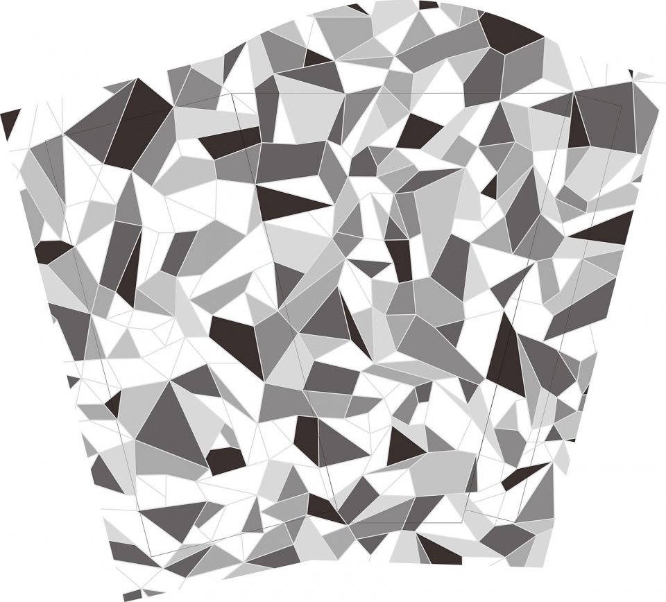

Patterns are purposely fragmented and layered with a textural grain that acts as a counterpoint to the EQ ripples. Glass is developed with thickness and depth through the fusion of colour, pattern, grain and texture. A sense of inhabiting the interior of a rough cut diamond and experiencing wonder in flux.Artist Pamela Gaunt worked closely with iph architects to develop concepts and fully embed art with architecture.Internally the colour, texture and patterning creates a Kaleidoscopic effect consuming the occupants and encouraging one to look up.
▼远景鸟瞰,建筑呼应码头的涟漪肌理,distanced overall view, building corresponded to the rippled texture of the quay
▼建筑外观,碎片化的图案和纹理,external view of the building with fragmented patterns
伊丽莎白码头风吹日晒,环境极度恶劣。因此,贩卖亭被设计成可以灵活开闭的形式,以抵御各种极端自然气候。与立面等长的上下折叠门不仅能够提供荫蔽,还在物理上扩展了室内空间。
The EQ environment exposes one to extreme winds, sun and storms. Our kiosk is developed with the flexibility to open and close sides and provide protection from ALL natural extremities. Full length doors fold up and down to easily provide protection while expanding the physical presence of the interior space.
折叠门打开后扩展室内空间,folded doors expanding the interior space
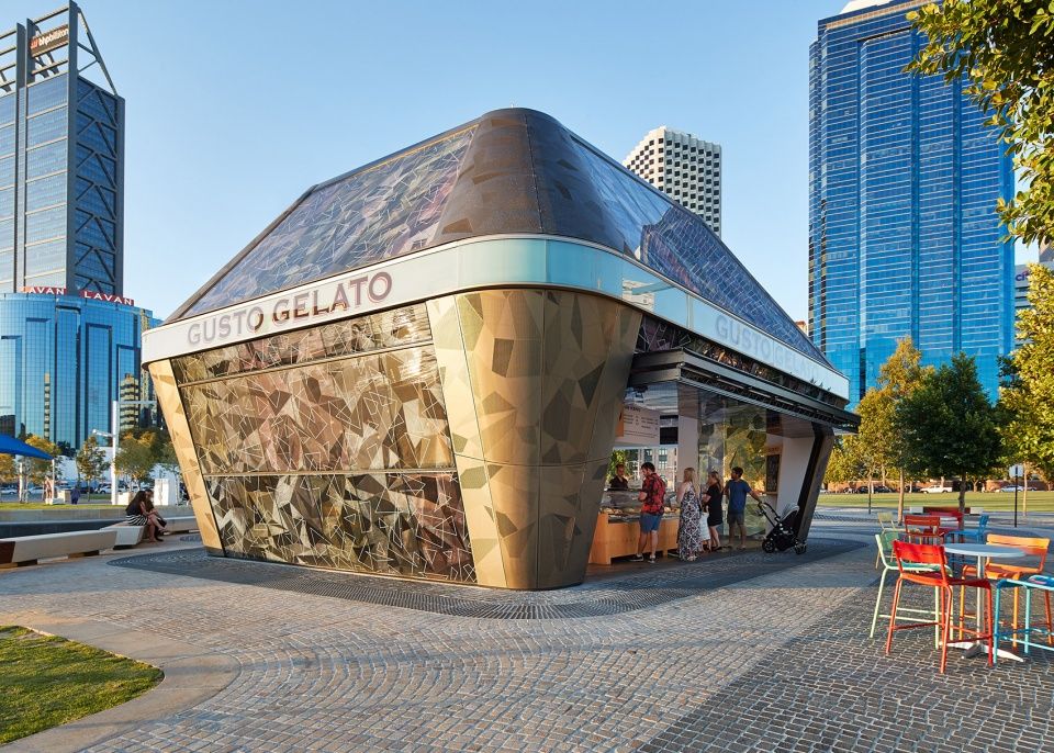
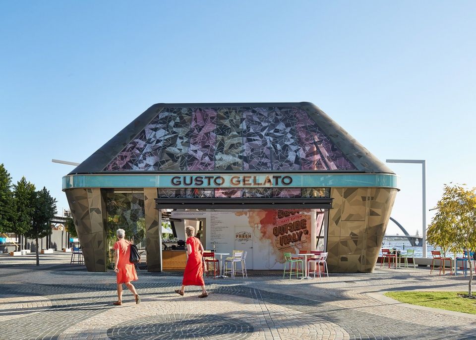
▼立面近景,closer view to the facade
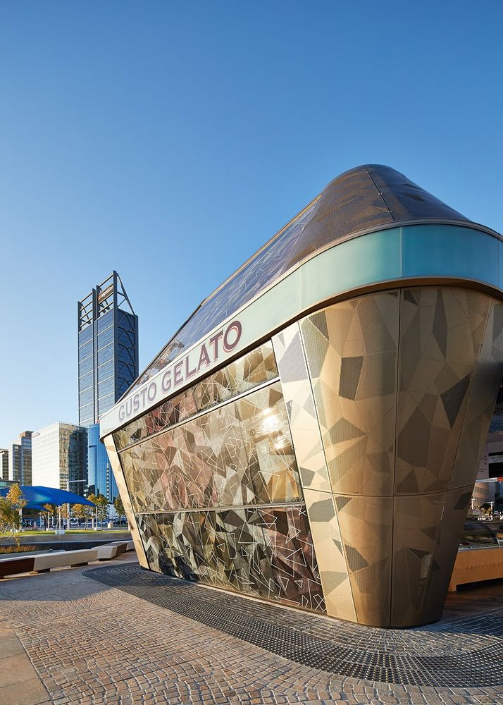
建筑有五条边,图案和穿孔一直延续到屋顶,呼应未来的业主丽兹·卡尔顿以及周边的办公大楼。屋面设置了一系列LED灯,白天反射,夜晚闪烁。
所有服务设备都被隐藏在了穿孔屋面下,创造了一个透气的空间。折叠门和高处的低速风扇将热空气吸入服务区,为室内带来自然通风。带图案的多层薄膜减少了直射光和太阳辐射热,同时保证了充足的自然光照。夜晚则通过反射的LED灯光照明。
It is designed as a 5 sided figure, the patterning and perforations continue on to the roof for the benefit of future Ritz Carlton occupants and surrounding office buildings. A collection of LEDS skims light across the roof surface shimmering in to the night and reflecting during the day.
All services are concealed from view under this perforated roof skin in a ventilated space. The space is naturally ventilated with the folding doors and high level low velocity fans extract hot air in to the service platform area. The patterning and interlayer films reduce exposure to direct sun and heat gain while allowing significant natural light. Night lighting is provided through reflected LED lighting.
带图案的薄膜遮挡直射光
patterned films reduce direct sun
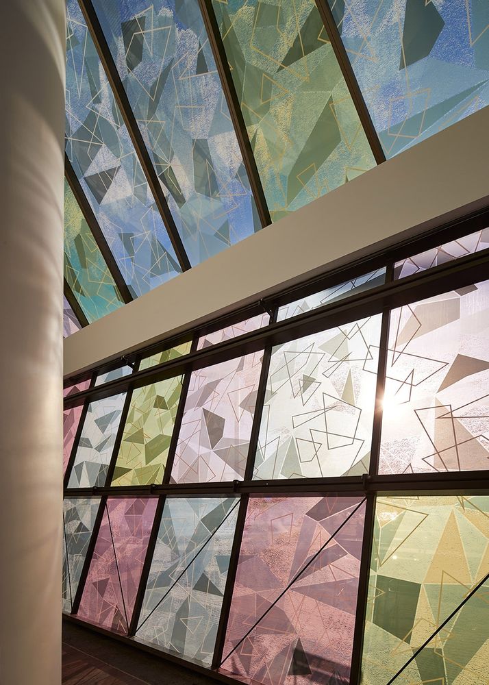
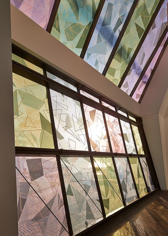
▼图案延伸到屋顶,patterns extending to the roof
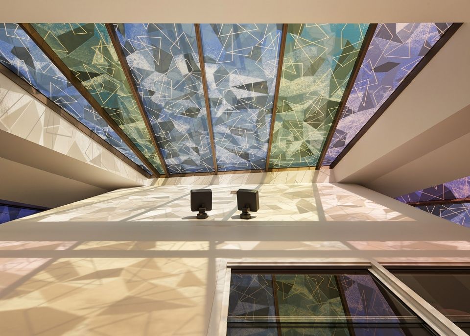
照明Lighting
伊丽莎白码头冰淇淋贩卖亭采用了独特的照明手段。码头本身是各种颜色LED灯光的大杂烩,亭子使用安静的白色反射光,照射出了一个独特而不断变化的物体。彩色的灯光和纹理位于建筑内侧,只有穿过静谧的白光才能体验。
The Elizabeth Quay gelato kiosk is unique in its approach to lighting. While Elizabeth Quay is a smorgasbord and orgy of contrasting and competing colour LED’s, our Kiosk uses reflected white light (silence), to illuminate and form a unique, continuously changing object. Coloured light, pattern and grain is inhabited, possible only through the use of silence (white light).
▼夜间鸟瞰
aerial view in the night
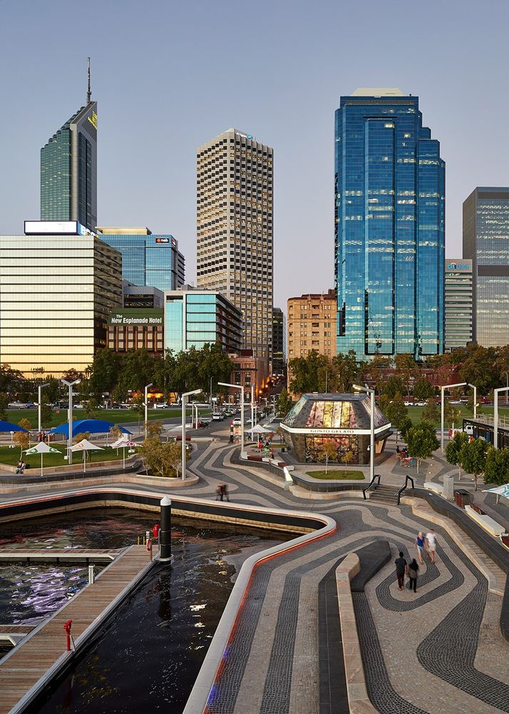
▼建筑照明与码头灯光呼应,the lighting of the building responds to the illumination of the quay
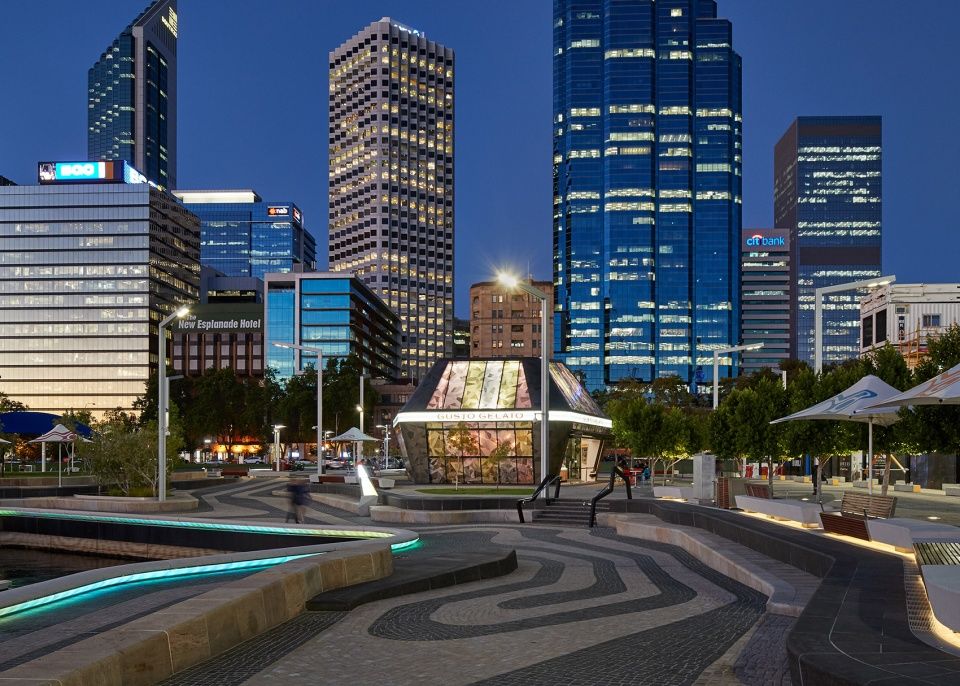
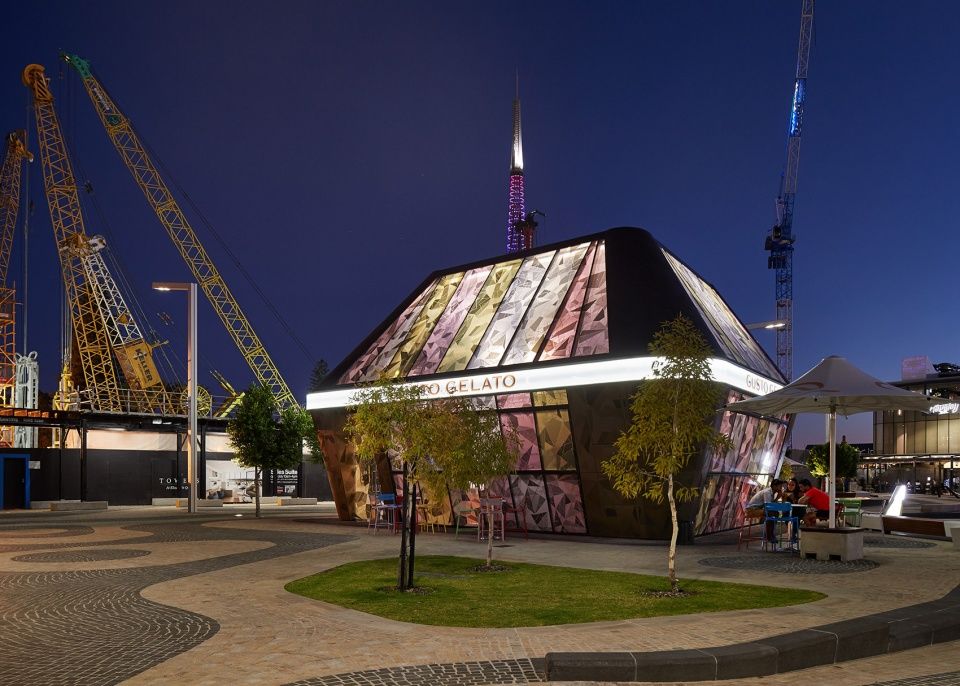
夜晚近景
closer view to the building in the night
可持续
Sustainability
建筑被设计成了一个“工具包”,可以被完全拆除后运送到另一个地方重组。这样的设计也大大减少了现场施工的时间,并且使得商户及室内元素的改变成为可能。所有服务设备都被设置在一个悬浮的平台上,方便工人进入保养。
The building was designed and constructed as a ‘kit of parts’ to enable full dismantling and relocation. This also minimised construction time on site. It allows for a future change of occupant and re-design of interior elements. All services are located on a suspended platform, easily accessible for maintenance.
▼分解轴测图
exploded axonometric

建筑的设计最大化了自然通风效果,使用者可以通过电力装置控制整面折叠门。这些门扇还可以保护顾客免受恶劣环境元素的侵扰。高性能玻璃表面覆有多层彩色薄膜和纹理覆面,遮挡直射光的同时可以减少对人工照明的需求。上方体量中安装低速风扇,吸收热空气,形成低能耗的烟囱效应系统。LED灯设置在白色围墙上,提供低能耗照明。低挥发涂料和耐久材料可以延长建筑的生命周期,降低维护成本呢。
It is designed to maximize cross ventilation and allow occupant control with electronically controlled full width folding doors. These doors also protect against the elements.High performance glass with multiple layers of coloured film, texture and pattern provide protection from direct sun. The quantity of glass reduces the need for artificial lighting.Low velocity fans located in the upper volumes extract hot air creating a low energy consuming stack effect system.LED lighting bounced from surrounding white wall surfaces provides low energy consuming lighting.Low VOC Paints and durable materials extend the life of the building and reduce requirement for maintenance.
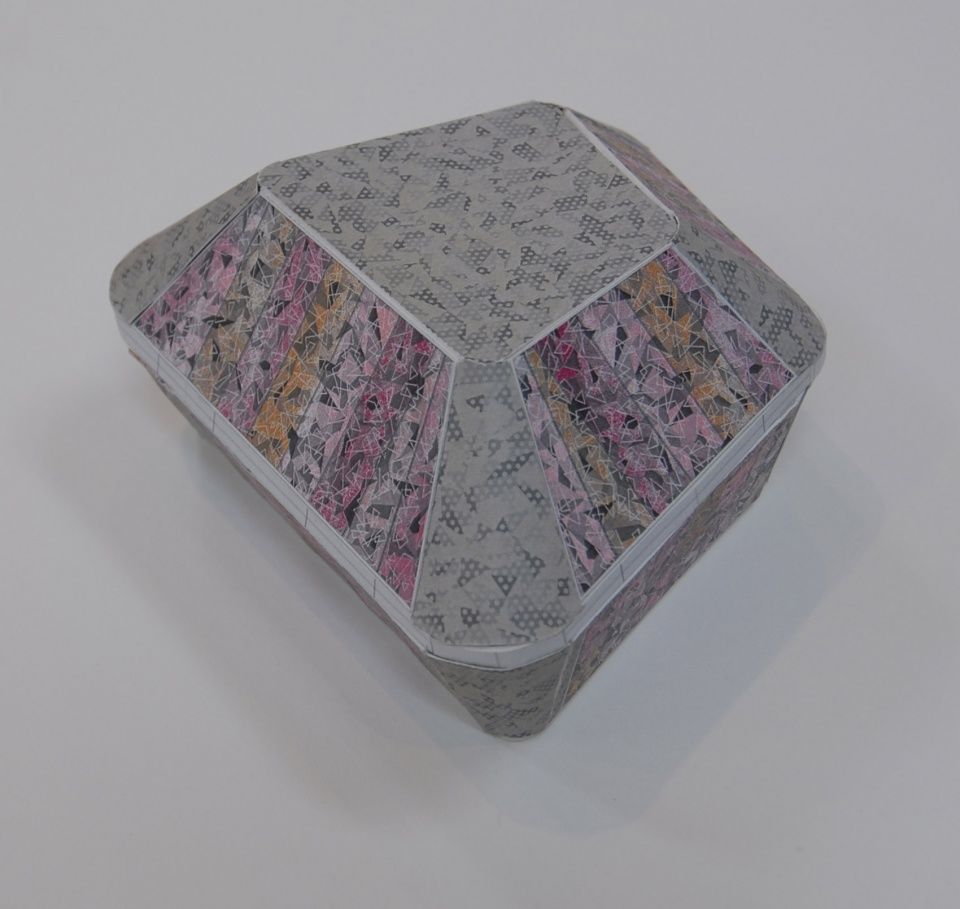
▼模型,model
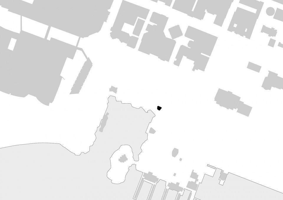
区位图,location
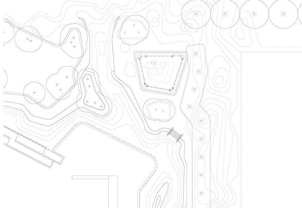
▼总平面图,site plan
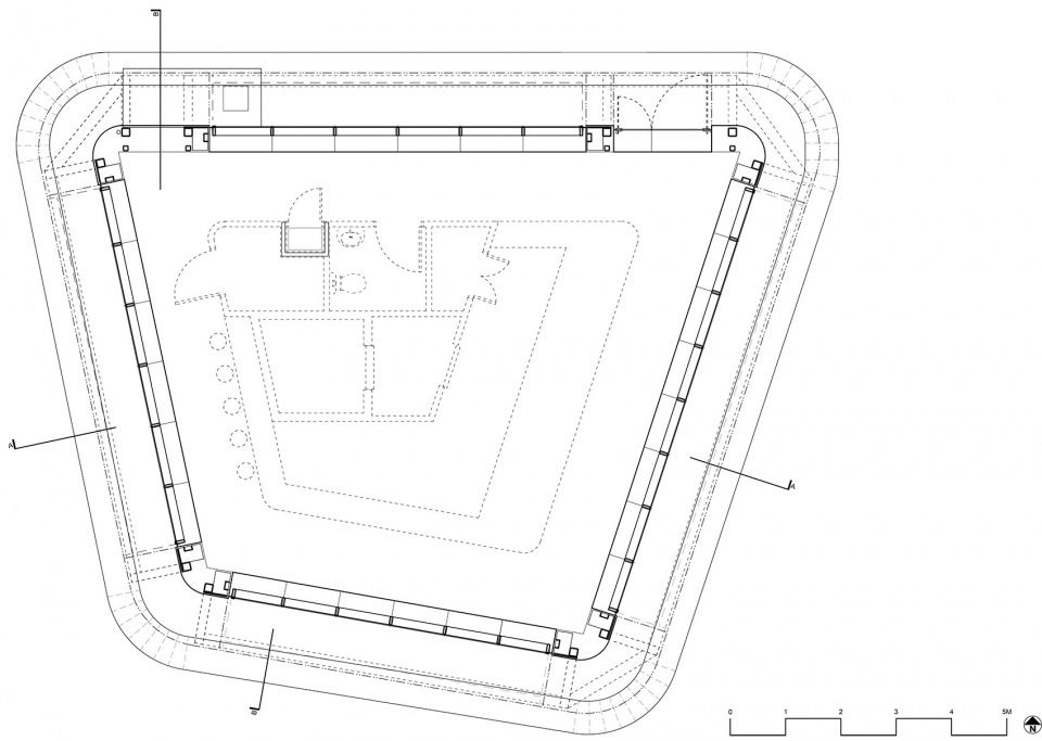
▼平面图,plan
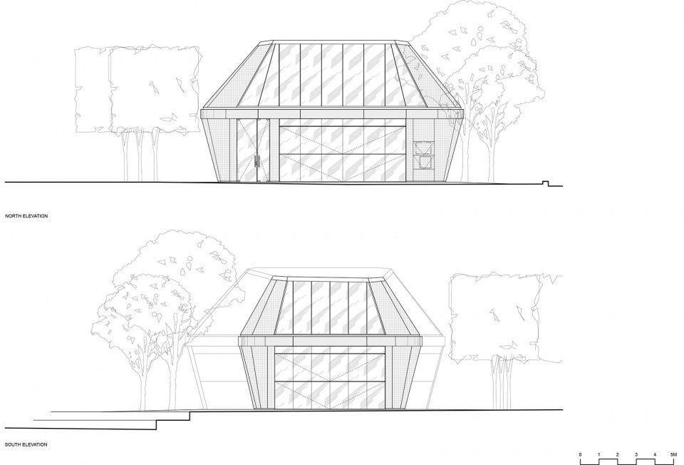
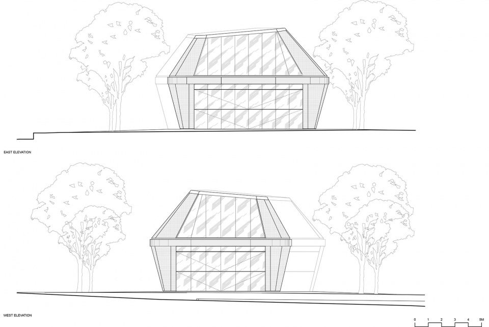
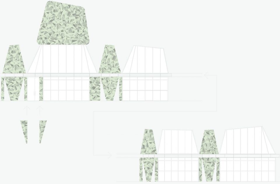
立面图,elevations
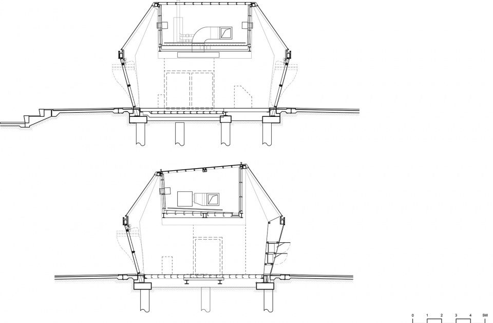
▼剖面图,sections
立面颜色和肌理,color and texture of the facade
Gross Floor Area: 120m2
Architects: iredale pedersen hook architects
Architect Team: Adrian Iredale, Finn Pedersen, Martyn Hook, Joel Fuller, Jordan Blagaich, Rebecca Hawkett, Jason Lennard, Fred Chan, Alana Jennings, Charles Dewanto.
Art: Pamela Gaunt
Structural and Civil Engineering: Aurecon
Mechanical: SMW&C
Electrical: BEST
Hydraulic: Wood and Grieve
Client: Metropolitan Redevelopment Authority MRA- Eden Shepherd
Project Manager: Brett Dickman PwC

