M1DTW Architects designed a unique and calming spatial experience in the realization of Oakridge Dental Center located in Rochester Hills, Michigan.
Located as part of a 2-acre site in Rochester Hills, Michigan, Oakridge Dental Center is a dentistry office designed to create a unique and calming spatial experience for its patients and staff. The challenge was to achieve these characteristics adjacent to a traffic circle and within the project’s constrained construction and material budgets. The building is situated in a manner that preserves a large majority of a wooded site, portions of which have been sculpted to absorb infrastructure, create buffers, or collect stormwater.
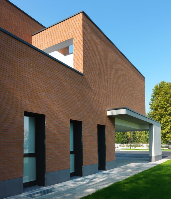
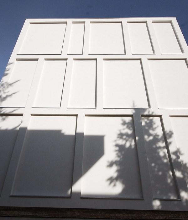
The exterior material palette is restrained in order to highlight the relationship between the building and the surrounding landscape. Norman-sized face brick with a soft-white, mineral paint finish provides a neutral backdrop to the seasonally changing colors and textures of the site. This finish allowed for the use of an economical, transitional kiln brick that gives the building a muted presence. The matte, white masonry reads monolithically from afar while revealing the textural and tactile quality of the masonry as users approach, including at the entryway where the bricks were spun around and installed with their grooved backs facing outwards.
While the north and east façades are minimally fenestrated, window openings in several sizes on the south and west façades are deliberately and thoughtfully placed. These equally proportioned, dark-frame windows strongly punctuate the white brick façade and produce a dynamic and rhythmic compositional effect while simultaneously concealing the standard and repetitive dental operatory unit inside. From within each operatory, a pair of windows provide dappled natural light while framing a unique pairing of exterior views.
The main entrance is situated on the northeast corner where visitors are pulled into a quiet portion of the site removed from the adjacent road and busy traffic circle. A wood-clad recess in the office’s simple box-like form announces the entry and provides a sheltered zone prior to entering the building.
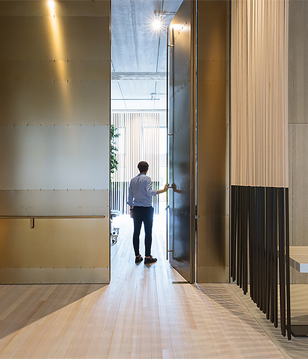
In contrast to the exterior, the interior character is shaped by moments of materiality and color. Vertical white oak cladding within the vestibule transitions to the floor in the waiting area. A matte, richly painted blue core defines the sterilization and lab spaces while organizing the operatories. Spatially, the interior of the building is designed to first remove—and then selectively reconnect—users to the surrounding landscape. The theme of removal begins as one enters the white-oak clad vestibule and moves into the reception area. The opaque north façade shields the sounds and sights of the parking lot while two large skylights draw ample natural light into the space. As one moves around the sterilization core, natural light from the perimeter as well as above, along with views to outside, are choreographed in a series of re-framed interactions: of tree limbs, circling birds, a grassy berm, or passing clouds — with not a hint of the nearby cars and trucks going round and round.
Architect: M1DTW Architects Photography: Nev Muftari, Jeffrey Kilmer
8 Images | expand images for additional detail
{{item.text_origin}}

