Architect:ATMOROUND
Location:Bomoonsan-ro 331, Moonwha dong, Deajeon, South Korea; | ;
Project Year:2021
Category:Restaurants
There are various form of relaxation. To capture this, we drew the diverse form of relaxation on a long sheet of paper, then folded another paper, having openings cut out by scissors, onto it. We built MOSP: a place that reflects each individual’s form of relaxation. Openings between these walls act as a vent, making the place a space of relationship, not a confinement. “MOSP”, located in Daejeon city, is under the foot of a mountain. Daejeon’s downtown can be seen from the front, and Bomunsan Mountain from the back.
MOSP is located on the top, fifth floor of the building. There are gentle stairs that flow from the ground of Bomunsan up to the cafe, which naturally lead visitors inside. The building has somewhat vertical mass when viewed from the opposite side of Bomunsan. However, when you enter the café from Bomunsan, you’ll experience a low and gentle horizontal mass. Upon entering, the view of downtown Daejeon that unfolds from the terrace feels extraordinary. As you climb the gentle stairs, you’ll see that there is a sense of comfort infused in the interior of the café. We wanted the cafe to be spacious, but not vastly extensive. We wanted a cozy place for people to comfortably relax. We set up a long connected partition having openings and windows to reflect the diverse methods of relaxation.
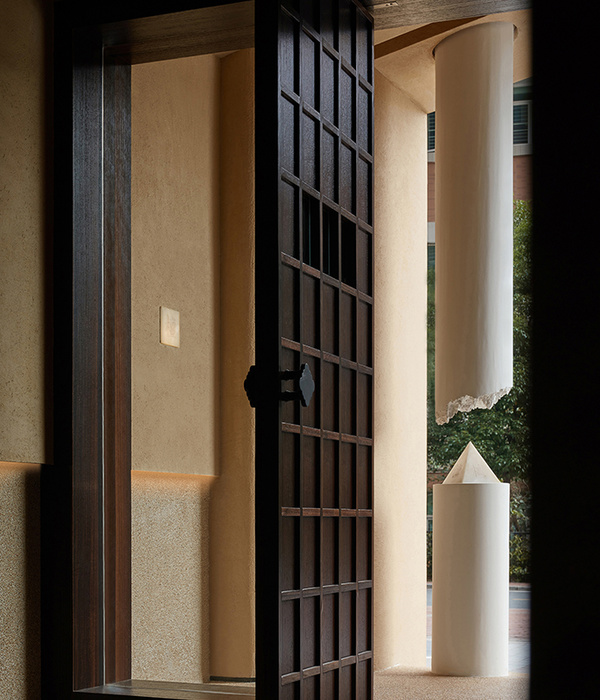
: Through the gentle stairway, the first thing you see upon entering is the arch-shaped overlapping openings. The continuous foldage of a partition divides the interior space, imbuing a sense of inside and outside. Through these openings, two opposite sides of “relaxing” space is connected. A long narrow table that pierces through the openings provides a place to rest, where you can sit and spend time quietly.
: Light fills a semicircular wall and shines through the openings on it. This wall embraces the morning ray of sunlight that shines from the east side of Bomunsan Mountain. As you sit here and look out the front window, a green forest unfolds before you. Part of the floor is filled with water, which puts the sky under your feet, creating a space full of light that wholly embraces nature.
: Beyond the semicircular wall of light, there is a staircase that seems like it would lead to a hidden place. This stairway leads you to a garden. This garden is a healing place for anyone, and also a great viewpoint for people to read and drink tea. Seeing Bomunsan through the windows in the garden, the boundaries between in and out become ambiguous, attracting us to outside.
: When creating this space, we thought of people leaning against a concaving glass window. So we gave it a deeper and wider space than others, and made a window behind it to lean back.
: We imagined people relaxing under sunlight as the sun moves from south to west of the café. We piled up glass blocks, hoping it would absorb the light and make the place cozier. With sunset scattering through glass block windows, an imagery of cozy relaxation sits here.
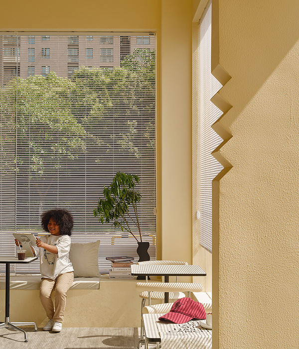
: Look through these long windows and see the city before you. There are seats by the windows. These windows capture the glow of sunset and let people observe the cityscape. Due to a partition, this place feels protruded out from the central inner space of the café. Therefore, while still inside, this place acts as an outer terrace and the tables become a railing. Sitting at a slightly ascended table and looking outside would be like seeing the view while leaning against a railing.
: Windows by this place is not only for people who wants to relax, but also for people who needs to work. These people are who we also wanted to not dismiss. Capturing the sincere moment of working in these windows almost seem like a scene from a movie.
Partitions, the main axis of the café, are a boundary and a medium of relationship as well. They create distinguished boundaries, from inside to outside, but also connect those boundaries through openings and windows. Partitions also connect the various shapes of relaxation forming in each space. These partitions give a different look for each MOSP space. While they distinguish movement and space, they do not completely cut each other off. Instead, they give the place a consistent aesthetic, which flows through each and every corner.
1. Floor: Natural stone concrete polishing, brick
2. Wall: Stucco, plywood dyeing
3. Ceiling: Spray coat
▼项目更多图片
{{item.text_origin}}

