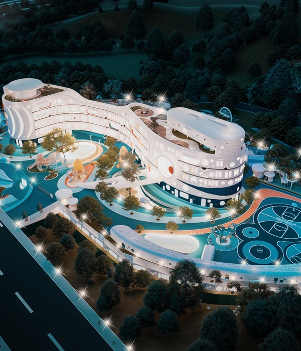
The starting point from which the design of the nursery was born, was the idea of making an analogy of the growth of a child. Like a child, who is growing through experiences, the nursery’s activities are developed through a ramp that communicates the different levels of the project: on the ground floor there are areas for infants, who are the youngest and, as the ramp grows in height, the educational grades also grow, passing through maternal and pre-kindergarten to finally reach the last level, where the roof garden and playground are located.
The ramp is conceived as a form of playful intercommunication, where the activities take place around it. The space itself is delimited only by activities according to the child's development. In addition, thinking of the user in its different stages, the ramp also functions as a form of universal accessibility to all areas of the nursery.
This continuous loop is reinforced thanks to the patio that serves as the central axis, in addition to giving light and ventilation to all the areas of the project.
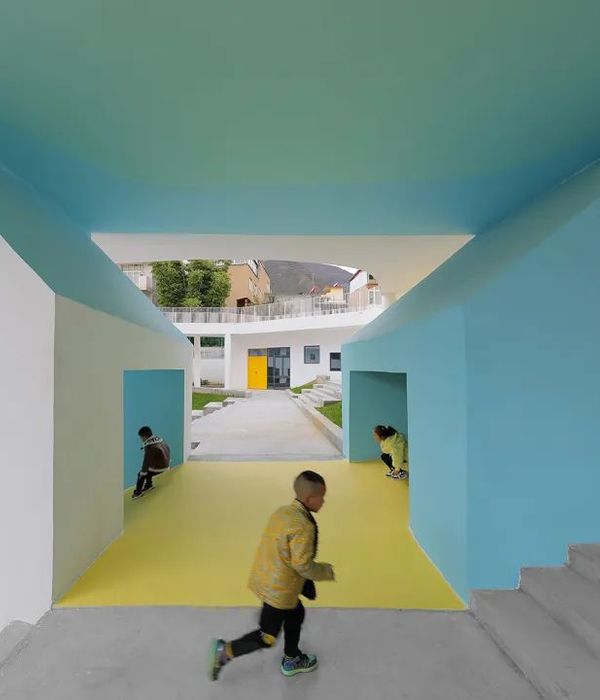
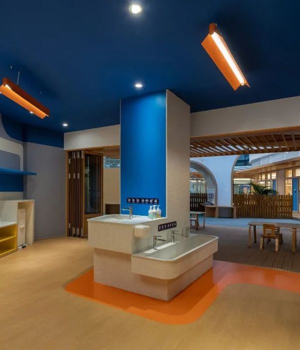
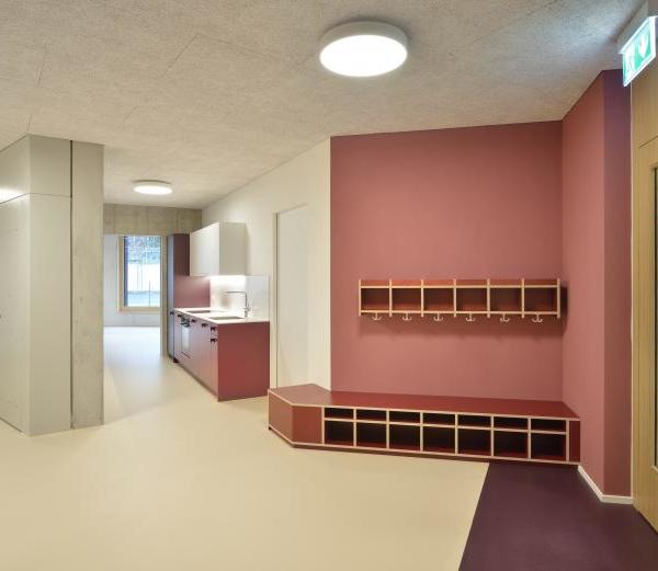
As for materiality, the facade maintains a certain dynamism, thanks to the colored panels placed at different heights and sizes. Likewise, we used a color palette that was attractive to children, and this same palette was implemented in the interior design and furniture.
The facade also responds to the function of the space, because, on the ground floor, the areas such as reception, kitchen and offices are totally translucent, taking advantage of the north orientation of the property; on the other hand, on the upper level, where the learning areas are located, despite using a material that allows the passage of light, visibility is minimized to give privacy to the users.
{{item.text_origin}}

