黑白容器 | line+上海办公空间的创新设计
"作为设计师,我们希望办公空间不是枯燥伏案的场所,而是一个以多样化场景构成的可持续空间。这个’黑白容器’是我们为自己重新定义的办公空间,在黑白的底色之上,我们将所需的辅助功能和分隔墙体同化,空间从而显现出一种可感知的秩序感和流动性,辅以可自由转换的空间场景,新的故事和未来的畅想在这里不断生长。"
As designers, we hope that the office space is not a boring place, but a sustainable space composed of diversified scenes. This’ black-and-white vessel ‘is the office space we redefine for ourselves. On the black-and-white background, we assimilate the required auxiliary functions and partition walls, so as to show a perceptible sense of order and fluidity. After that, we superimposed freely convertible space scenes in the space, where new stories and visions of the future continue to grow.
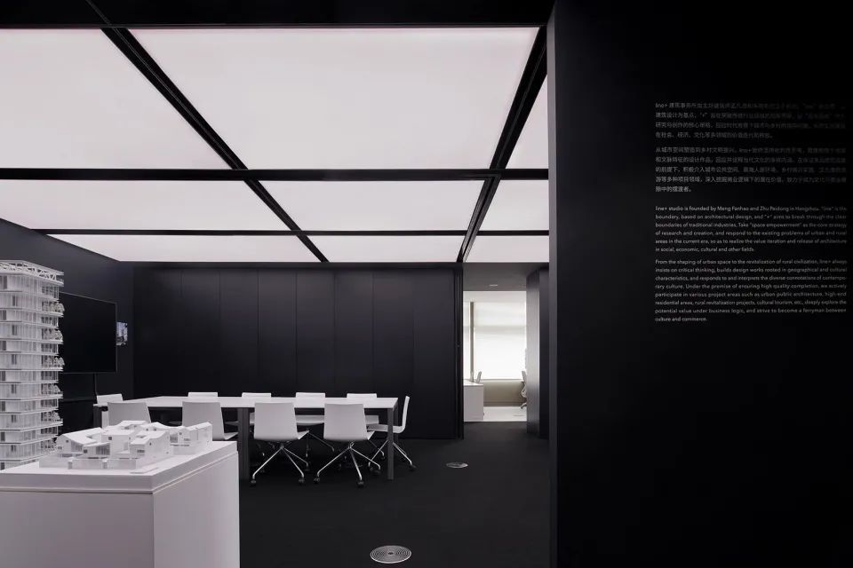
▼空间概览,overall view of the space
line+上海办公室选址于上海虹桥商务区内的诺亚财富中心。作为走出杭州的第一站,line+希望在此打造一个集企业展示、学术沙龙和舒适办公为一体的空间。在新地域拓展业务的同时,新的办公场地也将树立更高品质的企业形象。
The line+ Shanghai office is located in Noah Wealth Centre in Shanghai Hongqiao Business District. As the first stop out of Hangzhou, line+ aspires to create a space that integrates corporate exhibition, academic salon and comfortable office. While expanding business in new regions, the new office space will also establish a higher-quality corporate image.
▼门厅,entrance

接待区、会议区和展览区,reception, exhibition and meeting areas

▼会议室和展览区,exhibition area and the meeting room
诺亚财富中心的建筑由福斯特建筑事务所设计。作为高端写字楼,成熟的架空地板层、地送风系统以及天花集成系统为后续设计提供了良好的前提。端部开间拥有两个连续幕墙面,从而获取了极好的城市景观和自然光照。顶部的金色铝板是立面材料向内的延伸,保证了建筑立面的完整性,却也成了室内既定的预设条件。
The building of Noah Wealth Centre was designed by Foster + Partners. The mature raised floors, ground air supply systems, and integrated ceiling systems give a suitable foundation for later design as a high-end office building. The end bay has two continuous glass curtain walls, allowing for excellent city views and natural light. The golden aluminum plate on the top is an inward extension of the façade material, which ensures the integrity of the building façade, and also becomes a predetermined preset condition of the interior.
▼空间原貌和设计概念,original condition of the space and design concept
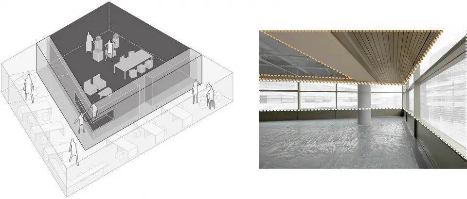
和line+杭州办公室一样,我们希望这里不是枯燥伏案的场所,而是设计师、业主、各类专家进行交流碰撞的空间。因此在功能排布上,设计要解决的是如何让展厅、沙龙以及30人的办公在不到300方的面积内生动地展开。同时在空间形式上,如何尽量减少无法拆除的金色铝板对最终效果的影响。
We hope that, like the line+ Hangzhou office, this will be more than just a location to sit at a desk, but a place where designers, owners, and other specialists can connect. As a result, the design must consider how to fit a 30-person exhibition hall, salon, and office into a functional layout of less than 300 square meters, as well as how to minimize the impact of the golden metal plate that cannot be removed on the spatial form.
▼ 空间生成,space generation
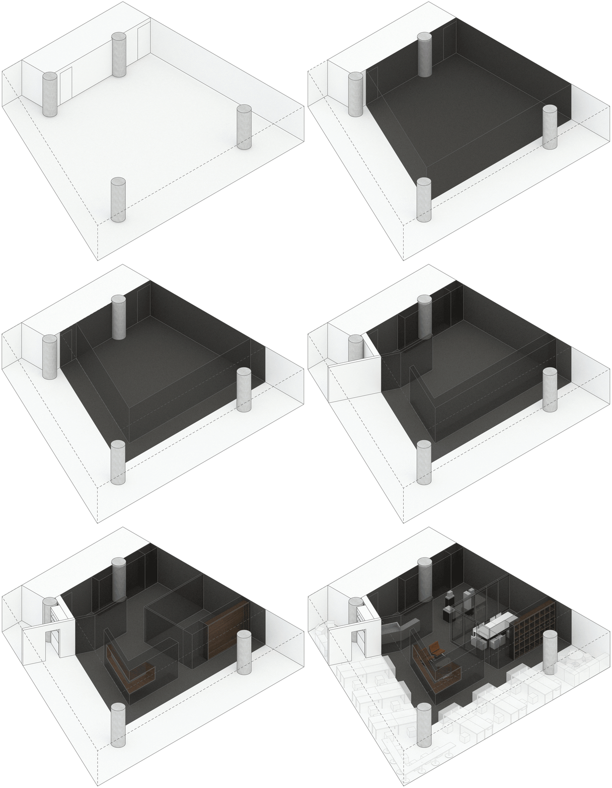
设计遵循原有的场地平面逻辑,将空间分为办公和公共两个区域。办公区域自然沿幕墙侧展开,同时拥有敞亮的办公氛围和一定的私密性。公共区域则包含了前台、展厅、会议、接待等功能。
The design follows the original site plan and divides the space into two areas: office and public. The office area naturally expands along the side of the curtain wall, rendering a bright office atmosphere and a certain degree of privacy. The public area includes the front desk, exhibition hall, conference, reception and other functions.
▼空间分为办公和公共两个区域,space divided into office and public areas
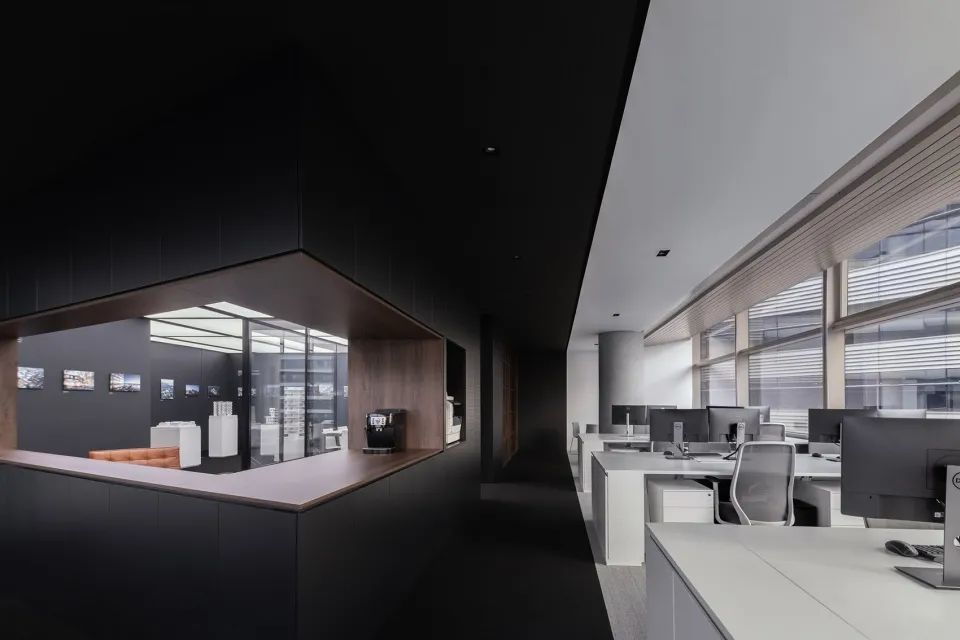
在空间上,两个区域由中部的集中功能墙体分隔,在视觉上则采用黑白两色的对比。空间和视觉分隔的错位自然形成了主走道。
A centered functional wall in the middle separates the two sections spatially, and a visual contrast of black and white is utilized. The main pathway is organically formed by the displacement of space and perceived separation.
▼功能墙体分隔空间,space defined by a functional wall
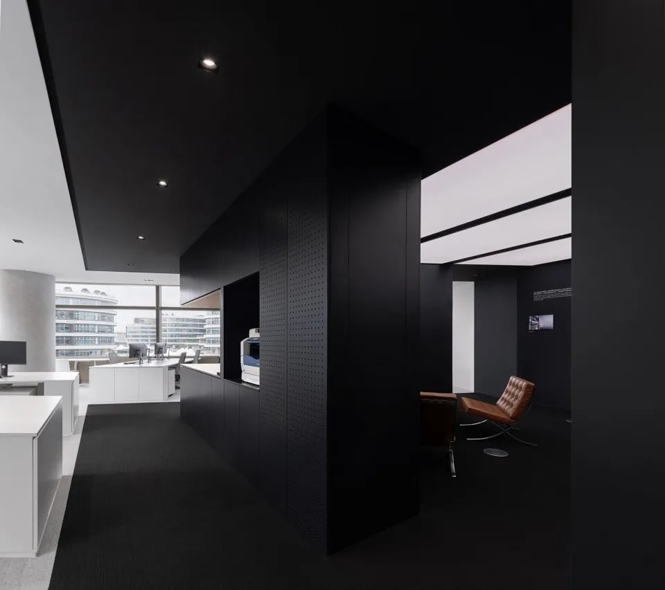
▼从公共区看向幕墙侧的办公区,view to the office area along the curtain wall from the public area

▼从办公区看向公共区,view to the public area from the office area
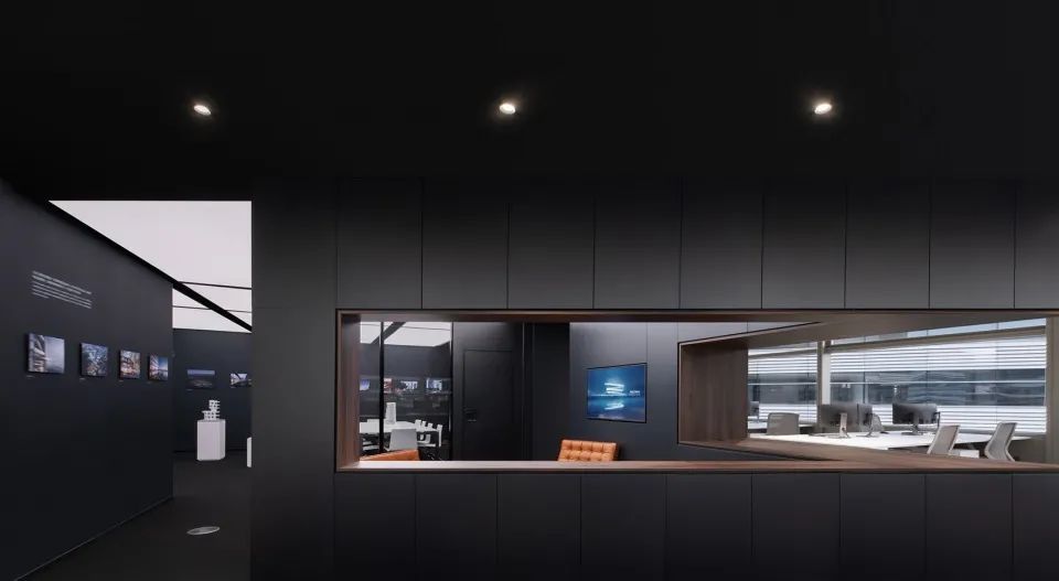

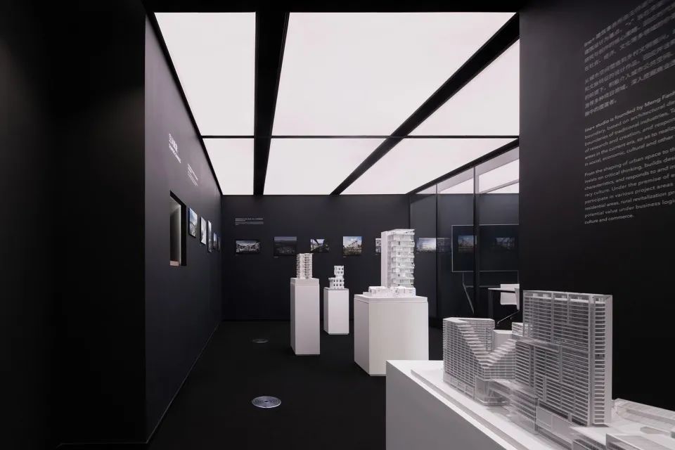
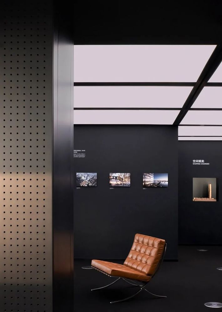
深色的墙面地面配合顶部的发光膜系统塑造了公共区域的纯粹气质,也更能凸显展品本身。考虑到所受光照条件的不同和材质本身的差异,墙面的乳胶漆、烤漆面以及地面的地毯都做了专门的颜色挑选,以确保呈现效果的统一。
The black wall and floor, along with the bright film system on the ceiling, provide a pristine atmosphere in the public space while also highlighting the exhibition spaces. The latex paint on the wall, the lacquer surface, and the carpet on the ground were particularly selected to achieve the consistency of the presenting effect, taking into account the various lighting circumstances and the differences in the materials.
▼展示区,exhibition area
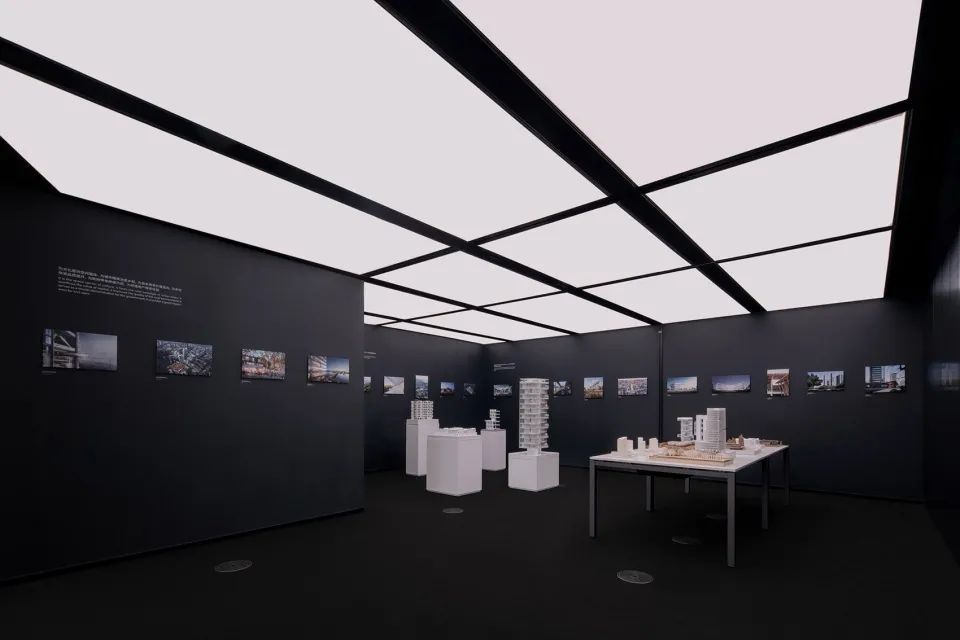
▼深色墙体突显展品本身,the black wall highlighting the exhibits

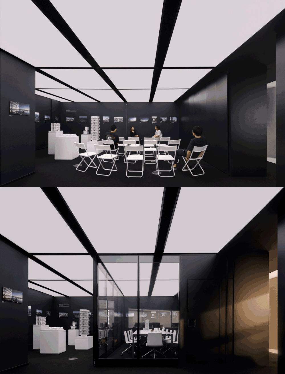
移动隔断则使得公共区域可以在常规会议、沙龙和展览等不同模式间随意切换。这样的灵活性带来的是更高的空间利用频率。
Movable partitions allow public areas to switch among regular meetings, salons, and exhibitions. This flexibility brings about higher frequency of space utilization
▼公共区域的不同使用状态,different utilizations of the public area
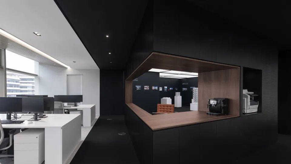
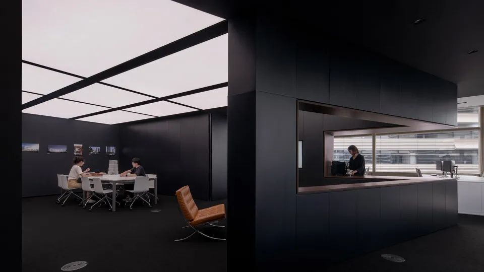
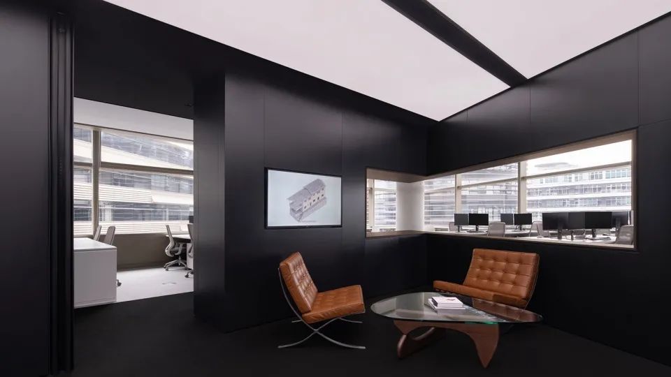
为了让功能区域最大化,我们将所有辅助功能集中在用以做空间分隔的中部墙体。水吧台、打印机、服务器机柜、书籍模型展柜以及储藏等功能对应地向两侧提供服务。墙体保证了两个区域一定的独立性并丰富了空间层次。在锐角侧打开的取景框对应建筑形体,不仅让接待区的使用者享受城市景观,更是对不同区域间互动沟通的促进。
All auxiliary functions are concentrated on the center wall for space separation in order to optimize the functional area. The water bar, printer, server cabinet, book model display cabinet, and storage functions are all supplied on both sides. The wall provides a degree of separation between the two sections while also enriching the spatial levels.
▼锐角取景框,the viewfinder frame opened on the acute angle side corresponds to the building shape, which not only allows the users in the reception area to enjoy the urban landscape, but also encourages engagement and dialogue across different locations.
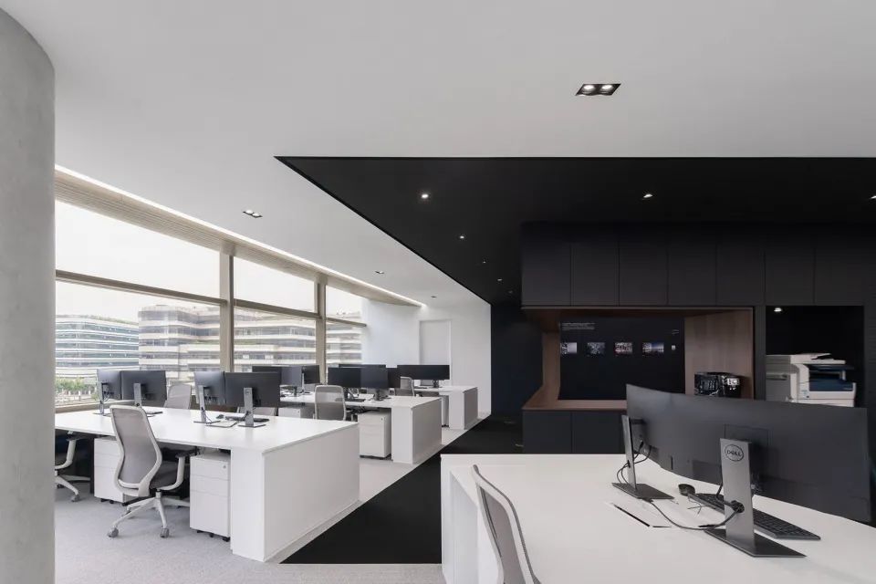
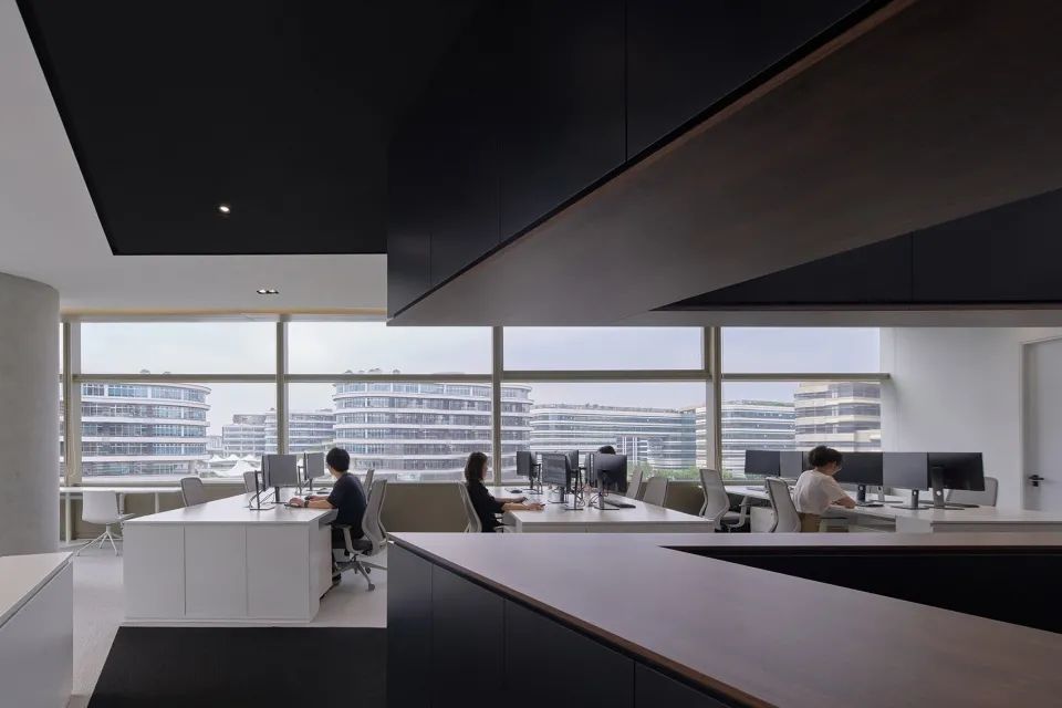
由白色办公家具和白色地毯组成的办公区域和公共区域的深色形成对比,将自然光照形成的明朗氛围最大化。顶部原有的金色铝板由此得以自然地纳入,对室内空间的影响降至最低。端部窗侧的景观工位给午餐的员工带来更好的心情。
The office area, consisting of white office furniture and white carpet, contrasts with the dark color of the public area, maximizing the bright atmosphere created by natural light. The original golden aluminum plate on the top is naturally integrated therefore, and the impact on the interior space is minimized. When employees have landscape workstations on the side of the end windows, they will have a better lunch mood.
▼办公区和公共区颜色对比,color contrast between the office and public areas
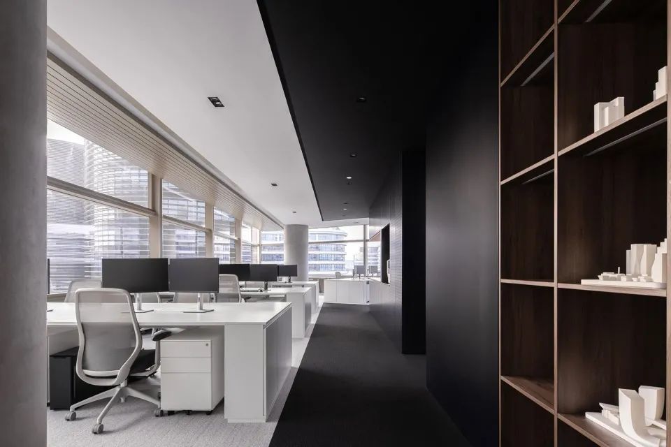
▼自然光照亮的办公区,office area filled with natural light
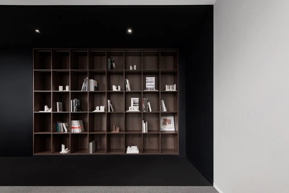
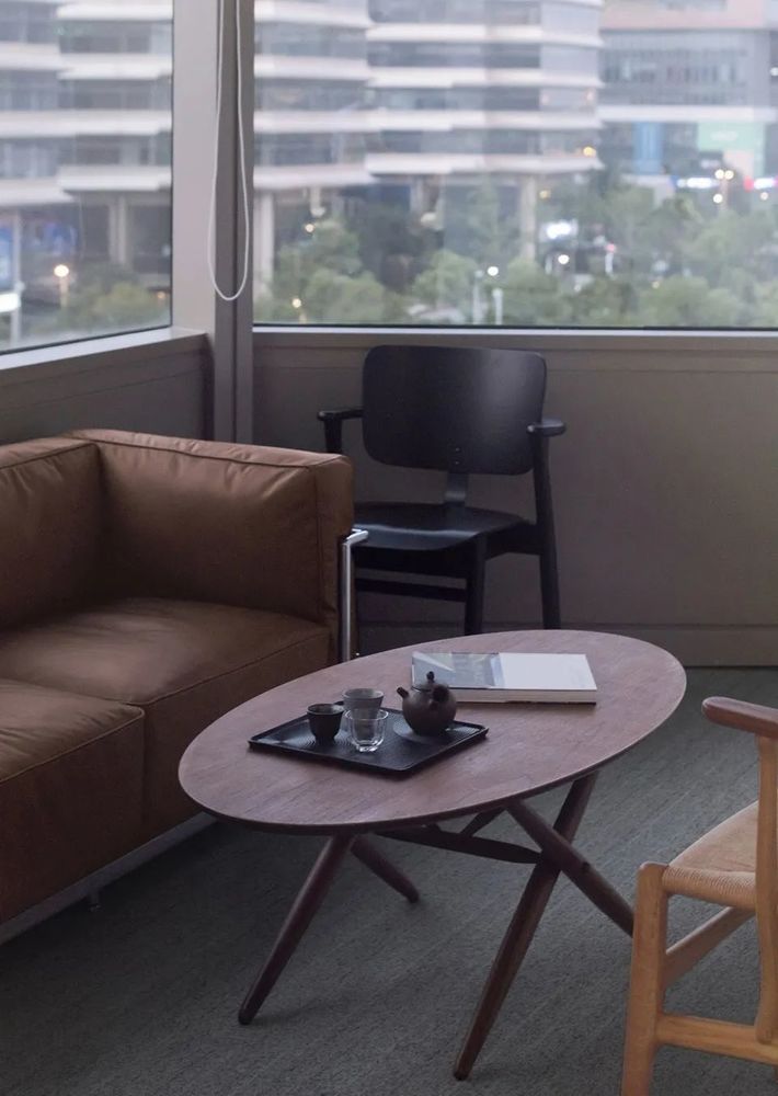
胡桃木、跳色家具在黑白两色的纯净环境中尤为凸显,为空间带来温暖和品质感。
Walnut and color-contrasting furniture stand out in the pure environment of black and white, bringing warmth and quality to the space.
▼胡桃木书柜,walnut bookshelves

▼家具细部,furniture details
日常工作中,员工开会讨论、休闲咖啡亦或是客户来访参观,都穿行于两个区域间。即使面积不足300平,空间和色彩的转换也同样能带来丰富的体验。
Employees conducting meetings and conversations, as well as clients visiting, will all pass between the two spaces on a regular basis. Even if the room is only 300 square meters, the movement of space and colours may provide a rich experience.
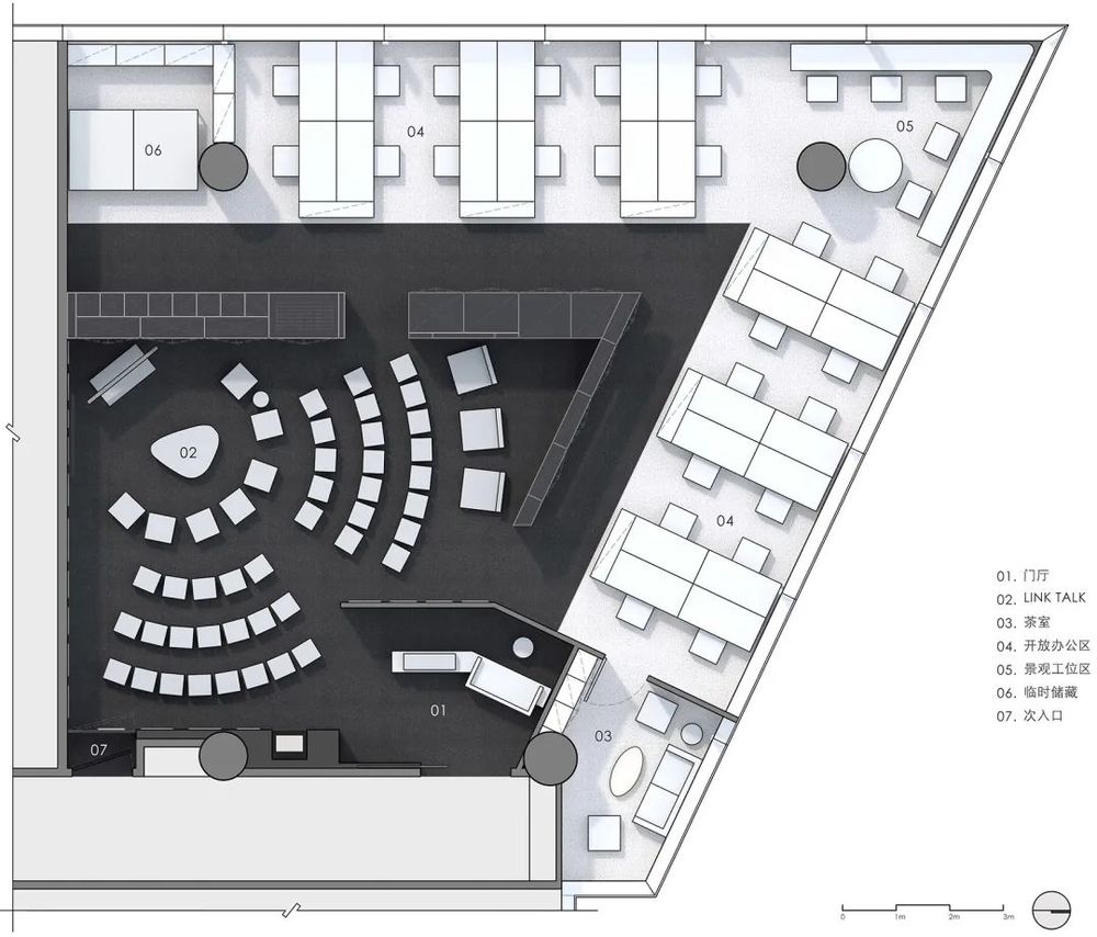
▼日常办公室模式平面,floor plan of common office pattern

▼LINK模式平面,floor plan of LINK pattern
项目名称:line+上海办公空间
项目位置:上海市诺亚财富中心
项目面积:290㎡
设计单位:line+建筑事务所
主持建筑师:孟凡浩、朱培栋
项目主创:祝骏
设计团队:祝骏、杨莉、张思思、邱丽珉
家具:杭州智楷家具、Enjoyspace
摄影:yuuuunstudio云眠

