Brief
The project brief was to create an atmosphere with features of a reputable and high-class bank, and of modernity and dynamism at the same time — the signature elements of the sport world. It was necessary to reflect the values of the company in the interior through design and provide ultimate functionality in the interior.
Space layout
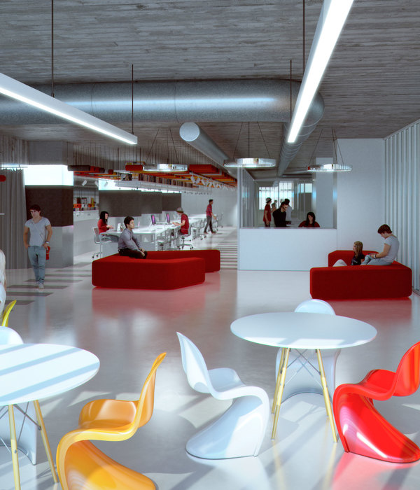
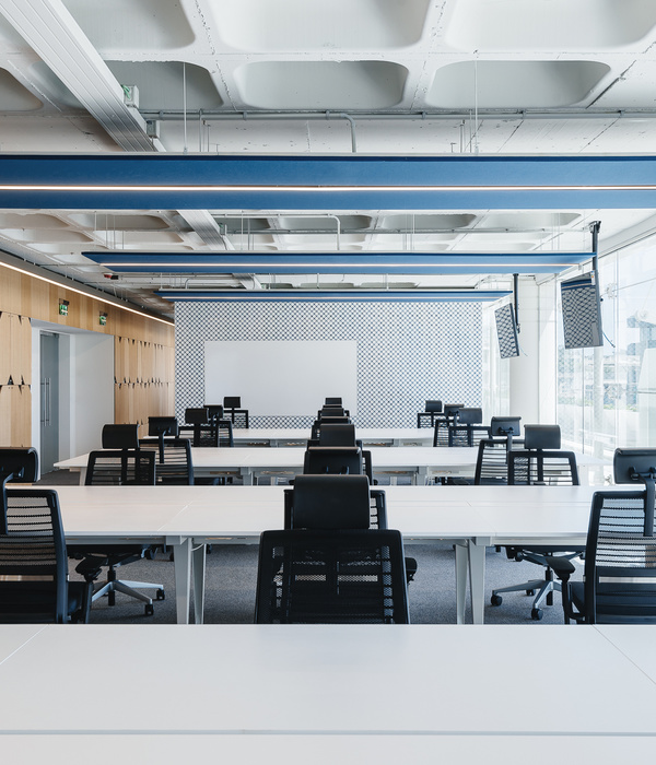
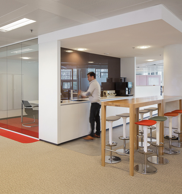
The layout type is an open space, where the management’s cabinets, reception, sports zone, and a zone for socializing are separated from the main space. The architects went beyond typical layout solutions and employed crooked lines, angular partitions, signature design for the cabinets to make the interior look special. Thus, the employees can easily change their activity within the space — from team to individual work, if they need a private space. The office has a lounge zone and several small meeting rooms of an open space type. The new design also provides a sports zone, leisure room, a quiet room with sofas and a TV set, and even a tea-room — so that employees have an opportunity to have a rest in the office.
Concept
The design idea is based on contrast and balance between two values of the company’s brand: reputable and solid, and dynamic and ambitious at the same time.
Design and Architecture Solutions
The sports theme is running through all the office interior adding contrasts to the restrained atmosphere of a high-class company: dynamic space with flowing forms, signature photo wallpapers with panoramic images symbolize drive. Podiums, transformable partitions, zones for socializing make the space fluid and adaptive to various needs.
One of the company’s values — trustworthy relationships with clients. To represent the value and the status of a successful and experienced company the architects implemented the insets made of expensive ceramic granite and the wood ornamental panels into the interior. At the same time, the light glass constructions, flexibility of the layout, and thematic decorations on the walls emphasize dynamism and ambitions of the company.
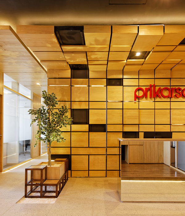
The asymmetrical form of the reception desk with Fonbet logotype and a big TV-screen with sports event translations stand in contrast to the refrained finishing of the walls and signature lamps of a geometric form. Thus, the spacious space turned into a harmonious room with a secretariat and a zone for visitors.
Innovations and technologies
It was important for the client to provide acoustic comfort in the office. Thus, the architects decided to install acoustic panels between the working desks, double partitions, acoustic ceiling above the working desks, felty lamps, and used enough textiles in the interior — carpets and curtains.
Alexandr Paramonov, general director of Fonbet:
“The most interesting part of the project was the process of interior sketch creation. On the sketches, our new interior seemed quite moderate. However, when we saw the final result, we realized that our office had got a special atmosphere.
The architects, talented professionals, managed to create a reputable atmosphere and to add «humane touch» making our office a cozy place for leisure and rest as well.”
{{item.text_origin}}

