Architects:Carlos Martinez Architekten
Area :7400 m²
Year :2016
Photographs :Petra Rainer, Daniel Ammann, Adrien Barakat
Manufacturers : Elval Colour, Saint-GobainElval Colour
Client And Collaboration : Gerald Stiegler
Collaboration And Consultant Of Client : Jürg Keel
Architects In Charge : Carlos Martinez, Alexandra Tilgner
City : Speicher
Country : Switzerland
The design of the Ophthalmic Clinic was focused around importance of the historic heritage of the site. Wherein the battle of Vögelinsegg in 1403, the people from Appenzell, Switzerland attained their independence. Out of this significance, a rock-like volume was developed that reminds of the steadiness of earlier times.
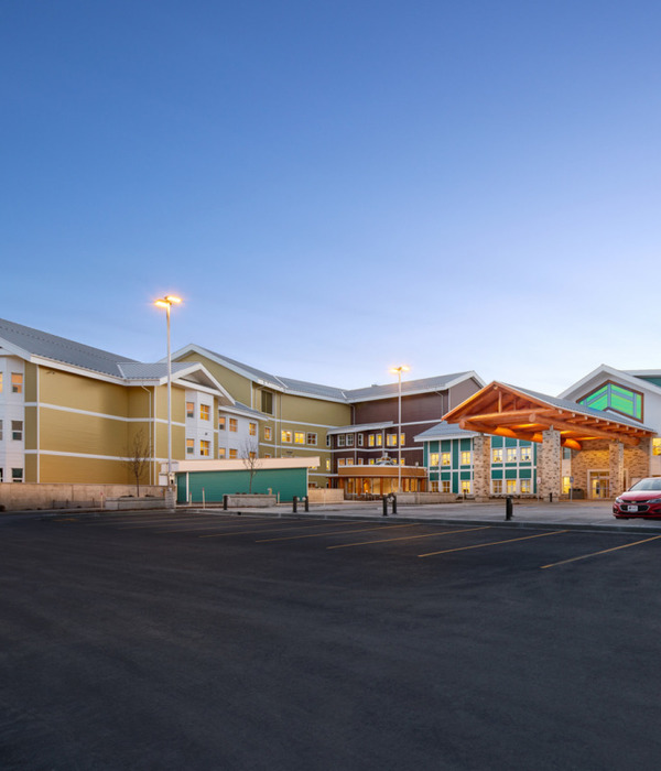
The building towers neatly above the terrain edge and opens itself towards the lake of Constance. Despite its remarkable size, the black-coloured building represses itself and at the same time follows the slope’s topography with three kinks. The stacked surface of the dark pigmented fair-faced concrete strengthens the stone-liked character of the house form. The compactness of the building dematerializes in the middle part through a horizontally running window belt. The entire hospital is located in this section. The glazing provides a rhythmical structuring of the façade and gives the building a clear appearance and a kind of lightness. All rooms for therapy and patients as well as the new equipped OPs are located in the north and provide outlooks without conceding insights. Room-high windows offer natural lightning conditions and visually draw in the environment into the inside of the building. Electronic tintable glass can be used at the push of a button and allow – especially for sensitive eyes – to dim out the room.
Four exquisite luxury apartments are located on the top of the hospital. There you can find the same architectural language of a reduced palette of materials and strong relations between inside and outside.
The building exceeds through a stunning sequence of rooms and a coherent formal and substanced expression. The clinic is in service since October 2016 and is a successful example of how a structure directly addresses the conditions of the task and the challenges of the site. In addition to the interplay between history and contemporary, most importantly it is the outstanding quality that makes the hospital an extraordinary building.
Product Description. The stacked surface of the dark pigmented fair-faced concrete strengthens the stone-liked character of the form.The horizontally running window belt in the north provides a rhythmical structuring of the façade and gives the building a clear appearance and a kind of lightness. The entire hospital is located in this section. Room-high windows offer natural lightning conditions and visually draw in the environment into the inside of the building. Electronic tintable glass can be used at the push of a button and allow – especially for sensitive eyes – to dim out the room.
▼项目更多图片
{{item.text_origin}}

