Architects:MTT
Area:201m²
Year:2023
Photographs:Choi Young Joon
Lead Architect:Jeon Jae Hong
Landscape Designers:The Sup
Construction:NEMO FACTORY
Senior Spatial Designers:Kim Sang Hoon
City:Gangbuk-gu
Country:South Korea
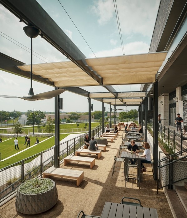
Tranquil and profound abundance, 'goodly'. Café goodly, situated at the eastern end of Bukhansan, was originally a house that had been built long ago and remained vacant for a considerable time. When we first arrived at the site, nestled at the edge of a village filled with tightly packed old houses, the narrow village lanes felt stifling. However, upon reaching the site and surveying the surroundings, the panoramic view was refreshingly cool and expansive. The edge of the village also marked the beginning of hiking trails, generally quiet and serene due to sparse human presence, contributing to a sense of tranquility and comfort. Therefore, goodly has become known to locals as a "hidden gem" that they want to keep to themselves.
The original building, completed in 1968, was a brick structure with a gentle atmosphere. Initially, during the planning stage, we intended to preserve certain facilities, including the exterior, to maintain the original charm of the architecture. However, due to years of neglect, the building's structure had become unstable for safety reasons, necessitating the removal of much of the exterior and reinforcement of vulnerable structural elements.
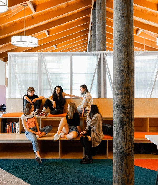
As a result, almost everything except the primary structure was demolished, and additional reinforcement work was carried out where necessary. Consequently, the traditional tiled-roof house was transformed into a café with an open structure supported by steel beams.
In terms of customer accessibility, the planning of parking spaces can be crucial, determined by the front and back of the house and the yard. Initially, our client wanted to use the backyard for parking, following the layout of the original house. However, our proposal, taking business considerations into account, suggested utilizing the front yard for parking instead, accommodating seven vehicles, and exchanging the front and back doors. This decision not only considered the basic revenue structure of the business but also took into account the importance of customer flow, reflecting a design perspective that prioritized the courtyard. Based on this, all interior space planning was completed sequentially. The former parking lot now serves as a courtyard and garden on the first floor, with the second-floor veranda shared with it. Additionally, although facing north, the narrow balcony on the north side, which offers views of Bukhansan, was redefined as a meaningful space through expansion.
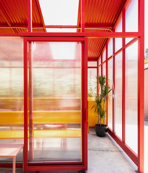
For the finishes, we chose a red tint as the main color to intensify the greenery of Bukhansan and to inherit the emotional sensibility of the existing brick architecture. The space was redesigned to be simple yet rich and relaxed, subtly varying the color and texture of the main color according to the structure of the space. To create a space that is simple yet powerful, we had to strive for a meticulous harmony of these intricate elements. The colors, textures, and furniture of goodly were no exception. As a result, we were able to create a space of tranquility and profound abundance that we envisioned here.
Project gallery
Project location
Address:Gangbuk-gu, South Korea
{{item.text_origin}}

