以精简纯粹的建筑设计手法构建空间。保证使用的基础上,舍弃复杂的装饰结构,采用极简设计和具有视觉冲击的手法,并让艺术元素与空间相融合,从而打造全新的体验店与展厅。“特专之家”首家直营终端店位于中国深圳罗湖区的中心消费区,由拥有二十多年经营历史的金叶商城升级改造而成。
The space is constructed with simple and pure architectural design techniques. On the basis of guaranteed use, the complex decorative structure is abandoned, the minimalist design and visual impact techniques are adopted, and the artistic elements are integrated with the space to create a brand-new experience store and exhibition hall. “TOBACCO SPACE”the first directly operated terminal shop is located in the central consumer area of Luohu District, Shenzhen, China, upgraded from the Golden Leaf Shopping Centre, which has been in operation for over 20 years.
项目邀请来自深圳的知名设计公司——造就设计打造其中国首店,面对新时代烟草行业的发展趋势,基于“打破思维定势,促进现代终端资源价值升级”的政策思维,从而围绕以“沉浸式多功能空间与互动消费模式”为主的设计策略进行设计创作,并打造了“前店&后展”的空间结构。
The project invites a well-known design company from Shenzhen,ZAOJIU Design,to build its first store in China.Facing the development trend of the tobacco industry in the new era, based on the policy thinking of "breaking the stereotype and promoting the upgrade of the value of modern terminal resources", the project was designed around the design strategy of "immersive multi-functional space and interactive consumption mode", and created a space structure of "front shop & back exhibition".
空间设计通过清晰的体块关系、材料关系与空间形式,将空间结构内的“前店”售卖功能和“后展”展示功能相结合,以空间为载体,尝试打造烟草行业直营终端店的空间新突破,以包容且多模块应用的空间模式打造多元化空间,通过不同的空间路径,体现人与空间的关系,并为品牌方创造产品多角度展示的场景。
The space design combines the "front shop" selling function and the "back exhibition" display function within the space structure through clear block relationships, material relationships and spatial forms, using the space as a carrier to try to create a new spatial breakthrough in the direct-operated terminal store in the tobacco industry, creating a diversified space with an inclusive and multi-module application space model, fully reflecting the human connection and relationship within the space through different spatial paths, and creating a scene for the brand to display their products from multiple angles.
通过色调、材料、体块在空间建构内的跨度碰撞,演变出颇具未来主义语言的空间体验。
Through the collision of colors, materials, and blocks in the space construction, a space experience with a futuristic language has evolved.
设计不拘泥于固定的形式,将不同的触感与独特态度的表达方式结合,因此产生了克制冷静的空间形式。
The design does not stick to fixed forms, combining different touches with expressions of unique attitudes, thus producing a restrained and calm form of space.
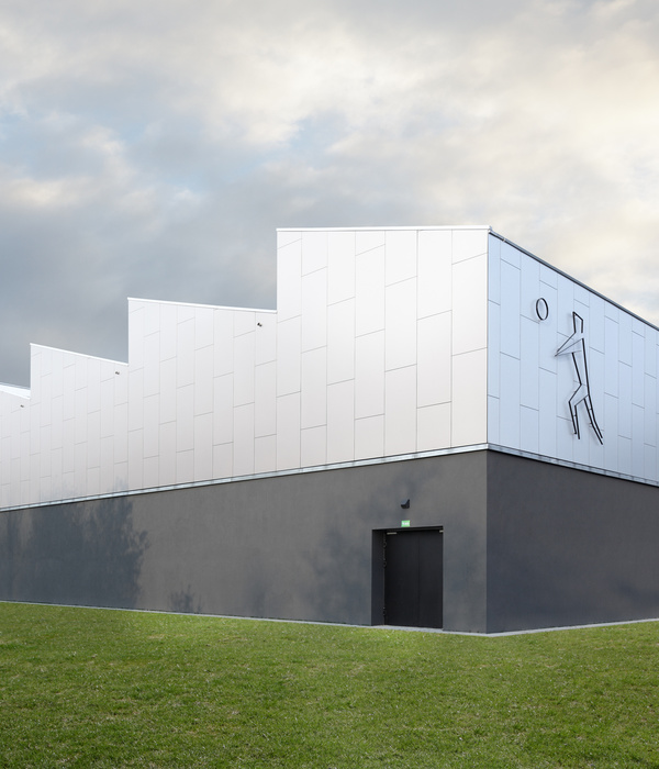
考虑“特专之家”的定位,空间的建筑外立面融合在整栋建筑里,斑驳的水泥漆、雕塑感的品牌形象标识、透明落地玻璃与“前店”、“后展”的金色不锈钢自动门创造视觉冲击,通过材质与尺度的和谐,营造出工业化的建筑体量感。
Taking into account the positioning of the "House of Specialists", the façade of the space is integrated into the whole building, with the mottled cement paint, sculptural brand identity, transparent floor-to-ceiling glass and the golden stainless steel automatic doors of the "front shop" and "back exhibition" creating a visual impact, creating an industrial sense of architectural volume through the harmony of materials and scale.
当人驻足空间外部直至进入空间内部,皆是保持着完整且专属空间的感官体验。
The sensory experience of the space remains complete and exclusive from the moment one sets foot outside until one enters the space.
通过对消费者在空间内的心理预设,前厅售卖区域以快消品陈列、展示品陈列、商品储存三种形式进行设计,为前厅售卖区域的消费人群进行不同展示,并通过空间中的“装置”,完成前厅售卖区域动线之间的联系。
Through the psychological presupposition of consumers in the space, the front hall sales area is designed in three forms: fast-moving consumer goods display, display product display, and commodity storage, so as to provide different displays for the consumer groups in the front hall sales area. The "installation" of the foyer completes the connection between the moving lines of the sales area in the front hall.
前厅售卖区域左右的拱门可以让“前店”与“后展”相互独立又相互关联,使得前后空间的利用转换松弛有度。
The arches on the left and right of the sales area in the front hall can make the "front store" and "back exhibition" independent and interrelated, making the use of front and rear spaces relaxed.
甲方希望赋予空间更多的可能性,因此设置前厅售卖区域与后方展览空间是自由且相互联系的状态,另外空间在使用上更有可塑性,当通过不同的活动有不同的体验。
The owner hopes to give the space more possibilities, so the sales area in the front hall and the rear exhibition space are set to be free and interconnected. In addition, the space is more malleable in use, and different experiences can be obtained through different activities.
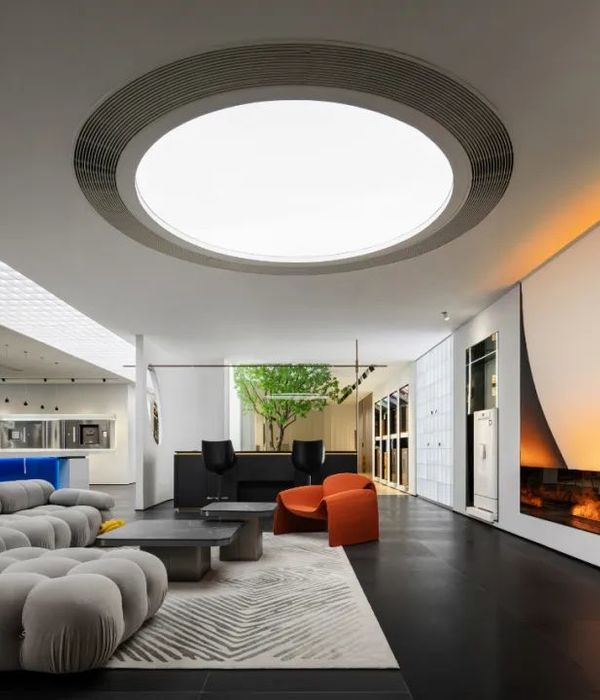
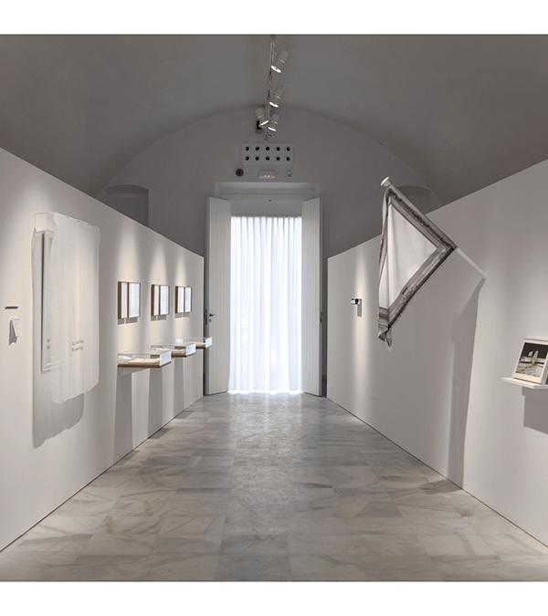
后展空间以集商业宣讲、新品展览、沙龙活动为一体的设计策略进行布局,三种活动形式可在后期随时切换,打造沉浸式的多功能体验空间。
The post-show space is laid out with a design strategy that integrates business presentations, new product exhibitions and salon activities, the three types of activities can be switched at any time in the later stage to create an immersive multi-functional experience space.
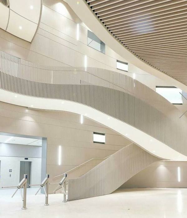
设计通过调整空间布局、灵活隔断、灯光强弱来切换功能的变化,在保持空间拥有最大视觉面的条件下,建立不同区域之间的关系与边界,让不同区域具有独立性又有关联性。
The design switches the changes of functions by adjusting the spatial layout, flexible partitions, and light intensity. On the condition that the space has the largest visual surface, the relationship and boundaries between different areas are established, so that different areas are independent and related.
不同体块的金色不锈钢与银色不锈钢,保持纯粹的空间关系,用材质延展出整体视觉冲击。
The golden stainless steel and silver stainless steel of different blocks maintain a pure spatial relationship, and use materials to extend the overall visual impact.
家具陈设上,延续现代简约风格,选材和用色皆和外部空间有着一定的关联。没有用常规的桌椅方式,好的空间应是家具与空间的和谐统一,并在空间中达出一致性。
The furniture is furnished in a modern, minimalist style, with the choice of materials and colours all having some connection to the exterior space. A good space is one in which the furniture is in harmony with the space and achieves consistency in the space.
通过密斯·凡·德·罗(Ludwig Mies Van der Rohe)提倡的玻璃、石头、水以及钢材元素的打散重组,用新与旧、手工与机械的对比产生出耐人寻味的空间环境。
The contrast between the old and the new, the handmade and the mechanical, produces an intriguing spatial environment through the dismantling and restructuring of glass, stone, water and steel elements advocated by Ludwig Mies Van der Rohe.
Interiors:彭熙-造就设计
Photos:江河摄影
{{item.text_origin}}


