成都 NORHOR 家具展厅 | 家居美学与环保理念的融合
- 项目名称:NORHOR家具展厅
- 项目类型:商业展厅
- 设计范围:建筑设计,室内设计
- 建筑面积:3500平米
- 设计时间:2019.4—2019.6
- 施工时间:2019.07—2019.11
- 设计团队:张雷,孙浩晨,李璇,姜大伟,林芳,泮娅
- 施工团队:上海匠欣装饰工程有限公司
- 撰文:陈林
- 摄影师:吴越
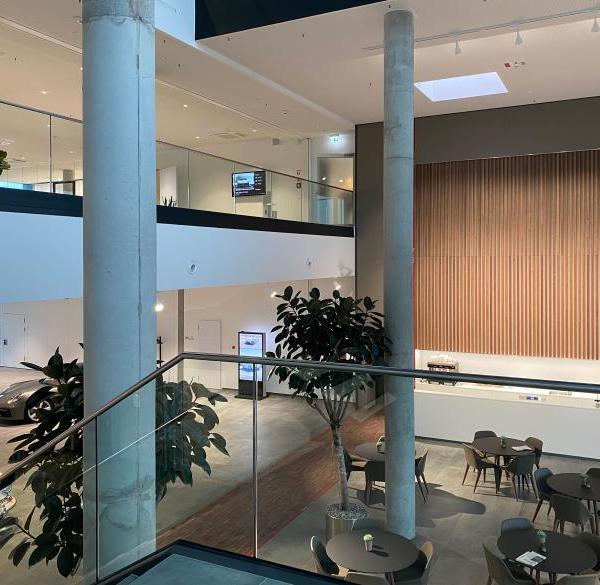
设计概述 著名家居品牌NORHOR,3500平米西南旗舰展厅在成都开幕,这也是 Muxin Studio为NORHOR设计的第二座家居展厅。这个集超过50个国际家具品牌于一身的家居展厅真实地传递出NORHOR的信念:一切改变应该从家开始。
NORHOR, a famous household brand, opened its 3,500 square meters southwest flagship exhibition hall in Chengdu, which is also the second home exhibition hall designed by Muxin Studio for NORHOR. This home exhibition hall with more than 50 international furniture brands truly conveys NORHOR’s belief that all change should begin at home.
▼项目概览,preview ©吴越
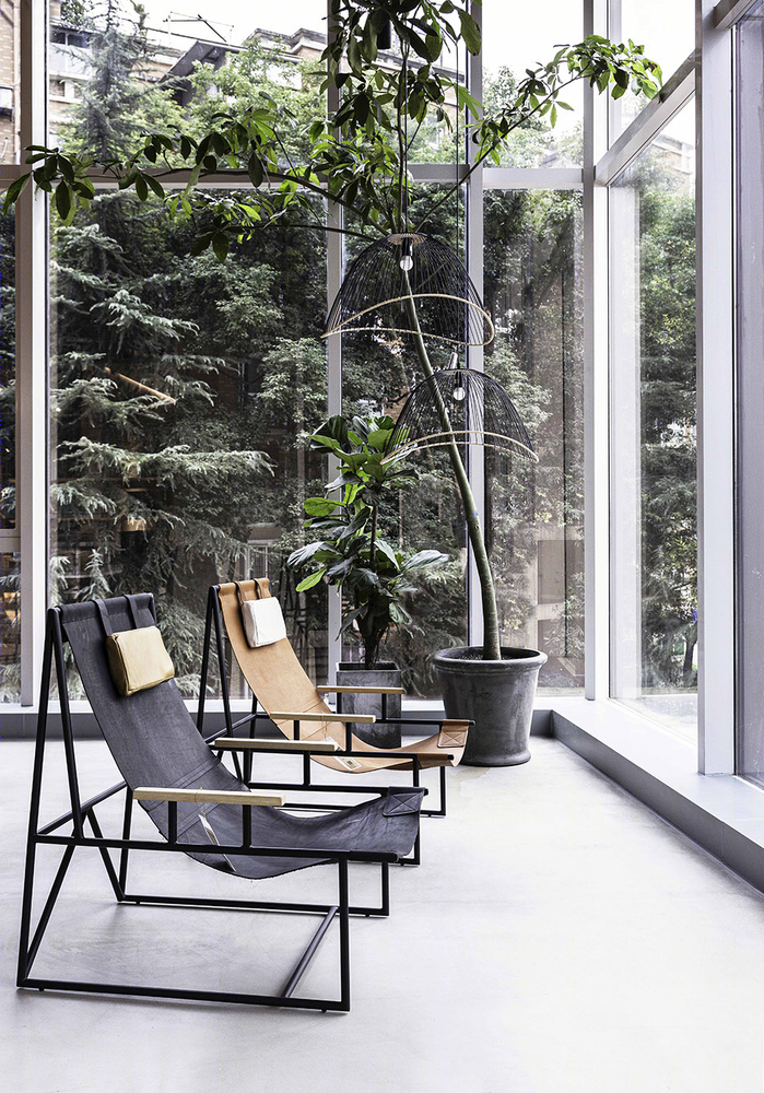
长达30余米的玻璃幕墙让过往的车辆与行人能够若隐若现地看到部分的展品,展厅内被分割的展示区彼此相连,形成循环的展示空间。在入口处,设计团队运用了虚实对比的设计手法,黑色大门来突出主体,营造更好的空间感,使画面更有层次感。
The 30-meter-long glass curtain wall allows passing vehicles and pedestrians to vaguely see some of the exhibits. The exhibition hall is divided into exhibition areas connected to each other, forming a circular exhibition space. At the entrance, the design team adopts the design technique of contrast between reality and reality. The black door highlights the main body to create a better sense of space and make the picture more layered.
▼室外景观的引入,The introduction of the outdoor landscape ©吴越
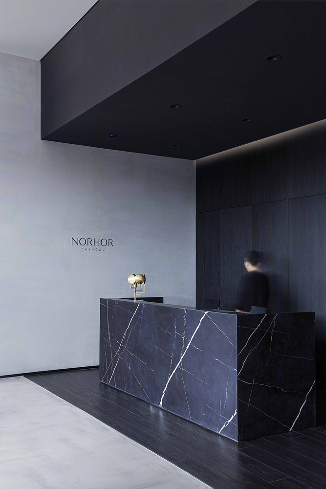
接待区与展示空间自然地融合在一起,并非一个独立、传统的接待区,而是成为空间场景的一部分。
The reception area and the exhibition space naturally blend together, not as an independent and traditional reception area, but as a part of the space scene.
▼接待区,The reception area ©吴越
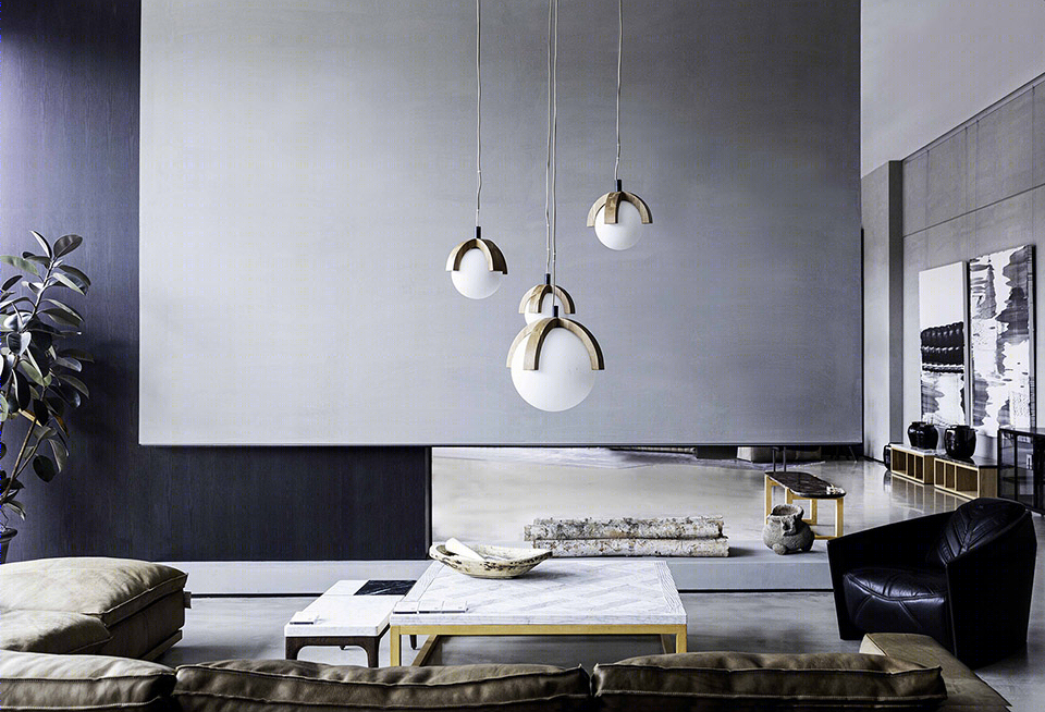
▼空间的分割与交流,The division and communication of space ©吴越
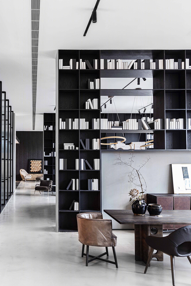
▼通透陈列的书架分割空间 ©吴越 The transparent displayed bookshelves divide the space

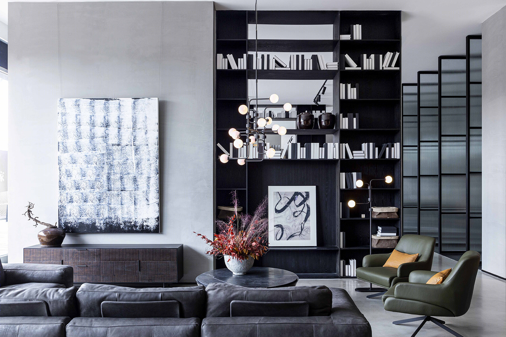
整个展厅分为高端品牌区、创意品牌区、大众品牌区、灯饰展览区及艺术展览区,达到产品展示及纯粹的空间体验。让人与人、人与家具、人与空间交流对话,启发人们在游览的过程中对于家居美学及生活方式的思考。
The whole exhibition hall is divided into high-end brand area, creative brand area, mass brand area, lighting exhibition area and art exhibition area to achieve product display and pure space experience. Let people, people and furniture, people and space communication dialogue, inspire people in the process of the tour of home aesthetics and lifestyle thinking.
▼入口框景,Entrance to framing ©吴越
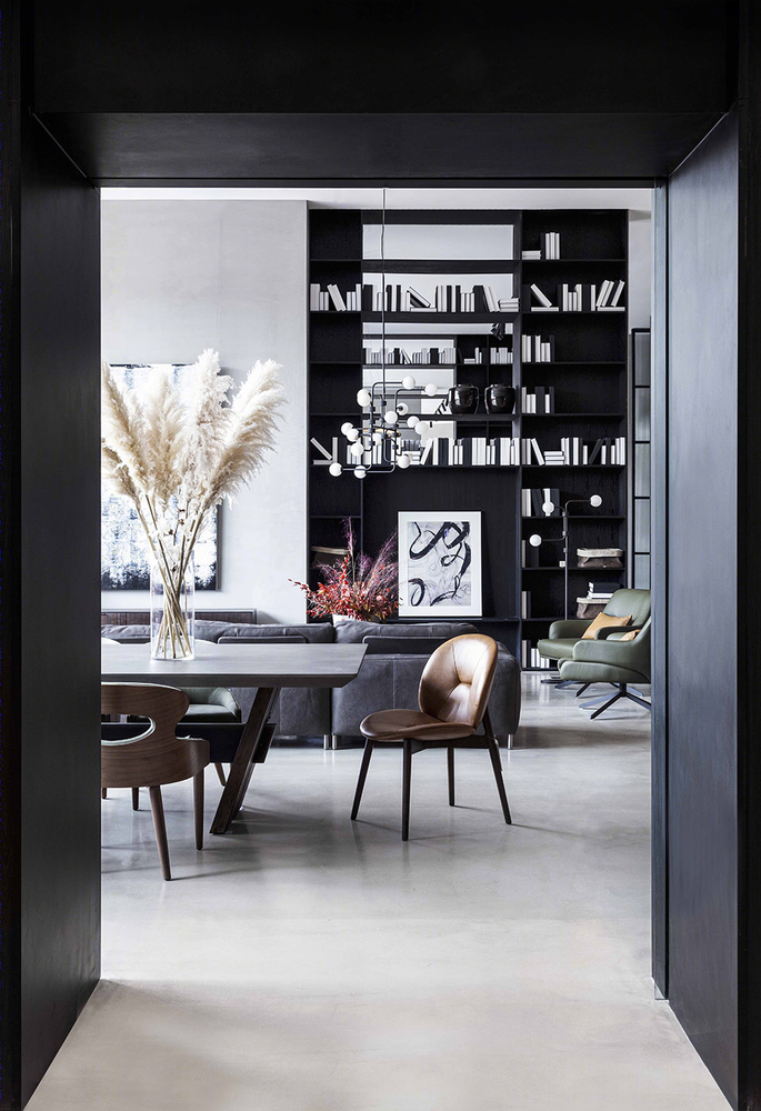
凭借材料的原始质感,呈现出坚固耐用的特征,以及能够为任何空间带来美感的冷静与优雅。
With the raw texture of the material, it is characterized by ruggedness and durability, as well as calmness and elegance that can bring beauty to any space.
▼1F高端产品展示区,1F high-end product exhibition area ©吴越
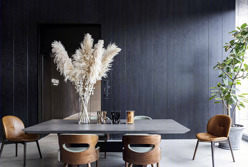
如何有效地划分空间,并有序地展示多品类的产品,Muxin Studio要解决的最大问题。基于对空间的巧思构想,Muxin Studio利用原建筑的柱体创造具有流动性、序列性既分割又有交流的空间。
The biggest problem Muxin Studio has to solve is how to effectively divide the space and show the multi-category products in an orderly way. Based on a clever conception of the space, Muxin Studio USES the columns of the original building to create a fluid, sequential space that is both divided and communicative.
▼2F沿窗阵列空间,2F along the window array space ©吴越
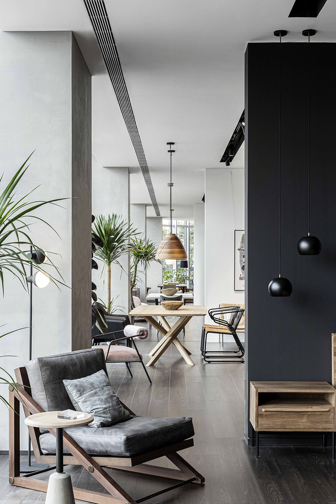
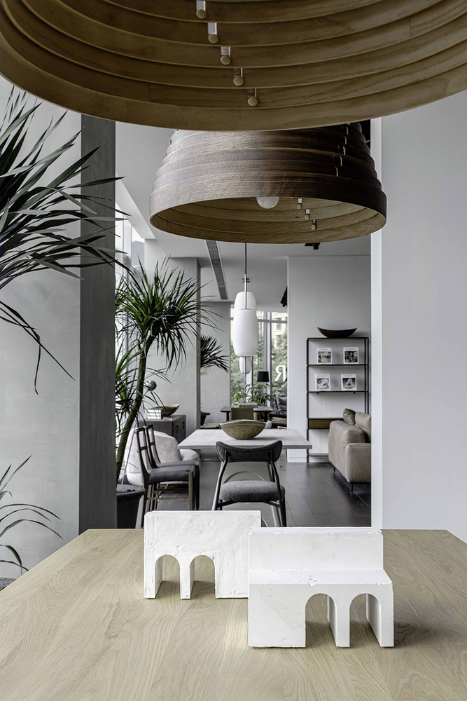
▼室内细节,interior detailed view ©吴越
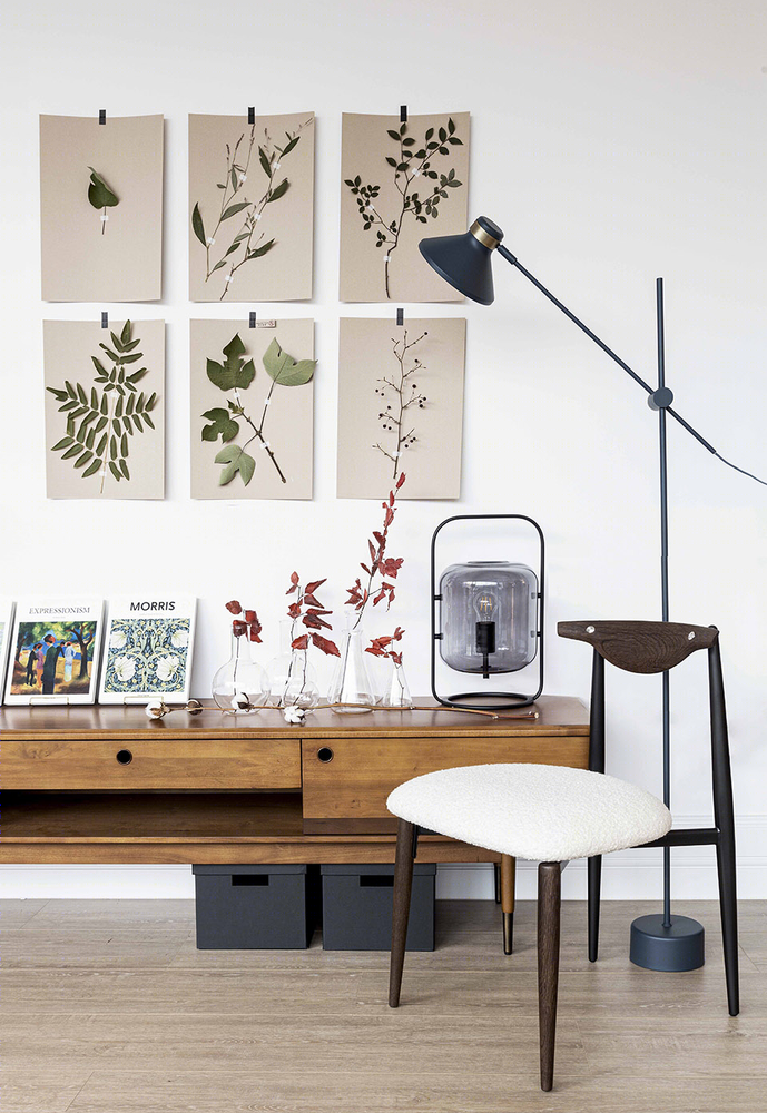
材料上Muxin Studio采用水泥等自然的元素,通过纹理、色调和手工制品的质量来培养一种简单的美。所有这些元素通知和启发这个精心策划的空间,旨在尊重NORHOR想传达给消费者环保自然地理念。
Muxin Studio USES natural elements such as cement in its materials, cultivating a simple beauty through texture, tone and the quality of the handmade. All of these elements inform and inspire this carefully curated space designed to honor the idea that NORHOR wants to convey to consumers of environmentally friendly nature.
▼2F接待区 ,2F reception ©吴越
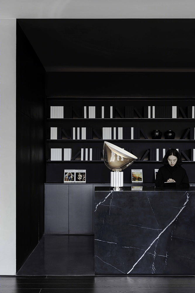
Muxin Studio始终坚持还原材质本身的特性,结合水泥、木材、金属、玻璃、石材等自然的材料诉说自然温润的氛围。
Muxin Studio always insists on restoring the characteristics of materials themselves, combining cement, wood, metal, glass, stone and other natural materials to tell the natural warm atmosphere.
▼独立展示空间,Independent display space ©吴越
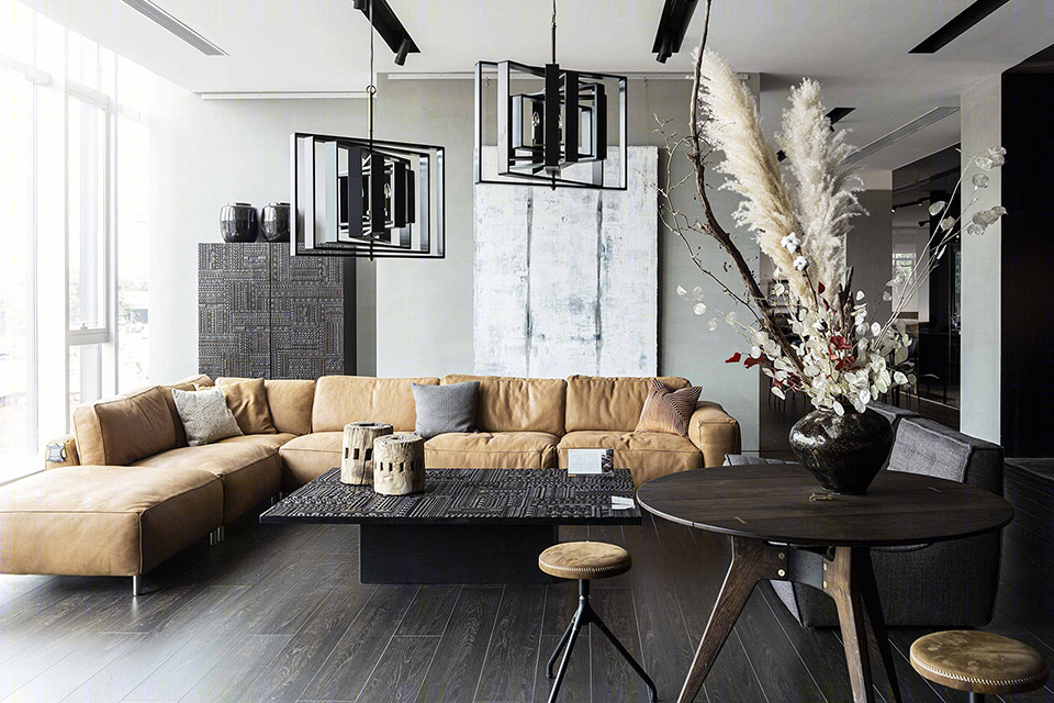
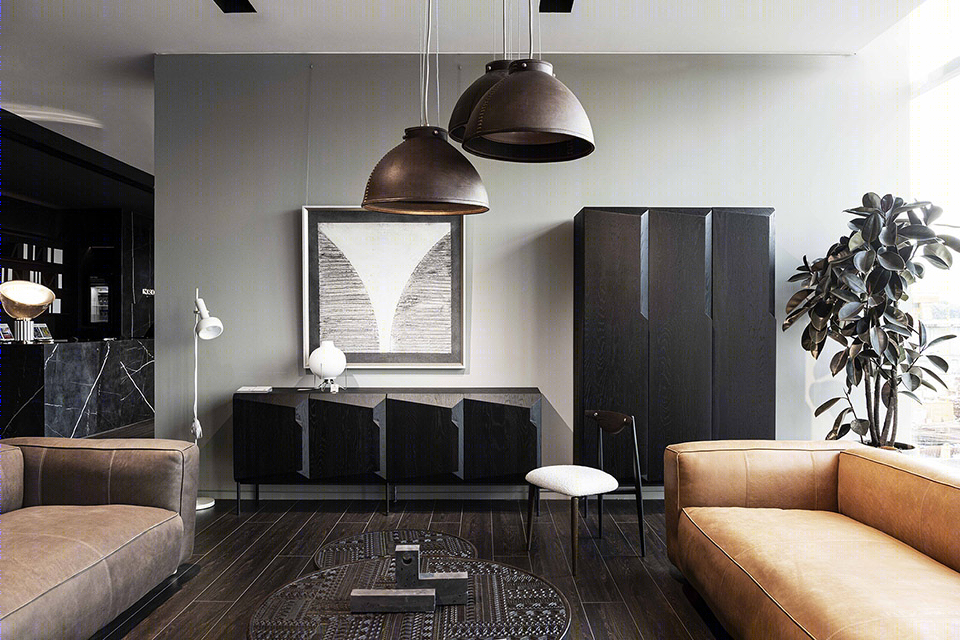
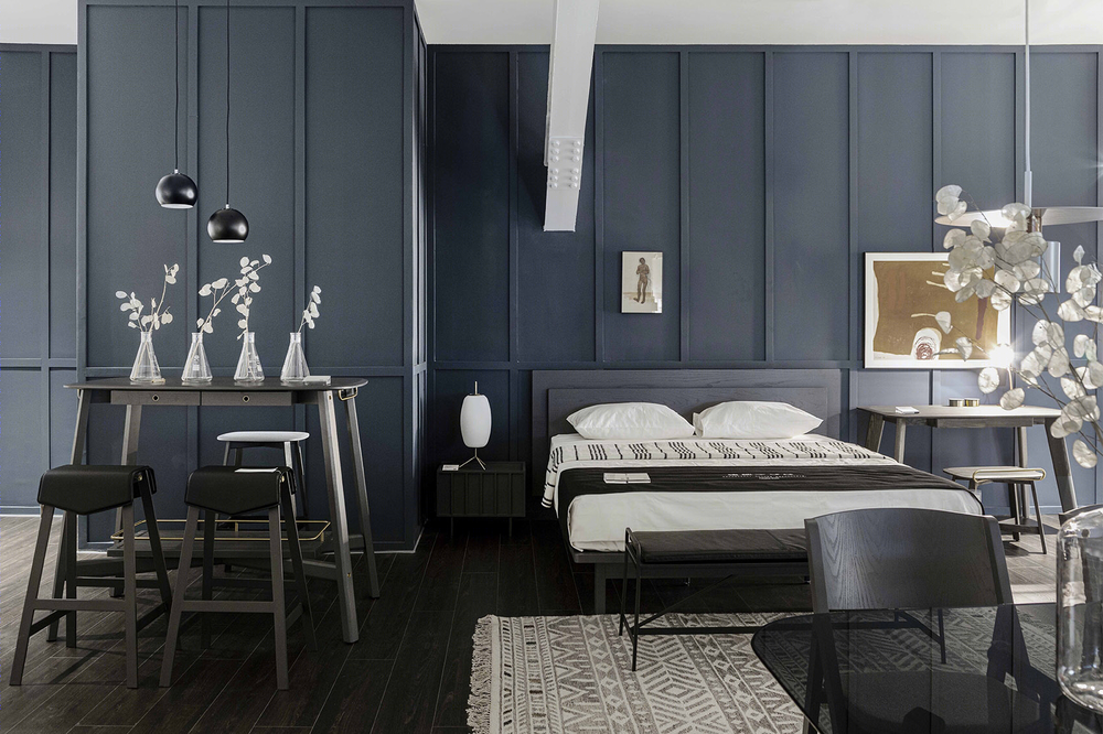
Muxinstudio对质感、色彩和成品的感官处理,以及这些元素的放置,与产品的触感自然地结合在一起。
Muxinstudio’s sensory treatment of textures, colors, and finished products, as well as the placement of these elements, are naturally combined with the tactile feel of the product.
▼室内细节,interior view ©吴越
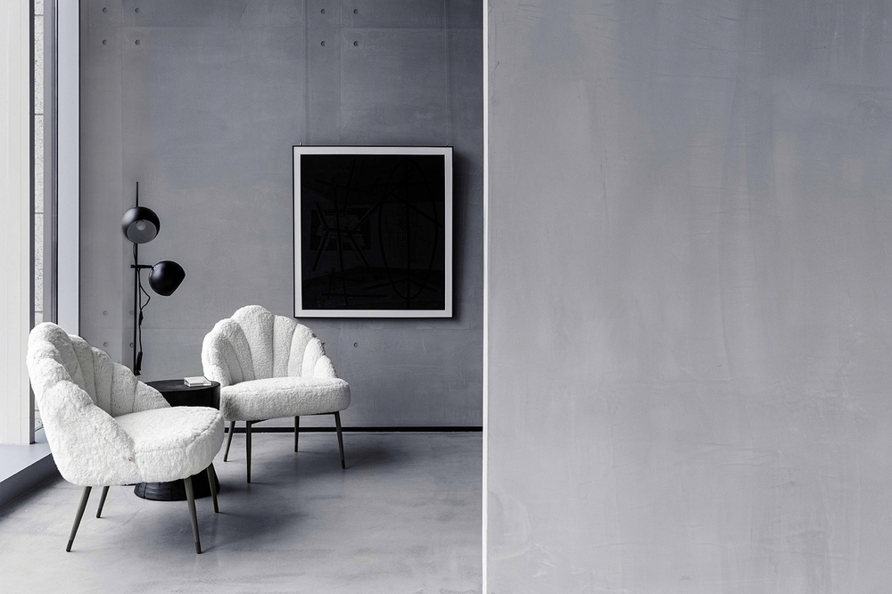

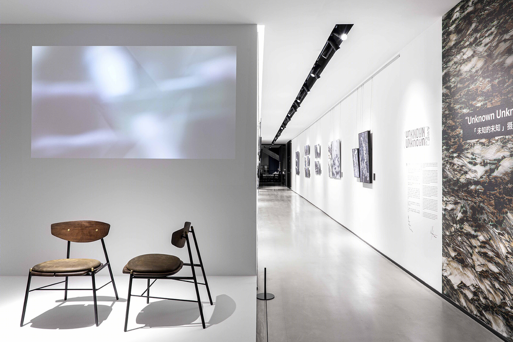
艺术画廊利用狭长的走廊空间,为品牌与空间注入商业以外的血液,为年轻优秀的艺术家、学生提供展示的机会,丰富空间体验的同时也体现NORHOR强烈的社会责任感。
Art gallery takes advantage of long and narrow corridor space to inject blood beyond commerce into brand and space, provide exhibition opportunities for young and excellent artists and students, enrich space experience, and also reflect NORHOR’s strong sense of social responsibility.
▼艺术画廊空间,Art Gallery space ©吴越
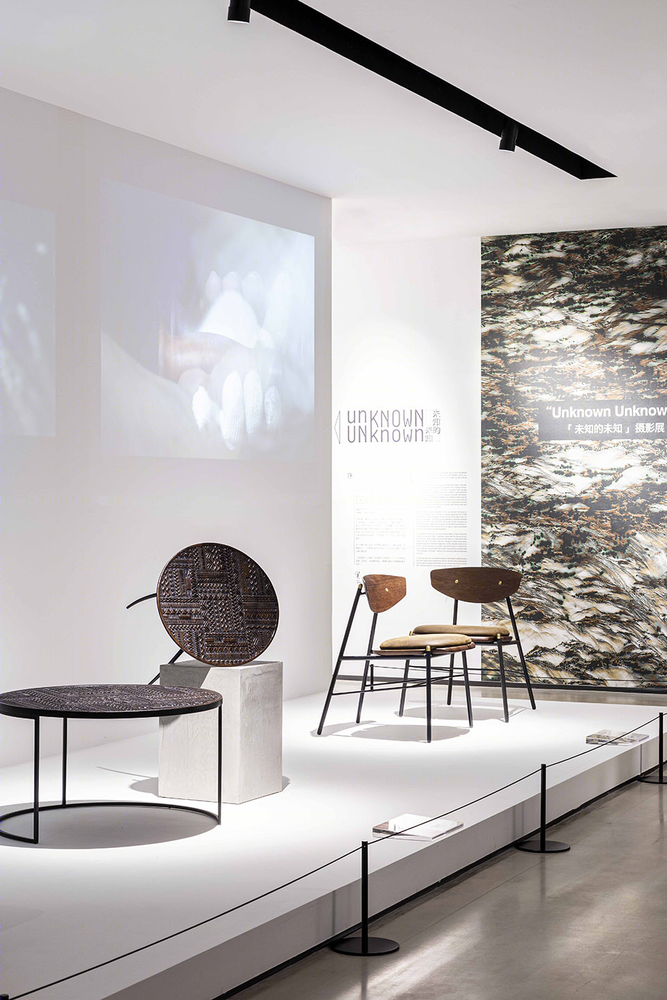
▼细节图,Details of the figure ©吴越
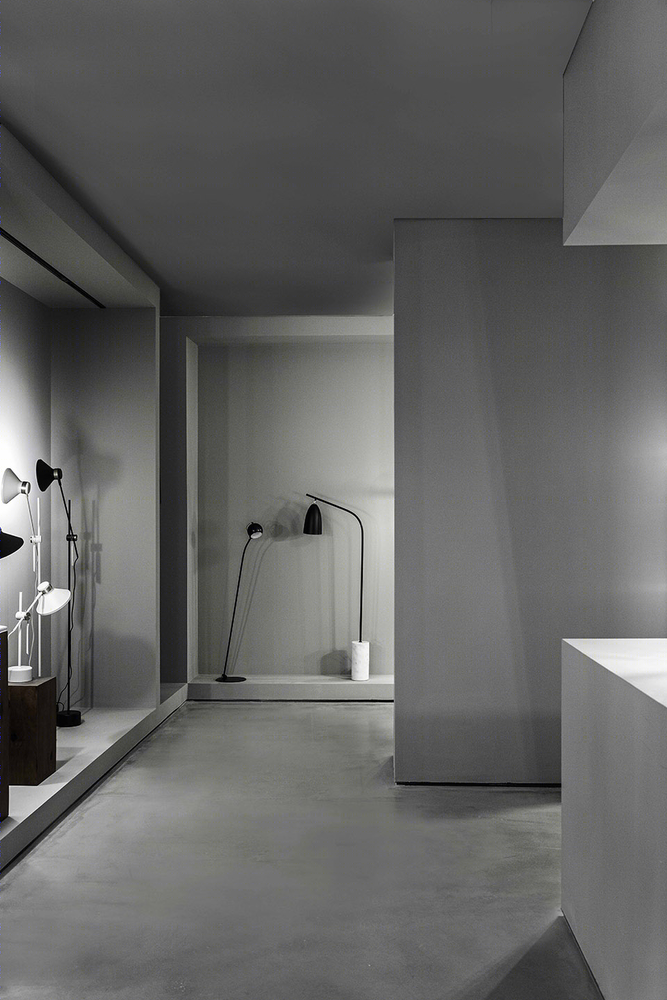
方正的内向型体量带来了极佳的氛围,内部多层次的体块穿插满足不同的灯具形式展示的同时,极大的丰富了游览的动线。
The square, inward-looking volume creates an excellent atmosphere, and the internal multi-level volumes are interpenetrated to meet the different forms of lamps and lanterns, which greatly enriches the travel line.
▼静谧的水泥盒中的灯具展厅 ©吴越 The lamps and lanterns exhibition hall in the cement box is quiet
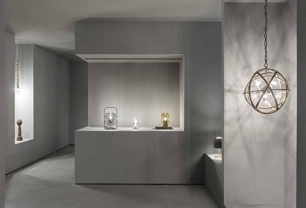
▼虚实穿插的展示空间体块 ©吴越 The display space block interspersed with virtual and real objects
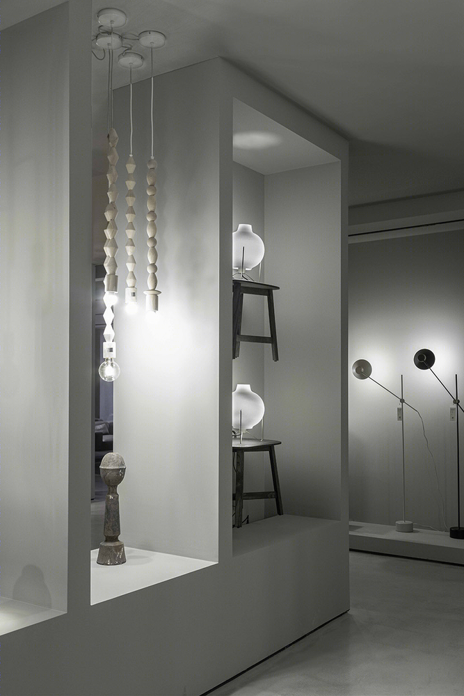
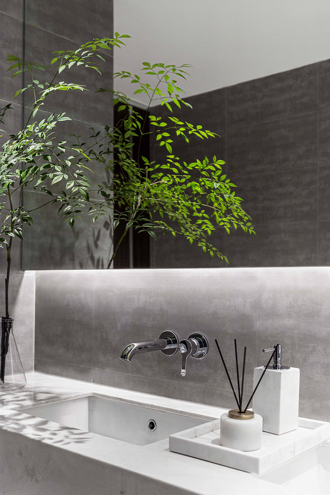
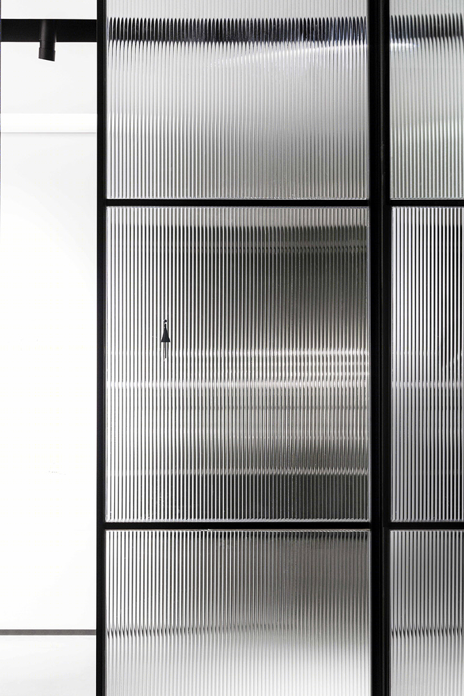
▼卫生间细节图,Bathroom detail ©吴越
项目地址:成都市 项目类型:商业展厅 设计范围:建筑设计、室内设计 建筑面积:3500平米 设计时间:2019.4—2019.6 施工时间:2019.07—2019.11 设计团队:张雷、孙浩晨、李璇、姜大伟、林芳、泮娅 施工团队:上海匠欣装饰工程有限公司 撰文:陈林 摄影师:吴越
Project Address: Chengdu Project type: Commercial exhibition hall Scope of design: architectural design, interior design Construction area: 3500 square meters Design time: 2019.4 — 2019.6 Construction time: July, 2019.07 — November, 2019.11 Design team: Zhang Lei, Sun Haochen, Li Xuan, Jiang Dawei, Lin Fang, Pan Ya Construction team: Shanghai Smixin Decoration Engineering Co., LTD Article: Chen Lin Photographer: Wu Yue

