© Sean Fennessy
肖恩·芬内西
Gorund Floor Plan
猩猩平面图
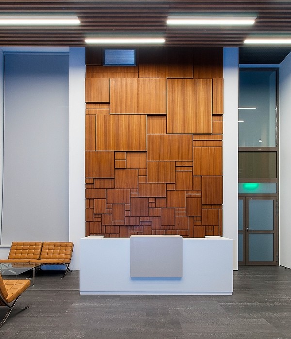
架构师提供的文本描述。这个概念很简单:尽可能多地保留现有的建筑结构。在需要服务和便利的地方,它们提供了新的插页。他们在谷仓的原始信封内工作,创造了两个独特的空间:一个长而低的空间,供用餐用;另一个是高而小的空间,展示了建筑最初的全部高度,同时也展示了建筑师们精心清理的原有屋顶瓦的底部。
Text description provided by the architects. The concept was quite simple: retain as much of the existing building fabric as possible. Where services and amenity were required, they have provided new insertions. Working within the original envelope of the barn, they created two distinctive spaces: a long, low one for dining and a tall, smaller space that showcases the original full height of the building while also revealing the underside of the original roof shingles that have been painstakingly cleaned by the architects.
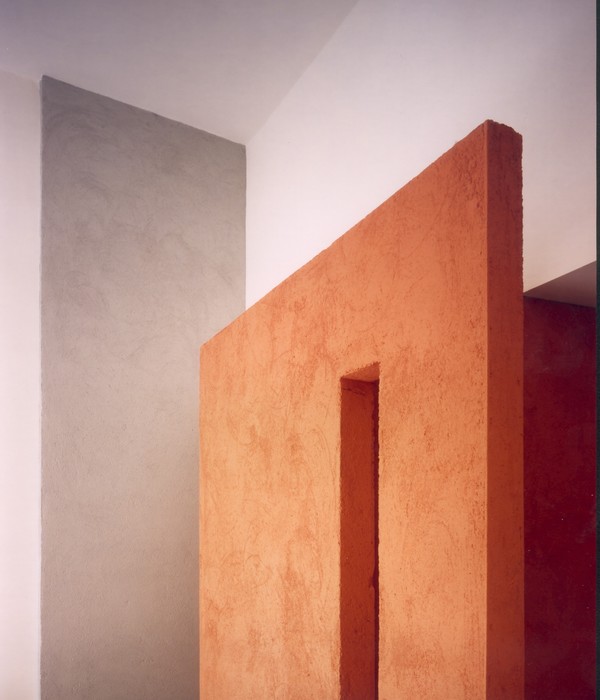
所有的新工作都是根据现有的结构来解读的,这样就保留了建筑物过去的重要品质。伯拉宪章的咒语“尽可能多做,尽可能少”已经导致了许多丰富的纹理的石材,木材和石膏板。因此,强调了新插入的独创性。
All new work has been made to read differently from the existing fabric and in this way the important qualities of the building’s past have been retained. The Burra Charter mantra of “do as much as necessary, as little as possible” has led to the retention of much of the rich textures of the stonework, timberwork and plasterwork. As a result the ingenuity of the new insertions is emphasized.
© Sean Fennessy
肖恩·芬内西
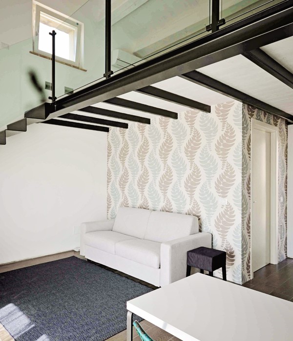
每一次最大限度地发挥空间效用的机会都已被利用。例如,新的玻璃与外部砂岩齐平,提高了对“新”的认识,而在内部,这些插入的窗口盒提供了非常需要的辅助存储空间。在室内,建筑师成功地保持了谷仓原有高度的感觉,降低了相邻的空间,并根据原有马厩的结构和间距划分了空间。
Every opportunity to maximize spatial usefulness has been exploited. For example, the new glazing finishes flush with the exterior sandstone, heightening the awareness of the “new,” while internally these inserted window boxes provide much needed ancillary storage space. Inside, the architects have succeeded in preserving the sense of the barn’s original height by making the adjacent spaces lower as well as dividing space according to the structure and spacing of the original horse stalls.
© Sean Fennessy
肖恩·芬内西
© Sean Fennessy
肖恩·芬内西
他们在最初的信封内工作,使用音量、前景和明确的物质策略来定义空间,鼓励多样性和娱乐性。
Working within the original envelope, they have used volume, outlook and a clear material strategy to define spaces and encourage variety and play.
这个项目以压倒性的方式证明了少就是多。
This project overwhelmingly demonstrates that less can be much more.
© Sean Fennessy
肖恩·芬内西
© Sean Fennessy
肖恩·芬内西
Architects workbylizandalex
Location Hobart, Australia
Category Adaptive Reuse
Architect in Charge Alex Nielsen, Liz Walsh
Area 62.0 sqm
Project Year 2015
Manufacturers Loading...
{{item.text_origin}}

