▼视频,video
灵感来自BMW VISION NEXT Inspired by BMW VISION NEXT
从巴伐利亚飞机厂到BMW VISION NEXT100,历经百年的宝马不仅是汽车品牌,更是一种文化。建筑师从NEXT100概念车上抓住了他百变的三角形肌理单元,由此基本单元融合地缘特色创造出成都宝马宝创新展厅的动线与联系,完成了从建筑改造到景观及内部空间的一体化高品质设计。
From Bayerische Flugzeugwerke AG to BMW VISION NEXT100, BMW, with a history of one hundred years, is not only a car brand, but also a kind of culture. On the basis of the changeable triangular texture unit seized from the conception car, NEXT100, the architects combined the geographical feature to create moving lines and connections in the Chengdu Baochuang BMW 4S Showroom, completing an unified and high-quality design from building renovation to landscape and interior space.
▼远景鸟瞰,aerial view of the project from distance ©吴鉴泉
项目概览 Overall of the Project
该项目坐落于成都郫都区高店路旁。总建筑面积10000余平米,原建筑荒废多年,外墙砖老化严重,部分剥落,以及烟道外露等等,改造实际要面临着挑战很多。业主希望该建筑成为作为一个充满活力、引人注目的体量,易于从对面沿线的高铁及公路上识别,并且将宝马的环保可持续理念融入其中。
Located beside the Gaodian Road, Pidu District, Chengdu, the original building with a total floor space of more than 10,000 square meters had been abandoned for years, whose exterior wall bricks were seriously ageing and partially had peeled off, and flues were exposed. So the renovation actually faced many challenges. The owner wanted the building to become a dynamic and remarkable volume, which meant it would be easy to be identified from the high-speed rail and highway across from the building, and to incorporate BMW’s concept of being environmental-friendly and sustainable.
▼项目外观,external view of the building ©吴鉴泉
建筑师将建筑主体外设置了第二层表皮——阳极氧化冲孔板,肌理从VISION NEXT的概念车皮肤三角形中获取灵感,强化了纵横矩阵层叠体块的可读性。在保证采光的情况下,冲孔板将建筑内部车间笼罩起来,使建筑整体外立面富有层次感。冲孔板内的幕墙单元是大面积可独立开启的自然通风窗,减少了夏季阳光的大量直接照射吸收的辐射热导致出现热岛效应,减少降温耗能比率,从而达到节能减排的可持续理念。它为夏日带来了遮阳,为冬日创造了隔热。像一层生态皮肤,让建筑更加环保。
The architects set up a second layer of skin —— anodized perforated facade outside the main body of the building, with the texture inspired by triangles in the skin of the conception car VISION NEXT, and strengthen the readability of layered blocks of the vertical and horizontal matrix. On the premise of lighting, the perforated facade covers the internal workshop of the building, making the overall facade of the building rich in layers. The curtain wall unit in the perforated facade is a large area of natural ventilation windows that can be opened independently, which reduces the heat island effect caused by the absorbed radiant heat from the large amount of direct sunlight in summer and reduces the cooling energy consumption ratio, so as to achieve the sustainable concept of energy conservation and emission reduction. It brings shade in summer and creates heat insulation in winter. Like a layer of ecological skin, it makes the building more environmentally friendly.
▼建筑立面,facade ©吴鉴泉
▼冲孔板细部,perforated facade detailed view ©吴鉴泉
在接受了建筑外观方案后,业主的要求是工期短且成本可控,于是我们提出了预制钢结构的方案,在加工车间里完成大量工作,然后在现场组装这些预制构件。这个方案确保了工程的质量和准确性。建筑、景观和室内的一体化设计使得整个项目能够将设计理念一以贯之。
As the owner required a short construction period and a controllable cost, we put forward a scheme of prefabricated steel structure after accepting the exterior design scheme of of the building, that is to complete a lot of work in the processing workshop, and then to assemble these prefabricated components on site. The scheme ensures the quality and accuracy of the project. The unified design of architecture, landscape and interior space allows the design concept to run through the whole project.
▼入口外空间 space outside the entrance ©吴鉴泉
建筑内部的南面空间一层是专业的宝马车展厅及路演活动区,后部分是接车预检的服务车间,全开放的空间为客户提供了可视化的预检服务;夹层是开放休息区、周边零售区等共享社交区,设计对整个空间的初衷是社会性、通透性的,所以整个一层内双层空间应是融为一体的。
On the first floor of the south space inside the building are a specialized BMW exhibition hall and roadshow area, and the latter part is a car pre-inspection service workshop whose fully open space provides customers with visual pre-inspection service. While on the mezzanine are an open rest area, a merch retail area and other shared social zones. The original intention of the design for the whole space is to be social and transparent, so the double-layer space on the whole floor should be integrated.
▼轴侧分解及动线图,axonometric analysis and moving line diagram
我们所知,建筑场地所在的郫都区地表水均为都江堰宝瓶口内江分出的水系,这个地缘特色启发了建筑师的设计灵感。于是建筑师没有做过多的空间分隔,而把重点落在了大厅的动线设计上,用动线设计回应都江堰水系场域的概念,以一个单元衍生变化的设计语言将场域、建筑、人、车、生活方式及宝马品牌理念关联在一起。
As we know, the surface water in the Pidu District where the building site is located is a river system composed of distributaries from the Precious Bottle Neck Neijiang River of Dujiangyan. It is the geographical feature that inspires the design inspiration of architects. Therefore, the architect did not do too much work on space partitioning, but focused on the moving line design of the hall. Responding to the concept of Dujiangyan river system field with the moving line design, the field, architecture, people, car, lifestyle and BMW brand concept are connected in a design language that the changes are derived from one unit.
▼装置与建筑立面,Facade of Installation and Building ©吴鉴泉
这个单元依然来自BMW VISION NEXT的三角形符号,构成一个几何体大型吊顶装置,延伸贯穿将夹层两个空间形成共生关系。悬挑出夹层的装置部分,主要由四片三角形构成一个指向未来的箭头符号。
The unit still inspired by the triangle symbol of BMW VISION NEXT is a large geometric form suspended ceiling installation that extends through the two spaces of the mezzanine to form a symbiotic relationship. The installation overhanging the mezzanine is mainly composed of four triangles to form an arrow symbol pointing to the future.
▼室内空间概览,overall view of the interior space ©吴鉴泉
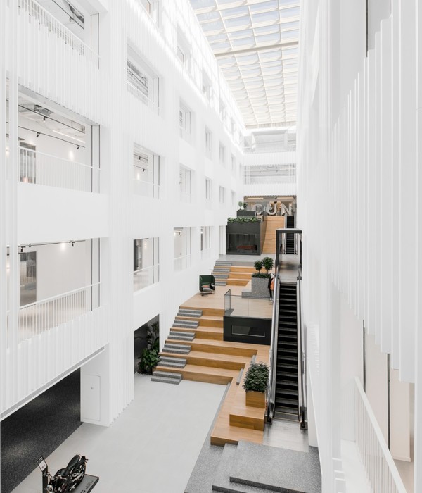
装置延展部分是为顾客动线做一个引导提示,从展车大厅的不同车型区域,到生活方式区、周边零售区、休闲区、茶室、咖啡区等两层复合功能空间,用这个三角单元衍生而串联起来,同时也将展示、销售、客户体验、售后服务融会贯通于一体连接起来。正如业主所说的“我们没有任何神秘的地方,所有的服务都对顾客开放,来的所有人都可以自由享受我们给大家带来的免费服务,不管是咖啡还是茶道还是各种娱乐社交活动”,因此整体空间布局都没有实质的物理隔墙,而是希望给顾客一个可以自由穿梭的空间。
The extension part of the installation is to provide a guide for the moving line of customers. From the different car model areas in the exhibition hall to the two-layer complex multi-functional spaces including lifestyle area, merch retail area, leisure area, tea room and café area, they are derived from and connected together by the triangular unit, which also integrates display, sales, customer experience and after-sales service at the same time. As the owner said, “we don’t have any mysterious place. All services are open to customers, and everyone who comes here can freely enjoy the free services we bring to them, whether it’s coffee, tea ceremony or various entertainment and social activities”. Therefore, there is no physical partition in the overall space layout, with the hope of providing a space for customers to move freely.
▼自由穿梭的开放空间,open space for moving freely
装置的钢结构将来可循环利用。挑空的大厅拔高视觉空间的同时提高整体亮度,从而减少繁多的灯光布置,节省了成本也降低了电耗。
The steel structure of the unit can be recycled in the future. The design of hall open to below raises the visual space and improves the overall brightness, so as to reduce an array of lighting arrangements, which will save costs and reduce power consumption.
▼明亮的挑空大厅,bright double height hall ©吴鉴泉
▼装置与大厅,installation and the hall ©吴鉴泉
▼装置界定的空间 space defined by the installation ©吴鉴泉
▼标识墙后的洽谈区 communication area behind the feature wall ©吴鉴泉
二层是相对独立的客户餐厅及内部办公区,三四五层则是专业的维修车间,在这个复合性的多功能综合体,我们在整体设计上注重的是动线分流:顾客、服务人员、车间工人的动线,都有各自的互不影响的独立动线设计。
On the second floor is a relatively independent customer restaurant and internal office area, while on the third, fourth and fifth floors are specialized maintenance workshops. In the multi-functional complex, we focus on the moving lines diversion in the overall design, and thus independent moving lines that do not affect each other are designed for customers, service personnel and workshop workers.
▼楼梯,二层为办公空间 stairs, office on the second floor ©吴鉴泉
▼楼梯细部,details of the stairs ©吴鉴泉
▼展厅,exhibition hall ©吴鉴泉
我们认为好的设计不是材料的堆砌,简洁的木纹色及白色是整个空间的主基调。作为环保材料的着色木纹铝型材,不会释放氡、甲醛等有害元素,且可塑性强,更重要的是不但使用寿命比实木长,而且取代实木能起到保护生态环境,减少材料资源的浪费。立面白色不锈钢具有重复利用的属性,不会变色生锈并且安全可靠,为整体空间提升简洁调性,同时也达到了重复利用的可持续发展理念。
In our point of view, a good design is not a pile of materials, so simple wood grain color and white are the main tone of the whole space. As an environmentally friendly material, the colored wood grain aluminum profile will not release harmful elements such as radon and formaldehyde, etc, and has a strong plasticity. More importantly, it not only lasts longer than solid wood, but also can protect the ecological environment by replacing solid wood and reduce the waste of material resources. The facade made of white stainless steel are reusable, safe and secure, and will not change color or rust, which enhances the simplicity of the overall space while achieving the sustainable concept of reuse.
▼夜景,night view ©吴鉴泉
▼总平面图,general Layout ©ARCHIHOPE
▼一层平面图,1F Plan ©ARCHIHOPE
▼夹层平面图,Mezzanine Plan ©ARCHIHOPE
▼二层平面图,2F Plan ©ARCHIHOPE
▼三层平面图,3F Plan ©ARCHIHOPE
▼南立面图,south elevation
▼西立面图,west elevation
▼东立面图,east elevation
{{item.text_origin}}

