旧金山私募基金办公室现代改造
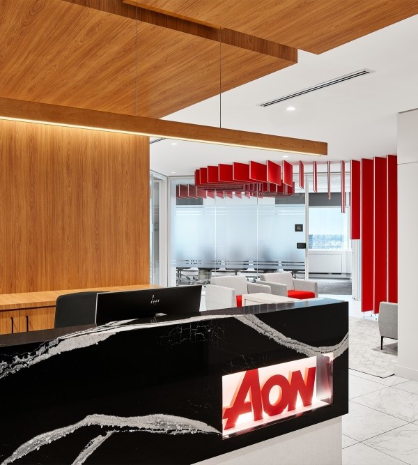
Jennifer Tulley Architects were engaged by a private equity firm to design the modernization of their offices located in San Francisco, California.
This SOMA Loft space was redesigned to suit the needs of a fast-paced Financial Services firm.
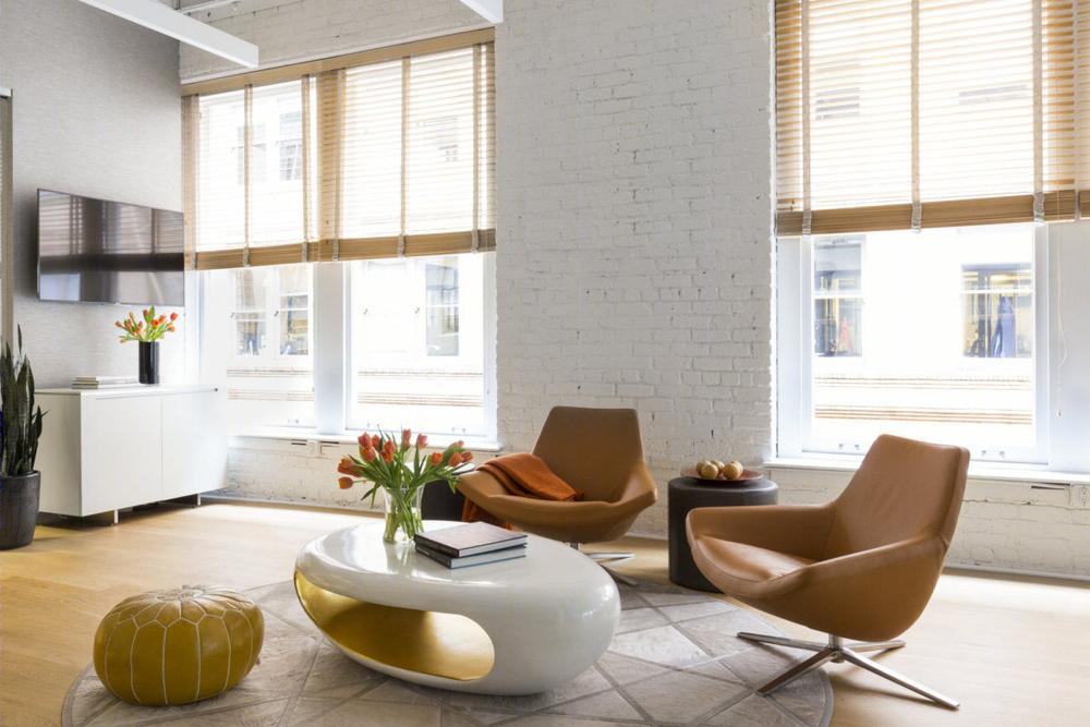
This project required modernization of a classic SOMA loft space. The client is a technology focused Private Equity firm with offices in Asia and San Francisco. The firm’s Principal is attracted to modern design and art and travels around the world.The renovation is unique in the extreme attention to detail required by the client. This included highly specific use of materials, finishes and a curated selection of artwork.
The goal was to maximize open space, light and views, while providing privacy for meetings and phone calls. The client wanted an office that was welcoming, comfortable, clean, modern, and fun.
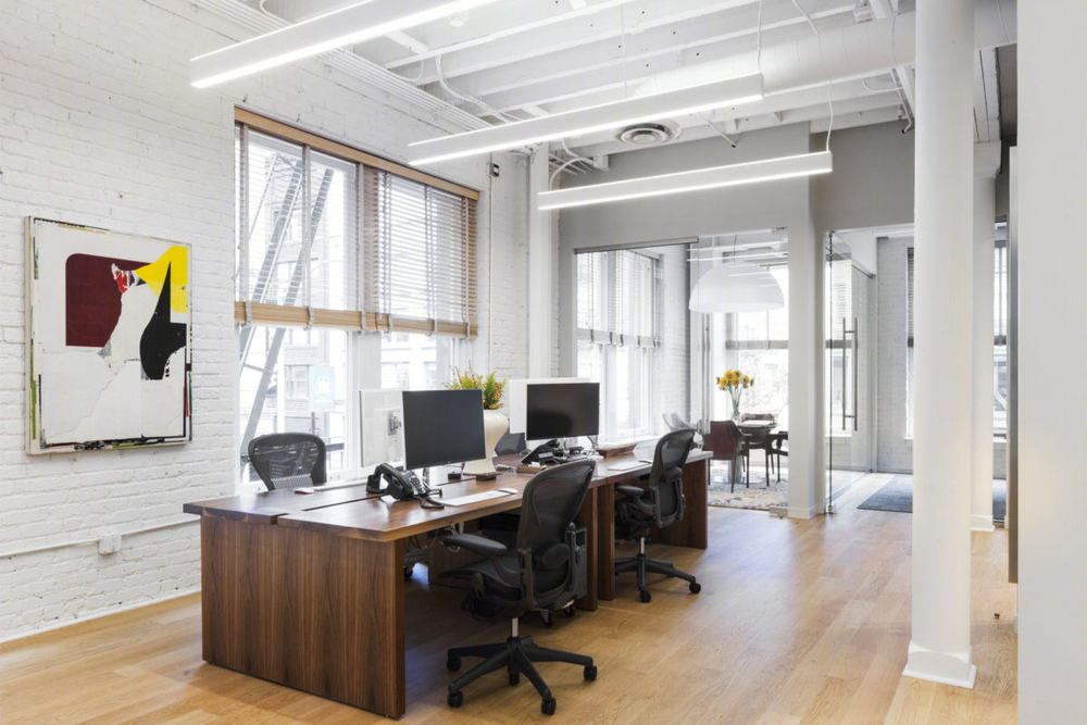
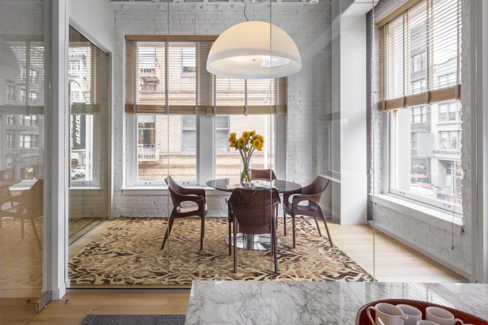
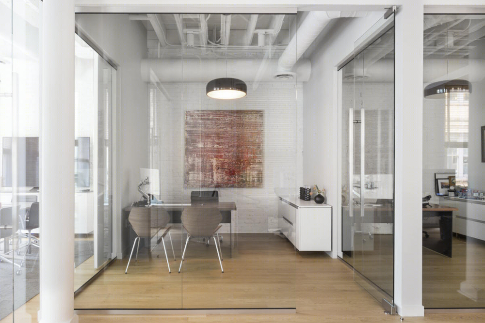
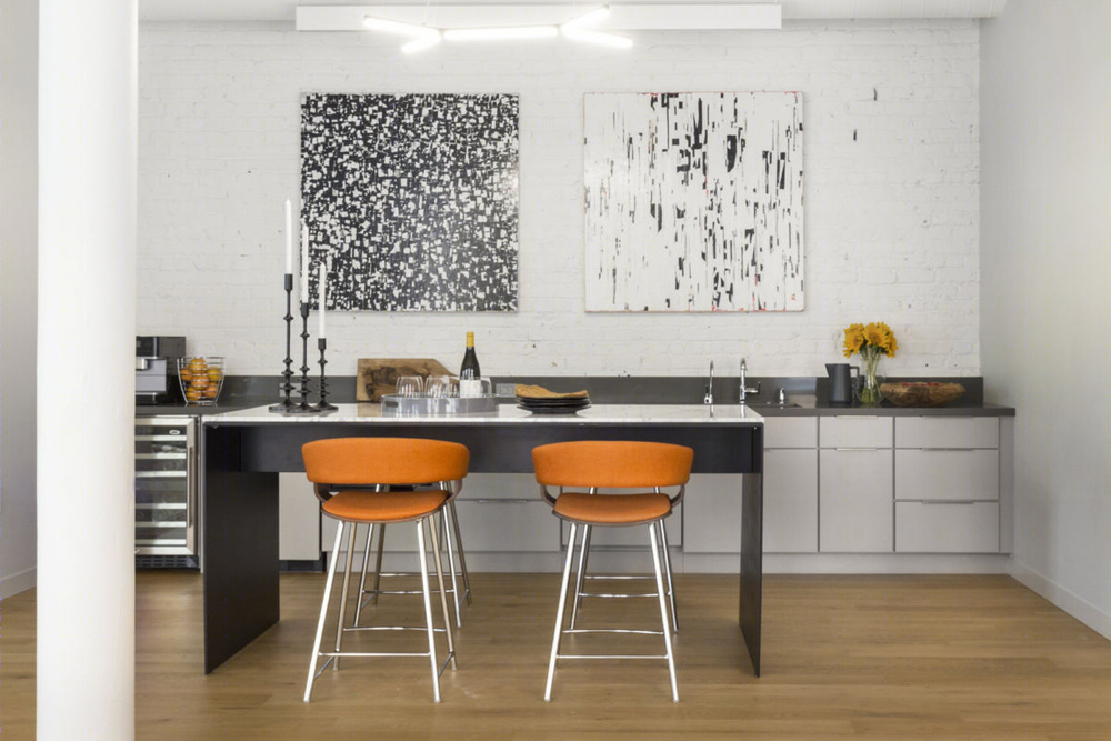
JTA was hired to update the space into a functional modern office. The client wanted to remove all of the existing partition walls to start with an open floor plan in this tall ceiling downtown industrial space in the former Photography District. Then they wanted to add as few walls as possible, with as much glass as possible to maintain that open feel while providing workspaces to meet their needs. He also wanted a great cappuccino machine and a large hang out space around it!
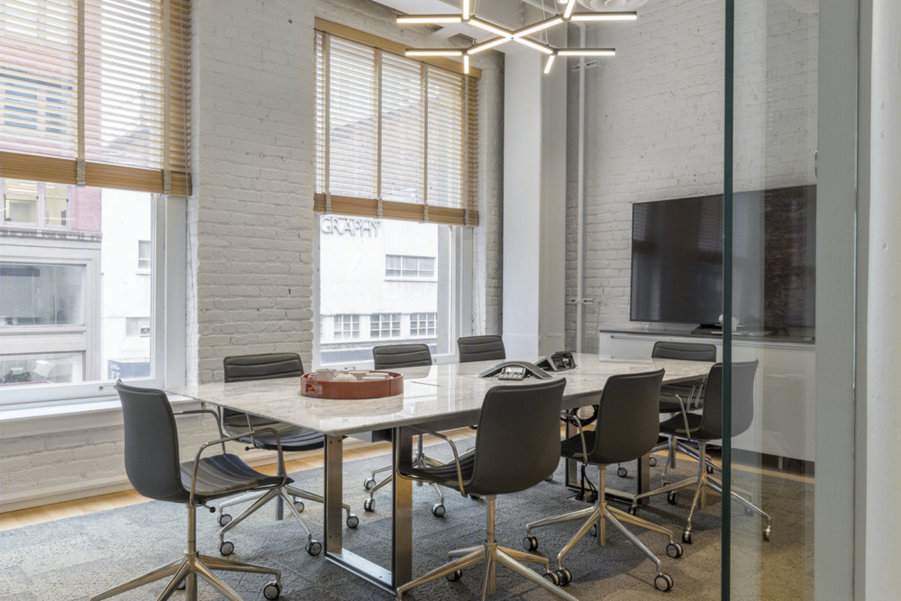
This is an office space so private offices for the principals and a private conference room, a bit of social space (found in the kitchen and the entry foyer); and they were very attracted to the rough industrial quality of the space, so maintaining this was important. Jennifer created a clean open design that accentuated the existing bones but also met the needs of a private office. The client wanted to maximize glass in the offices but that left only a small wall space for a whiteboard in the conference room. To increase that area, we created a sliding whiteboard wall that slides over the window between the private office and conference room, providing double the whiteboard space and privacy for meetings.
We had to make the two existing restrooms handicap accessible which took space out of the lobby area. We took advantage of this by painting one of the bathroom walls with light gray whiteboard paint and using this to turn the kitchen into a brainstorming work area. It also created a more intimate feel to the entry since the space was more compressed than the larger open workspace.
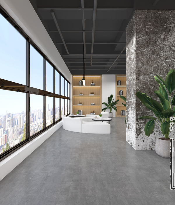
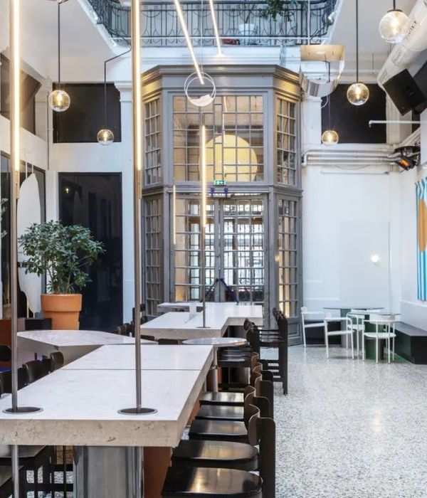
We were able to open up the space to reveal all of the large windows, the series of columns and the open ceiling, and to create a single, large, volume, but with more intimate, connected workspaces within the whole.
Designer: Jennifer Tulley Architects
Contractor: Jeff King
Photography: David Duncan Livingston
8 Images | expand for additional detail

