- 项目名称:邦喜展厅
- 设计公司:TURING DESIGN图盈拓新
- 主案设计:李敢,李骞
- 项目面积:200平方
- 项目地址:中国,南京,汇金中心
- 项目完工:2020.07
- 空间摄影:EMMA
项目名称:邦喜展厅
设计公司:TURING DESIGN图盈拓新
主案设计:李敢、李骞
项目面积:200平方
项目地址:中国、南京、汇金中心
项目完工:2020.07
空间摄影:EMMA
Project Name: Bangxi Exhibition Hall
Turing Design: Turing Design
Main case design: Li Gang, Li Qian
Project area: 200 square meters
Project Address: Huijin Center, Nanjing, China
Project completion: 2020.07
Space photography: Emma
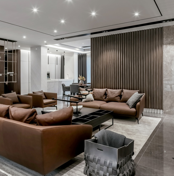
邦喜建材位于南京河西,这个由传统办公室改造而来的新型展厅令人印象深刻。“深刻”并非来源于视觉观感的跳脱或出格,而是来自其轻盈灵动的氛围和简洁艺术的陈设,以及空间内部对工艺和质量表达出的人文敬意。
BangXi is located in the west part of Nanjing. This project is a transformation from an old traditional office into a newly exhibition display. Its well-organized interior space and artsy display area gives the viewers an unprecedented experience. The design of the space is focused on the quality of craftsmanship and the respect to human nature.
▼
邦喜展厅
室内空间概览 Bangxi exhibition hall interior space overview
在设计师看来,pandomo磐多魔本身是一种具有惊奇感的装饰材料,能够将纷纭的创意和想象随意呈现在天花、墙面和地坪上,加之店里还代理有其他多种肌理涂料,因此设计的最初想法就是将这里打造成一个类似“材料艺术馆”或者“材料美术馆”的地方,架构简单而坚固,气质潜静且富有变化。
In the designer’s point of view, the material named PANDOMO is a surprisedly ornamental material, which helps the designer to realize the imaginations on the ceilings, walls and grounds. Combining with other textures in BangXi, the initial design concept creates a simple but interactive space like a “ material lab” .
▼运用
pandomo
磐多魔的空间设计 Using the space design of Pandomo Pan-Duo
该项目体量有限,设计师不希望人们进入以后,直觉这里是个一览无余的空间,于是巧妙地利用隔断,通过塑造不同的几何结构来丰富空间层次,透视带来了更多趣味,蓝色穿插其间充满凝聚的力量,弧线的多样面相扩大了场景感,丰富的曲率变化不仅给人以自由、轻柔、流线的的艺术感受,还使人联想到自然物像生长的规律。同时,为了增加人在空间中行走和停驻的更多可能,动线设置采用了多路径模式,不同通道视角呈现出不同的向量和围层,不同空间的容积划分互有穿插又保持着各自的可识别性和界限。
Because of the spatial limitation, the designer wanted to display the space in a lively way. The smart use of dividers as visual layers to create geometric depth in the space which added a lot of fun elements within the design.The use of color blue gathered the audience’s visual attention throughout the whole design.In the interior space, the arcs create cinematic effects. The diverse usage of the arcs renders the feelings of relaxation, freedom, and flexibility, so that it is reminiscent of the pattern of growth. Meanwhile, to aid people navigating the space smoothly, the designer constructed the space with multiple pathways. Different paths provide different angles and layers that adds to the complexity of design, but each space remains its own uniques in materials, colors, textures…
▼巧妙隔断 几何结构丰富空间 The clever partition geometry structure enriches the space
项目朝南,白天时几乎可以不用灯具照明,自然光线穿过透明的玻璃,穿过中空的格架,穿过交错的结构,穿过自然气息的绿植,穿过流动的空气和静止的温度,在空间内部跳跃、叠加、折射,光影和物质性成为这个展厅的明显标识。而等到天色向晚,日光不再,这里在灯光设计的配合下则又是另外一番场景,新的明暗和内外关系随着暮色衍生开来。
The project facadefaces the south which eliminate the use of additional illuminant during day time. The natural light passes through the translucent glass, hollow trellises, interlaced structures, and the natural green plants captures the moment in time. Light and shadow juxtaposed each other on theexhibition wall. When the sun has set, another design appears. The project illuminates from the inside and expel the darkness outside.
▼自然光在空间中的运用
▼细节
▼
模型图
▼
结构分解
phone:18651899866
{{item.text_origin}}


