Mini Cuppa 上海奶茶店 | 弯曲空间呈现俏皮奶茶文化
hcreates近日在位于上海虹桥引人注目的Zaha Hadid Sky Soho开发项目中为Mini Cuppa开设了一家新的奶茶店。客户希望通过一个充满活力且舒适的空间来吸引周围商业大楼的年轻白领。当hcreates第一次去了解Mini Cuppa时,他们就立刻注意到了他们非常具有吸引力的创意饮品和小吃系列。设计总监Hannah Churchill表示是产品激发了创作过程。 “我们反复回看珍珠奶茶的形象,茶中形成的层次、质地和颜色具有非常有趣和俏皮的意象。我们无法控制它对于这个空间的设计美学所产生影响。”
hcreates recently opened a new café for Mini Cuppa in the striking Zaha Hadid Sky Soho development in Hongqiao, Shanghai. The client wanted a youthful and cozy space to attract the young professionals in the surrounding office towers. When hcreates first started to learn about Mini Cuppa, they immediately noticed their range of creative drinks and snacks that were very eye-catching. Design Director Hannah Churchill said the creative process was ignited by the products. “We kept going back to this one bubble-tea image, the layers, texture and colours formed within the tea had a really interesting and playful imagery. We couldn’t help but let that influence the design aesthetic for the space.”
▼店铺外观,exterior view © Brian Chua
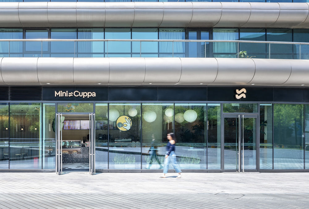
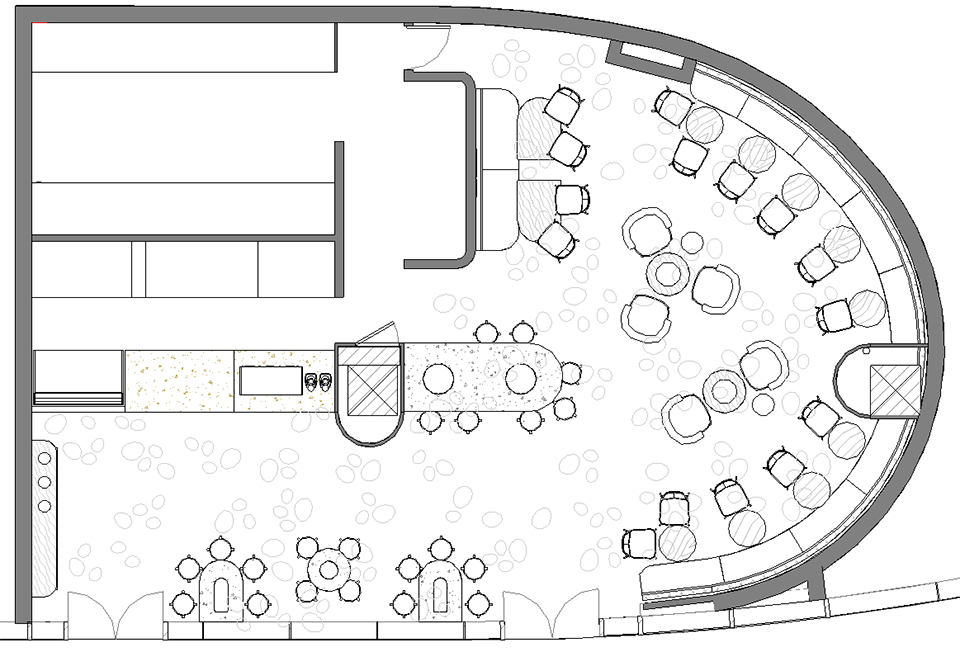
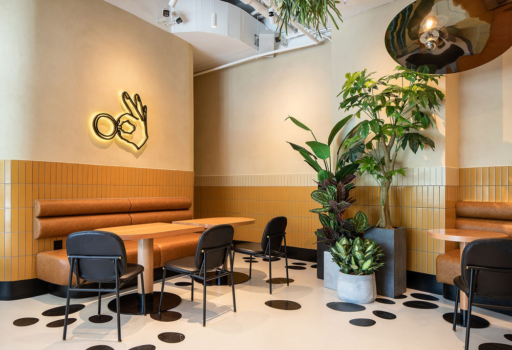
坐落于一排商店的尽头,建筑整体设计的典型特征就是其拥有的一面格外弯曲的墙体。我们利用场地本有的自然形状制作了一个大型弯曲长椅,安置在商店后面的位置,环绕着顾客的座位区域。焦糖色的墙面使黑白定制水磨石地板和定制抛光不锈钢灯具之间的空间变得温暖。水磨石地板是为该项目特别定制的,灵感源于奶茶中的珍珠。每块瓷砖都预先经过切割并嵌入不规则形状的鹅卵石形状石头。然后在现场对每块瓷砖进行编号、安装和抛光,以创造出亮眼且有趣的地板图案。奶茶拥有的曲线和建筑场地本身之间的关系在为提供商店设计理念中发挥了一致的作用。对比色搭配的水磨石桌通过相交的弯曲底座和桌面也继续延续了这种关系。
The site being at the end of a row of stores had an extremely curved wall end typical to the buildings overall design. Using the natural shape of the site we formed a large curving banquette, which nestles into the back of the store, wrapping around the customer seating area. Caramel coloured walls warm the space between the striking black and white custom terrazzo floor and custom polished stainless steel lighting fixtures. The terrazzo floor was custom made especially for the project, inspired by bubble tea balls, each tile was pre-cut and inlaid with irregular pebble shaped stones. Then each individual tile was numbered, installed and polished on site to create the eye-catching and playful floor pattern. The relationship of the bubble tea curves and of the building site itself played a consistent role in informing the design of the store. The terrazzo tables continue this relationship, with intersecting curved bases and tabletops in contrasting colours.
▼入口区域,entrance © Brian Chua
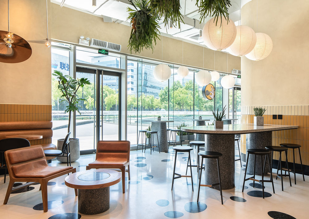
▼焦糖色墙面搭配黑白定制水磨石地板,caramel coloured walls with black and white custom terrazzo floor © Brian Chua
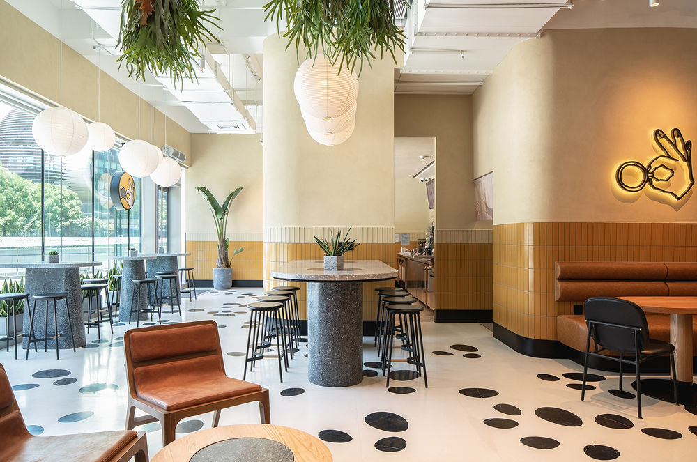
▼制作区,service area © Brian Chua
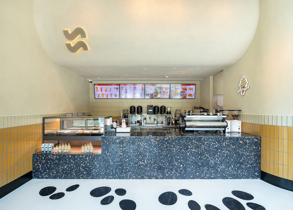
▼从入口望向座位区 © Brian Chua view to seating area from entrance
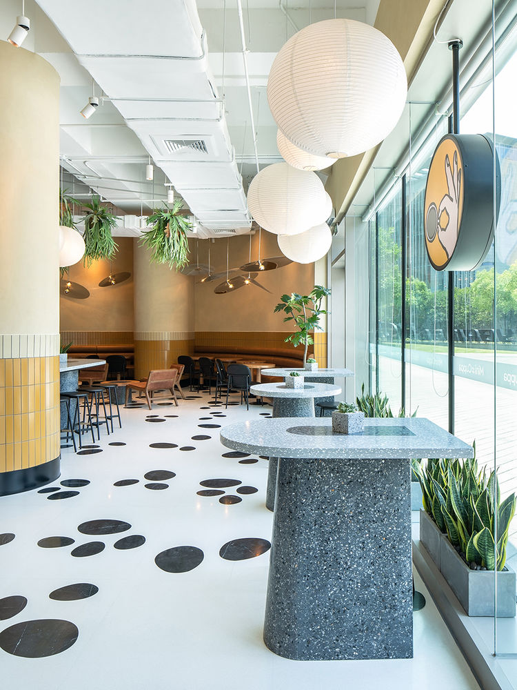
▼座位区,seating area © Brian Chua
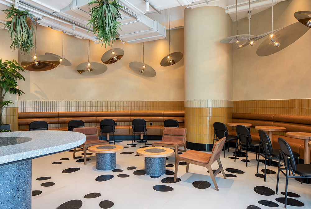
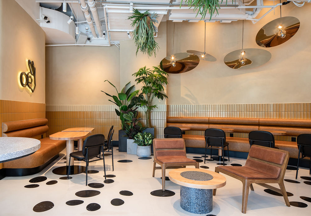
▼格外弯曲的墙体,extremely curved wall © Brian Chua
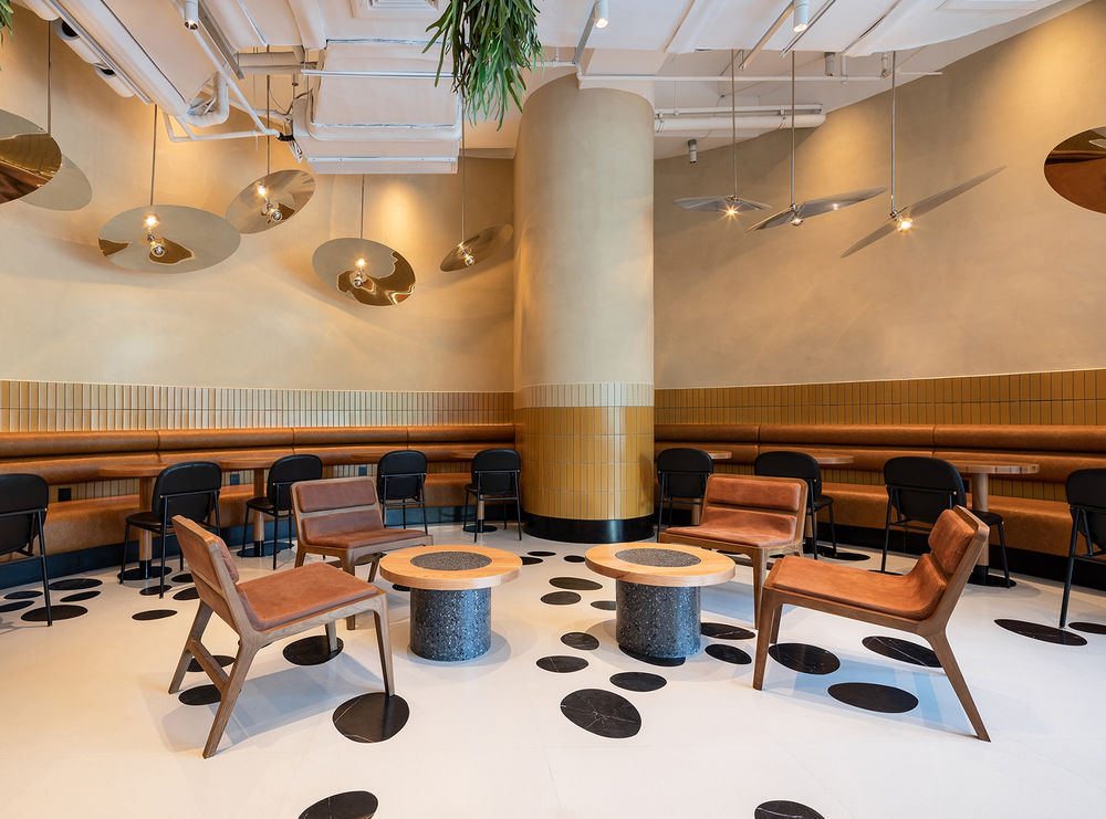
▼大型弯曲长椅,large curving banquette © Brian Chua
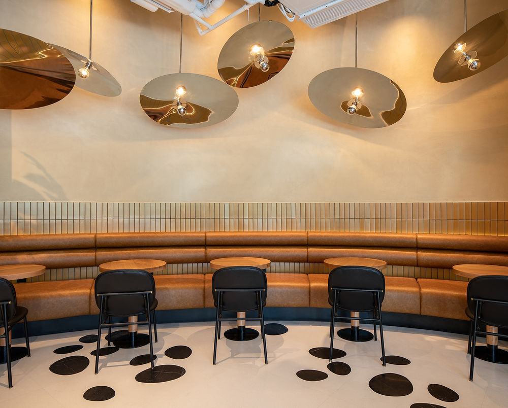
▼座位区一角,corner of seating area © Brian Chua
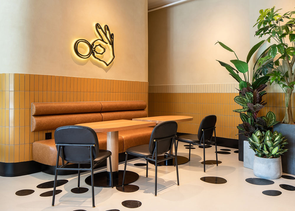
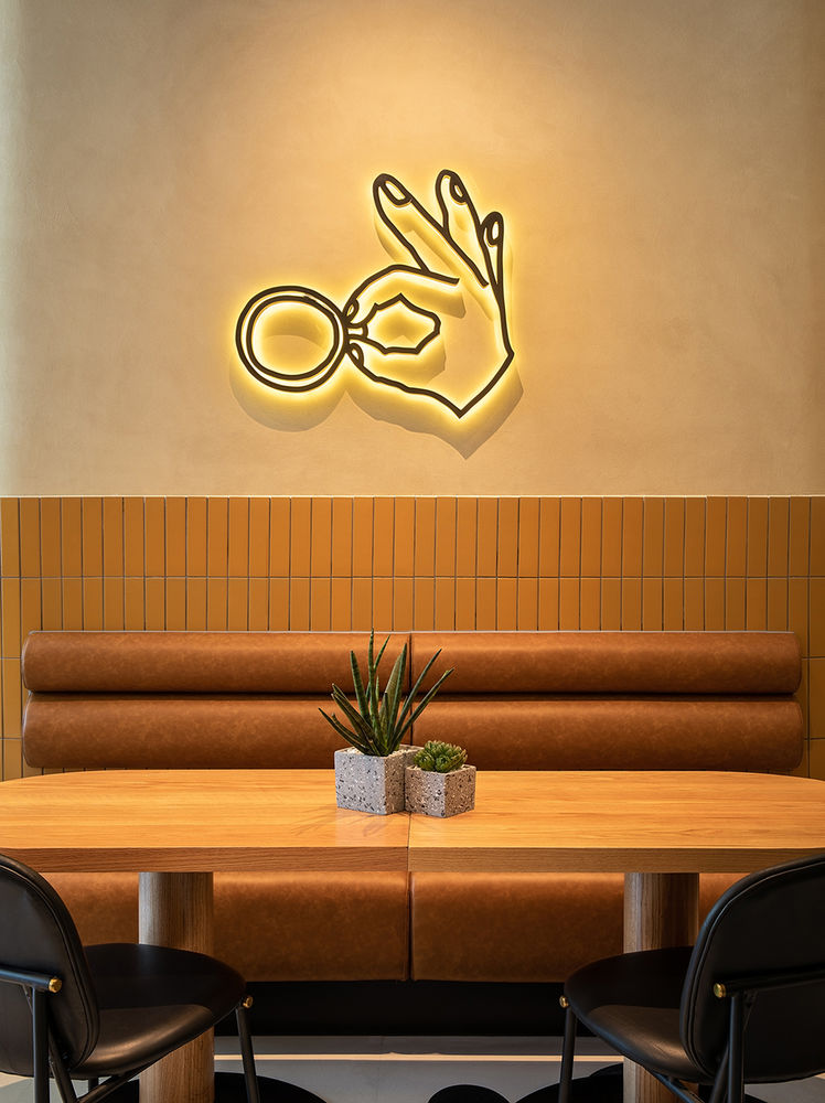
▼发光标识,luminous logo © Brian Chua
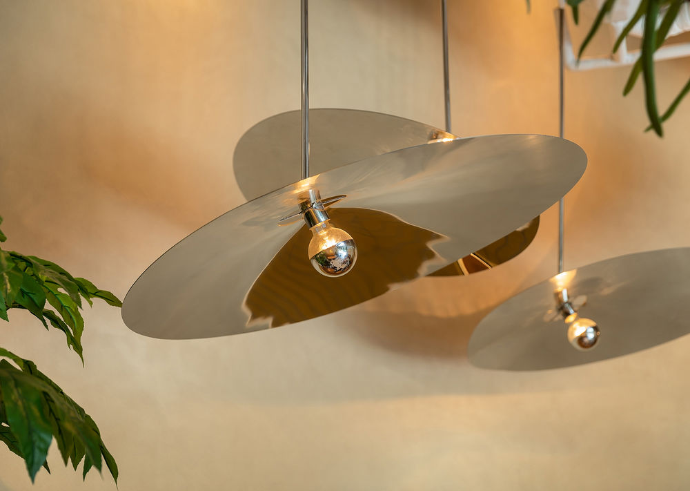
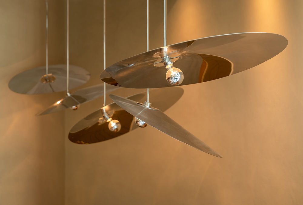
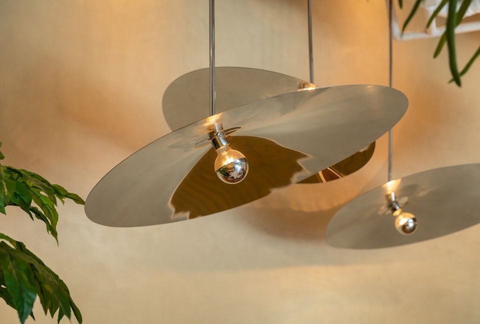
在大型环绕式的弯曲长椅上方悬挂的大型抛光不锈钢圆盘形坠饰也是为此项目特别订制。每个圆盘都被折叠成轻微圆锥形体并悬挂在指定角度。通过圆锥体和摆放角度的不规则性,我们可以通过旋转该装置来创造一个独特的类似于雕塑的灯光效果。随着阳光在空间里移动和变化,它们也会对光进行反射并与其互相影响。大型的纸灯笼和绿植使空间变得柔和,增添了轻松的氛围感。Hannah说: “总而言之我们希望创造一个可以让人们脱离上面商业大楼办公桌的空间,可以和同事聊天休息,并享受这样轻松、有趣,同时能够激发灵感的空间。”
Above the large wrapping banquette, large polished stainless steel disk shape pendants were also custom made for the project. Each circular disk was folded to create a slight cone shape and hung on an angle. Using the irregularity of the cone and their angle we could play with the installation rotation to create a unique and sculptural lighting piece. As the sunlight moved through the space during the day these reflected and interacted with the light. Large paper lanterns and planting soften the space and add to its relaxing atmosphere. Hannah said “Overall we wanted to create space where people could take a break from their office desk in the tower above and socialize with colleagues and enjoy an inspiring, light and fun space.”
▼大型抛光不锈钢圆盘形坠饰,large polished stainless steel disk shape pendants © Brian Chua
▼平面图,floor plan © hcreates
