Firm: DELUTION
Type: Commercial › Office
STATUS: Built
YEAR: 2018
SIZE: 0 sqft - 1000 sqft
THE DIAL is an interior design concept applied to Traveloka ofiice which includes Diagonal & Industrial nuance. The Development of workspace that follow the times and the emergence of millenial generation is now starting its impact. As an office which has a young and dinamic culture, Traveloka wants to present a workspace, which is not monotonous and rigid for its employees.
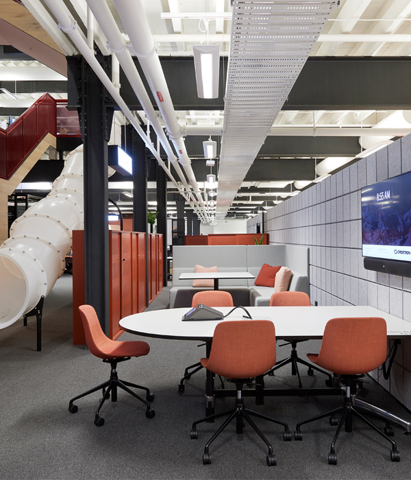
The Industrial Design at Traveloka office is supported by several materials which is exposed ceiling, iron pipes, and color acquisition. Industrial design was chosen because of the easy maintenance factor.
The impression of fun and not rigid, so employees can work comfortably while still being able to feel the formal impression of an office.
To support this, architect brings the industrial design style, so create and apply the main concept which is Diagonal, and several supporting concepts which is Pop Up, Collaborative Spot, and the application of capsule room concept.
DIAGONAL
As an office which has a young and dinamic employees, architect tries to present mon-monotonous atmosphere by choosing the main concept of ‘Diagonal’
This diagonal concept is applied by applying the diagonal pattern on the office element. This pattern is applied by applying flooring, table ararngement, wall pattern, and ceiling.
POP UP
Industrial Design Concept with monochrome colours. But to make the fun impression and not rigid and support the Diagonal concept, architect applies the concept of ‘Pop Up’ on the use of colors in the office that cannot be separated with the identity of Traveloka itself.
The color used for the office area itself is a combination of Yellow, Orange, and Blue. But there are differences in the use of color in technical subspace. In this room due to more of male employees, architect tried to present the masculine sideby using monochrome colors
In addition, 'Pantry' also has a different color from the workspace but has the same concept, which is Diagonal. This is deliberately applied so that the 'pantry' becomes a more relaxed place and presents a new atmosphere outside the atmosphere of the workspace
COLLABORATIVE SPOT
Many collaborative spots in this office are provided to support office activities which are no longer rigid, there are a lot of facilities or spots that can be used as informal discussion areas that are spread in various parts of the office.
The use of informal couches for meetings also supports the concept of Collaborative Spot.
In addition, the dynamic employees in this office, architect decided to implement an open office design so employees can communicate easily. Besides the use of open office also aims to anticipate that the office looks more spacious and relieved. This concept is applied by minimizing the use of insulation in the office.
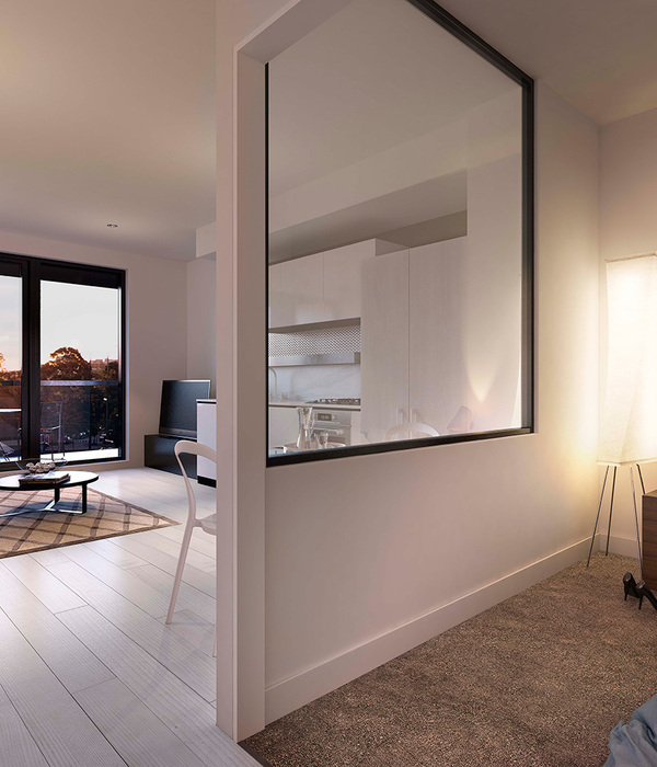
For some parts that require a partition,architect anticipates by using transparent glass.
CAPSULE ROOM
In this era, employees are required to be dynamic in their work, so there are worries lack of rest and leisure time from employees which will affect the employees work quality itself.
Starting from there, client wants to bring comfort to the employees by presenting a "napping bed". To make the concept of napping bed comfortable and private, architect designs the napping bed with the concept of ‘Capsule Room’ so employees can enjoy relaxing or resting time comfortably and without being interrupted, as well as private.
{{item.text_origin}}

