Firm: Wheeler Kearns Architects
Type: Cultural › Gallery Industrial › Warehouse
STATUS: Built
YEAR: 2017
“Don’t screw it up”
An old machine shop was found, off the beaten path, up against the tracks.
A gallery owner asked us to look at it.
Messed up façade. Tired, listing trusses, rotting roof/drain‐heads, cracked/heaved slab over slab.
But the span, the height, the monitor light was right. Finding the rear courtyard sealed the deal.
We said to ourselves, “Don’t screw it up”
The Sequence
One space to receive
One space to present/absorb/reflect
One space to meander/tinker/discover
One space, outdoors, to catch ones’ breath
The Work
Shell: Roof trusses were restored, reinforced and tensioned; purlins, structural decking replaced, sandblasted to expose the Douglas Fir. A central portal was opened, for vehicles and pedestrians alike. (design problem: concealed security shutter, sectional truck bay door, accessible entry on property line, all in “one move”).
Within: A new concrete floor, ground, carefully rises, plateaus, rises.
Atop this, a visually disengaged, “floating, inner liner” of flat white painted gypsum.
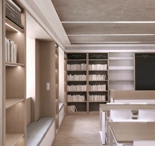
Douglas Fir reception top and library shelves.
Heights and widths and depths and lines are implicitly interrelated.
New metals are brushed silver; structure, sash, mechanical, lighting, fans, trim.
Two large rolling walls live in the main room, each the width of one portal. (These are initially mudded together, but will migrate over time.)
That’s it.
Donald Judd said “art and architecture should always be symmetrical except for good reason”.
Bill Turnbull said he wanted “my work to appear that of a farmer”, as if he was not there.
It’s harder than it looks.
{{item.text_origin}}


