Bucharest 现代主义建筑重生记
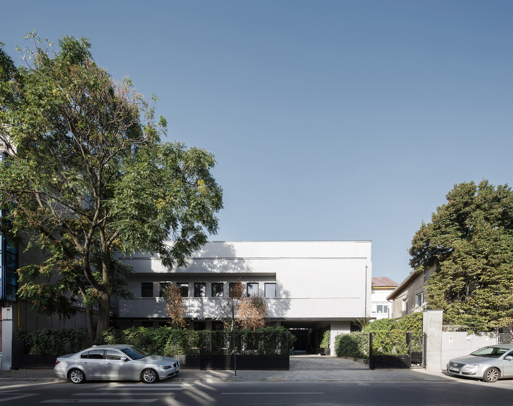
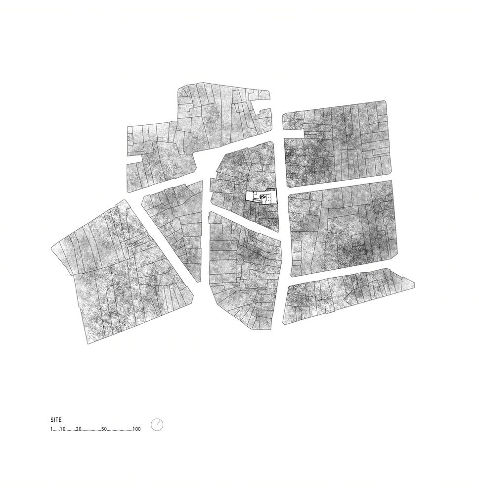
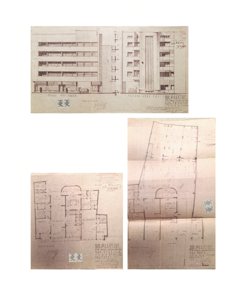
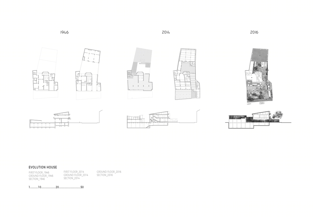
The story of the house on Vasile Lascar St. is the story of many modernist houses in Bucharest: it has undergone numerous changes in ownership, usage and general configuration between 1946 when it was built, and 2014, when we were appointed to revitalize it.
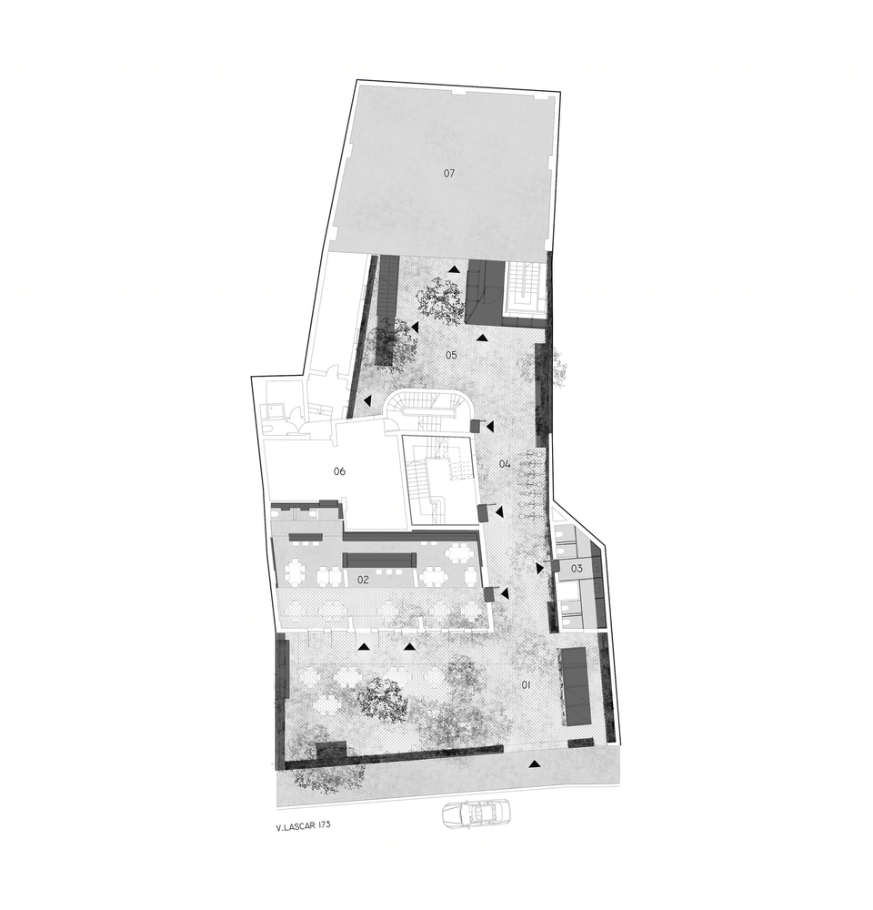
VASILE LASCAR HOUSE IN NOVEMBER 2014 We found the house empty, in a derelict state: all the finishes stripped off by the passage of time, the first-floor windows walled in, the lower level partially flooded, PVC paneling enclosing the ground floor open access passage with the intention of increasing the internal ground floor area.
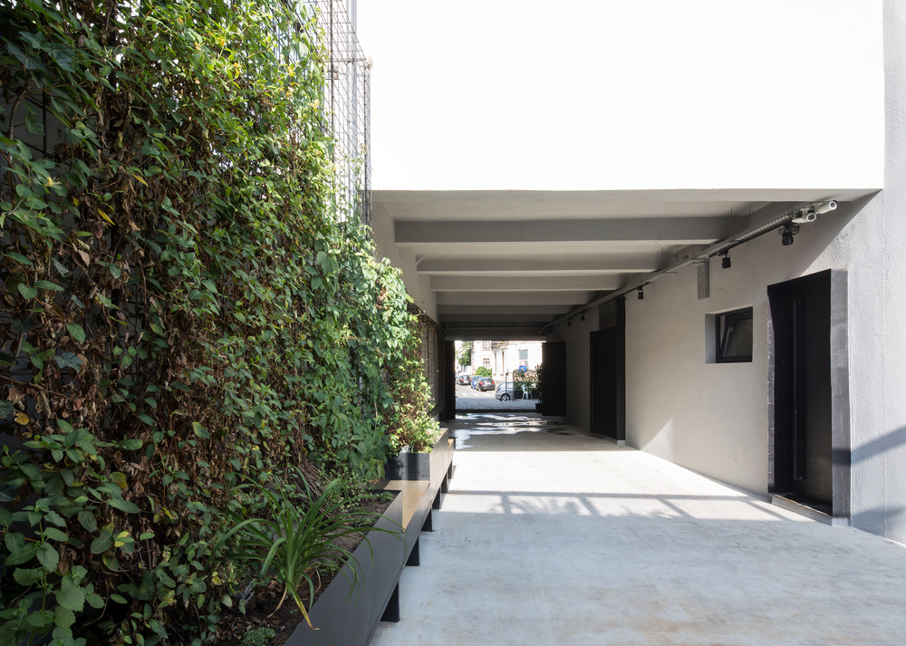
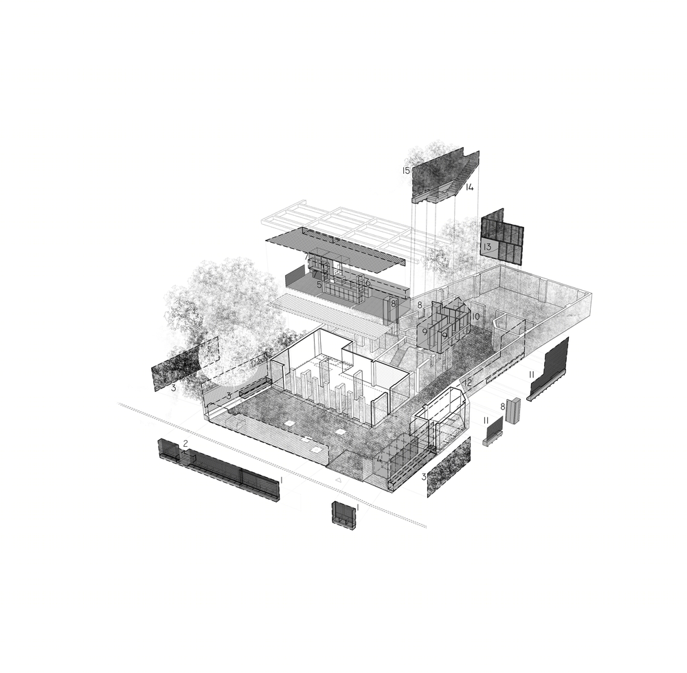
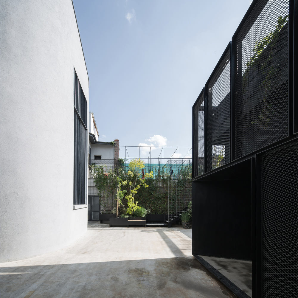
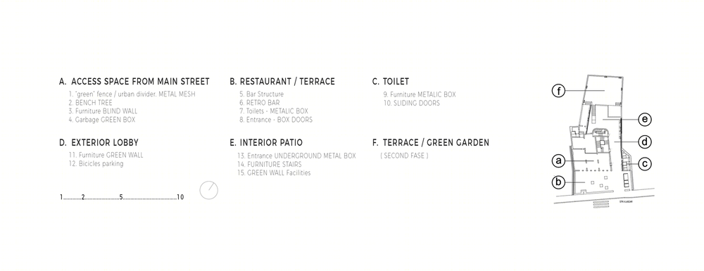
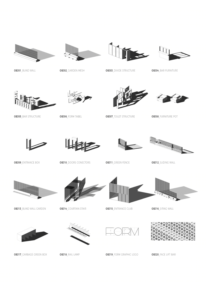
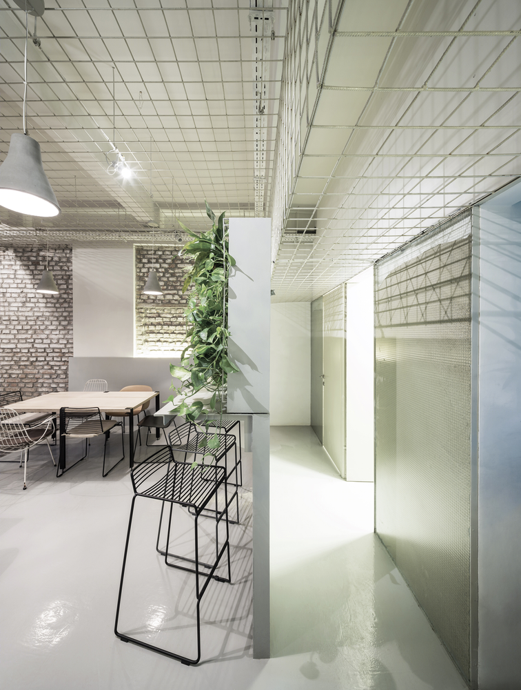
THE PROJECT Our proposal aims at recovering the original internal space quality through the insertion of a bespoke infrastructure perfectly adapted to the client’s brief. We embarked on the project as you would an archaeological survey: on dismantling the improvised interventions of the former occupants we discovered the generosity of the original space, designed in the 1940s. The strict budget limitations prompted us to be resourceful in the use of a restrained materials palette, organized in simple geometries only: metallic mesh and reinforced glass screens, green living walls, folded metal sheets.
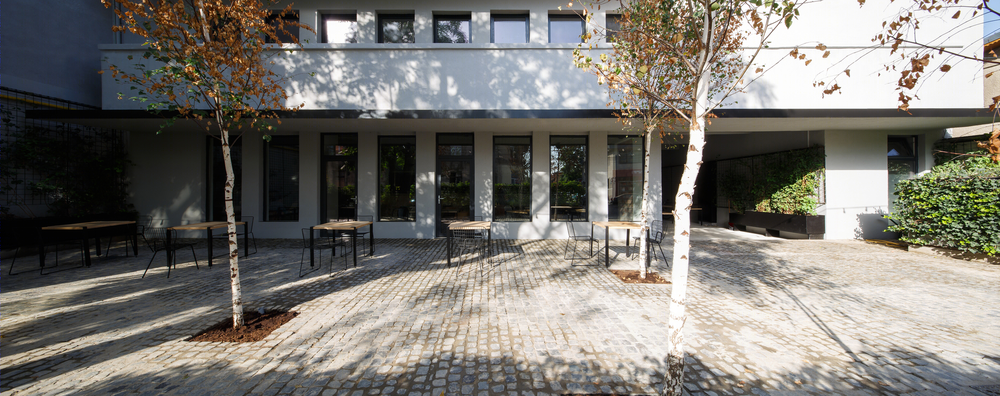
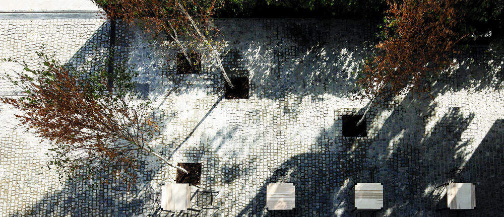
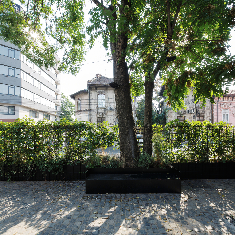
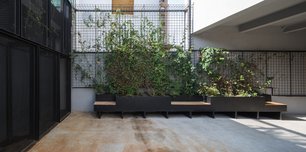
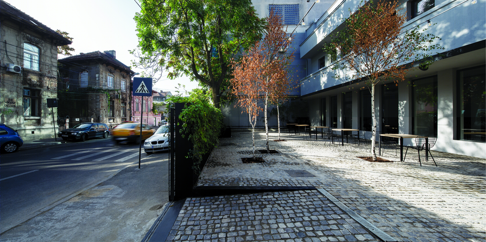
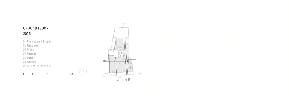
The project is designed as a series of spatial interventions that revitalize the neglected building and re-introduce it to the public. The site limit on Vasile Lascar St. takes on ambiguous features: urban bench, lush planter, and services housing unit, a mobile gate that defines a new public square pocket in front of the house when fully open. The metal grid unifies the transition from the open passage towards the internal courtyard and the future terrace.
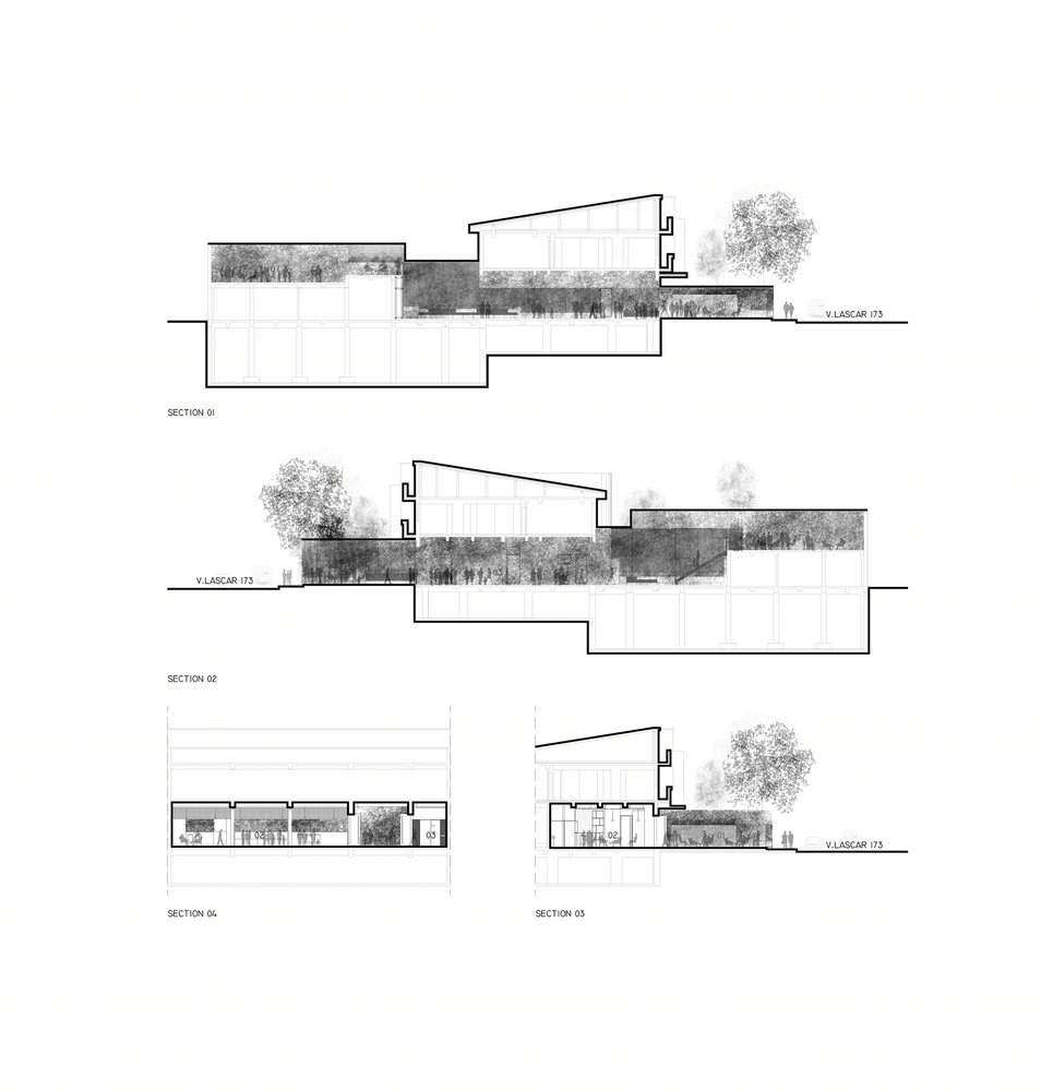
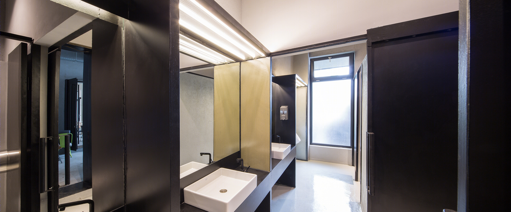
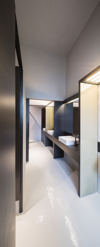
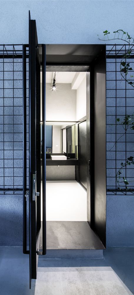
Each one of the new spaces are accessed through a folded metal plate doorway that punctuates as thresholds and also set a functional hierarchy for the design, as connectors. We also designed the escape stairs, the bespoke panels for toilet cubicles, the bar and worktops, and the planted screens as elements that all reinforce the proposed spatial concept for the client’s brief.
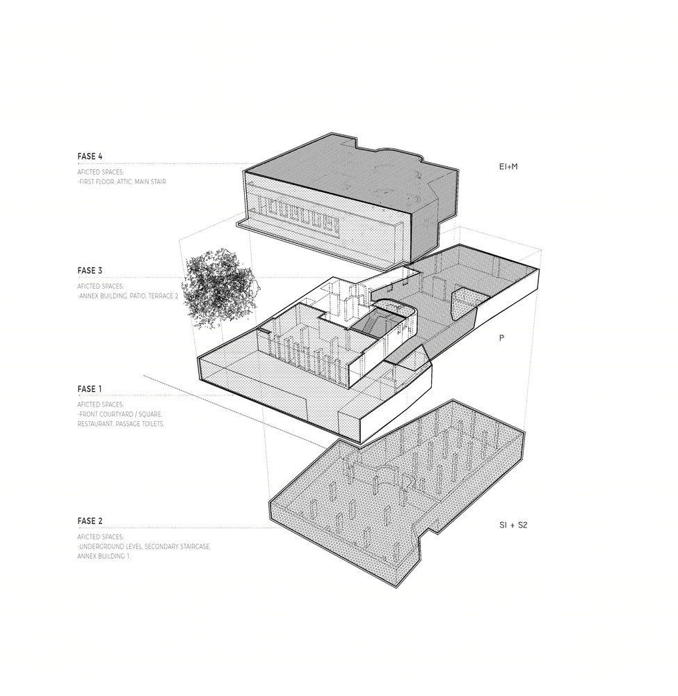
The team involved in developing FORM designed it as an open-end project, structured in phases that would enable useful feedback for the sequential design: PHASE00: General repairs, stripping off and demolition of redundant temporary structures. PHASE01: Ground floor restaurant and front of house pocket square. PHASE02: Lower ground floor multifunctional spaces and main stair. PHASE03: Private terrace and first floor gallery.
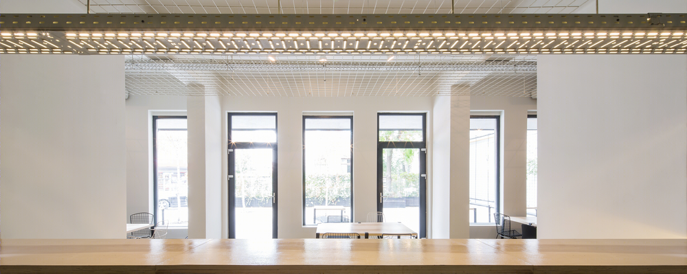
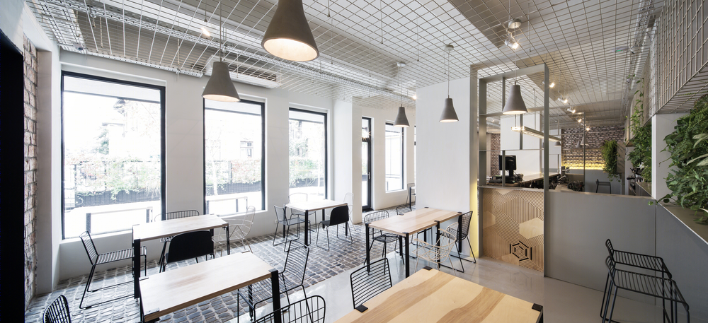
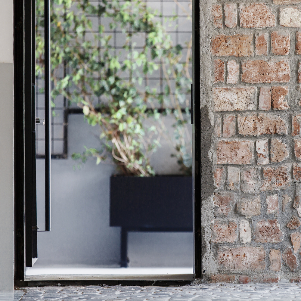
The space assigned to the restaurant on the ground floor is wide and narrow, therefore we decided to amplify it visually and merge it with the outdoors urban pocket in front of the house by letting in the external landscape, the basalt pavers, and the greenery. The original building fabric is highlighted by the monochrome palette of the proposed interventions: metal fixed furniture, basalt grey pavers, thin metal plinth that offsets the existing brickwork from the smooth floor finish in the dining area.
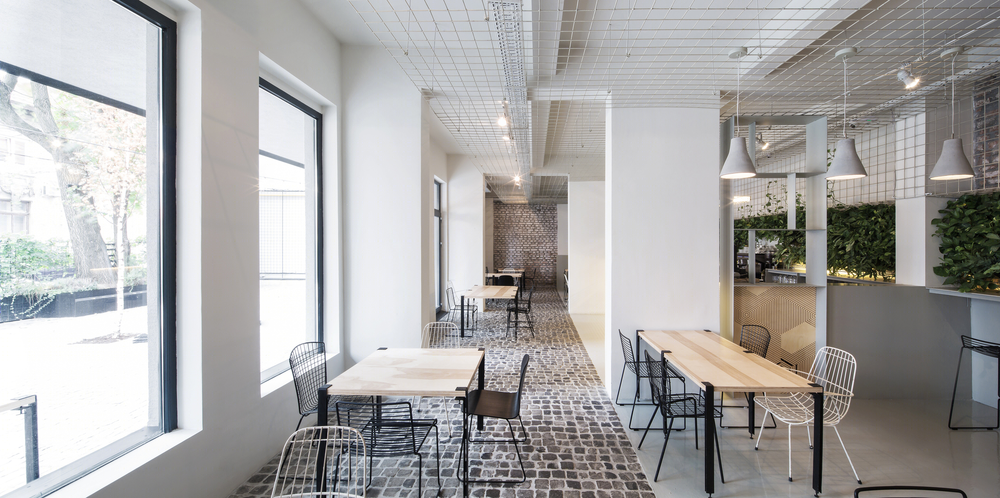
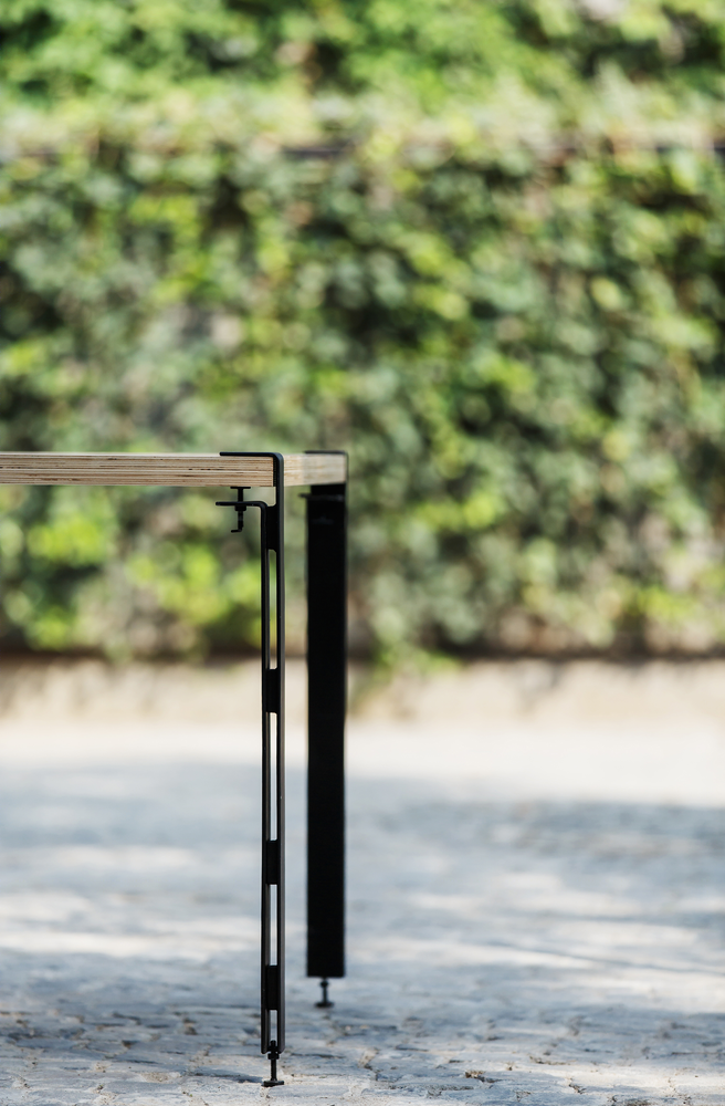
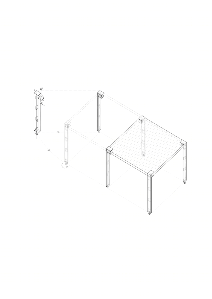
All bespoke fittings and loose furniture are designed in the same industrial spirit: the bar lights are using cable containment trays, the table legs are metal flat clamps. The drive of the project was to initiate an elastic dialogue with the old house, inviting the fleeting manifestations of urban life, changing in accordance to these, and then re-morphing by design.
