哈梅实体店 | 电商品牌融入实体的创新设计
架构师提供的文本描述。哈梅的第一家实体店为购物者提供了一种发人深省的解药,以解决其惯常的虚拟访问。拥有100多万在线用户,该品牌现在的目标是培养体验在线和关闭。AIM设计了位于安福路上的商店,以创新电子商务的样子.这是一个为人和平台设计的机会,创造了一个美丽的、发自内心的空间来体验在屏幕后面所做的事情如何仍然能被深深地感受到。
Text description provided by the architects. Harmay’s first brick and mortar store offers shoppers a thought-provoking antidote to its customary virtual visits. With over 1 million users online, the brand now aims to cultivate experiences online and off. AIM designed the shop, located on Anfu Lu, to innovate what e-commerce looks like. It was an opportunity to design for people and platform, creating a beautiful, visceral space to experience how what is done behind a screen can still be deeply felt.
© Jerry Yin
(三)尹杰良
我们的网络文化和不断的点击意味着体育购物的目的是值得讨论的。数字市场场所和在线品牌已经打乱了消费者体验传统零售的方式。2016年,中国网上购物市场的交易额约为4.7万亿元-这是一笔很大的交易!那么,随着越来越多的消费者在网上购物,为什么一家成功的电子商店会在现实世界中开设商店呢?什么会激励人们离开舒适的沙发去购买网上现成的东西呢?
Our online culture and constant clicking means the purpose of physical shopping is up for debate. Digital market places and online brands have disrupted the way consumers experience traditional retail. Transactions in China’s online shopping market totaled some 4.7 trillion yuan in 2016 – that is a lot of shopping! So with more and more consumers moving online to do their purchasing, why would a successful e-store set up shop in the real world? What would inspire someone to leave the comfort of their sofa to buy something readily available online?
当哈梅,一个成功的在线化妆品品牌,接近我们设计他们的第一家离线商店时,我们问自己这些问题。这是一个有趣的想法,也是我们在AIM中体现出来的一种意想不到的想法。物理空间如何支持电子平台,反之亦然?哈梅的整个品牌本质是网上购物,他们做得非常好,代表了数百个品牌的利基美容产品和化妆品-这是一个完美的在线零售产品,但有了店面,零售商和消费者都有真正的参与机会。
When Harmay, a successful online cosmetic brand, approached us to design their very first offline store, we asked ourselves these questions. It was an intriguing idea, and the kind of unexpected thinking we embody at AIM. How could a physical space support the e-platform, and vice versa? Harmay’s entire brand essence is online shopping, and they do it very well, representing over hundreds brands of niche beauty products and cosmetics – a perfect retail product for online, but with a shop front, both retailer and consumer have a real opportunity to engage.
© Jerry Yin
(三)尹杰良
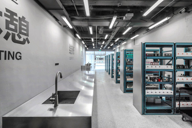
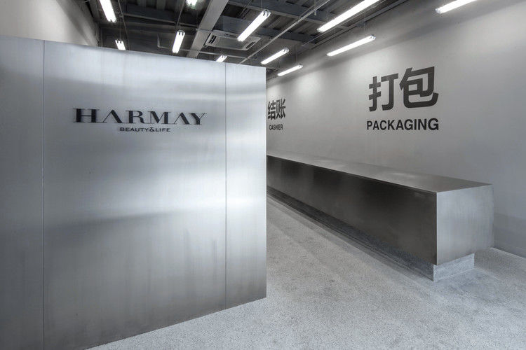
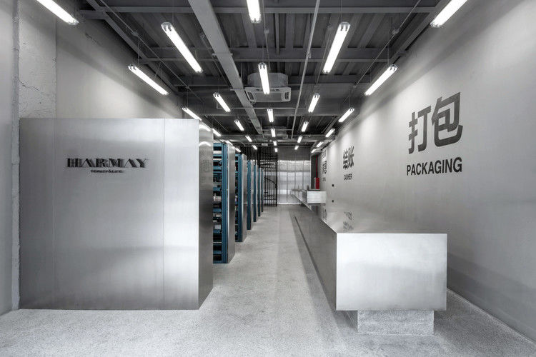
我们决定不重新发明轮子,而是看一下机器上的齿轮。这家实体店打扮得像个仓库,但位于前法租界的黄金地段-在所有可爱的精品店中,这或许是一个大胆的选择,但哈梅准备采取不同的做法。就像走进在线外观的玻璃,设计反映了业务的核心,并直接将购物者带到幕后。
We decided not to reinvent the wheel, but instead provide a look at the cogs in the machine. The physical store is dressed up like a warehouse, but located in a prime spot in the Former French Concession – perhaps a bold choice among all the cute boutiques, but Harmay was ready to do things differently. Like stepping through the online looking glass, the design mirrors the core of the business, and brings shoppers directly behind the scenes.
© Jerry Yin
(三)尹杰良
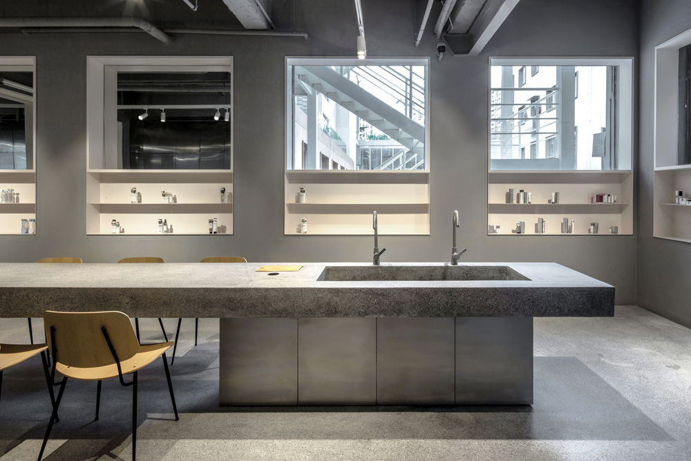
外墙采用透明聚碳酸酯面板。在古老的门面上,它使商店与街道上的其他精品店区别开来,同时也为人们熟悉网上购物提供了一种发自内心的体验。里面有一种干净、精确的仓库感觉,甚至像实验室一样。
A transparent polycarbonate panel was used for the façade. Layered over the old façade, it gives the shop visual distinction from a line of other boutiques on the street, but also provides a visceral experience to the familiarity of shopping online. There’s a clean, precise warehouse feel within, even laboratory-esque.
© Jerry Yin
(三)尹杰良
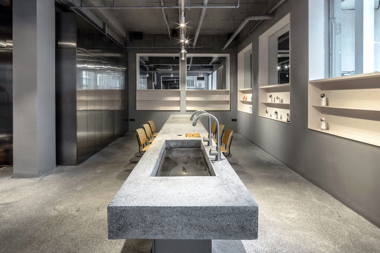
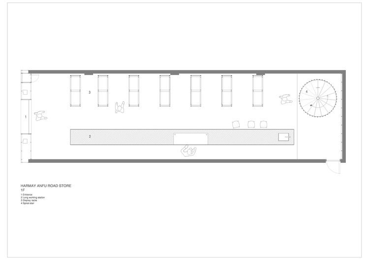
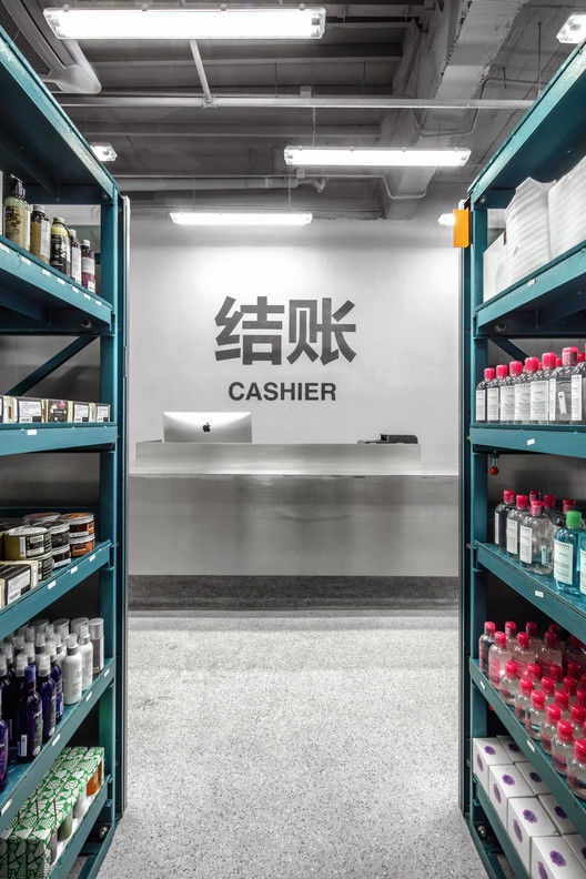
我们的想法是,这个空间就像心脏一样运作-你可以说,这是品牌的“厨房”。哈梅仍然存在于网上-但这里是一切发生的地方,是行动的中心。当你选择一个新的洗面奶,比较香水瓶,或尝试一种唇色时,其他人也在做同样的事情-网上订单源源不断,产品由真实的人精心挑选和包装,然后发送到世界各地。现实生活中的购物者也成为在线过程中不可或缺的一部分。
Our idea was this space operates as the heart – the ‘kitchen’ of the brand, you could say. Harmay still very much exists online – but this is the place where everything happens, the center of the action. While you select a new face wash, compare perfume bottles, or try on a lip color, others are doing the same – online orders stream in, products chosen and carefully packaged by real people, and sent out into the world. Shoppers in real life become part and parcel to the online process, too.
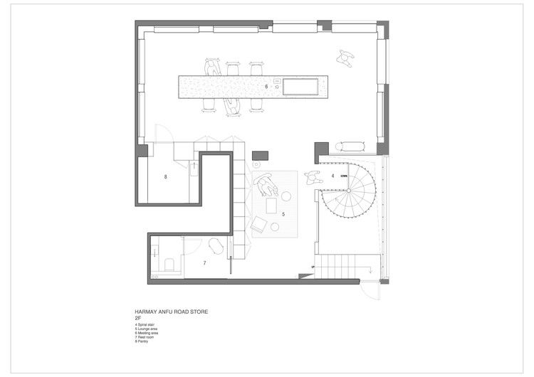
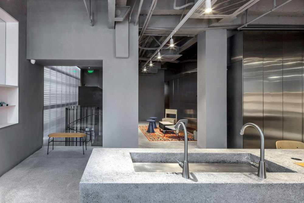
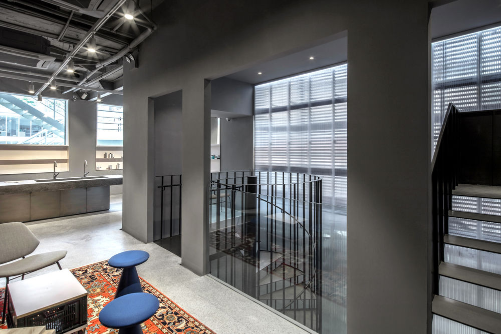
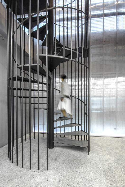
一个螺旋金属楼梯带购物者到二楼的一个小空间。在这里,氛围更多的是休闲和休闲,而不是买卖。
A spiraled metal staircase takes shoppers to a small space on the second floor. Up here, the vibe is more lounge and leisure than buy and sell.
© Jerry Yin
(三)尹杰良
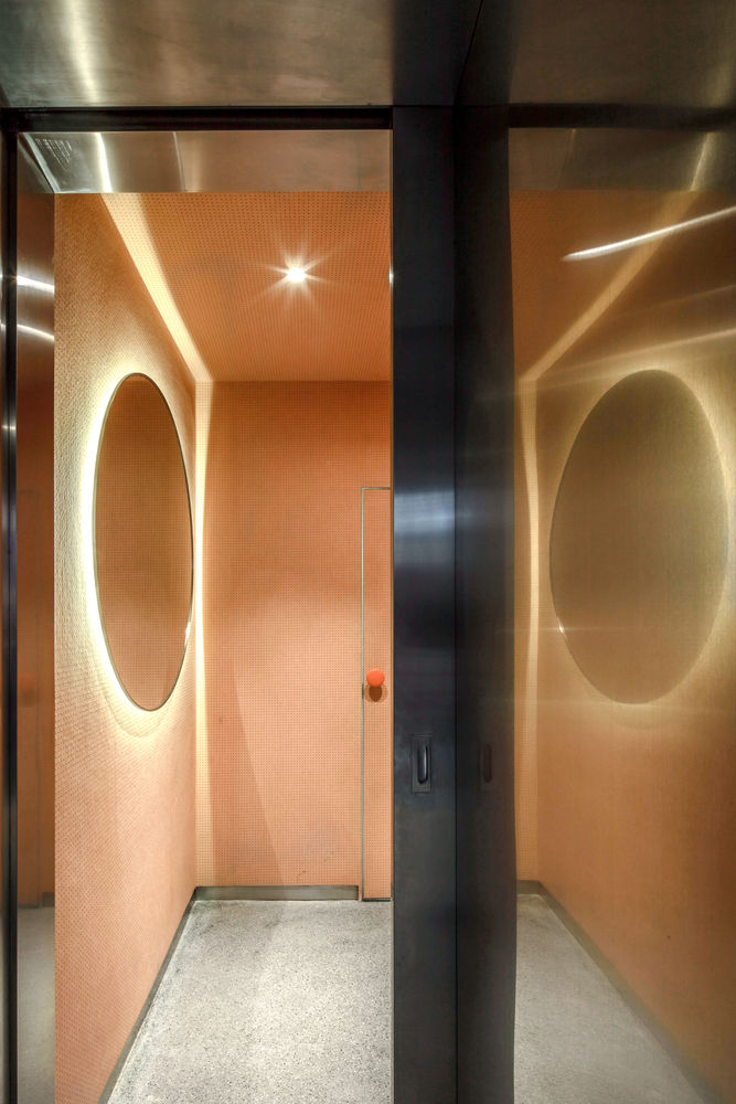
红色调色板与手工制作的老式地毯、折叠式家具和蓝色电动凳子混合在一起。作为一个活动空间和新产品发布,它是一个理想的地点交换美容提示,或测试驱动新的项目。如果第一层把你带到已知体验的幕后,那么二楼就会让你回到舒适的区域。发现生活在事务性点击中的生命的物质化身是令人耳目一新的,了解它们背后的人类体验也同样令人耳目一新。该设计体现了这些感受,并将虚拟体验与复杂,人为中心的地方带入了生活。
A blush palette mixes with a handmade vintage carpet, eclectic furniture, and electric blue stools. As a space for events and new product launches, it’s an ideal spot to swap beauty tips, or test drive new items. If the first level takes you behind the scenes of a known experience, the second floor puts you back in your comfort zone.It’s refreshing to find physical incarnations of a life lived in transactional clicks, and equally refreshing to know the human experience behind them. The design reflects these feelings, and brings to life the virtual experience with a sophisticated, people focused place.
© Jerry Yin
(三)尹杰良
