JOOM HQ LENINGRADSKY AVE 37, BLD 7, MOSCOW AREA: 2000 M2 PROJECT: 03.2018-11.2018 BUILDING: 04.2018-01.2019 AUTHORS, ARCHITECTS: EVGENIY SHCHETINKIN, LEEZA SEMIONOVA 3D VISUALIZATION: BOGDAN VITKOV, EVGENIY SHCHETINKIN PHOTO: POLINA POLUDKINA CLIENT: JOOM RUSSIA GENERAL CONTRACTOR: CAPITAL DIRECT ENGINEERING: CAPITAL DIRECT LIGHTING: LIGHTNET, IGUZZINI, ARTEMIDE CEILING: ECOPHON FLOORING: DESSO WALLS: CAPITAL DIRECT, SUPERPLY FURNITURE: MAGIS, NARBUTAS SANITARY: DURAVIT, HANSGROHE
INFO:
IT company Joom is a marketplace and an application that provides the opportunity to purchase goods from China. According to Google, Joom became the most popular application in its segment in 2016 and ranks second in Russia.
V12 Architects were invited a few months before the construction, so the design took place in parallel with the implementation. The task was to rethink the initial zoning of the space and reflect company's identity and the specifics of its work. Architects sought to create a conceptual, non-trendy interior, but at the same time functional and balanced.
“The tight deadlines imposed certain limitations in conceptual and technical capabilities, but nevertheless, we managed to realise all the ideas as they were made in the concept.” - architect says.
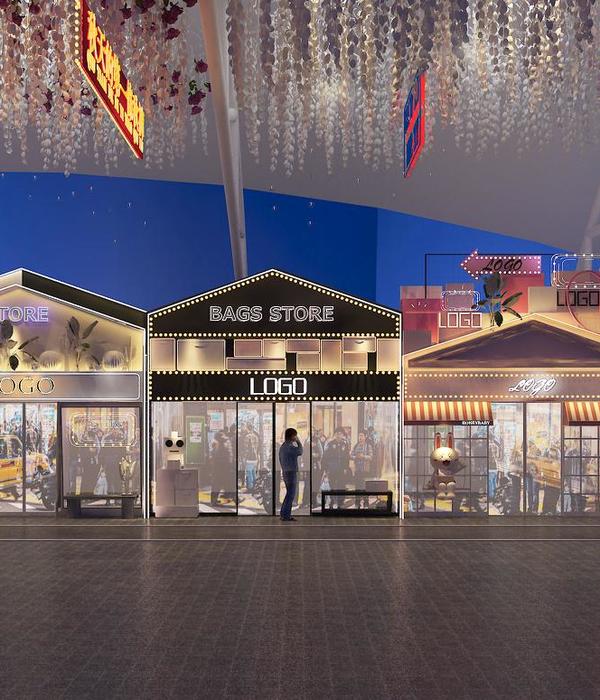
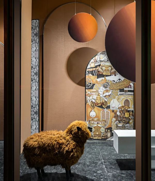
Conceptually, the core of the office represents the idea of the city, its squares and streets, formed by a single mono-structure of interlocked houses of various forms. The space is made of contrasting dense woody shell and the light, translucent perimeter.
A single compositional dominant emerged from the dense core of multiple meeting rooms. Thus, all work desks were placed around the perimeter of the building with prevailing natural lighting. Numerous meeting rooms and spaces for individual and team work, technical and service facilities are integrated into the central volume of the “city”.
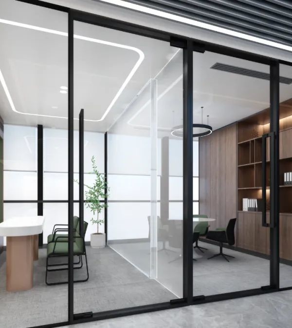
The introduction of translucent glass volumes around the perimeter of the facade fragmented the open space, creating comfortable working areas. The goal was to prevent employees from feeling part of a huge factory.
The conceptual solution allowed:
1. Balance complex and rich program of functions and facilities
2. Make airy and open space
3. Minimise corridors and leave more space for workstations
4. Diverse space: each part in the office has its own city block, which helps to navigate. (For the speed of movement, scooters with parking lots is organised)
5. Reveal and strengthen panoramic city views of the neighbourhood.
All partitions are made of transparent glass, which opens a city panorama, seen immediately from the elevator hall. The spatial composition is balanced by suspended mesh clouds, landscaping, neon logo and dichroic film on glass partitions.
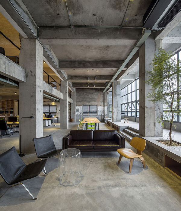
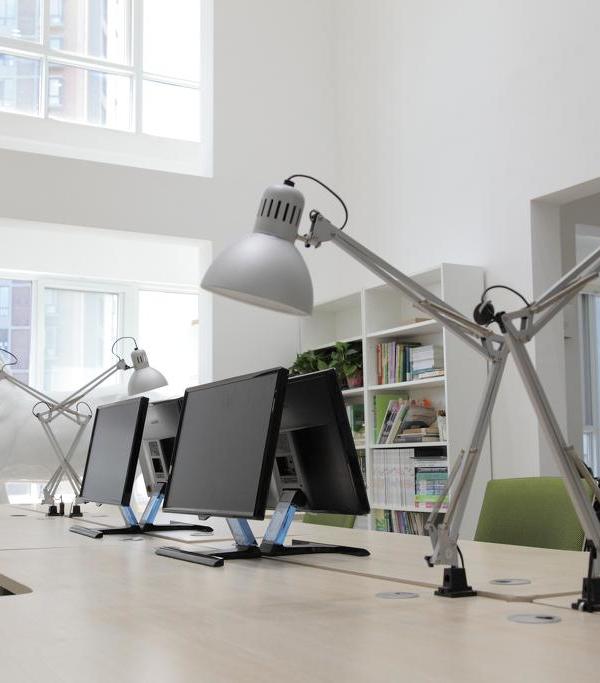
Globally, office lighting is built in unusual way. In the afternoon natural lighting from huge stained-glass windows gets in. In the evening all workstations are illuminated with floor lamps: the lower light illuminates the desks, and the upper light floods the entire space, creating a very comfortable mild effect. Lamps are individually dimmed and can change brightness depending on weather conditions outside.
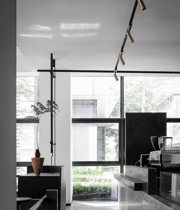
Track system highlights the core of the office, consisting of houses.
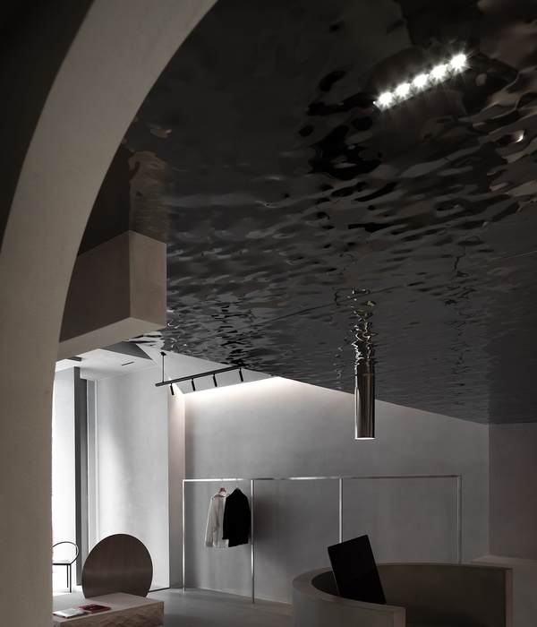
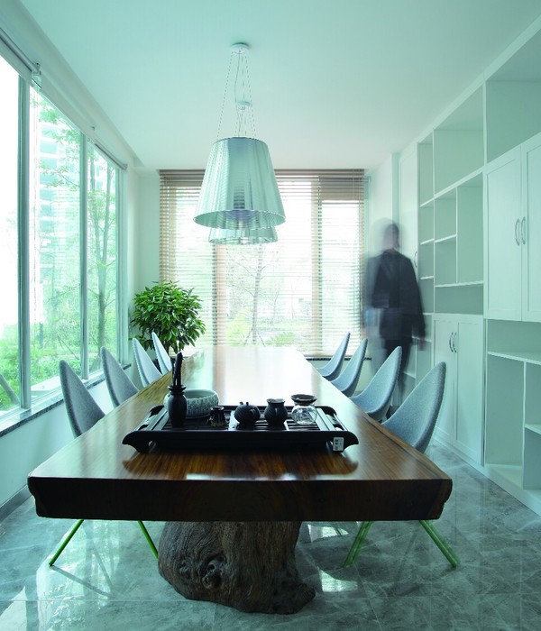
Inside the meeting rooms - are decorative lighting solutions.
{{item.text_origin}}

