Location:Austin, TX, USA
Category:Libraries
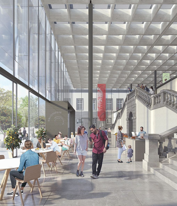
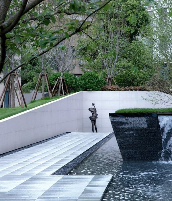
The long-anticipated Austin Central Library opened in the Fall of 2017, and while the building itself is stunning with equally beautiful views of Shoal Creek, the public land that surrounds the north and east sides of the library also offers residents of Austin a relaxing park in which to walk, bike, read, and socialize. Austin-based MWM Design Group was the landscape architecture firm working with Austin’s engineering department to create the public spaces adjacent to the library.
The city and MWM’s vision was to create a viable open public space that would transition seamlessly from the building to the park to Shoal Creek. It was also important to have a visual connection to the creek from both the library and park and to offer gathering spaces outside the library. The park area to the east and north of the library is approximately 300 feet by 125 feet and then extends north of the library along Shoal Creek another 600 feet.
MWM’s task was multifaceted: create the park, manage storm water and flood control, manage bicycle traffic on Lance Armstrong Bikeway, which runs through the entire library park space, and automobile traffic on 2nd Street, which runs along the north side of the library. “Our site design changed the landscape and flows in the creek,” says MWM’s David Cazares. “We stabilized the creek walls using mechanically stabilized earth and natural stone that didn’t look like it was stabilized and armored. The creek walls now emulate walking along rock edges.”
MWM advocated for turning 2nd Street into a woonerf through the park area, giving equal access to bikes, people, and vehicles. “We had a lot of firsts with this project,” say Cazares. “Creating a woonerf was one of them; there were none in the city,” says Cazares. “Our goal was to redesign the street, getting rid of curbs and creating a plaza and open street along the library. Cars still have access, but landscaping and bollards signal that this is a slow speed, pedestrian-friendly street.”
MWM used site elements as visual cues to help manage the interaction of people, bikes, and cars throughout the park. Paving areas helped to define use. Glass pavers, for example, were installed in the area where greater interaction between bicyclists and people using the library occurs. Elevation was another element that separated spaces and defined use. “Functions associated with the library, such as the plaza, are closer to library level,” explains Cazares. “The bikeway, which runs between the library and the creek, is at the intermediate level. Shoal Creek Walkway is at the third level, closest to the creek.”
The choice of Alcott area lighting and Hawthorne path lighting addressed two characteristics MWM was looking for in light fixtures. “First, the fixtures had to stand on their own as architectural elements,” says Cazares. “Second, the lights needed to have a relationship, be part of the same family, so that no matter where you were in the park, you knew you were associated with the library.”
MWM worked with Landscape Forms to create the lighting plot, which was needed early on in the design, since the lights were being used as architectural elements within the park and needed to conform to the city’s lighting requirements. “Landscape Forms helped our design team model light levels and light patterns, which was important in defining where the lights would go,” says Cazares.
Alcott area lights present a strong vertical element in an overwhelmingly linear space, and their placement establishes a rhythm throughout the park, which extends south to north nearly 1000 feet. MWM appreciated the architecturally unique and artistic form of the lights. “For this project, we didn’t want fixtures that would blend into the background,” says Cazares. “The architectural site elements in the park are primarily the stone and the bridge, so it was important to introduce another architectural element, and that’s something we liked about the fixtures.”
Path lighting serves to define the edges of spaces. One area directly outside the library’s event room is defined by architecturally cut limestone blocks. On the east side of the library is a lawn. MWM installed path lights to mark the edges of those spaces. On the north side, path lighting marks the transition from the street into the library and the upper level of the park from the lower level. MWM placed path lights in line with walkway guardrails as another visual element defining transitions and elevations. “The lights signal the gateway between the hardscape of the library and the natural, landscaped areas,” says Cazares.
▼项目更多图片
{{item.text_origin}}

