首尔 Soui 旗舰店 | 打造洞穴般的购物体验
Architects:HOFFICE
Area :144 m²
Year :2022
Photographs :Kyunseok Seo
Design Team : Ho Han, Seungho Lee
City : Seongdong-gu, Seoul
Country : South Korea

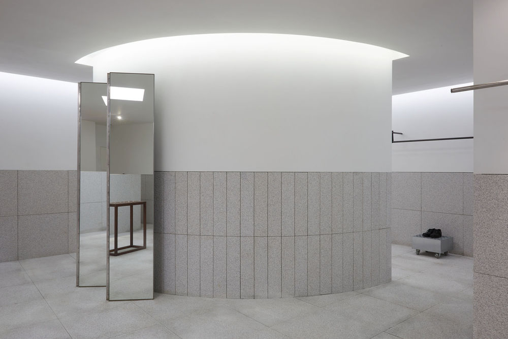
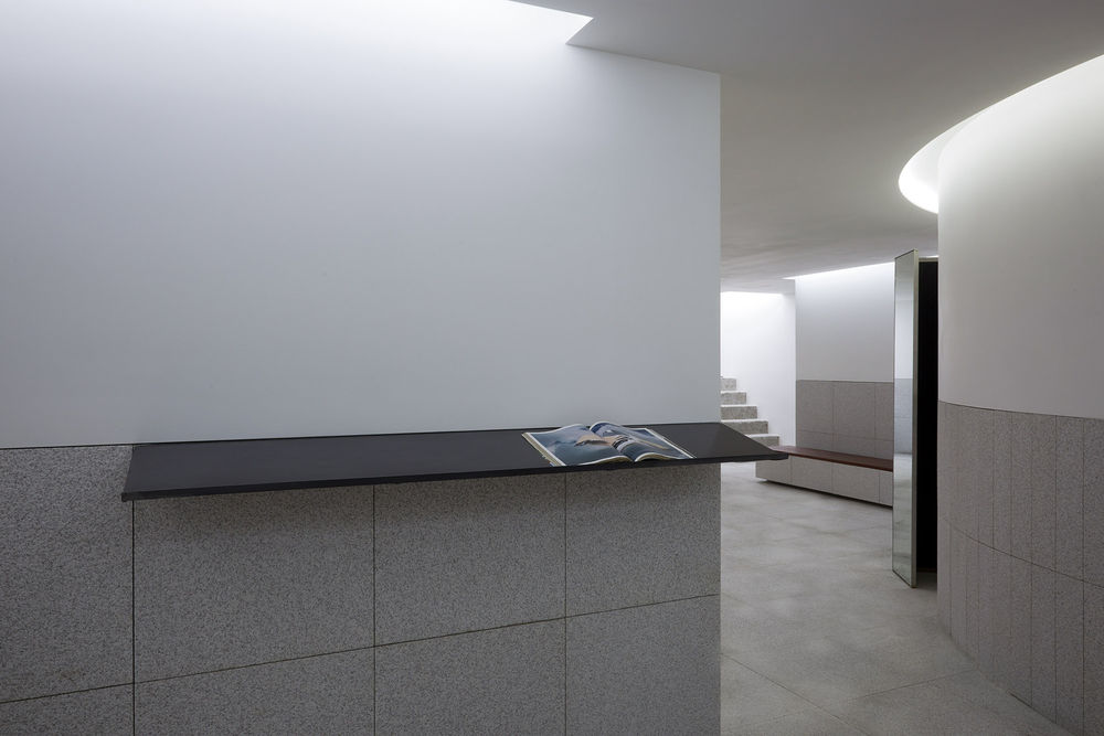
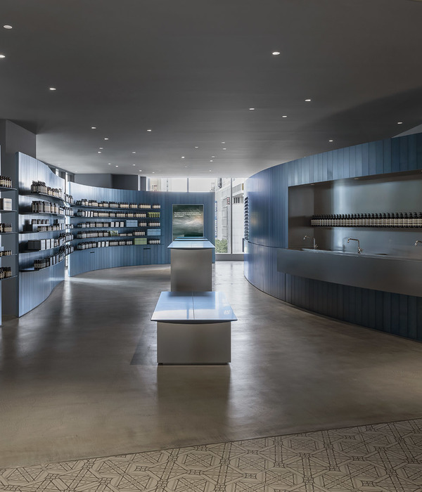
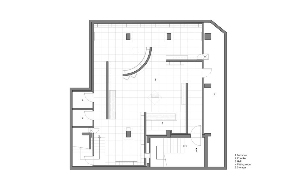
South Korea-based hoffice has created a small store in the basement for Soui. located in Seoul, where natural light and external air are blocked. The plan has been divided based on the floor grid by the walls, inducing functional solutions and spatial experiences. In this space, the walls surrounding the central space flexibly divide each area, creating a private shopping experience inside the wall, and a pure sense of space visually organized by displayed products outside (the central space). In addition, each wall is designed to guide the flow of traffic, giving visitors a primitive experience as if they were exploring a small cave.
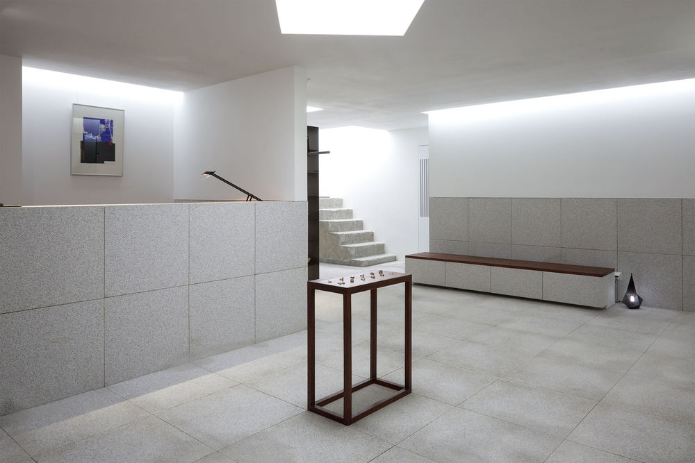
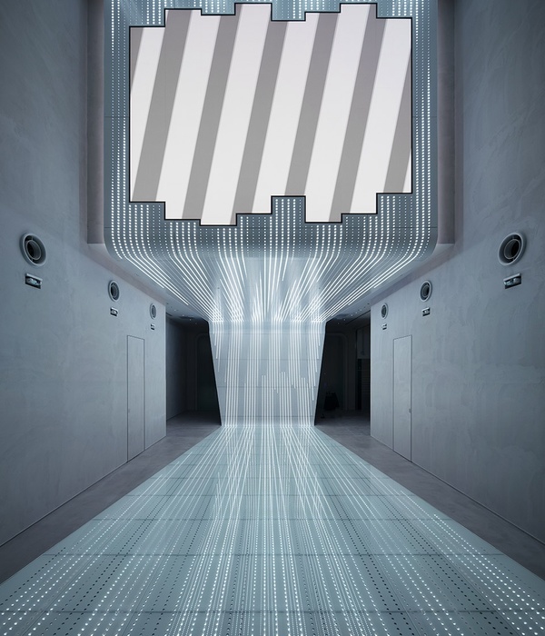
To overcome the site's characteristics, we designed to create a natural light-like by installing strong luminous lighting higher than the ceiling surface, it was possible to minimize the lighting exposed to the ceiling surface while inducing visual illusion as if the roof was open. The simplified ceiling design compensates for the shortcomings of low ceiling height, and the soft light centered on indirect lighting creates a natural spatial atmosphere.
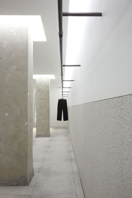
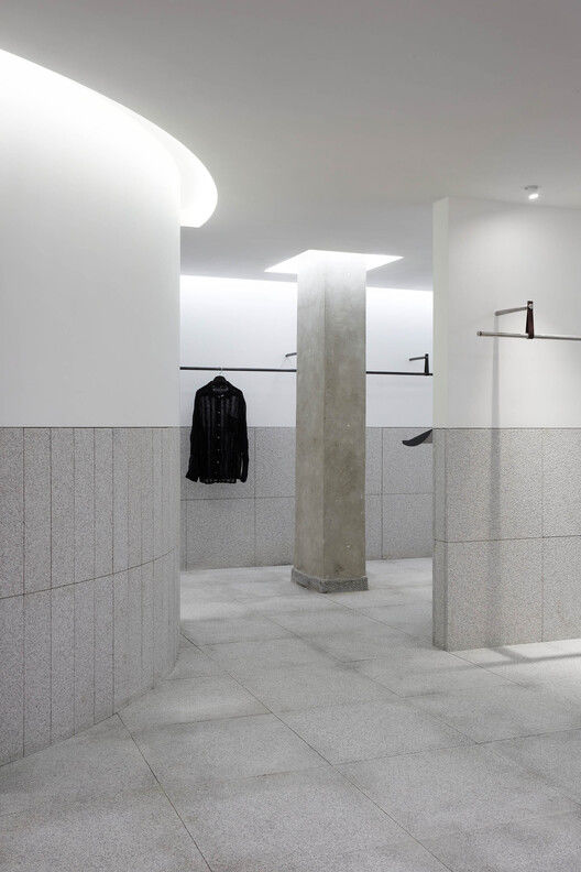
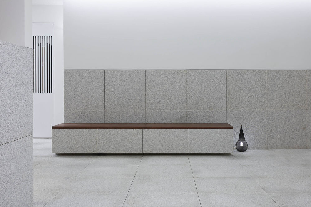
Pocheon-Seok, a material that constitutes the entire space, is a series of granite from pocheon city, where korea's largest stone mine is located near the site and is processed by the traditional method of dabbed finish. This material has been widely used as an exterior flooring for traditional korean buildings and is still the most commonly used stone in korean architecture. The stone surface, where only the particles of stone shine subtly due to the omission of luminosity, contrasts with the smooth white surface, creating an ambient atmosphere, and small bumps stimulate the senses of hands and feet when stepped and touched. All walls and built-in furniture were planned according to a 600*600(mm) stone standard, which produces calculated regularity and strict moderation.
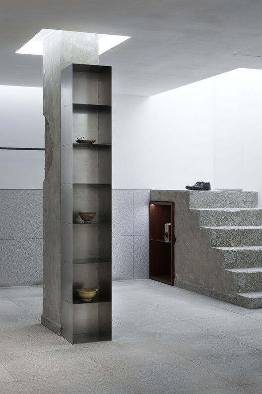
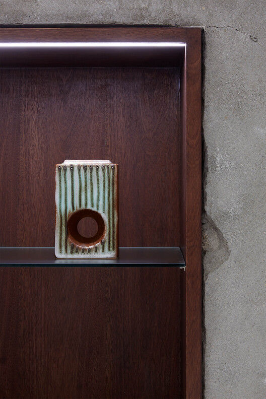
In addition, it was intended to look like an object in minimal space by leaving the structures of existing buildings such as concrete pillars and stairs intact. Focusing on expressing the pure objectivity of the material as it is, the hanger-racks detail of the hanging structure was devised using vegetable leather contrasted with an unprocessed metal. The mirror and shelf design in the central space was inspired by byung-poong, a traditional korean folding screen, and the eaves of han-ok, a traditional architecture. Materials throughout the space were considered to be aged over time. "Temporality" is the most important factor in the overall plan, expressed by linear flow composition, rhythmic volumes, and materials that constitute space.
