Kibo Restaurante | 融合东西方文化的独特餐厅设计
Architect:nihil estudio
Location:Valencia, Spain; | ;
Project Year:2020
Category:Restaurants
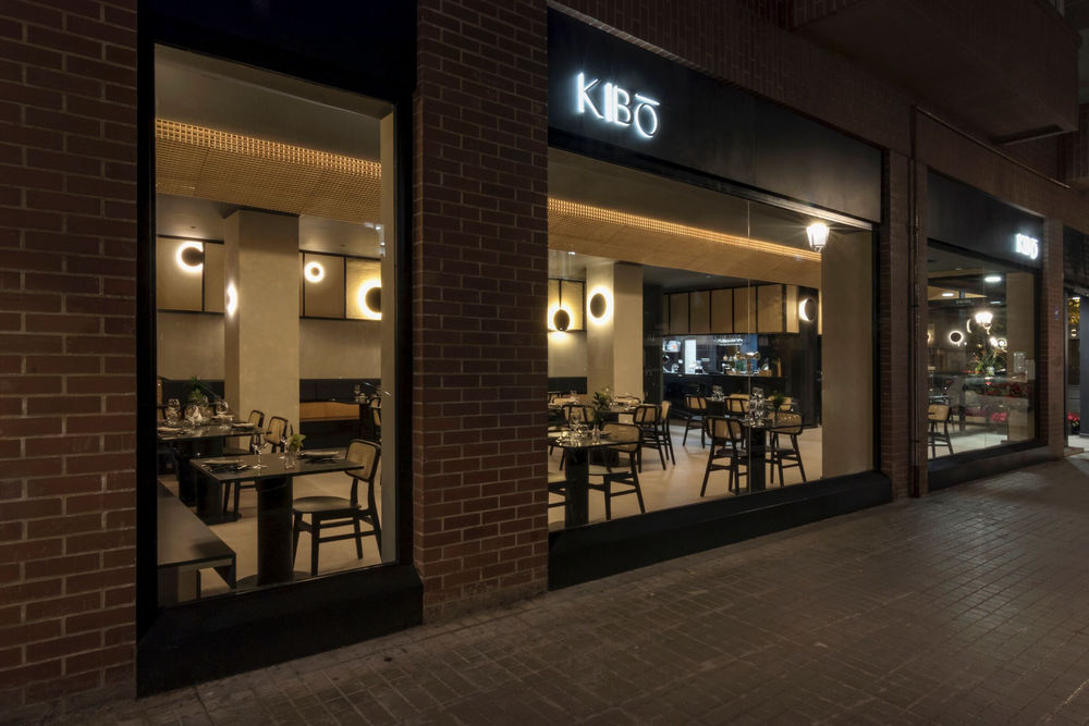
Passion for a new project. Kibo Restaurant is born out of love for the hospitality industry and good customer service. An honest gastronomic space, where the user can disconnect, enjoy and feel at home. Kibo aims to be a warm and dynamic brand, with professionalism and elegance.
When it comes to design,
looks for a timeless design that conveys warmth and comfort and differentiates from competition, achieving a good local positioning. Natural light and dark colours in contrast with the presence of lighting. A unique atmosphere where everything is in its place and harmony and coziness are felt. A new personality is created which is in line with the gastronomic proposal and the enterprising courageous spirit of its clients, who undertake this new adventure during the global pandemic.
The gastronomic offer is based on the fresh and transparent fusion of two apparently unconnected cultures: Mediterranean and Asian. This duality lays the foundations for the interior design developed by
, trying to strengthen and transmit it both formally and in the materiality of the space.
On one hand, the Mediterranean. Culture of light, tradition and product. The image of the calm sea on a summer morning comes to mind, when only colour and light exist on the horizon.
On the other hand, but not in contrast, the oriental cuisine, the Asian culture. Both broad and varied, but with some common features: textures, colours and culinary creations that surprise by their complexity and visual appeal, full of scents and very unique flavours.
The main aim of
is to create a space where East meets West, linking two widely different civilizations with a common denominator: the importance of gastronomy.
All these concepts and ideas materialize in space through different means:
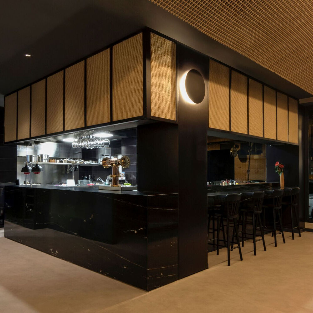
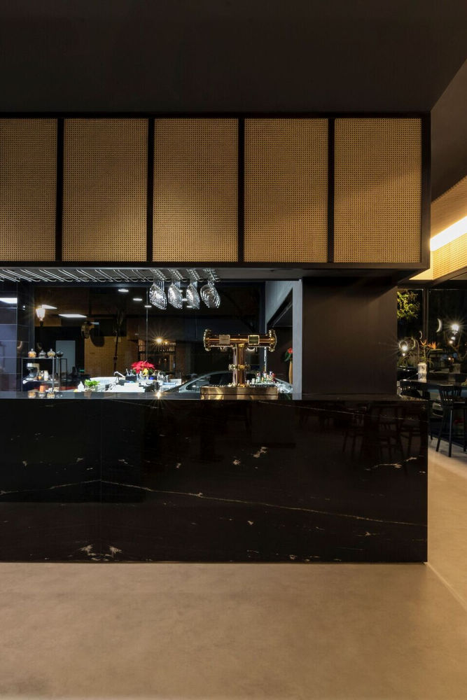
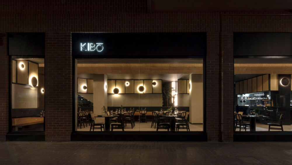
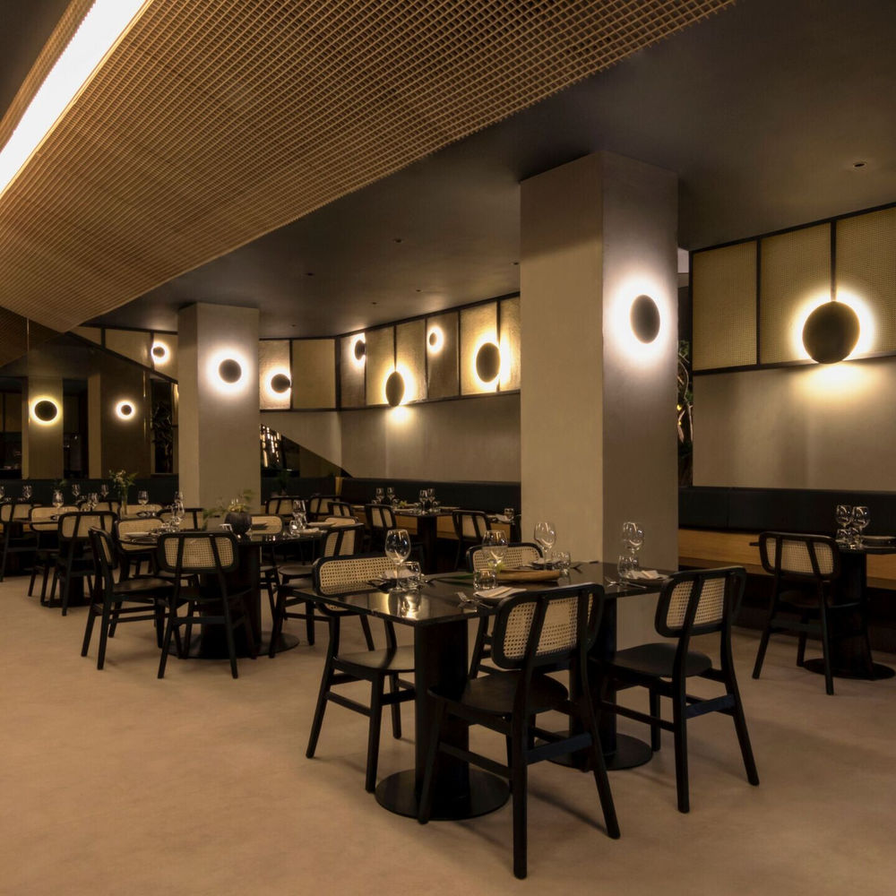
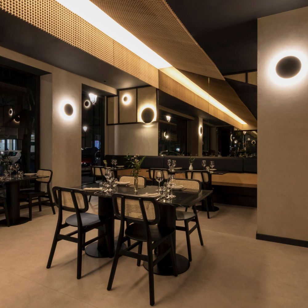
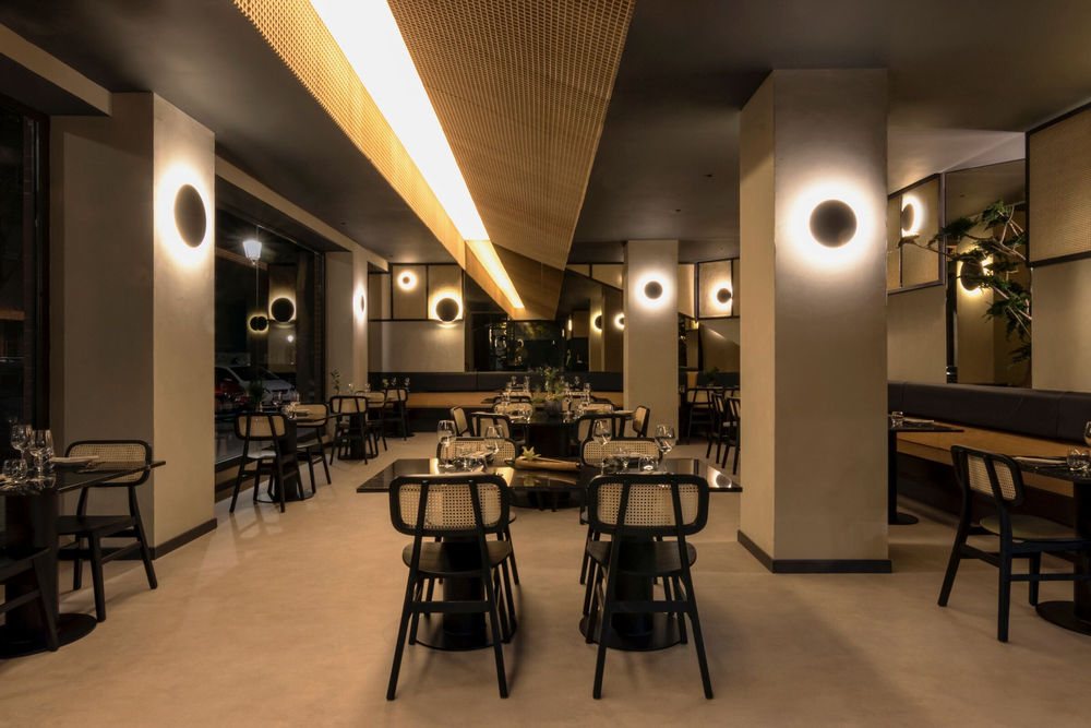
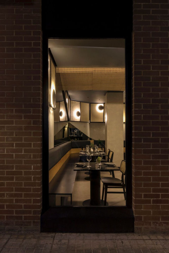
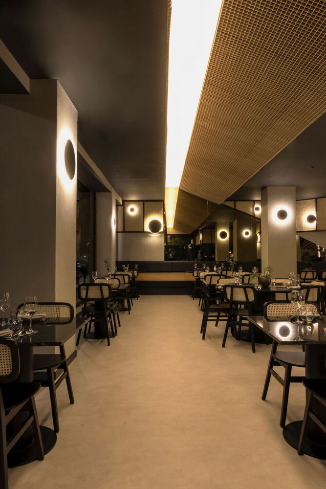
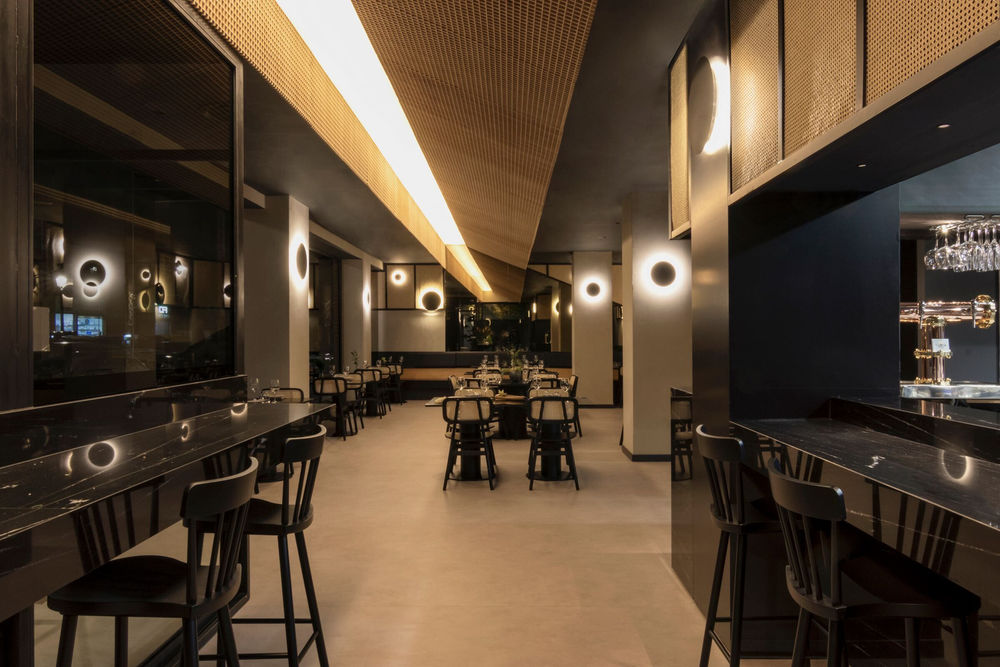
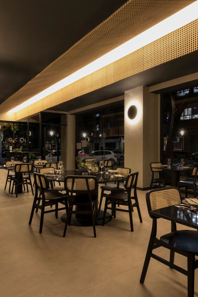
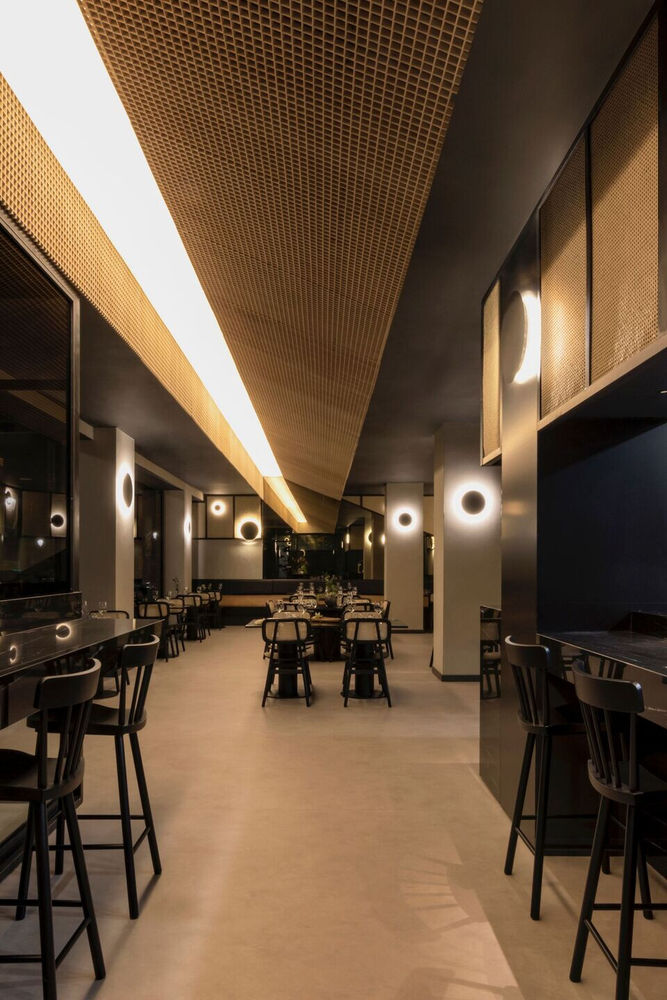
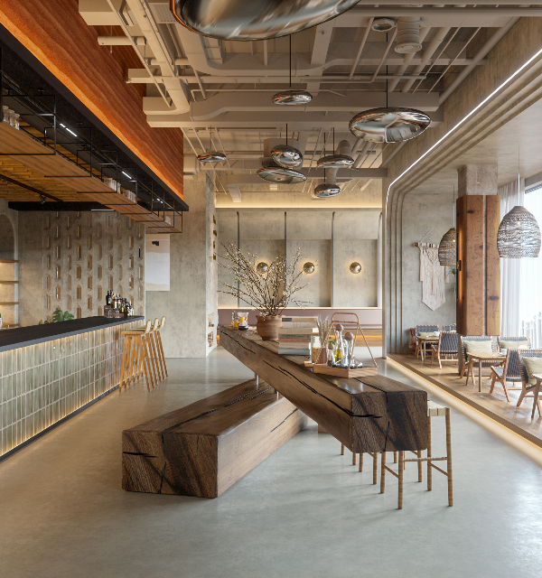
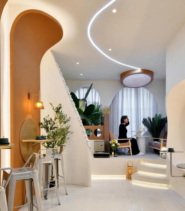
The light and the absence of it: a light strip crosses the entire space and is reflected in a horizon of mirrors, contrasting with a dark and neutral background but full of textures, that reminds us the image of the sea.
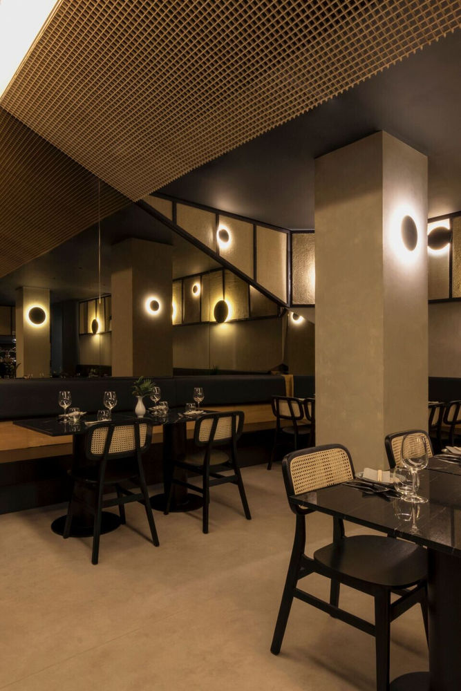
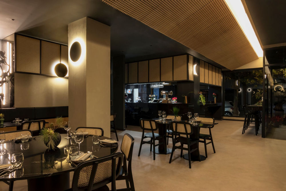
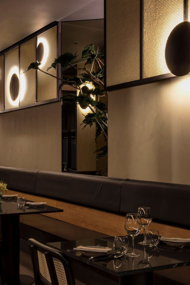
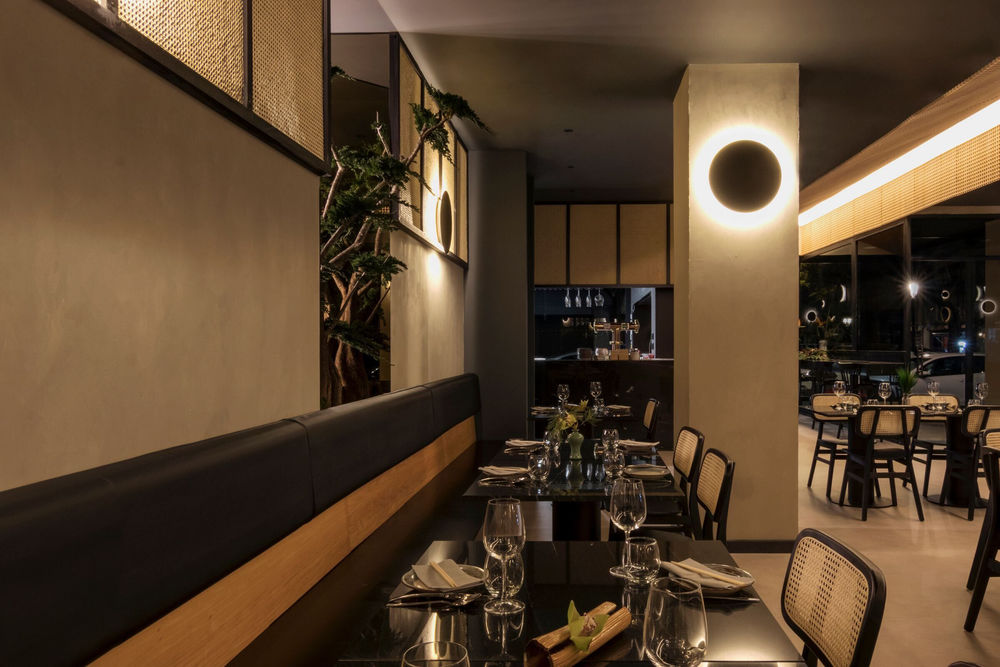
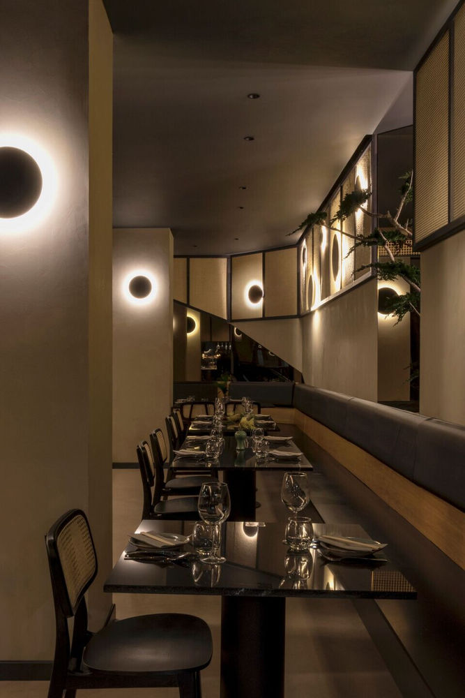
A continuous bench with clean and simple forms surrounds the space and emphasizes the feeling of horizon, while allowing more space for tables in a complicated floor plan limited by 2 major central pillars.
On the other hand, the forms: a simple, clean and pure geometry; combining the most orthogonal blocks from traditional Mediterranean architecture, with the slanted mirrors and skylight that remind us of pagodas from Asian architecture.
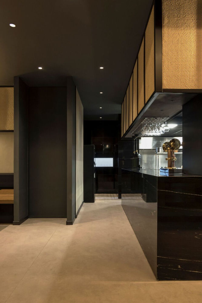
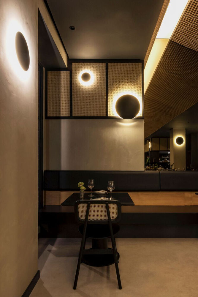
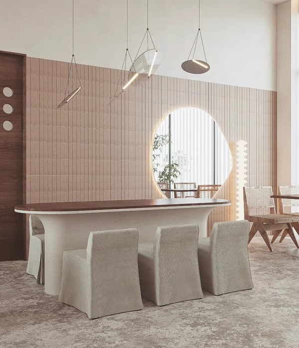
Lastly, the choice of materials, which has been determined not by chance, as nothing in Kibo. Playing with contrast, fusion and functionality. The finish of walls, ceiling and flooring reminds us of the dried mud, already greyish, which is part of the origin of all cultures, the connecting link, the canvas where everything happens. On it, two colours contrasting: black and brown, heavy and light. Black is implemented through two materials: the elegant and restrained Vía Láctea granite for the surfaces where the product is presented, tables and countertops; and the black stained wood for seats and frames. Brown appears on the natural wood of the continuous bench and the skylight lattice, and on the rattan of both chairs and decorative frames. These characteristic elements (skylight lattice and decorative frames), in addition to the formal importance in the space, have a hidden functionality: acoustic properties to improve the reverberation.
As a 360 degrees project,
has developed each component of the Kibo Restaurante brand: the logo and symbol, signage, the restaurant’s menu, business card design, etc., caring for the typography, composition and general aesthetics of each element in order to communicate overall homogeneity and coherence.
▼项目更多图片
