Explore the vibrant transformation of a commercial property and warehouse into a cutting-edge working space by LAMA Studio in the heart of Barcelona, Spain. This modern marvel, known as Codea, boasts innovative design concepts and a creative oasis.
About Codea
Codea: Creative Transformation in Barcelona
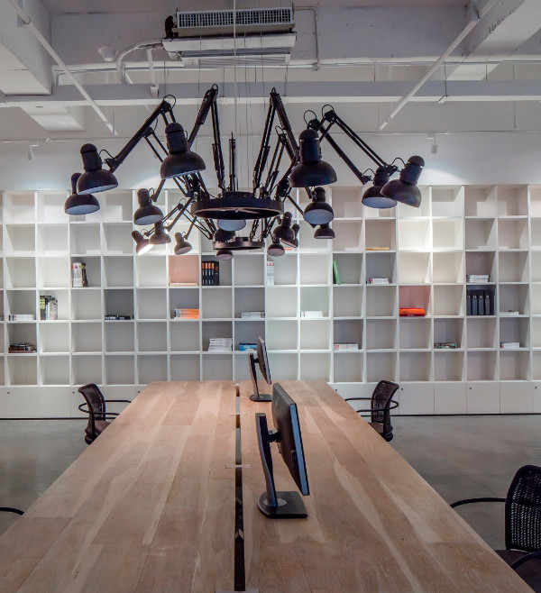
Codea Studio, a Barcelona-based creative agency, embarked on an ambitious project to convert a commercial property and warehouse into a versatile working space. This unique endeavor covered a single elongated floor, measuring 3,821 square feet (355m²). The space posed challenges with its narrow 6-meter-wide front façade, limiting natural light. The front section featured a 14.8-foot (4.5m) ceiling and varying widths, with flat slabs and metal beams. At the rear, an open-plan warehouse with a striking 5.5-meter-high gable roof, constructed using wooden trusses, emerged as the project’s architectural centerpiece.
Innovative Concepts Shape the Project
To meet the agency’s requirements, the team established two fundamental design concepts. First, they conceived a central core housing service areas: storage, technical rooms, meeting spaces, and lavatories. This core retained open spaces and served as a transitional zone. Second, they proposed a continuous linear element along the dividing wall, adapting to various functionalities.
Distinct Zones and Material Selection
The property was divided into four zones, each serving a unique purpose. The open-plan space by the street was the primary entry point. Further, the central service area extended along a lengthy hallway. The distinctive warehouse area became the agency’s central hub. To introduce a new back façade and infuse the building with light, the team meticulously restored the old courtyard, creating three spacious openings.
Material selection played a pivotal role. The approach preserved the original character with a clean, white aesthetic. This neutral canvas shifted focus toward the renovation. The client’s preference for raw materials, volumetric contrasts, and rich textures and colors informed the project’s palette. Materials reflected a Mediterranean vernacular with architectural references and Mexican-inspired textures and colors.
Rough-finished concrete blocks with pink undertones crafted the primary core area and continuous linear element. This choice added character, durability, and self-supporting capabilities for the core area. On-site extensions in the linear element and warehouse featured textured plaster finish, highlighting their artisanal quality. Lavatories, planters, and workspaces used complementary materials: Catalan rasilla bricks and red and green glazed ceramics from La Bisbal. Raw MDF board, a contemporary material, offered smooth surfaces blending practicality and elegance.
Photography by José Hevia
{{item.text_origin}}

