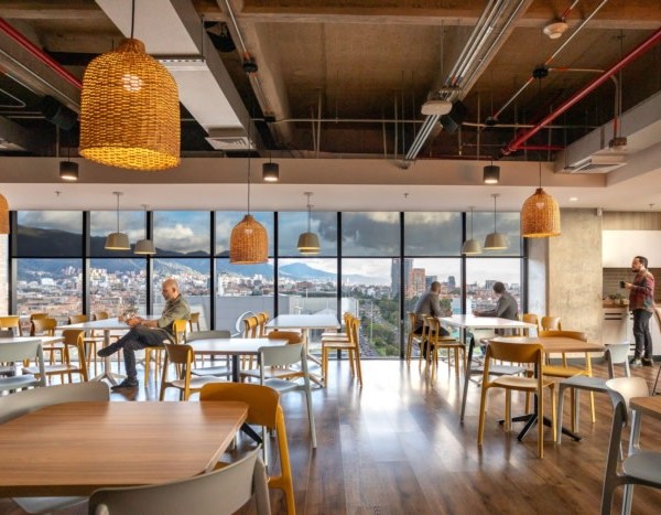
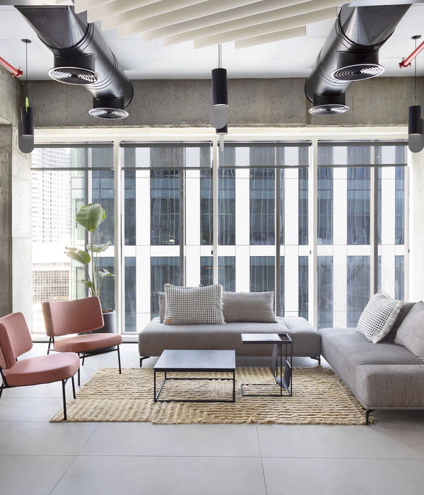
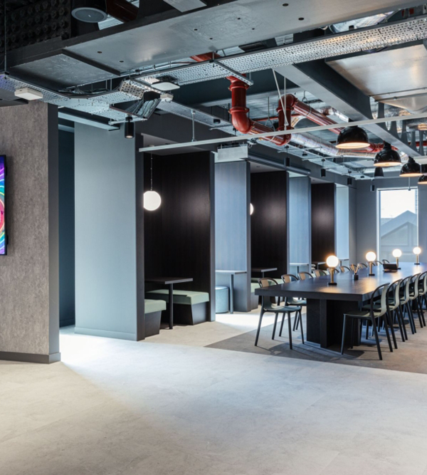
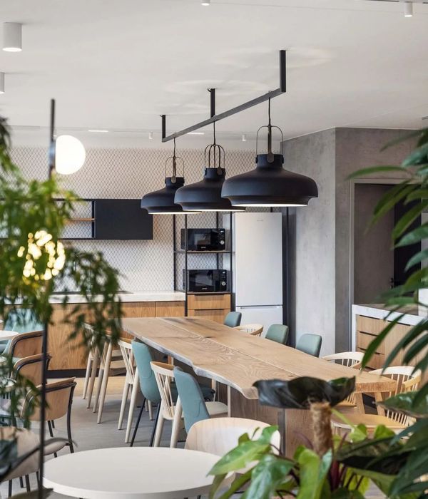
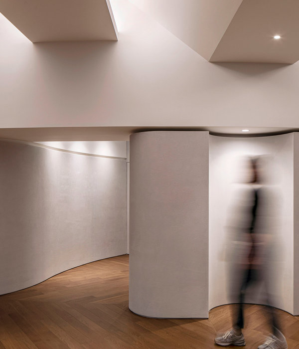
Belltown Collective位于一栋二十世纪建筑的一层和地下层,这里曾是Egbert的家具展厅。此次业主邀请RHA事务所将这里改造成为全新的10,000平方英尺办公空间。
The new 10,000 square foot Belltown Collective, designed by Robert Hutchison Architecture (RHA), is located on the ground floor and basement level of an early 20th century storefront building at 2231 1st Ave, in what was once Egbert’s furniture showroom.
▼空间内景,interior view
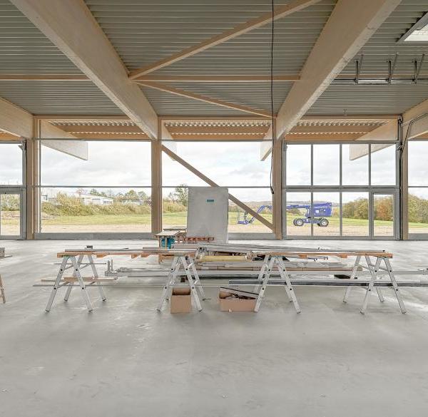
建筑师Robert Hutchison解释道,“进行租赁空间设计的时候,我通常喜欢将这个空间尽量维持原貌。”在这里,去繁从简是最主要的设计宗旨。原空间中两个现有的承重墙沿空间长向布局,将原有建筑空间分隔成三个长向空间。均匀的墙面开口极大的增加了空间的渗透性。开放性的布局是空间的使用和功能布局更加灵活。天花板和承重墙上9英尺高处的石膏板被移除,光线从墙体间穿透,在裸露的实木结构上形成趣味的光影变化,让空间环境别有一番滋味。
Architect Robert Hutchison explains, “When designing a tenant improvement project, I like to work with the existing space as much as possible.” Subtraction, rather than addition, was the main design theme. Two existing load-bearing walls run the length of the area, establishing three linear yet distinct rooms. Symmetrical openings were cut into these walls at even intervals, increasing permeability by allowing for greater flow of traffic between the rooms, as well as creating an updated open office layout with flexible space arrangement. At 9 feet high, drywall and other finished have been removed from the upper portions of the bearing walls to expose the wood studs and ceiling joists. Daylight now filters between the rooms and the exposed studs cast dramatic shadows on the white walls.
▼均匀的墙面开口极大的增加了空间的渗透性,symmetrical openings were cut into these walls to increase permeability
▼对空间做减法,subtraction, rather than addition, was the main design theme.
▼天花板和承重墙上的石膏板被移除,露出实木结构,drywall and other finished have been removed from the upper portions of the bearing walls to expose the wood studs and ceiling joists
“新与旧的界限严格分明,”Hutchison说道。贴心的坡道设计让各空间之间的高差消失于无形之中。新铺设的胶合板地面和定制的黑钢扶手低调又亲密的回应了原木屋顶和边界墙,同时将空间的细节雕刻的更加精致。空间参考了蒙德里安的绘画色调,以白色,黑色,红色,灰色为主。
“The datum line between new and old is rigorously applied throughout the entire space,” says Hutchison. Strategically placed ramps allow for seamless accessibility between the three different rooms, each on a different level, following the grade of the sidewalk. New plywood flooring and custom steel handrails provide a tailored detail, while complimenting the original wood ceiling and perimeter concrete party walls. The color palette is limited to white, black, red, and gray, referencing a Mondrian painting.
▼贴心的坡道设计让各空间之间的高差消失于无形之中,strategically placed ramps allow for seamless accessibility between the different-level rooms
▼通往地下的楼梯间,staircase to the basement floor
▼地下层,the basement floor
▼平面图,plan
Robert Hutchison Architecture design team Robert Hutchison, lead architect Scott Claassen, design team Siyu Qu, design team Wenjing Zhang, design team
Project Team Robert Hutchison Architecture (architecture) Metis Construction (contractor) evolution Projects (client) Perbix Bykonen (structural engineer) Lucrecia Blanca, Blanca Lighting Design (lighting consultant)
Photography Jill Hardy
{{item.text_origin}}

