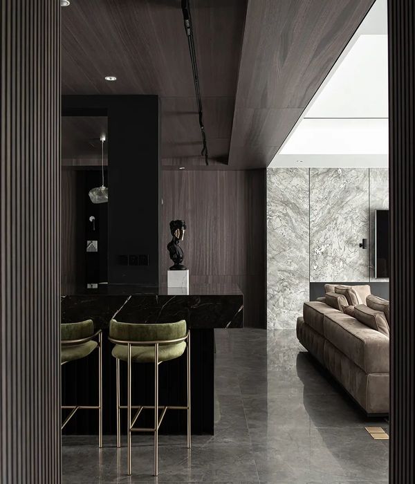
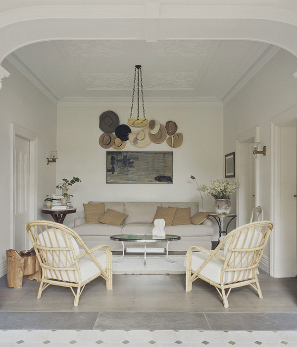
The design was for a home in Tokyo's suburbs, inhabited by a couple in their 30s. A flexible, future-proof renovation was planned for this couple to live in their earthquake-retrofitted apartment for the next 50 years.
"nuance" refers to the subtle differences in emotion, meaning, color, sound, and expression. The structural framework of the room follows the typical grid plan that was mass-produced during the high economic growth period (1950-70s), creating a strict 1:1 relationship between "space" and "function," with no room for flexibility or interpretation. To embrace the diverse activities of the double-income couple who regularly work from home and to update the room’s design to suit modern times, this project strives to create a "nuance" – a subtle variation that lies somewhere between "on" and "off," "active" and "relaxed," or something entirely different. The “nuances” are incorporated in spatial composition, color, and materials, allowing an individual to sense their subtle feelings and choose a place where they want to "do that" in "that place."
While maintaining the typical proportions of a Japanese apartment in terms of width and depth, the existing apartment possesses assets that emerge from its corner-room layout, such as a long-side entrance and three-directional openings. To utilize these strengths to their full extent, a group of smaller rooms are arranged along the exterior walls. By allowing direct access to each small room from the living room, corridor spaces have been entirely removed, normally separated by walls.
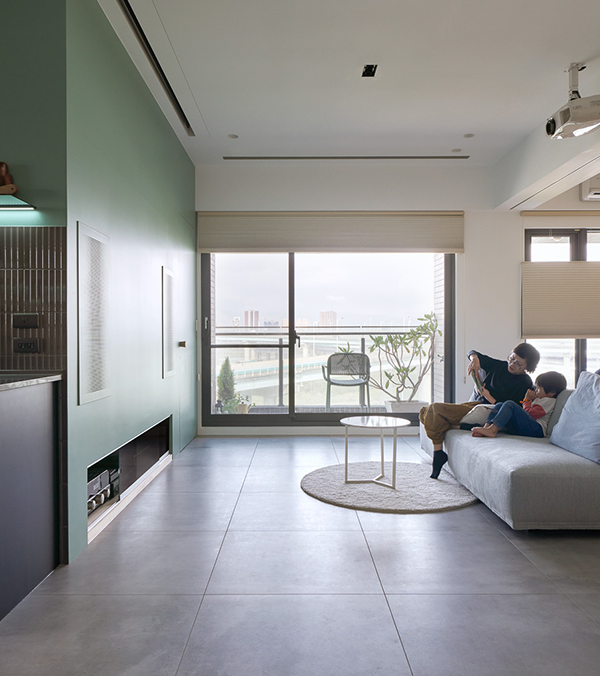
By deconstructing the corridors, a weak point of the standard grid-shaped layout, and by absorbing the “daily access routes” into the living room, the routes turned into a bright, open, and clean area, thus creating a sense of overall spaciousness. Moreover, by directly connecting the small rooms to the living room, the nuances of activities and atmospheres in each room permeate into the living room, creating a lively and relaxed space. The aim was to replicate the feeling of a public street or plaza within the home.
The unique double-opening design, where “outer openings” take in light and “inner openings” frame living activities, creates continuity and expansiveness within the interior space. The diverse looks of the inner facade shape a streetscape and infuse the living space, conceptualized as a plaza, with nuances. Depending on the purpose of the smaller rooms, the inner openings change form, with the facade showing different looks depending on the type of partition (swing doors, curtains, sliding doors, transoms).
Overall, multiple slight differences co-exist in this living space, created through the symbiosis of a nuance-propagating street and a plaza. Within this space, inhabitants have the flexibility to select an area that best suits their momentary emotional state. By dissolving the one-to-one relationship of room and function and opening up the corridors, more room for flexibility is granted. This approach serves as a modern reinterpretation of the traditional grid-like plan to accommodate the changes in family and lifestyle over time.
{{item.text_origin}}

