Firm: Nook Architects
Type: Commercial › Office
STATUS: Built
YEAR: 2015
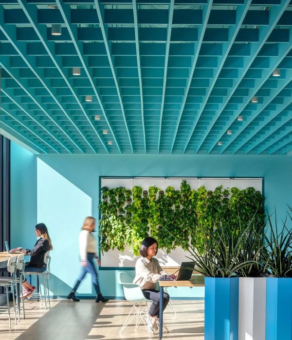
We had been trying for one, very long year to change our place of work and after visiting several apartments and establishments, we suddenly came across the opportunity of developing a project for a shared office with a closely known client. On this occasion time was our main challenge- we had to finish an interior design project, obtain estimated costs, manage the construction works and move in just 3 months. This is an extremely limited timescale for the city of Barcelona.
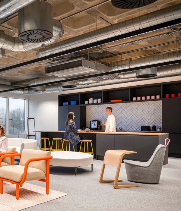
The working space has a configuration very commonly found on buildings built in the 70’s at the Poble Nou neighborhood; large lofts with completely glazed facades that housed workshops and warehouses, with various people and service lifts, and a very industrial character that’s reminiscent of the neighborhood’s productive past which is now undergoing a continuous renewal. We found a space that was empty and completely lacked partitions, 300 m2 supported by reinforced concrete pillars and hung beams.
The structure is composed of three centerlines that clearly fitted the required functional plan: two offices located on opposite sides and the common meeting rooms and resting areas in the center.
We noticed, from the beginning the strength of the orthogonal arrangement set by the reticular structure and the modulated façade. It also made very obvious the fact that one of the centerlines was narrower than the rest, which complicated the solution for the need of the two very similar office spaces. The intervention was then clear: the construction of three light volumes- two for meeting rooms, one for the bathrooms; we defined the ensemble by granting hierarchy to the existing vacuum and differentiating our intervention from the original envelope.
We used diagonals to set apart our intervention and to configure spaces that overflowed from the limits of the structural axis. This established a relationship between the three volumes and two diagonals that go across the entire space, making interstitial spaces for resting areas and an ample galley. This idea was reinforced by using three different pavement tones of gray that go from the darkest near the facade to the lightest at the entry on the opposite side.
These volumes were originally thought of as rectangular boxes with flat roofs, the minimum structure for a meeting room. As time went by, we deformed these, transforming them into asymmetric pieces by elevating the diagonal to the roof, increasing its volume up to the capacity set by the limits defined by the slab and the hung beams.
We placed the bathrooms near the entry and elevated it from the original pavement level to allow the sanitary installation to reach the only drainpipe located on one end of the establishment.
We then set ourselves to solve the volumes and the working tables with the same material. We used colored chipboard, which is durable, water resistant and available in large sizes. The rest of the rest of the furniture are standard modules adapted to the dimensions of the spaces.
Upon finding the challenge of a blank canvas, we established in Zamness diagonals that diluted the limits of each zone the same way that we intend to dilute the limits between work, rest and leisure time.
{{item.text_origin}}

