A box is not just a box if you know how dynamic a life inside is. A beautiful house sets a similar example of well-designed architecture, embodied in one of the city’s compact residential areas. Aarjav residence is built around an area of approximately 219 sq. mt of a plot, having three open sides and one shared wall. Within such tight fabric, it was quite a challenge to build a 4 BHK house that also includes a studio apartment on the top floor.
This house speaks the language of leisure through merging the lush greens and design values intricately woven by the team of DWG. It exemplifies contemporary aesthetics and functionality to its full potential. The most important feature of the house is its façade. “We wanted to make the whole façade interesting”. The idea was to create a dynamic skin that not only creates dramatic shadows during the daytime but also generates curiosity within ones’ self to how warm and cozy their inside would be. Patterned solely with bricks, their varied modules had thoughtful punctures to bring in light and visual connectivity into their indoors.
One of the considerations behind this façade design was its climatic condition. Since it orients toward the South-West, the idea of solid skin was to reduce the heat gain inside. The projections and offsets are designed in a manner so that 40-50 percent of the house remains in shade especially during extreme summers. Apart from this, existing trees played an important design decision factor for openings. An age-old mango tree towards the south shares a large portion of its foliage, keeping the living areas shaded throughout the year. One can also enjoy this seasonal vibe from a bold window on the first floor and through brick cut-outs from the floor above.
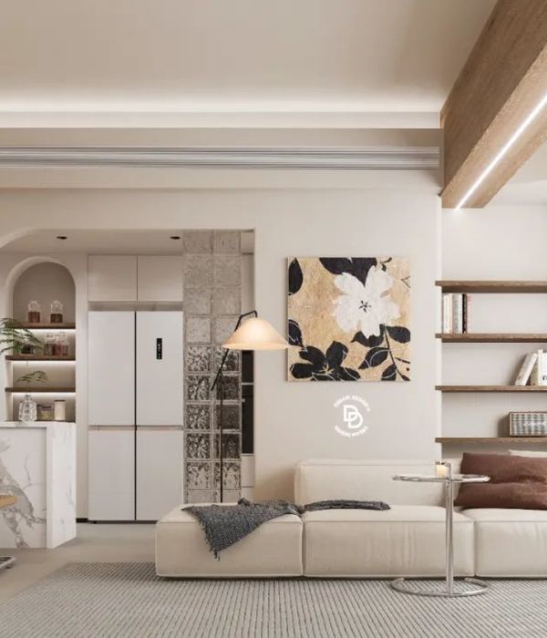
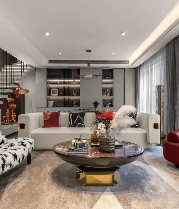
The basic house idea turned into a beautiful amalgamation of nature and built environment through the use of approximately 150 plant species outdoors as well as indoors and; through planned skylights for a good amount of natural light to purge inside, even inside bathrooms. In terms of materiality, the textures and colors of its interiors differ from that of its exterior. The use of brick and metal creates a rustic look as perceived from the outside, while the inside is cheerful with color, wooden, and marble finishes. The idea to use a subtle color palette indoors was to make space look more spacious as compared to what its outside fabric offered.
▼项目更多图片
{{item.text_origin}}

