Minus Workshop 打造东京街头风 Takano 拉面酒吧
- 项目名称:Takano 拉面酒吧
- 项目类型:拉面酒吧室内设计
- 项目地点:香港沙田新城市广场
- 设计方:Minus Workshop
Minus Workshop created a space that is both modern and traditional for the restaurant style at Takano Ramen Bar, giving diners a dynamic approach for layout variation and privacy.
When speaking of the traditional food of Japan, Ramen reminds us of leisure travel, especially for the Hong Kong people who are addicted to the place. Kevin Yiu, the founder of Minus Workshop, also the design director, opted to bring the memory of the scene in hustling Tokyo city form by utilizing simple lines and structural elements through Takano — a Japanese Michelin label that has gained a reputation on Ramen for more than 25 years. Moreover, this brand is consistently being listed as one of Tokyo’s top 10 ramen spots. And now, It newly sits at the New Town Plaza of Shatin, one of the busiest shopping malls in Hong Kong.
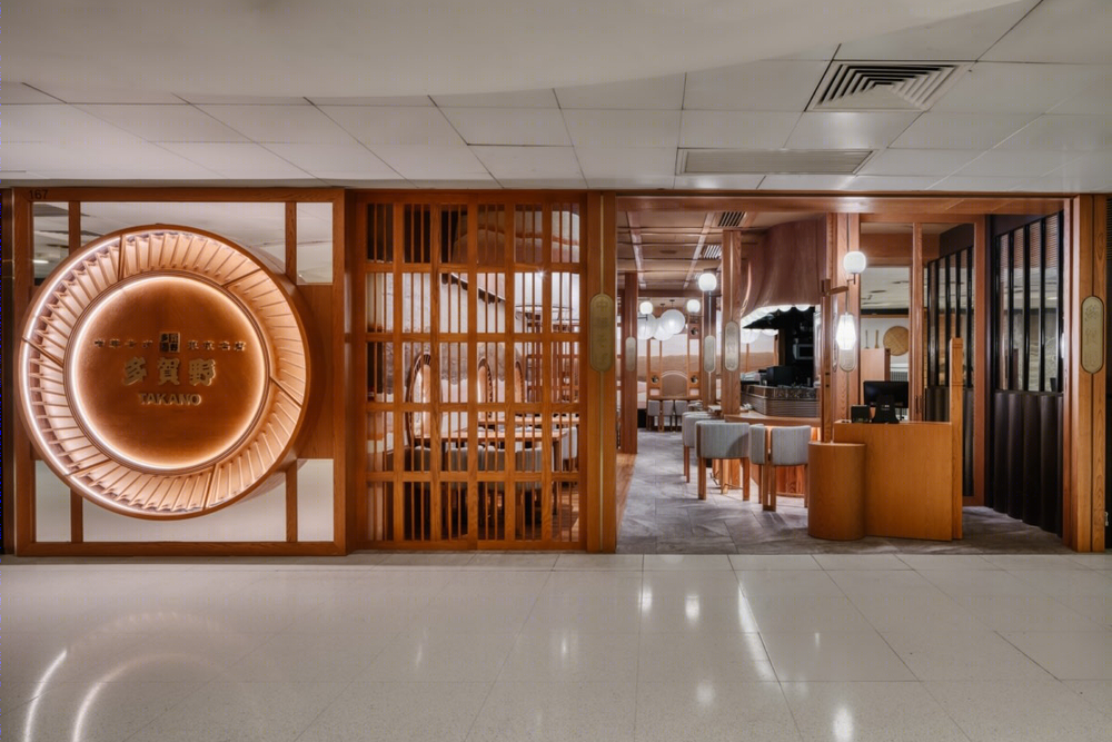
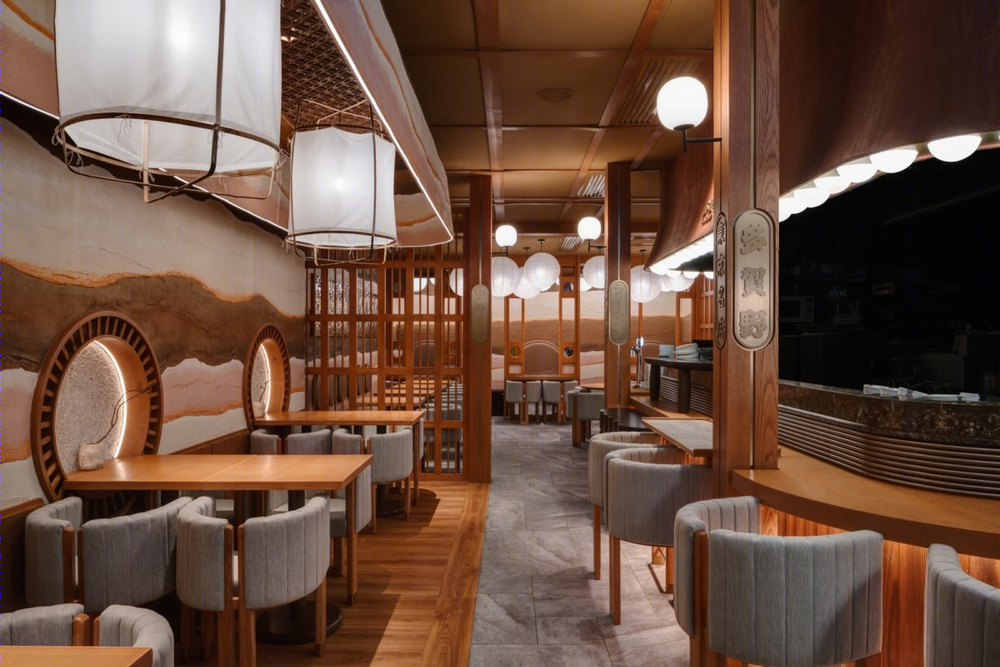
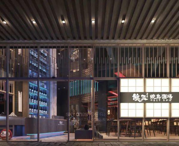
Based on the philosophy of other projects directed by Kevin, the sensation of vision, smell and touch are fundamental to uplift the gourmet journey. As the shop is located at the deep end of the mall. Therefore, a whimsical entrance must solicit the passerby’s attention. The self-rotating signage at the open shop front is one striking installation art piece, assiduously as a welcoming visual to stimulate curiosity. Once the guest steps into the store, a lively noodle bar is placed at the right to stand out as a statement, featuring a decorative roof taken from the contour of the traditional samurai’s helmet. Guests in it will immerse into an extraordinary experience witnessing how a bowl of fresh-cooked ramen be prepared.
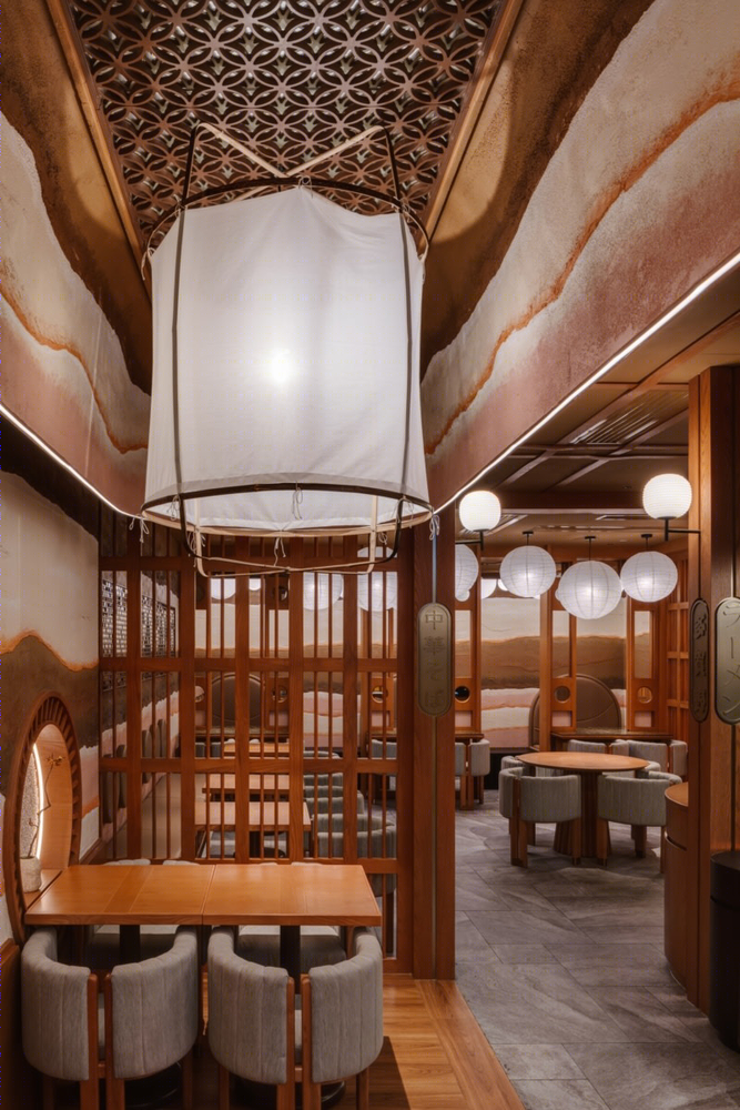
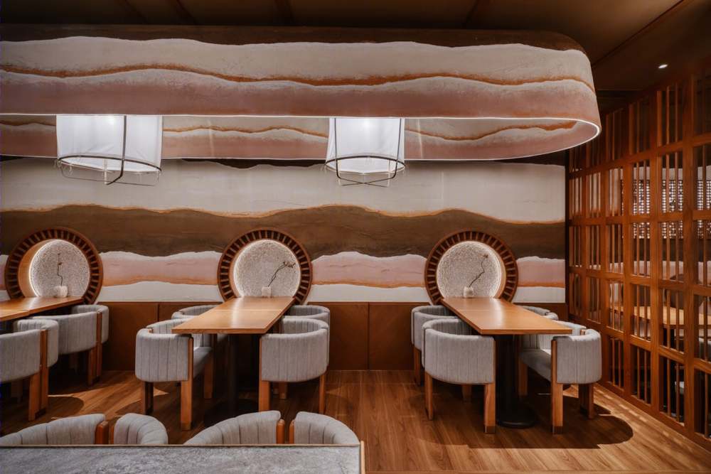
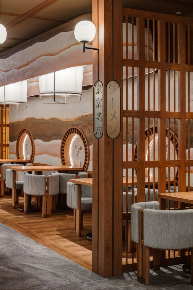
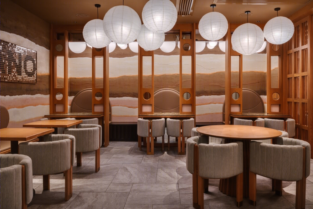
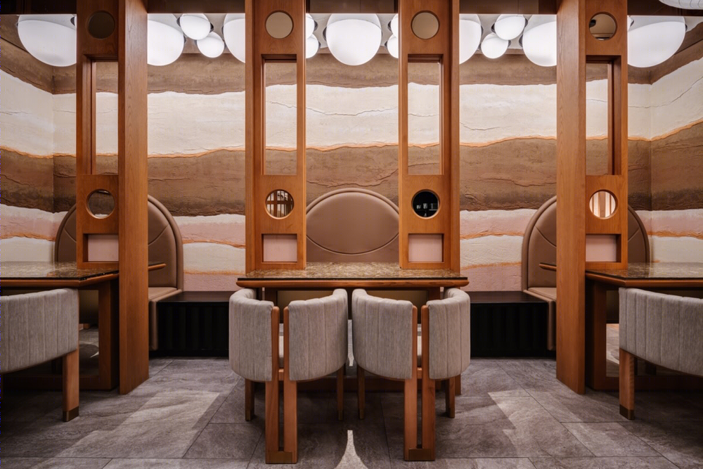
In addition, the guests will be impressed by the sincerity of each design detail, whether they take the seat at either the noodle bar or four-seaters — paired with the installed round service niches echoing the rotating wheel at the entrance. Using layers of clays create warm and dynamic navigation to guide people through the space. a natural pendant light made of bamboo and paper by Ay illuminate is well presented above the head.
Then when you walk to the end of the store, there is also a custom-made sliding partition as a hidden dining setup, right above the table of four, giving flexibility to the seat arrangement for the diners in couple or solo. There is also a movable partition inspired by fusuma, the Japanese sliding doors, to convert the space into a private space.
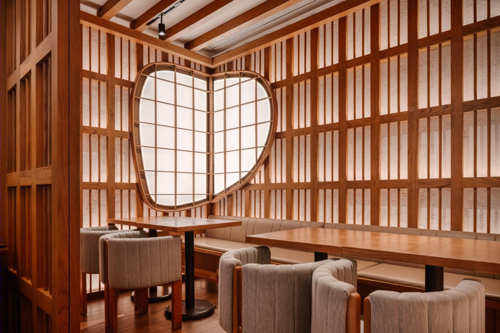
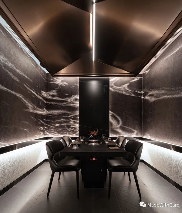
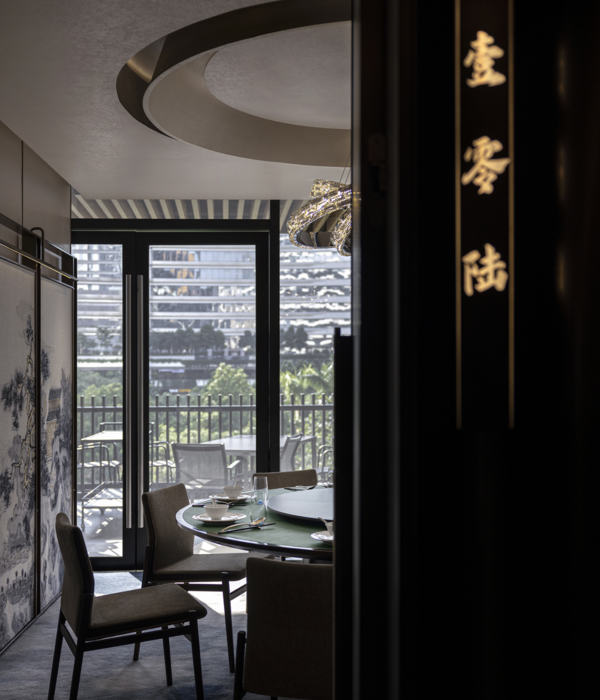
There are plenty of vibrant design details mixed with signature Japanese traditional elements that are not just limited to the shoji screens and various sizes of Noguchi sphere lanterns. But also the Kanban, the classic Japanese store signs written in the same language of phrases about Takano, ramen, soba, and Tokyo awarded merchants. Subtly yet conspicuously inserted in the pillar enhances the ambience of Tokyo street. The dining area also featured ancient Japanese construction materials such as mudball pebble and timber to calm nerves inspiring from a contemplative view in Japanese gardens. This VIP room is decorative by an oval shoji window balancing the linear design.
From all these cultural features, Yiu has redefined Takano ramen into a new level of dining classification. Inspired by the menu display from the traditional Japanese noodle bar, a spared wall in Takano converting the ritual into a modern art installation reflects an engrossing illusion with the Noguchi pendants above through numbers of tessellated mirror plates. In mixture of minimalism and avant-garde, the interior of Takano is more than just a traditional Japanese aesthetic concept. A significant quantity of gratings has brought a strong impact representing the eaves of the Japanese mansion house from inside to the outside of the whole restaurant.
Design: Minus Workshop Photography: Steven Ko Interior Photography
8 Images | expand images for additional detail
