- 项目名称:Sauce Up Bistro
- 项目类型:餐饮
- 设计方:白菜设计
- 项目设计:白菜设计
- 完成年份:2022
- 首席设计师:赵凯文
- 设计团队成员:刘添翼,王相卓,时含瑞,孙克楠,魏垠麟
- 项目地址:辽宁省沈阳市和平区北五经街20号八纬路交叉路口
- 建筑面积:168㎡
- 摄影版权:图派视觉
- 客户:Sauce Up Bistro
- 材料:木饰面,瓷砖,乳胶漆,金属方管
SAUCE UP是位于沈阳的一家精致的西式餐吧,名字出自Pink Floyd乐队专辑《A Saucerful of Secrets》,空间是多样的、碎片化同时极具包容性,希望传达一种有包裹感、不刻意的舒适氛围。
SAUCE UP is a delicate western-style diner in Shenyang. Its name is a reference from Pink Floyd’s album A Saucerful of Secrets. The space sparks diversity. It is fragmented yet all-inclusive, hoping to convey a sense of casual and coziness.
项目位于沈阳市老城区两面临街的一楼,场地前身是一家生鲜超市,室内原始状态是开敞的空间,由两侧通透的落地玻璃围成。
The diner is located on the first floor of a street in the old district of Shenyang. The storefront faces two sides. Since the site used to be a grocery store, the original layout is mostly one open space, enclosed by floor-to-ceiling windows.
▲项目轴测图
空间平面原始状态是不规则的,且柱子之间缺少对齐逻辑关系。我们在设计中根据柱的分布,结合用餐的感受,巧妙地划分出了不同功能区,并且使其在空间中和谐交融。
The original floorplan had an irregular shape. The pillars were asymmetrical and illogically placed. We took into account the locations of the pillars as well as the dining experience to partition the space into different functional areas, creating a harmonious ambience.
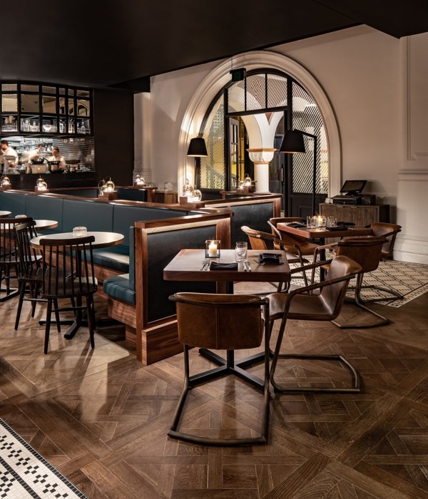
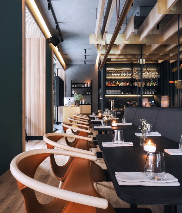
进入空间后映入眼帘的是开放式的吧台和厨房区域,在入口的左侧是餐区,分为长桌、卡座区和散桌三部分。客人透过餐区能看见尽头的花艺区,在花艺区有单独的开门,实现独立进出。
The first thing one sees walking into the space is an open bar and the kitchen area. The dining area is to the left. It includes three sections: long communal tables, booths and regular tables. Customers could see through to the floricultural area at the end of the dining area. There is also a designated door for the floricultural section, allowing customers to enter and exit.
入口右侧是休闲区(Lounge area),提供了休闲交谈的场所。整体布局开放、清晰,使各个功能区交互自由。
A lounge area is to the right of the entrance, providing space for people to interact. The general layout is open, self-explanatory, and allows the different functional areas to interact freely.
我们在该项目的设计中对原始建筑状态进行了选择性保留。我们保留了原始扩建的钢结构和木板做为空间生长变迁的印证,并且在空间中运用同样的金属色和木色,塑造呼应关系。通过长桌的植入,不仅保留了原始空间的痕迹,还消隐了过多柱子带来的阻隔感。
We intentionally kept certain parts of the original structure. The original expansion of the space by the steel and wooden panels are remnants of the history here. We used metallic and wooden colors in the space to match the original color scheme. By inserting in the long tables, it not only accentuates traces of the original space, but also helps weaken the sense of separation from the pillars.
空间选用绿色、棕色作为主观颜色贯穿,绿色与棕色带给人复古美式的即视感,同时也是生机与自然的颜色。我们从原始痕迹的选择,到空间内的墙地面材质,再到定制、家具、艺术品、软装,统统遵循主线颜色的把控,使得最终呈现整体且联动。在配色的层层框架之下,色彩的张力蔓延到空间。
The design uses green and brown as the main visual scheme. It gives a certain American vintage style. They are also the colors of vitality and nature. The colors of the original space, the materials of the walls and the floor, the custom-made furniture, the art pieces, and the interior design all follow the main color scheme. The presentation in entirety shows a space that communicates and connects from within. Because of this visual framework, the power of the colors expands and bleeds into the space.
SAUCE,丰富的调料般自由奔放。BISTRO,轻松的就餐气息。我们希望SAUCE UP BISTRO是美食与人自由交互的场所,通过空间构成关系与色彩的碰撞,呈现丰富的体验。
SAUCE, communicates an openness that’s like a dynamic seasoning. BISTRO, a light relaxing vibe. We hope SAUCE UP BISTRO is a place where people and food can meet freely. We designed a space that creates relationships, fluidity and contrast, all as a part of the dynamic experience of the restaurant.
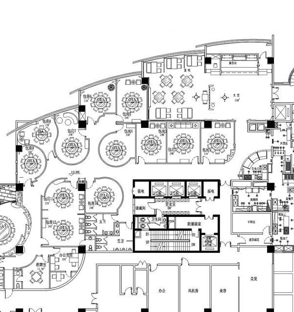
▲项目平面图
项目信息——
项目名称:Sauce Up Bistro
项目类型:餐饮
设计方:白菜设计
项目设计:白菜设计
完成年份:2022
首席设计师:赵凯文
设计团队成员:刘添翼、王相卓、时含瑞、孙克楠、魏垠麟
项目地址:辽宁省沈阳市和平区北五经街20号八纬路交叉路口
建筑面积:168㎡
摄影版权:图派视觉
合作方:沈阳博森建筑装饰有限公司
客户:Sauce Up Bistro
材料:木饰面、瓷砖、乳胶漆、金属方管
Project Information——
Project name:Sauce Up Bistro
Project type:Restaurant
Design:BaiCaiDesign
Design year:2022
Completion Year:2022
Lead Designer:Kaiwen Zhao
Design Team Member:Tianyi Liu, Xiangzhuo Wang, Hanrui Shi, Kenan Sun, YInlin Wei
Project location:Intersection of 8 wei Road, No. 20 North Wujing Street, Heping District, Shenyang City, Liaoning Province
Gross built area:168㎡
Photo credit:Topia Vision
Partner:Shenyang Bosen Building Decoration.Ltd
Clients:Sauce Up Bistro
Materials:Wood veneer, tiles, latex paint, metal square tubes
{{item.text_origin}}

