Firm: CPDA ARQUITECTOS
Type: Commercial › Office
STATUS: Built
YEAR: 2019
SIZE: 25,000 sqft - 100,000 sqft
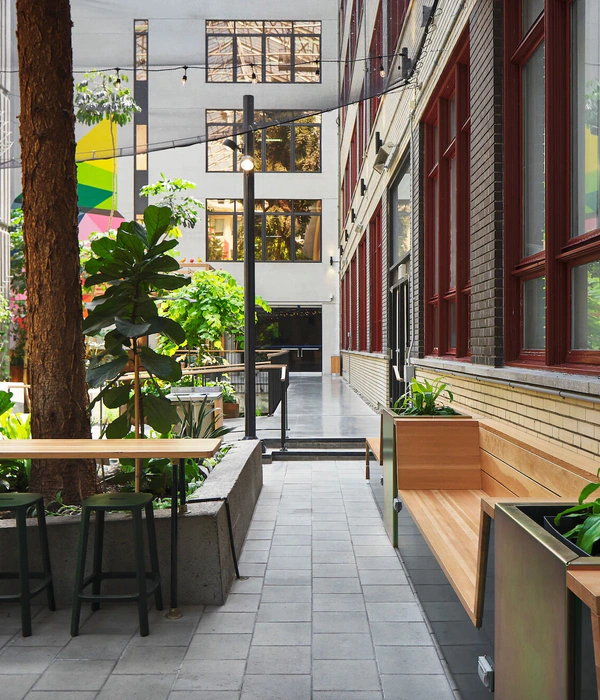
For the design of the new headquartes of startup CLIP in Mexico City; we reaches several fundamentals objectives: fostering an open and totally transparent corporate culture to maintain its startup roots through the use of glass in spaces for private use and free plants in work and recreation areas.
Maximum flexibility was sought in the spaces to be ables to accommodate the growth of the company in the future by organizing the different work areas through a clear and intuitive arrangement in the workplace. And to complement the company´s brand, it was sought through the architectural details to carefully consider the color palette that makes up CLIP´s DNA.
CLIP´s office comfort is primarily manifested in lots of wood, upholstered furniture, colorful accents. Two key principles: First, typically mix office equipment with more “homey” items. Second, the focus was mainly on the use of national materials to keep the project sustainable and thus support local companies. We also focused on acoustic comfort, so many sound absorbing elements such as rugs, absorbent ceiling panels, upholstered seats, cushions, and pressed felt laps were used.
The same shape of the Torre Manacar building provides us within an image that we can delineate through a perimeter bench, which allows to save the leveling of all the slabs having: (i) an economic saving, (ii) a rail for electrical installactions and data for the entire office, (iii) storage area, and (iv) collaboration area.
Complementing this organic silhouette, the core of elevators is covered with curved crystals, forming the meeting spaces. The centralized main room has the option of being divided by a mobile wall. The table in this main room is made of several flip top tables, which contain the CLIP DNA printed.
To respect the privacy and acoustic of these room, a rear hallway was designed, where it was used to place the personal storage area of the users in lockers, in order to reduce the amount of paper and keep the workspace clean.
A staircase was placed between the two levels to be able to connect the internally and control users access from the ground floor, this staircase serves as a forum, meeting and or training area, or simply to have a view of the city. To achieve better communication between the teams and their Vp´s, common spaces were designed, such as the Coffe&Print, Game Room and Brainstorming, with different designs and atmosphere that inspire the teams members and their guests.
{{item.text_origin}}

