Firm: archimatika
Type: Commercial › Office
STATUS: Built
YEAR: 2009
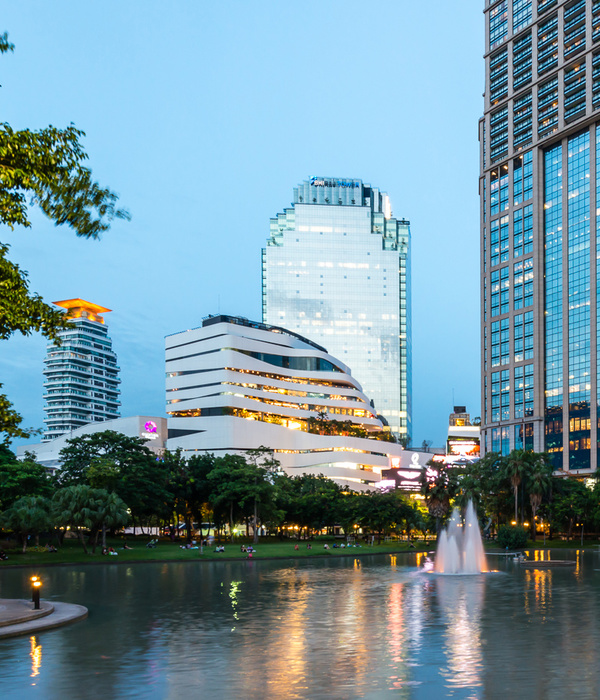
The laconic, simple and at the same time ideal solution for the exterior of a massive building made it one of the iconic modern objects in the city.
Solutions:
- We decided to make this asymmetric and quite massive building lighter by slightly rounding the external line of the building’s envelope and skew the glazing rising above the building’s roof
- In order to make the building slimmer and visually reduce its volume, white strips have been applied onto façade glazing.
- The shift of strips on glazing indicates that the building consists not of one single volume but of two horizontally shifted halves.
- To ensure natural ventilation of parking space, we offered a solution of glass panels placed at an angle like blinds.
Facts and details:
- Initially, the building was intended to be over 30 stories high.
- According to the original project, glazing was designed as a single surface running all the way to the top of the building, but subsequently, design specifications were changed and today, the line where the top part of glazing joins the main volume can be seen on the facade.
Project type: A-class business centre
Facade area: 61 850 sq.m
{{item.text_origin}}

