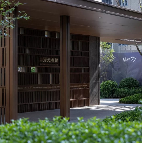
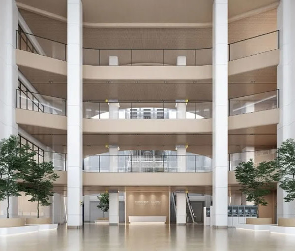
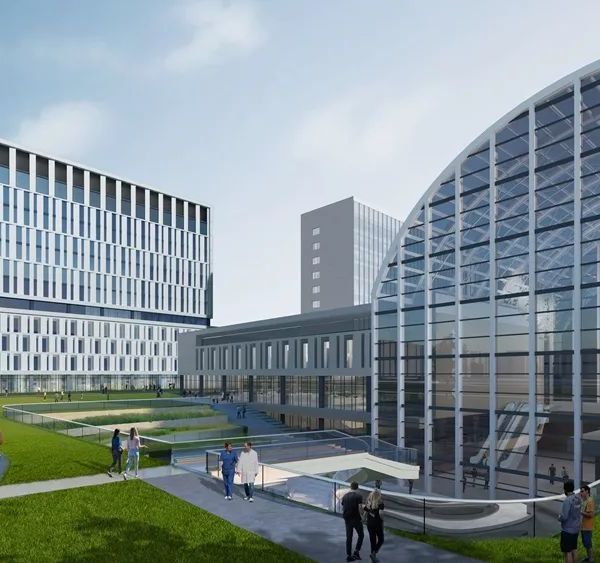
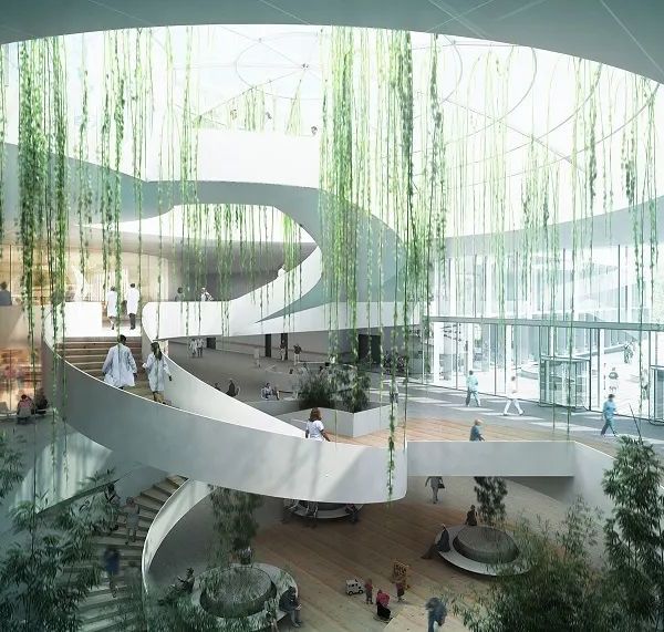
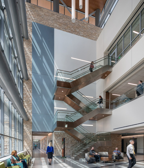
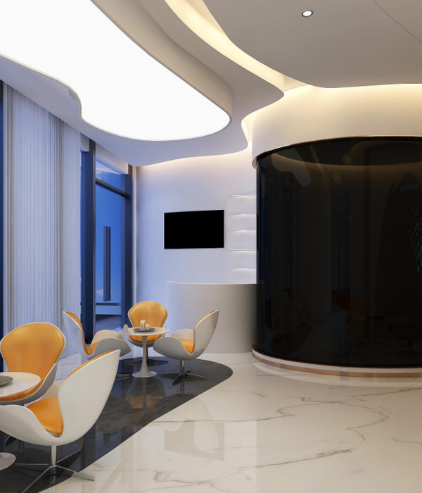
This oral and dental health clinic, located on a very strategical point on Bagdat Street welcome its visitors with a very spacious and airy welcoming room. A part of the waiting room includes comfortable lounges suspended from the ceiling and there is a free seating place in front of the counter, creating a sort of relaxation area.
The counter is located in the exterior wing of the building where clinics and sterilization are located, wrapping the waiting lounge. The design language of the woodwork counter matches with the general design language of the clinic. In the same way, the furniture which is designed in a thin wireframe woodwork way shows the general design language of the clinic. A masculine Japanese minimalism.
The designers created a visual facade and exposed the main identity of the clinic while configuring the planning of the clinics on the right side. In the interior, the left side is reserved for all the service units compactly that to satisfy clinic needs.
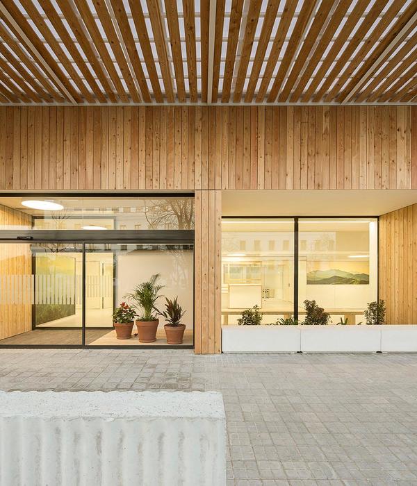
Thanks to the togetherness of clinic examination rooms and sterilization, the volumes facing the facade have a transparent effect in the interiors. The glasses and plants placed in between of the room separators made the general space look more spacious and transparent. With this transparent look, the clinic rooms are much more spacious and allow wider perspectives. The rooms show much more depth because of this.
As a contrast to all of this transparency, the left side of the corridor is designed is much darker and opaque. This contrast shows itself as the reflection of right side facade dividers on the left side’s reflection. All the names of the spaces are reflected, rigid and opaque facades reflected themselves. Along the corridor, this three-dimensional understanding aims to create an excitement and curiosity among the visitor. The reflection starting from the counter side gets usage as kitchenette, mini bookshop and exhibition spaces.
In terms of materiality and textures, the policlinic has a very minimal attitude, feeding itself from the darker tones and materials like natural stone. As the negative of these tones, in the transparent side, there are much more transparency and white colors. The waiting table with only half of a frame structure and a counter frame that flies above supports this language and makes it stronger.
{{item.text_origin}}

