Architect:Medium Plenty
Location:Oakland, CA, USA; | ;View Map
Project Year:2020
Category:Offices
In search of a new headquarters, HEIST, a flourishing visual storytelling and production studio, set their sights on an old auto repair shop in a burgeoning Oakland, CA neighborhood.
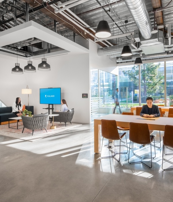
The studio tapped Medium Plenty to lead the renovation of the industrial, 5,500 square foot building, and create a versatile, open workspace interior set inside a gleaming exterior metal shell. Key original features of the auto shop were preserved to frame modern, approachable spaces with a broad range of uses from production services to neighborhood community gatherings.
The existing concrete floors were refinished and sealed. Other original warehouse features, like the exposed metal beams, were preserved to frame modern, “white boxes”, designed as private suites for meeting, shooting space, editing and finishing. An insertion of volumes in the space was a key solution to help break up the space and create areas within them. The kitchen/break room, with added mezzanine above, adds square footage to fill in and define the space while also being permeable and functional as a meeting area that overlooks the workspace below.
Additionally, the design team was tasked with creating a secure, yet inviting community space. The blurred boundary between outside and inside with glass doors is further accentuated by an outdoor trellis that sits within a spacious courtyard allowing for public and private events such as neighborhood outdoor movie nights, local vendor pop ups and art exhibitions. The outdoor walls, adorned with local art, create a protected, secure courtyard from the surrounding buildings.
The goal for the renovation was to create an approachable, flexible space for a range of activities including ideation of powerful visual campaigns to making creative content in production and post production.
The first challenge was activating the empty industrial warehouse with a specialized program of collaborative, elegant spaces that could also be used to engage with the surrounding community through neighborhood events.
A second challenge was maximizing the light and openness of the space on a limited budget. The design solution was to include as much glazing as possible at the main facade with enormous glass sliding doors at the entrance and conference room, which makes the indoor/outdoor spaces feel even more connected. With a substantial glimmering facade, this design choice provided a welcoming approach for visitors, meeting the owners’ vision for an inclusive, collaborative hub.
Custom furniture elements were fabricated, including an angular entry bench, clad with warm wood, complimenting other natural materials used on railings, stairs and perimeter suite doors. The closed rooms with glass and accents of wood line the perimeter of the double height space to emphasize the expansiveness of the room. Functional spaces like the bathroom and kitchen/break room were completed in varying earthy pink tones to delineate them from the bigger, open plan workspace.
Design: Medium Plenty
Photography: Melissa Kaseman
Interior lighting: Lightfactory & Menu
Interior furniture: Hay table and Arco chairs in Conference room
▼项目更多图片
{{item.text_origin}}

