深圳宝安国际机场 3 号航站楼——有机形态的雕塑设计
Shenzhen Baoan International Airport 3 Terminal
设计方:Massimiliano and DorianaFuksas
位置:广东 深圳
分类:交通建筑
内容:实景照片
承包方:China State Construction Engineering Corporation Limited, China Construction Eighth Engineering Divi
合作方:BIAD (Beijing Institute of Architectural Design)
图片:18张
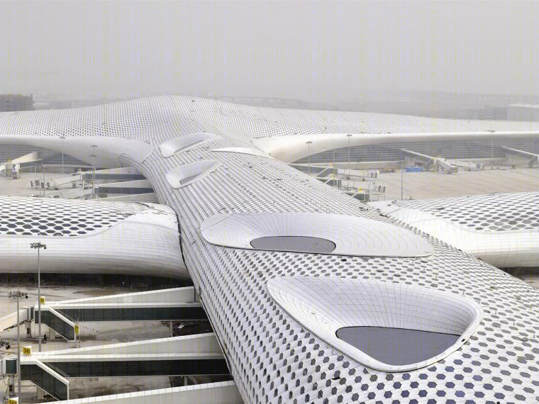
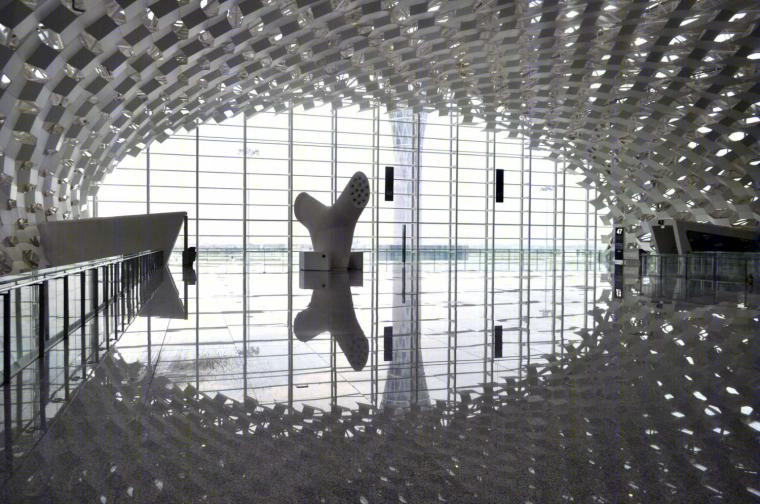
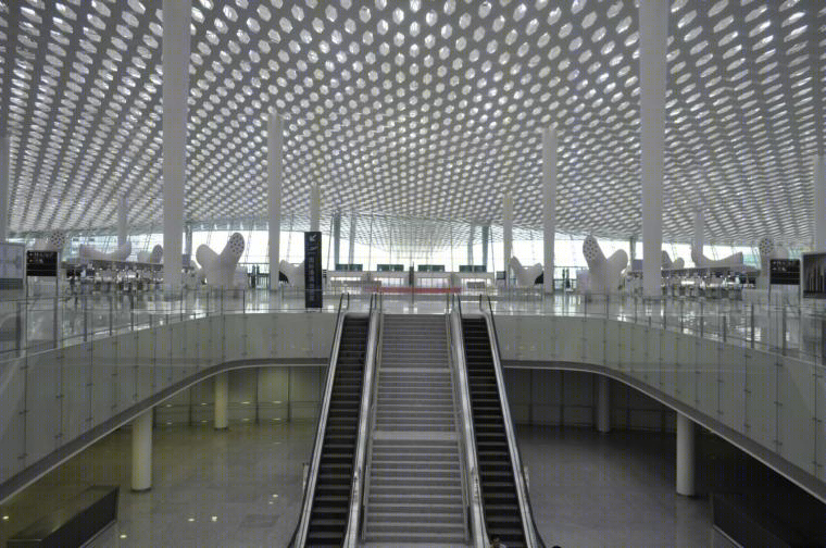
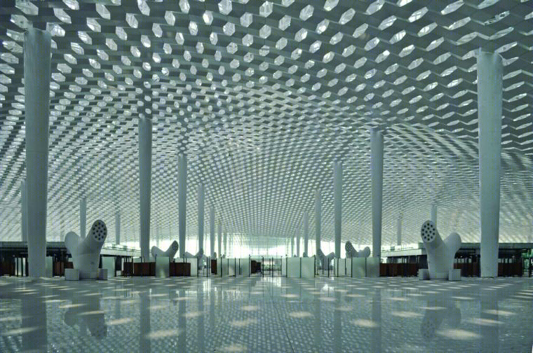
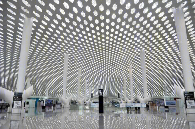
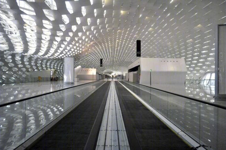
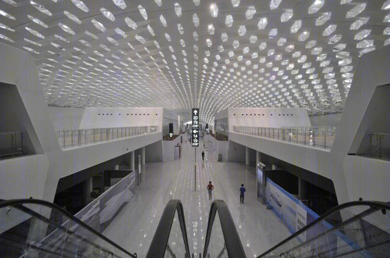
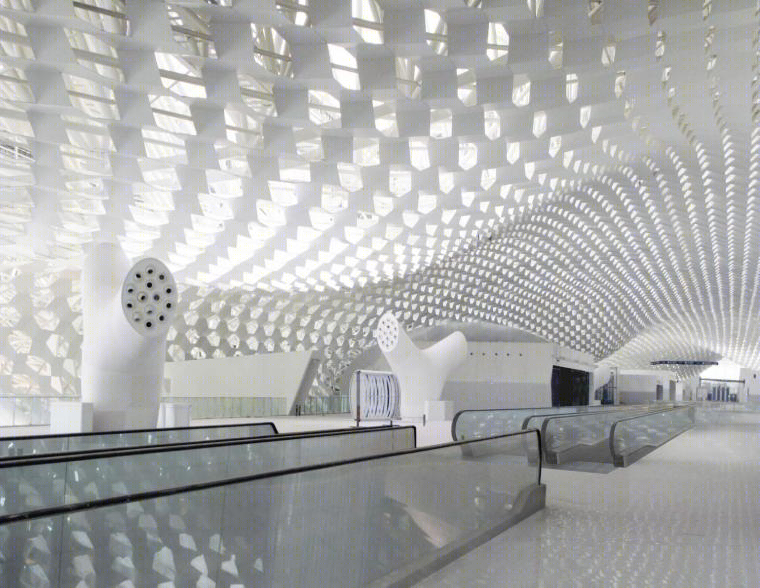
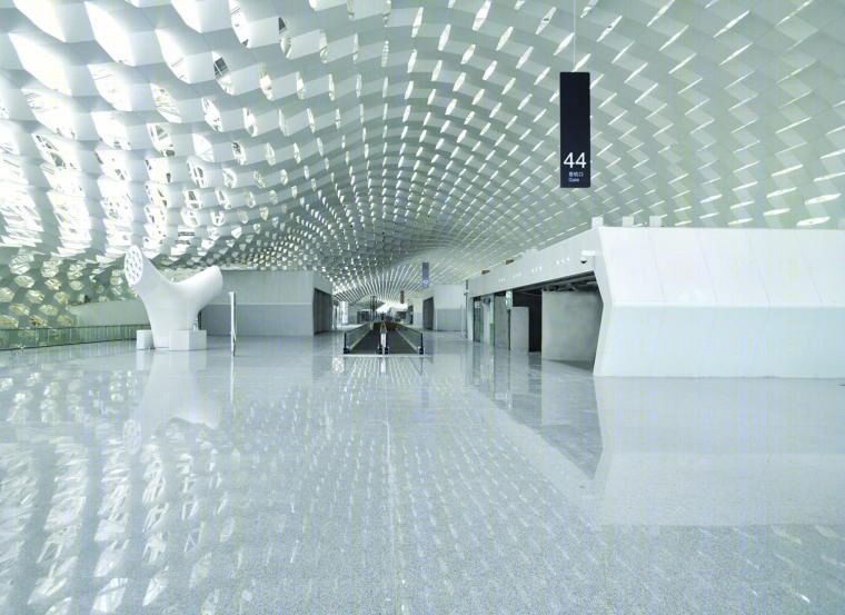
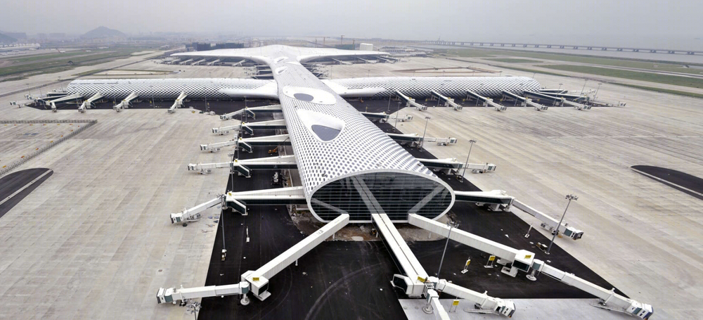
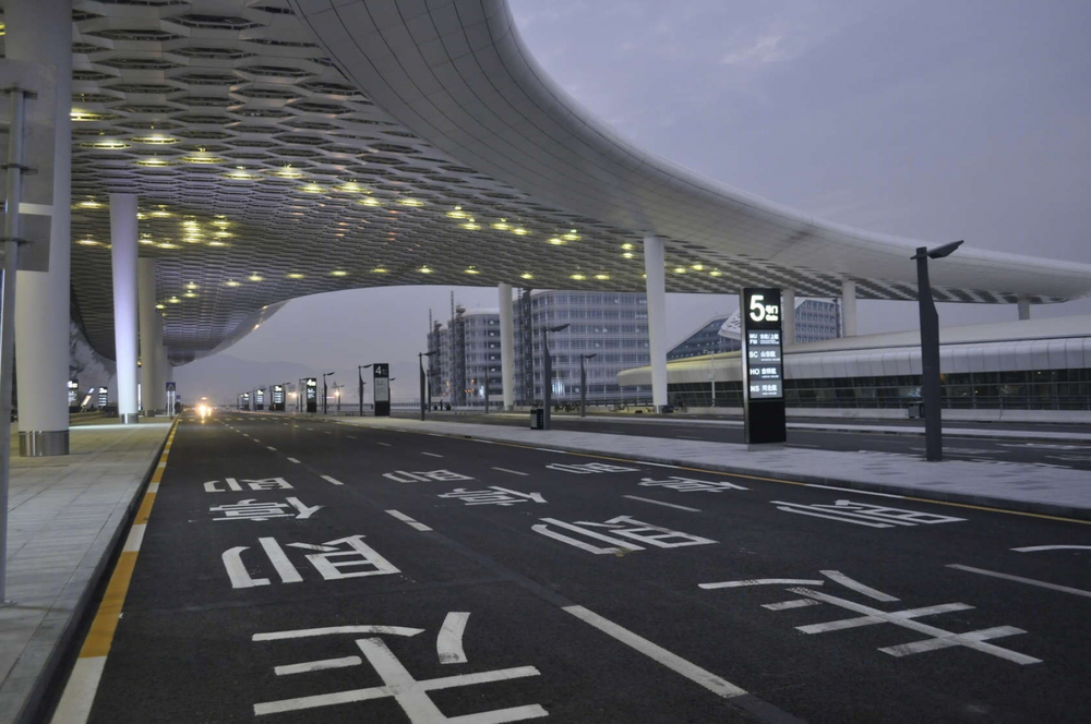
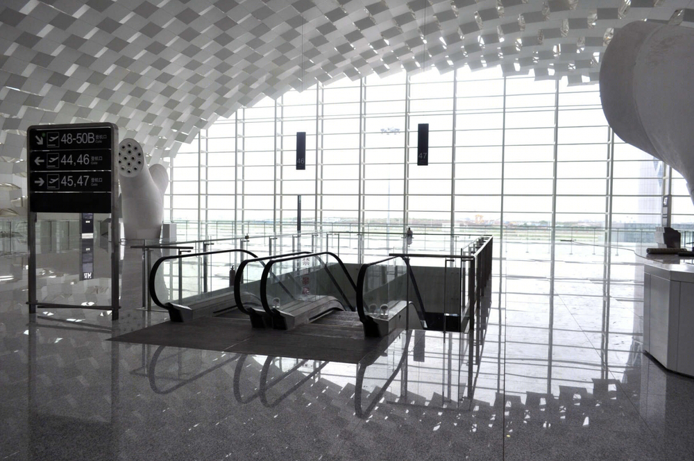
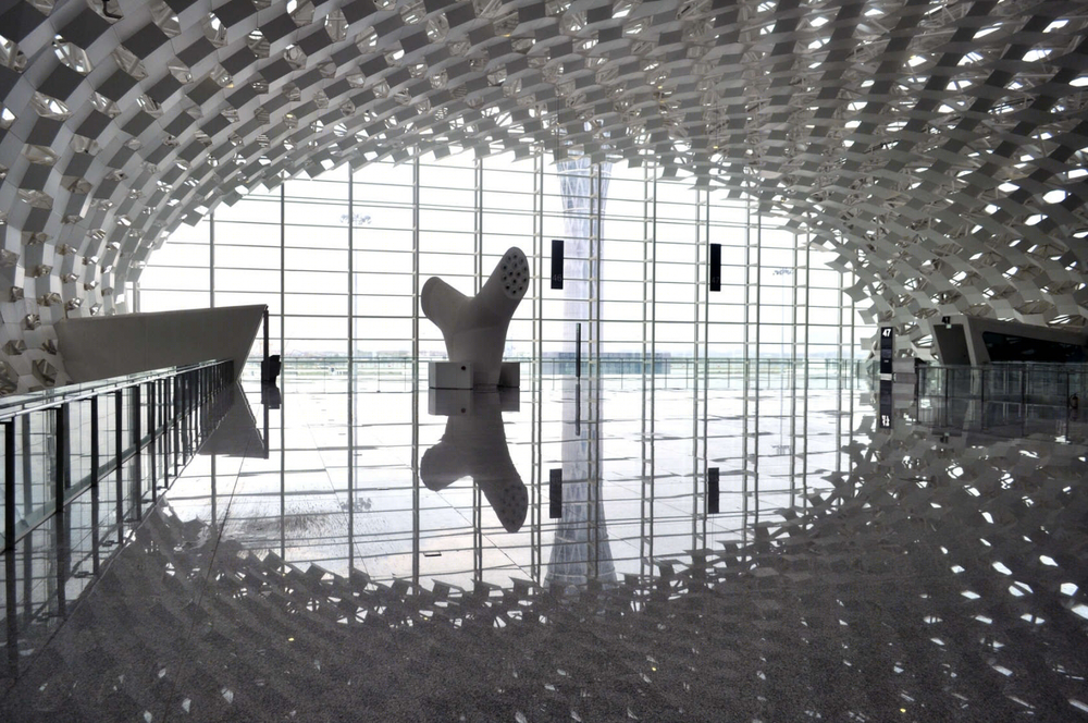
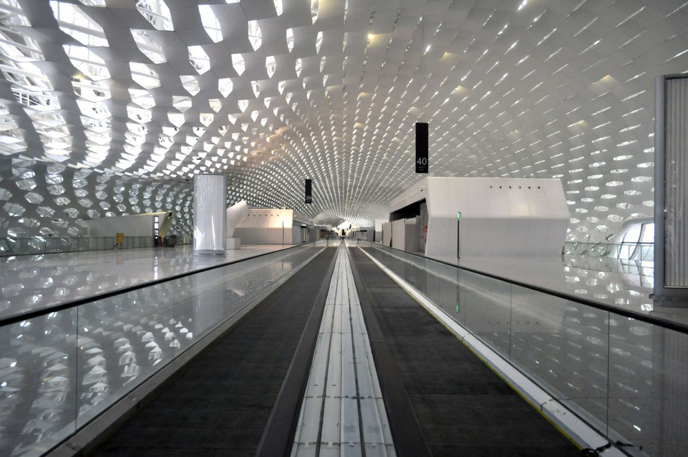
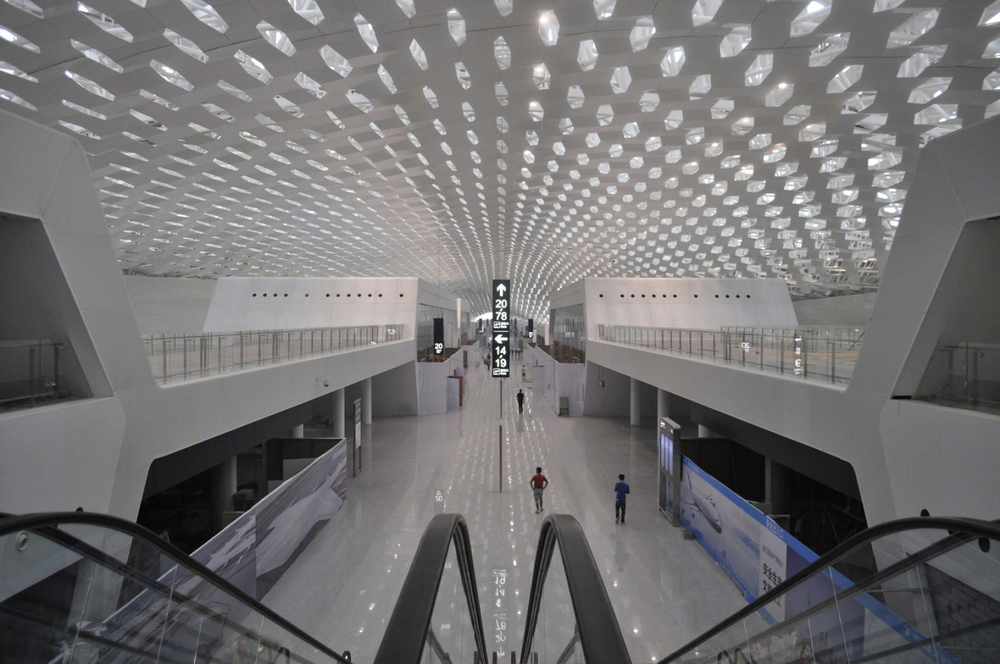
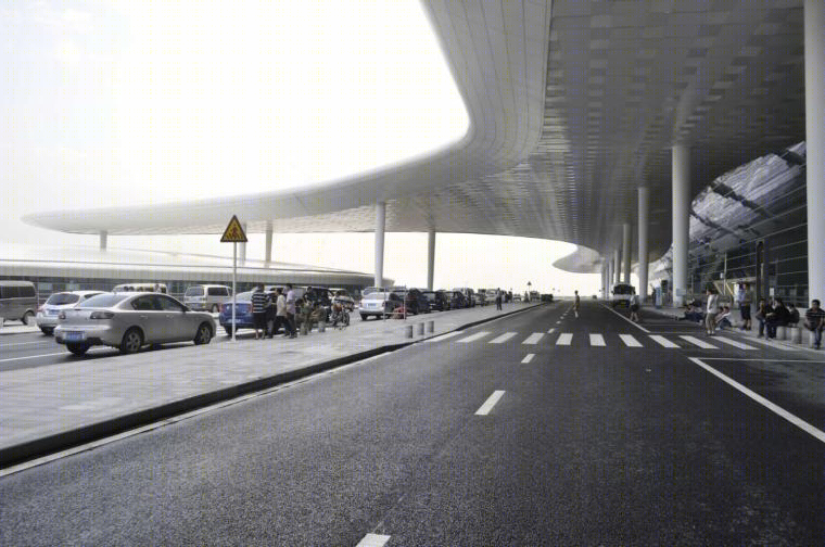
这是由Massimiliano and DorianaFuksas设计的深圳宝安国际机场3号航站楼。该项目的设计理念让人联想到蝠鲼的形象,这种鱼能呼吸和改变自己的形状,经过一系列的设计演变后变成了一只鸟,象征着一段激情而美妙的航程的开始。3号航站楼的结构是一条大约1.5公里长的隧道,它的形态看上去似乎是被风吹塑而成的,宛若一件有机形态的雕塑。屋面轮廓的高度不断变化,与周围的自然景观相呼应。该设计的象征性元素是包裹着建筑的内外双层“表皮”上的蜂巢状结构。这两层“表皮”可以让自然光照射进来,从而在室内空间中创造明亮的效果。覆盖层由蜂窝形状的金属板和可局部打开的、大小不一的玻璃板组成。
译者:筑龙网艾比
The concept of the plan for Terminal 3 of ShenzenBao’an international airport evokes the image of a manta ray, a fish that breathes and changes its own shape, undergoes variations, turns into a bird to celebrate the emotion and fantasy of a flight.The structure of T3 - an approximately 1,5-km-long tunnel – seems to be modeled by the wind and is reminiscent of the image of an organic-shaped sculpture. The profile of the roofing is characterized by variations in height alluding to the natural landscape.The symbolic element of the plan is the internal and external double “skin” honeycomb motif that wraps up the structure. Through its double-layering, the “skin” allows natural light in, thus creating light effects within the internal spaces. The cladding is made of alveolus-shaped metal and glass panels of different size that can be partially opened.
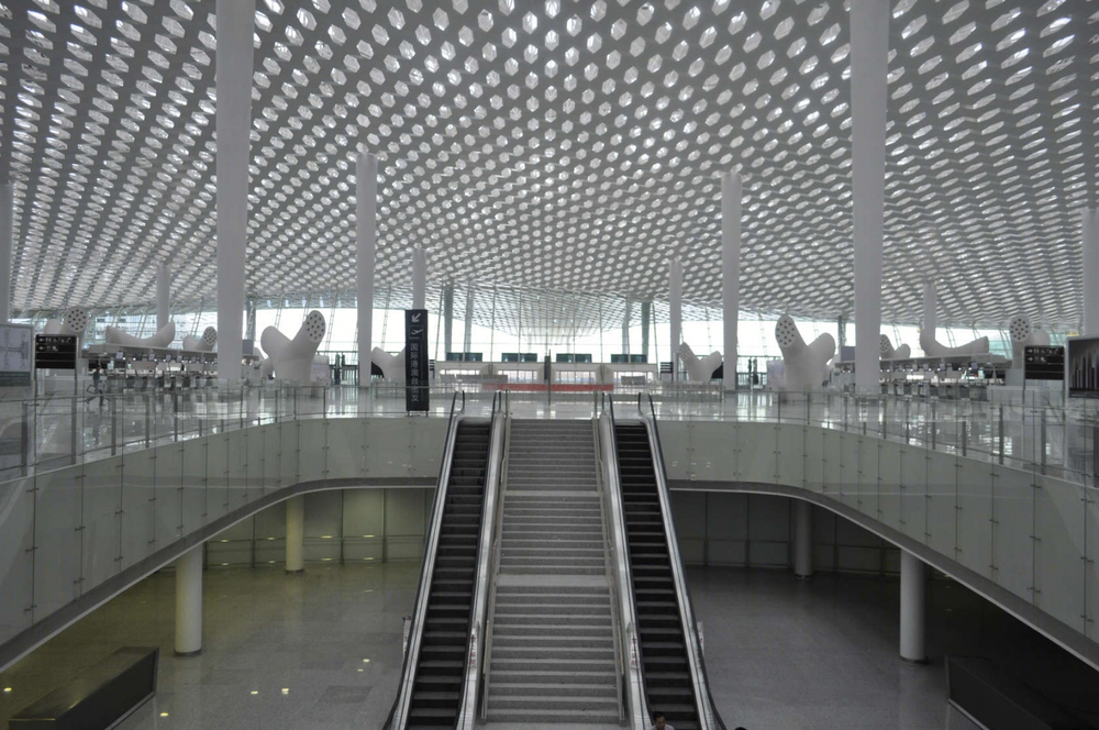
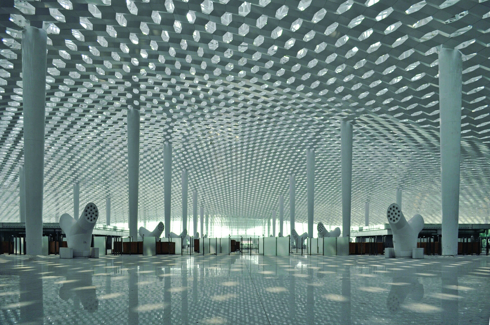
The passengers accede to the terminal from the entrance situated under the large T3 “tail”. The wide terminal bay is characterized by white conical supporting columns rising up to touch the roofing like the inside of a cathedral. On the ground floor, the terminal square allows access to the luggage, departures and arrivals areas as well as coffee houses and restaurants, offices and business facilities. The departures room houses the check-in desks, the airlines info-points and several help-desks. The double and triple height spaces of the departures room establish a visual connection between the internal levels and create a passage for natural light. After checking in, the national and international passengers’ flows spread out vertically for departures.
The concourse is the airport key-area and is made up of three levels. Each level is dedicated to three independent functions: departures, arrivals and services. Its tubular shape chases the idea of motion. The “cross” is the intersection point where the 3 levels of the concourse are vertically connected to create full-height voids which allow natural light to filter from the highest level down to the waiting room set in the node on level 0.
The honeycomb motif is transferred and replicated on the interior design.Shop boxes, facing one another, reproduce the alveolus design on a larger scale and recur in different articulations along the concourse.
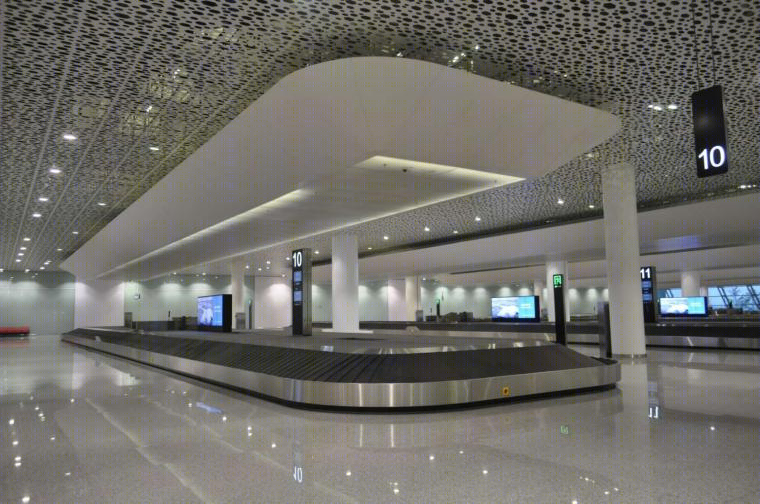
The interiors designed by Fuksas – placed in the internet-point, check-in, security-check, gates and passport-check areas – have a sober profile and a stainless steel finish that reflects and multiplies the honeycomb motif of the internal “skin”Sculpture–shaped objects - big stylised white trees - have been designed for air conditioning all along the terminal and the concourse, replicating the planning of amorphous forms inspired by nature. This is also the case for the baggage-claim and info-point “islands”.

深圳宝安国际机场3号航站楼外部实景图
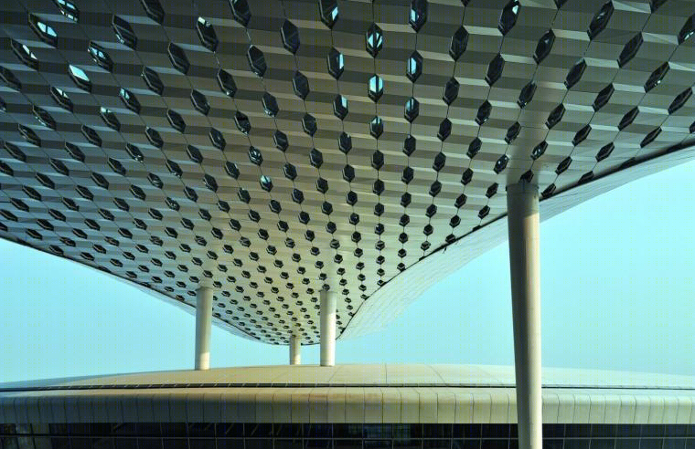

深圳宝安国际机场3号航站楼外部夜景实景图
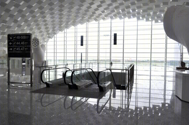
深圳宝安国际机场3号航站楼内部实景图
