You know the type. Red, double brick houses. Those bricks also came in a deep brown and a light tan. The ubiquitous Australian 1970’s brick veneer home. It came complete with aluminium sliding windows, eaves that stopped at the brick wall, and a ‘brick on edge’ window sill. It was the iconic image of Australian suburbia. And no-one would argue it was pretty bleak. Architecturally speaking, we weren’t kicking any goals.
The thing is, every country has its awful period. It’s bleak period. The period that everyone agrees we would be better off without. But, and it’s a big but, if we don’t embrace each period for what it brings, the good, the bad and the ugly, then we have nothing to leap from. We have nothing to challenge our perceptions, or to ignite and invigorate our designs, our art, or our politics. Rather than spurn the past and the periods we don’t like, we need embrace those eras and give them as much airtime as those periods we love and do see value in.
And that’s exactly what the architects of STUDIO11 did when designing the offices of Vizor games, a development company based in Minsk, Belraus. They essentially took the bull by the horns and, instead of shying away from the harsh aesthetic of the Soviet era of the 70’s, they revelled in it. There was no getting away from the public’s disdain for this period. However, they recognised the value in giving the architecture of that era merit. Their goal? They wanted to create a space that inherited local modernist tradition and showcased its stylistic significance.
Minsk, the city itself, is rich in different elements of the Soviet era. You can see it in the modernist buildings from that period all the way through to the attitudes and lifestyles of the people who inhabit it. STUDIO11 took their inspiration from both the modernist buildings but also from the subways.
The entry foyer, a rounded lobby of light-rose glass blocks, topped almost absurdly with green ferns hanging over the edge, is your first introduction to the space. Standing here you have the first view of the celling, one of the fit outs most striking features. And the floor – the second most expansive element.
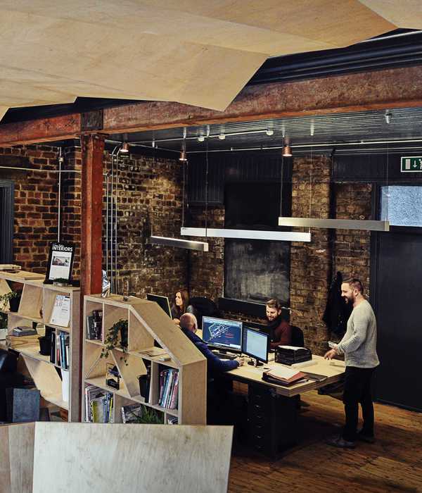
The flooring is a direct reference to the Soviet public buildings of the time. Small tiles broken apart and laid in geometric shapes, a sea of white crazy pavers, are in stark contrast to the dark and severe ceiling above. The building itself has been left brutally bare, in keeping with the building’s construction era. Pipes and beams run up the walls and across the red, rust-coloured ceilings, nakedly exposed but for their lick of matching paint. The ceiling is given aesthetic relief by the simple, elegant row of hanging, white, spherical lamps. They gracefully appear, seemingly reminiscent of a more romantic Russian time.
There are distinctly contemporary elements to this design too. The two-tone wall in the main working space. A subtle taupe colour applied to the walls, from ground to head height. Above the taupe, a white/grey concrete finish, it’s nicks and chips left unaltered, giving it an edgy, of-the-moment feeling. The signage, brass sheets laser cut into letters, pays homage to the Soviet fonts and graphics of the underground train stations. But here, against the two-toned concrete wall, it looks more like the type of thing you’d find in a uber-cool New York restaurant.
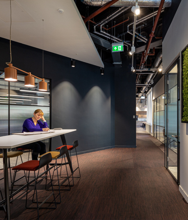
The austerity of this Soviet period is evident here once again with the low height concrete walls that cordon off the work spaces, edged with the simple detail of the black, Le Corbusier-style handrails.
But for all its somberness, the space surprises by bringing into play the beautiful archway leading into the kitchen. Here the white arch is backed either side by ceramic modules, sculpted by hand, incredibly striking and elegant. It is a wall of the finest handmade art. Here, the white geometric flooring with its black grout looks light and breezy and reminiscent of beautiful Moroccan interiors, designed to escape the heat whilst bringing a cool sophistication to the space.
The bathrooms, a nod to the 30’s, with their ceramic elements and washbasins have white pipe radiators lining the wall. It feels lighter in here. But it is still Spartan. Single brass taps sitting proud above sinks suspended from the wall, absent of any cabinetry to sit within. Even the rounded mirror simply expressed on the wall, hung from a slender steel rod says Soviet regime.
It is challenging to embrace architecture that culturally we have dismissed. But without efforts to acknowledge these areas we lose part of our heritage, our culture. For we are nothing culturally if not the memories of the accumulated eras we have lived through. Even if those memories are of red brick houses.
[Images courtesy of STUDIO11. Photography by Dmitry Tsyrencshikov.]
{{item.text_origin}}

