Located in an apartment building built in the 1960s on a frame structure, the apartment has the advantage of facing two cardinal directions, so that the ambiance changes noticeably throughout the day. Based on a light/dark contrast prior to the remodelling, we attempted an articulation by associating a number of dichotomous relations on various levels. In accordance with a ZEN spirit, the space proposes a minimalist philosophy that reduces all objects to an absolute minimum by combining different functions into a single gesture. The wardrobe at the entrance flows, gradually turning into a bookcase, kitchen-living room door, glossy MDF panels to reflect the light in the living room, a closed bookcase in the hallway, then an open bookcase ending with the electric panel cabinet. On this course, the object changes its texture, material and colour, but preserves its volumetrically recognisable and unitary aspect.
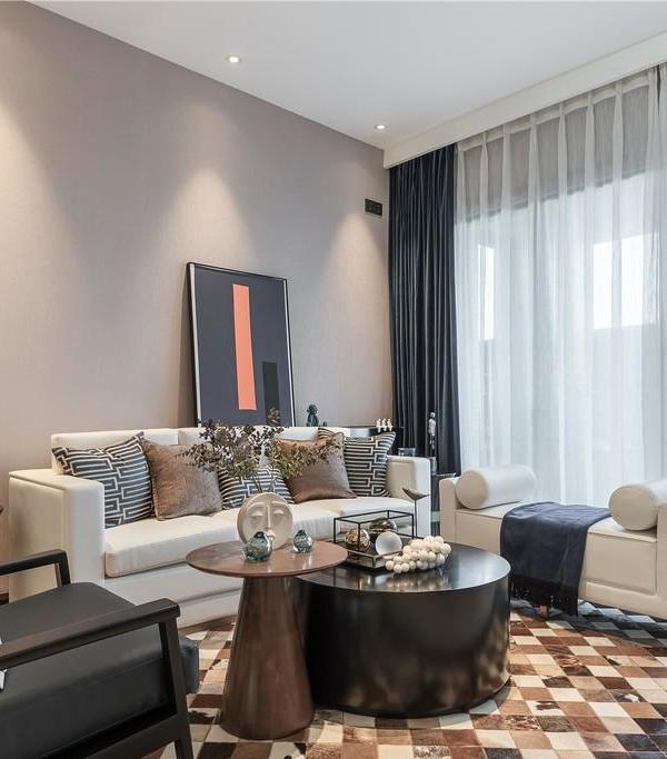
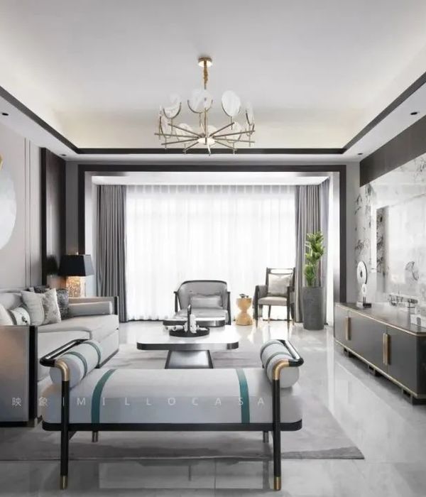
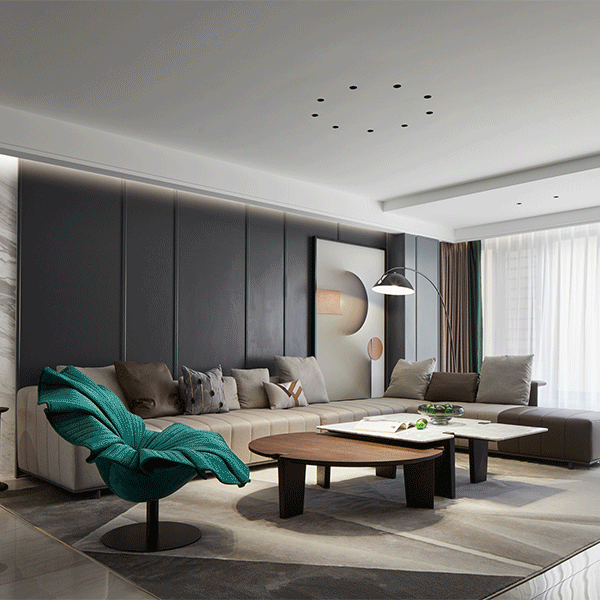
The kitchen consists of a preparation zone – a single piece of custom-made furniture – and a serving spot. The space of the kitchen is dynamic thanks to a piece of room-tall cuboid furniture incorporating the refrigerator, storage and a hidden pantry. The living room is spatially defined by the three exposed concrete beams, which have been exfoliated of the previous plaster. The frame created by the three beams and the window narrows down a central area, where a modular sofa takes up different configurations to suit the owners' needs. On the right and left side there is a sensory dialogue between the walls adjacent to the window: the wall on the left – massive, stone-like appearance, and, on the right, the media wall – light and delicate fabric-covered furniture.
The artificial light in the living room is the result of two types of lighting: the convergent light of the four focal spots – orientable and dimmable depending on the activity performed, and the indirect light cast on the MDF panels mentioned above. The light slit breaches from within the inflection point of the furnished wall, right between the dark and opaque surface, and the light and glossy surface. This glossy panel scatters the ambiental light in the living area dynamically.
The tour continues with the hallway, where the height of the ceiling has been lowered and the stretched ceiling has been dematerialised, lit from above.
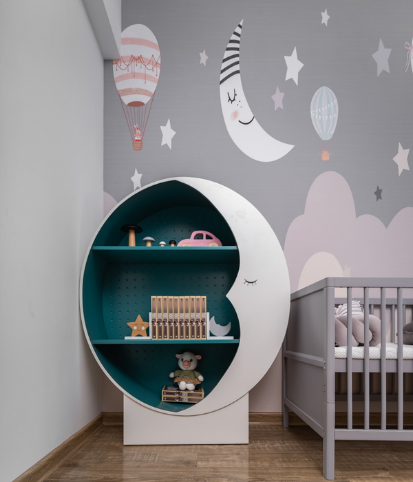
The baby room is based on separate zones so designed in order to support multiple subsequent adjustments as time goes by. Hidden behind the stone-like wall, this room has predominantly light colours.
The bathroom is animated by a play between dark-light materials and the subsidiary element created by the three lighting areas. Enjoying a generous view on the lush river bank and an Art Nouveau Building, the bedroom is divided into two zones: the first housing the sleeping and dressing area – furnished with hardwood on the wall and floor, and the latter, next to the window, defining the coffee area – furnished with dark ceramic tiles on the floor and the wall under the sill.
The light in the sleeping area is indirectly cast, beaming only from within the perimetrical suspended ceiling. The dressing is hidden in an alcove with shiny, white, room-tall furniture that opens up the space accompanied by the mirror on the right.
The features of the initial spatiality of the apartment have been captured, enhanced and upgraded, so that each area is filled with life by contrasting lights, materialities and nuances.
Designed by ZEN(o)- arch. Zeno Ardelean
Photography: Victor Băluțiu, Zeno Ardelean
Furniture execution- ICM Fruniture, Ionuț Mutașcu
Smart home devices and programming- Home Automation, Bogdan Drăgoi
Lighting fixtures- Traccia, Bogdan Sere
Metal works- Inometal, Benzar Gheorghe
{{item.text_origin}}

