The project is hidden in a densely populated and bustling alley, “ 485, Nhật Tảo Market “, with a width of only 2,2 meters, in an old famous electronic market with nearly 20 years of operation. Townhouses close together are also a characteristic of the urban system in Ho Chi Minh City as well as District 10. Therefore, proposing designs related to solving the outside noise, restricting views from the opposite neighbor‘s house, and providing natural light, green areas, and outdoor playgrounds became the inspiration that the design team brought to the house.
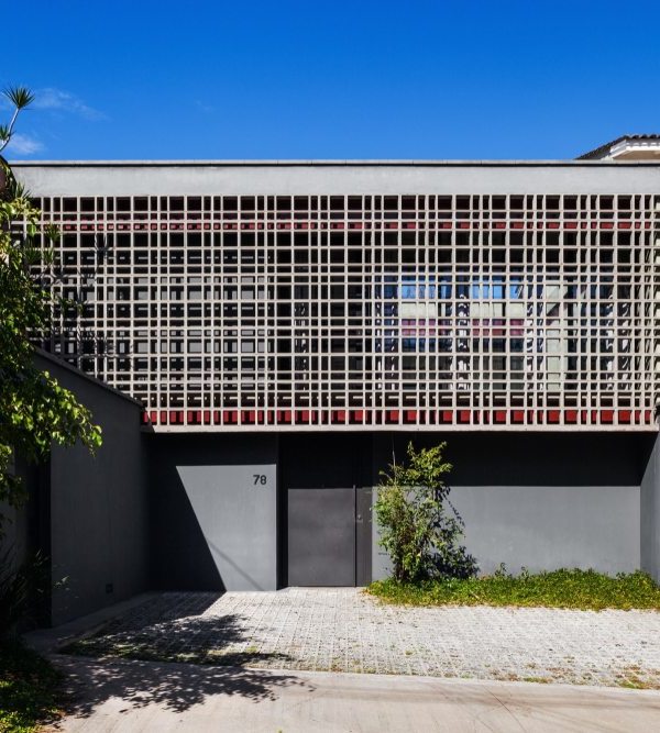
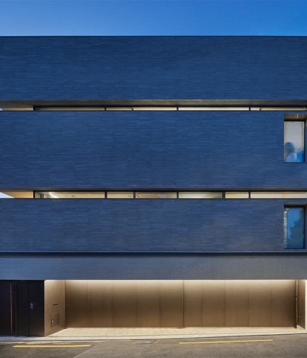
Seen from the façade, horizontal concrete louvers arranged haphazardly, combined with alternating green patches, resemble the image of a large natural curtain shielding the interior space from outside influences. That image is also shown in the design of the main iron door frame, which has perforated panels of the same color, making it easy to control activities outside the door. Entering the interior is the open space of the paddock, living room, and kitchen. The living room ceiling and floor both use concrete texture to create continuity of design from outside to inside.
The split-level floor structure helps make the space larger, and moving stairs to the floors is also more reasonable when there are flat breaks. The skylight area not only regulates the wind but also brings natural light from the roof to the ground floor. Light is also reflected through the glass brick railings and sliding glass doors. The steel ladder gaps also contribute to creating light openings, naturally eliminating the boredom of the atrium space. It helps the house remain full of light even when all artificial lights are turned off and saves electricity instead.
Bedrooms on the 1
and 2
floors are arranged in the front area, behind the concrete beams, and greenery is completely shielded from outside influences, ensuring full privacy and quiet for residents inside. The dressing room and toilets are located behind the house but still get natural light from the skylight. The 3
floor is the family‘s altar area, overlooking the playground, combined with green areas to create a fresh space; white painted steel panels are also a highlight to break the boredom of the space when it is sunny. The cool, fresh playground is suitable for family members to gather with friends on holidays.
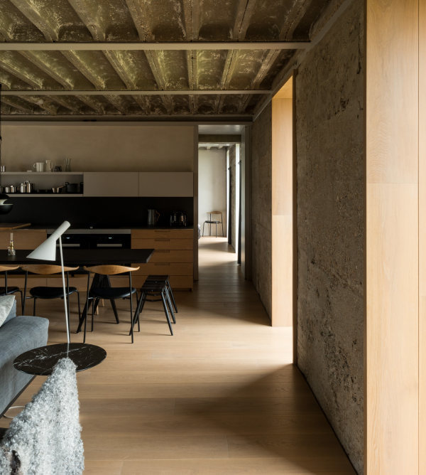
In addition, the column structure was designed to be hidden inside the wall, making it easier to arrange furniture. Although the house is quite small, it still creates a spacious feeling in the space with large and flat walls. The typical design style of the project is towards simplicity of shapes and neutral tones, but all design details from gypsum ceilings, cove lights, interior furniture details, full height wooden doors, glass brick railings, steel louvers, wooden handrails… are all carefully taken care. Not only does it bring beauty to the architectural space, but also sophistication in every small detail.
{{item.text_origin}}


