由ZPZ合伙建筑事务所设计的Tetra Pak研发中心,位于意大利北部Modena市以西的老Emilia大道工业区,占地约一公顷。这家跨国公司自1980年在这里成立,随着时间的推移,形成了一个制造土地生产设备的复杂管理系统。ZPZ 合伙建筑事务所的新项目与该地区的现有建筑建立联系,同时通过创新的建筑方案和由此产生的重新定义工业类型的形式风格脱颖而出。此外,它还系统地重新定义了工作空间。
The new Tetra Pak Research Hub, designed by ZPZ Partners, is located within a production area that occupies approximately one hectare of along the old Via Emilia industrial district west of the city of Modena, in Northern Italy.The multinational company has been established here since 1980, resulting in a complex system of managerial and land production facilities over time. The new project by ZPZ Partners establishes a connection with the existing buildings in the area while standing out through its innovative construction solution and the resulting formal consequences that redefine the industrial typology. Furthermore, it systematically redefines the workspace within the facility.
▼项目概况,project review © Marco Cappelletti
质朴其外,小巧其形 A large, pristine envelope with a compact, plastic shape.
从远处看,建筑结构看上去像一个平行四边形形状的塑料体块。它光滑、质朴,可弯曲,边缘弧度流畅。新的Tetra Pak研究中心以不透明的外表皮为主,突出其简洁、光洁的外观特点。如果你仔细观察,乳白色的大型包裹外表皮展现了结构和材质。视觉上柔软而富有弹性的表面由混凝土预制板构成。这些板材以规则的模式排列,形成了一个无缝、统一的包裹结构。混凝土板上的三角形向顶部逐渐缩小,最终消失。这个巨大建筑物的表面在东南和西北两侧略微弯曲。在建筑首层,大面积的玻璃让人可以看到内部,并直接到达工作区。包裹的表皮结构最终在西北侧形成了一个完整的开口,形成了主立面,并在其中设有入口,容纳了办公室和实验室空间。办公室部分似乎从建筑体量中浮现出来,在侧面和顶部都与塑料质感的外表皮分离。在二层办公室和外表皮之间有一个宽敞的露台。
From a distance, the structure appears as a large parallelepiped-shaped plastic object. It is sleek, pristine, capable of flexing and smoothly curving along its edges. The new Tetra Pak Research Hub is predominantly opaque, showcasing its clean and polished appearance. Upon closer inspection, the large milk- white-colored envelope reveals its structure and materiality. The visually soft and flexible surfaces are constructed with precast concrete panels. These panels, arranged in a regular pattern, create a seamless and uniform envelope. Triangular shapes, imprinted in the concrete panels, gradually diminish in size towards the top, eventually disappearing. The surface of this large container slightly flexes on the southeast and northwest sides. On the ground floor, extensive glass bands provide a view of the interior and direct access to the workspace. The envelope ultimately reveals a complete opening on the northwest side, forming the main facade that houses the entrances and accommodates the office and laboratory spaces. The office section appears to emerge from the volume of the building, detached from the plastic shell both on the sides and at the top. Between the second level of the offices and the shell, there is a spacious terrace area.
▼从远处看的建筑结构,the building structure from a distance © Marco Cappelletti
▼外观上的细节,the building facade detail © Marco Cappelletti
▼首层透明的办公区域, transparent office area on the ground floor © Marco Cappelletti
办公室和实验室所在的部分建立了外部和内部空间之间的关系 The section housing offices and laboratories establishes the relationship between the exterior and interior spaces.
基于活动-工作法和敏捷工作法的原则,办公室和实验室的设计为Tetra Pak设计了提高创造力的工作组织系统。工作环境的设计考虑到了大约15%到20%的员工会在家工作。因此,线下的办公区域就成为了互动交流的中心,用来举办各种无法在线上举办的活动。这里也成为每一个人都可以分享想法,与他人交流互动的协作空间。
The design of the offices and laboratories has allowed Tetra Pak to experiment with work organization systems that promote innovation, based on the principles of Activity-Based Working and Agile Working.The workplace is designed with the understanding that a percentage of employees, ranging from 15% to 20%, will work from home. The physical office, therefore, becomes a hub for creative interaction, hosting activities that cannot be conducted remotely. It becomes a collaborative space where individuals come together with the specific goal of sharing ideas and interacting with one another.
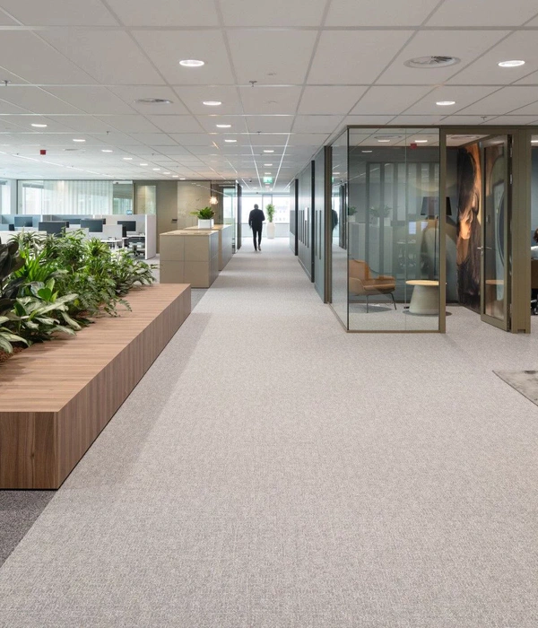
▼办公空间,Office space © Marco Cappelletti
在开放协作并且灵活自由的平面布局中,办公室房间朝整栋楼的西北的一侧排列,形成一个独立的建筑体量,似乎独立于其他各面都包裹着建筑表皮的巨大体块。办公区域分为两层,由两个部分组成。内部空间包括专用房间、高度专业化的活动空间、设计区域和会议室,与包装生产车间建立直接的视觉联系。外部空间是管理和行政部门,是生产基地主要面向的部分。这一部分空间的特点是采用全玻璃表皮,并按照不规则的节奏组织成网格状装饰。网格由木质构件组成,与外立面呈垂直排列,在夏季可遮挡阳光的直射,同时也反映出内部的特征和环境的质量。
▼办公布局平面,office plan © ZPZ
Arranged in an open, coordinated, and flexible layout, the offices align along the northwest-facing side of the room and form a separate building volume that appears independent from the container enveloping the structure on all other sides. In essence, the office section, organized over two levels, presents two fronts. The internal front, which houses dedicated rooms, quiet environments, spaces for highly specialized activities, areas for design, and informal meeting places, establishes a direct visual relationship with the area where the packaging machine production takes place. The external front, housing the managerial and administrative departments, defines the main facade of the production site. This facade is characterized by a fully glazed surface, organized in a grid pattern that follows an apparently irregular rhythm. The grid is made of wooden elements arranged orthogonally to the facade, providing shade from direct sunlight during the summer while reflecting the identity and environmental quality offered inside.
▼沿西北一侧排列的办公空间,office space © Marco Cappelletti
▼内部专用空间,the internal dedicated rooms © Marco Cappelletti
纯净、高效且环保的生产大厅 A pure, efficient hall with high environmental quality.
这个生产大厅的特殊性就在于它的灵活度。由于需要为食品包装设备的组装和测试预留一个大空间,ZPZ合伙建筑事务所重新思考了工业生产所需要的环境。这座容纳研发活动的新大楼,是一个完全可改造的机库,也是一个混合型工作空间。它能够容纳多条生产线,并作为活动和培训的场地,而无需进行额外的改造。
The uniqueness of this facility lies in its total flexibility. The demand for a large space reserved for the assembly and testing of food packaging machines led ZPZ Partners to rethink the industrial environment. The new facility, which currently accommodates research and development activities, was conceived as an entirely transformable hangar, a hybrid workspace capable of hosting production lines or serving as a venue for events and training without the need for additional modifications.
▼生产线大厅,hall for production line © Marco Cappelletti
设计的挑战在于组织一个包括各种公用设施和配电设施的复杂系统,这些设施基本构成了建筑的硬件。这些硬件设施包括压缩空气管道、用于处理水和其他液体的通道、电力和数据基础设施。ZPZ对这些系统的存在进行了重新规划,并创造出一种只在必要时才允许使用这些系统,其余时间则将其隐藏起来的设计。用于回收的传送带也位于地下的两条隧道中,隧道宽 7 米,横跨整个建筑。这种工业设计方法有几个优点,包括最大限度地减少噪音、创造极其洁净的空间、消除处理废物的场景以及促进回收过程。
The design challenge involved organizing a complex system of utilities and distribution, which essentially formed the building’s hardware. This hardware consisted of compressed air ducts, water and fluid channels for processing, electricity, and data infrastructure. The project reimagined the presence of these systems by creating a design that allows their access only when necessary, keeping them hidden for the rest of the time. Even the conveyor belts for recycling are located underground in two tunnels that are 7 meters wide and span the length of the building. This approach to the industrial design has several advantages, including minimizing noise, creating extremely clean spaces, eliminating the view of processing waste, and facilitating recycling processes.
▼创造洁净的空间、消除处理废物的场景以及促进回收过程,creating extremely clean spaces, eliminating the view of processing waste, and facilitating recycling processes © Marco Cappelletti
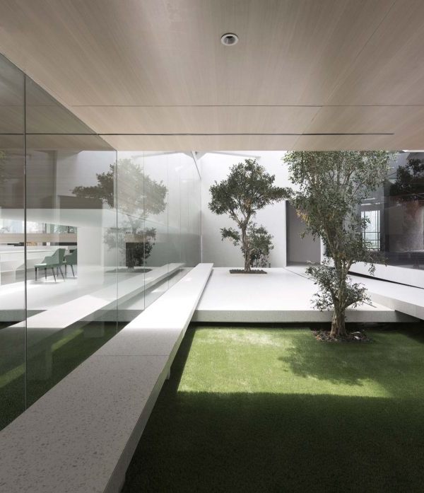
这些特质和工作空间同样可以成为一个充满幸福的场所的想法,驱使ZPZ将这些功能集合到这一占地超过4500平方米的单体大厅中。这座大厅有白色的地板和胶合板构成的天花,除了两个室内花园一般的大型网格结构以外,没有任何结构上的干扰。花园内种满了植物,除此以外,自然光也通过这些办公区域之间的花园渗透进整个大厅,大量的阳光通过屋顶的自由开洞渗透进来,同时也通过西南与东北立面的首层落地窗照耀进来。
These characteristics, along with the idea of the workspace as a place of well-being, led ZPZ Partners to conceive the over 4,500 square meters of space dedicated to these functions as a single large hall. The hall features a white floor and glulam ceiling, free from structural obstacles except for two large lattice elements that serve as internal gardens. In addition to entering through these plant-filled structures, natural light diffuses into the hall through the gardens located between the offices, numerous skylights scattered in a free form on the roof, and two windows running at street level on the southwest and northeast facades.
▼胶合板构成的天花,the hall features with glulam ceiling© Marco Cappelletti
▼内部花园,a internal garden© Marco Cappelletti
沿着建筑轴线的大型中央钢结构构件与一系列周边钢柱之间的协作,创造出了一个宽敞而开放的空间。在这一空间内,设置了四条生产线,最多可容纳 36 台包装设备,每台包装设备都有确保其完整运行的装置。传送带和公用设施(经处理的冷却水、循环包装水、原水、压缩空气和电力)主要分布在位于地下室的两条无障碍走廊内。因而维护工作可以在工作区之外进行,从而保持了试验大厅的整洁和灵活性。
The collaboration between the large central steel structural elements along the axis of the building and a series of perimeter steel columns has enabled the creation of a spacious and open space. Within this space, four production lines have been set up, with the capacity to accommodate up to 36 packaging machines, each supported by devices that ensure their complete functioning. Both the conveyor belt and the primary distribution of utilities (treated cooling water, recycled packaging water, raw water, compressed air, and electricity) are located in two accessible corridors in the basement. Maintenance can be carried out outside the active area, keeping the testing hall clean and flexible.
▼其他服务空间,other service space © Marco Cappelletti
最终呈现出的效果是纯洁、优雅、平静和令人惊叹的。该建筑允许专业人士、开发人员和客户等访客进入,促进了员工之间的合作,营造了一个有利于培养强烈团队精神和激励人心的工作环境。
The final image is pure, elegant, calm, and astonishing. This solution also allows for the presence of visitors such as professionals, developers, and clients, fostering collaboration among employees and creating a stimulating work environment conducive to strong team spirit.
▼建筑外观:纯洁、优雅、平静和令人惊叹的,the exterior of the building is pure, elegant, calm, and astonishing © Marco Cappelletti
▼夜景,night view © Marco Cappelletti
▼场地平面,site plan © ZPZ
▼地下一层平面,basement plan © ZPZ
▼一层平面,ground floor plan © ZPZ
▼二层平面,ground floor plan © ZPZ
▼屋顶平面,floor plan © ZPZ
▼立面,elevation © ZPZ
▼剖面,section © ZPZ
Project title: Building S R&D Tetra Pak Modena Campus Location Modena, Italy Project schedule Competition: June 2018 Announcement of the competition winner and assignment of the contract: July 2018 Construction start: September 2019 Completion of the building construction: June
Size Total surface area: 10,868 square meters Client :Tetra Pak Packaging Solutions Structures Studio Associato Paltrinieri Materials – reinforced concrete foundations and basement; – steel framework for the lattice pillars (gardens) and the test hall; – reinforced concrete frame structure for the laboratory and office area; – roof made of glulam beams, each measuring 36 meters in length and weighing 6 tons; – roof insulation with rock wool and high- reflectance polyolefin layer; – precast concrete panels for the perimeter walls, designed by ZPZ; – resin flooring for the test hall; – large porcelain stoneware tiles from Florim for the flooring in offices and laboratories; – internal partitions made of plasterboard and fiber cement;| – removable floor-to-ceiling glass partitions with 39dB sound insulation; – aluminum fixtures; – northwest facade sunshades made of okoumé wood.
{{item.text_origin}}

