“ 利用多种设计手法, 打造独一份。 ”
设计师手记 零星的 流行色 散布在 空间调色板中 将传统与创新 结合在一起 处于极简 设计的 最前沿现代的方式 突出了自然与人造 几何与有机 简单与非的并置
Jil Sander 商店
| Jil Sander Store
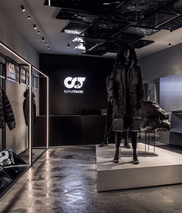
位于柏林选帝侯大街的 Jil Sander 商店的设计与品牌的新方向和审美保持一致。
The design of the Jil Sander store on Kurfürstendamm in Berlin keeps up with the brand’s fresh direction and aesthetic.
Created by Milan-based architect Andrea Tognon, the design of the store highlights the juxtaposition of natural and artificial, geometric and organic, simple and not.
Tognon 将石头、青铜等高贵材料与半透明树脂等合成材料结合在一起,将传统与创新结合在一起。
Tognon has set together noble materials like stone and bronze with synthetic ones, such as translucent resin, combining tradition and innovation at once. Similar effect was achieved by the delicate curation of custom-made pieces.
定制作品的精心策划也达到了类似的效果。庆祝过去的品质和对未来的兴奋,雕塑作品展示了永恒与开创性之间的平衡。
Celebrating the qualities of the past and the excitement about the future, the sculptural pieces show the balance between the timeless and the groundbreaking.
除此之外,在这个项目中,建筑师还考虑了它的可持续性——例如,一些树脂是由回收材料制成的。
In addition to that, in this project the architects have also considered its sustainability – for instance, some of the resin was made from recycled materials.
Gonzalez Haase AAS
Gonzalez Haase AAS
Just off the main avenue of Rua Cintura do Porto in Lisbon, Berlin-based architecture firm Gonzalez Haase AAS has transformed a former warehouse into a polished, industrial space for ‘Tem-Plate’: a high-end fashion and design concept store.
位于 Braço De Prata 水上新兴的 Marvila 创意区,以前废弃的工业建筑区已被改造成独立的艺术画廊、食品店和即将开业的 Prada 精品店。
Located in the up and coming creative district of Marvila on the water at Braço De Prata, the previously abandoned area of industrial buildings has been converted into independent art galleries, food stores, and a soon-to-be opened Prada boutique.
“模板”是这家以前的在线商店的第一个实体空间,包括限量版服装、设计物品、配饰和商店独家合作的精心策划组合。
‘Tem-plate’ is the first brick-and-mortar space for the formerly online store, encompassing a tightly curated mix of limited-edition clothing items, design objects, accessories, and store-exclusive collaborations.
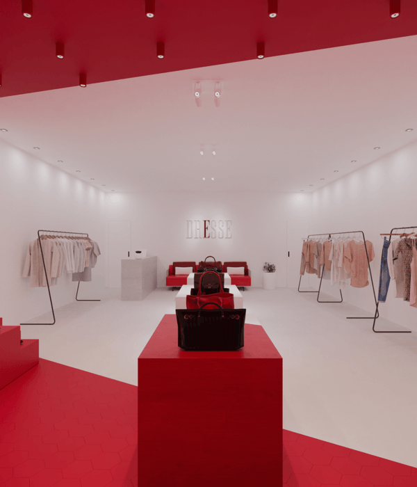
The firm is known across Europe for spatial concepts that combine light and architecture, and ‘Tem-Plate’ is a notable example of this. Inside the store, artificial lighting is at the forefront of the minimal design, where sporadic pops of color are interspersed amongst a greyish-silver color palette.
黄色的 PVC 窗帘欢迎顾客穿过空间,淡紫色的更衣室窗帘是半透明的,足以在试穿衣服时保护隐私。
A yellow PVC curtain welcomes customers through the space, and lilac dressing-room curtains are semi-transparent just enough to enable privacy while trying on clothes.
镜面和金属和玻璃隔墙使空间看起来被划分为不同的区域,反射和对比旨在与“可见的东西,迫使游客探索空间,”建筑师说。“在里斯本,我们为未来创造了模板”,他补充道。“这是一个为进一步探索铺平道路的实验室。”
Mirrored surfaces and metal and glass partition walls make the space appear to be divided into separate areas, where reflections and contrasts aim to play with “what is visible, forcing visitors to explore the space,” say the architects. “In Lisbon, we create the template for the future”, adds he store founders. “It’s a laboratory that paves the way for further exploration.”
{{item.text_origin}}


