America Terry & Terry Design company office
位置:美国
分类:办公空间装修
内容:实景照片
设计团队:Terry & Terry Architecture
图片:10张
旧金山的Terry & Terry Architecture设计团队,将一座建成一百多年的古老建筑,改造成了他们的总部办公室。设计师增建了二楼,并在里面打造了一面有特色的绿墙以及一个屋顶阳台。这座建成于二十世纪初的建筑,所处的位置是当时有名的红灯区,原先这是一家沙龙会所,在之后的几十年里,几经辗转最终变成了一个咖啡馆和办公室所在地。设计师们尽可能的保留了建筑之前的历史痕迹。
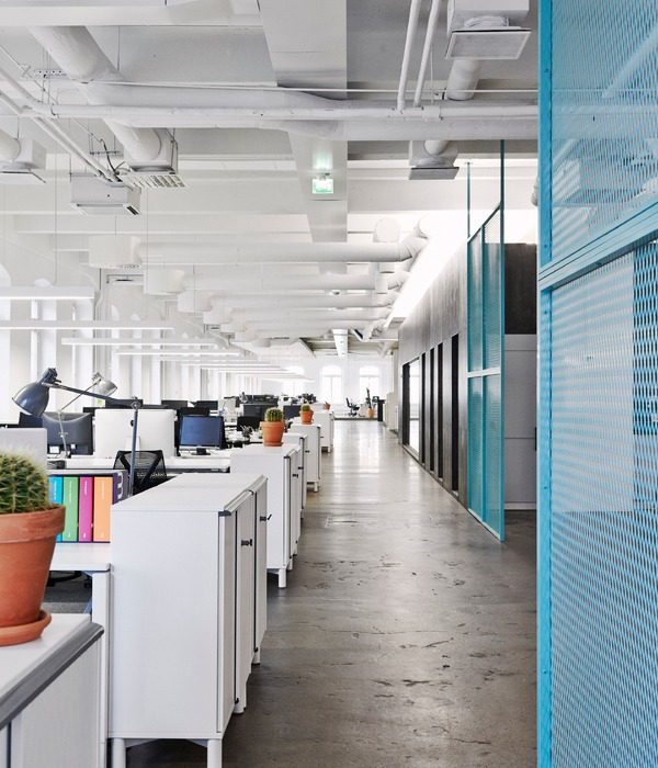
他们将建筑的外立面进行了部分改造,在大大的凸窗周围装上钢制的窗框,并且在上面贴上了色彩鲜艳的带几何图案的磨砂贴纸。临街的电梯后面,就是玻璃围出的入口门廊和会议室。建筑一楼开放式的办公区里摆放着长长的木桌,还有两间封闭的办公室以及一个储物区。办公室的大部分区域,都能够被隐藏式的灯具和从天窗透进来的光线照亮。
译者:柒柒
San Francisco firm Terry & Terry Architecture has transformed a century-old brick building into a design agency's headquarters, adding a second level that features a folding glass wall and roof terrace.The building was constructed in the early 1900s in the city's former red light district and once housed a saloon. It was altered over the years, and most recently contained a cafe and an office.The architect sought to preserve original elements wherever possible.
The design team replaced a portion of the front facade, installing a steel frame around a large bay window and adding a frosted decal with colourful graphics. Behind the street-facing elevation is an entry vestibule and conference room, both surrounded by glass walls.The ground level contains an open work space with long, wooden tables, two enclosed offices and an area for storage and shipping. The main area is illuminated by recessed lighting and skylights.
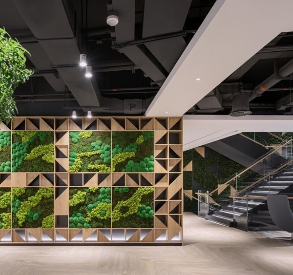
美国Terry & Terry设计公司办公室室内实景图
美国Terry & Terry设计公司办公室外部夜景实景图
美国Terry & Terry设计公司办公室平面图
美国Terry & Terry设计公司办公室剖面图
{{item.text_origin}}

