After 35 years, we outgrew our studio at 49 Exhibition Street, Melbourne. Spread over five small floors, we needed a new contemporary workspace with high connectivity, high flexibility, and good daylight and amenity. Level 19 in the IM Pei classic modernist tower at Collins Place, allowed us to consolidate onto a single floor. We asked ourselves the question – how do you make a design studio out of a corporate office shell? The building offered a traditional, central core floor plate of 976m2, with great daylight from large framed windows, giving a decidedly non-corporate feel.
Much of our approach became about maximizing this amenity. Our studio reflects our practice and our approach to design. Disarmingly minimalist, direct, simple, robust and enduring. Designed as an expression of our approach to architecture; we try to strip back rather than add, to simplify rather than complicate. It is predominately a working space, a workshop for the making of architecture and design, which reflects this hard-working aesthetic. We have condensed form and materiality to the minimum while maintaining collective and casual sensibility.
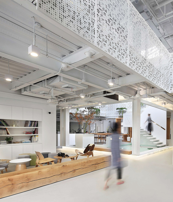
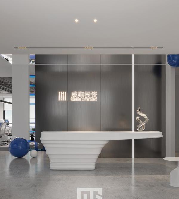
The project is a result of an internal, continuously evolving brief. Firstly, we wanted to create a memorable entry instantly signaling the practice as a creative institution within a corporate tower. A small lift lobby was removed, welcoming visitors and staff directly into reception/gallery, framed by perforated galvanized sheet walls, subtly revealing enlarged design sketches. The centerpiece reception seat seemingly morphs out from the floor – is it furniture or sculpture? A six-meter singular span of aluminum forms a reception desk and informal meeting space. Large meeting rooms are immediately accessible, each maximizing the use of simple, large aluminum tables and focused on large, wireless-enabled displays. Our brief for working spaces was simple. Maximize daylight, openness, amenity, utility, and open-plan workplace connectivity, while minimizing clutter and distraction.
Ceilings and floors are stripped out revealing the honesty of services and structure. Perforated galvanized steel sheet and burnished aluminum is the dominant material, reflecting daylight and enabling any surface to be used for pinup. Functional utility spaces (kitchen, server room, model shop, printers, storage, and staff lockers) wrap the central core, accessible yet concealed. Finally, we wanted to create a great amenity for our staff. Sit-stand desks allow flexibility and encourage healthy posture. A central hub breakout space with coffee machine unites staff. Flexibility allows re-configuration for lunchtime table tennis, functions and events. A central audio-visual display with wireless connectivity enables presentations.
Our overall approach is raw, stripped back, ultra-minimalist, rejecting current fashionable trends of warm, timber-lined, faux-luxury. We have worked hard to make this into something that reflects our design ethic and culture without excess embellishment, through Absolute rigor of stripping away and minimizing clutter and distraction. Hard-working, function-first approach to maximizing utility and amenity. The reception seat is the stand-out insertion, a distinctive and memorable element. It is not an object of place on the floor; it is the floor itself – swollen and split.
{{item.text_origin}}

