- 项目名称:Yamazaki 山崎面包店尚嘉中心店铺
- 设计周期:30 天
- 设计团队:继景设计
- 参与设计:范继景,林利达,汪吟萱,宋万洋
- 施工团队:上海超田装饰工程有限
- 摄影师:Peter Dixie 洛唐建筑摄影
Yamazaki 山崎面包是一家日资面包店,自制面包、西饼等。2004年Yamazaki入驻上海。Jin Design Studio应邀为Yamazaki设计了上海尚嘉中心久光店设计师希望在网红盛行的魔都,通过设计让传统的山崎面包吸引更多种类的消费人群,让更多的年轻人去接受这类品牌。
▼立面展示,elevation display
Yamazaki bread is a Japanese – owned bakery, homemade bread, western bread and so on. Yamazaki entered Shanghai since 2004. Jin Design Studio was invited to design Jiuguang Store in Shanghai Shang Jia Center for Yamazaki. The designers hope to make the traditional Yamazaki bread attract more kinds of consumers and make more young people accept such brands in Shanghai which web celebrity culture prevails.
▼被围合的面包展柜,enclosed bread showcase
▼另一侧转角处面包展柜,bread showcase around the corner
▼展示区得到更好的延伸,the display area is better extended
▼立面展示区效果,elevation display
为了削弱面包柜体的体量,又能保持展示区的连贯性,横向结构的层板,很好的将整个面包店铺得到一个延伸和展示功能。创造出一种被面包包裹的感觉,使其独立出商场多样而又复杂性的环境,成为整个商场视觉中心的焦点,从商场主通道的任何一个角度都可以望见漂浮的面包。所有承载面包柜的竖向结构均被最小化,远看面包柜像被漂浮在空中。
In order to weaken the volume of the bread cabinet and maintain the continuity of the exhibition area, the horizontal structure of the laminate gives the whole bread store an extension and display function. Create a sense of being wrapped by bread, make it separate from the diverse and complex environment of the shopping mall, and become the focus of the visual center of the whole shopping mall. The floating bread can be seen from any angle of the mall. The vertical structure of all the bread cabinets is minimized, and it looks like the bread cabinet is floating in the air.
▼不同高的不同柜体,the cabinet of different height
▼玻璃背板使面包柜体更通透,the glass back makes the bread cabinet more transparent
▼侧面立板的小兔子耳朵的卡通图案,cartoon of a bunny’s ear on a side elevation
由一种面包箱体演变而来层板,及植栽槽,收纳柜,盘夹柜。设置几组不同的高度。面包柜的开口因为客人选购时不同的视线而被区别对待。在儿童视点的高度,设置儿童区箱体,放置适合小孩子口味的面包2块侧板设置卡通图案,(如日本漫画中出现的卡通图案一样)造型卡哇伊。将上面盖板往内退,做成斜开口的方式。同时箱体背板和盖板互相连接处做成一块超透玻璃,更大程度的展示放在箱体内的面包。小孩子选购甜甜圈时的快乐,也被反映在其中。
From the evolution of a bread box from laminate, and groove, storage cabinets, disc clamping cabinets. Set several different sets of heights. The opening of the bread cabinet is treated differently because the customers have different views when they choose. At the height of children’s viewpoints, set the box body of children’s area, and put 2 side boards of bread suitable for children’s taste to set cartoon patterns (like the cartoon patterns in Japanese comics).
▼水磨石吧台和木质层板的小拖板,Terrazzo counter and small wooden pallets
▼放置法棍&现烤面包的中岛柜,the island cabinet where baguette & toasted bread is placed
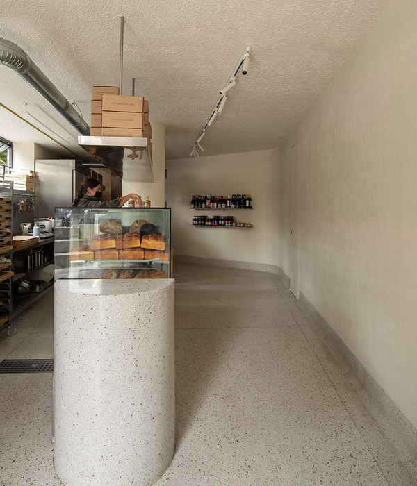
选取米色石材,贴满整个墙面,地面。正如在制作面包的过程中,奶白色的面粉撒上芝麻粒,从视觉的感官程度中能更好的激发消费者的购买欲望。
Select cream-colored stone, paste the whole wall and ground. Just as in bread-making, milk-white flour sprinkled with sesame seeds can better stimulate consumers’ desire to buy from the visual senses.
▼设计平面图,plan
▼剖面图,section
项目名称:Yamazaki山崎面包店尚嘉中心店铺
面 积:89平米
设计周期:30天
材 料:预制麻石、金属、橡木板、有机玻璃、涂料。
设计团队:继景设计
参与设计:范继景、林利达、汪吟萱、宋万洋。
施工团队:上海超田装饰工程有限公司。
道具团队:上海鑫闳翔展览展示服务有限公司。
摄影师: Peter Dixie 洛唐建筑摄影。
Project Name: Yamazaki Bakery, Shang Jia Center
Area: 89sqm
Design Period: 1month
Materials: precast marble, metal, oak plate, glass, paint
Design Team: Jin Design Studio
Project Designer: Fan Jijing, Lin Lida, Wang Yinxuan, Song Wanyang
Contractor: Shanghai Chao Tian Decoration&Construction,Ltd
Props Manufacture: Shanghai Xin Hong Expo&Display Service, Ltd
Photograper:Peter Dixie
{{item.text_origin}}


